Following this Post, I pointed out some bad UX related to the number of clicks required to reach certain actions, such as creating a relation or making a filter. It was a bit of a hassle, so I highlighted without providing solutions.
But because @sturdily challenged me  to do it, I couldn’t deny the challenge shout out to him. Jokes aside, I find it a great opportunity to share my thoughts and designs with the Design team of Anytype with the help of @Filip. so, thx.
.
Before I begin, I want to remind the design team of a post I made a while ago. I’m not sure if some aspects of it were taken into consideration by the team or if it just got buried away. This post was about UX improvements as well, but it also included a load of features. I shared some redesigns of the library, profile, and space settings, among other things. anyway, let’s begin.
Note, I made this concept in a hurry so it’s not in the best quality.
First Creating Or Searching for a relation
Usually this’s the process you have to go to create new relation. what I hate of the current Anytype approach that you need to navigate of windows within windows to do something. but I will fix that. First, I will split the Relation menu to the following sections, and I will reorder some with efficient way
- Toggling and hiding existed relations
- Adding Relations from (My relations library)
- Creating New relation for real
- Adding Relation from (Anytype library)
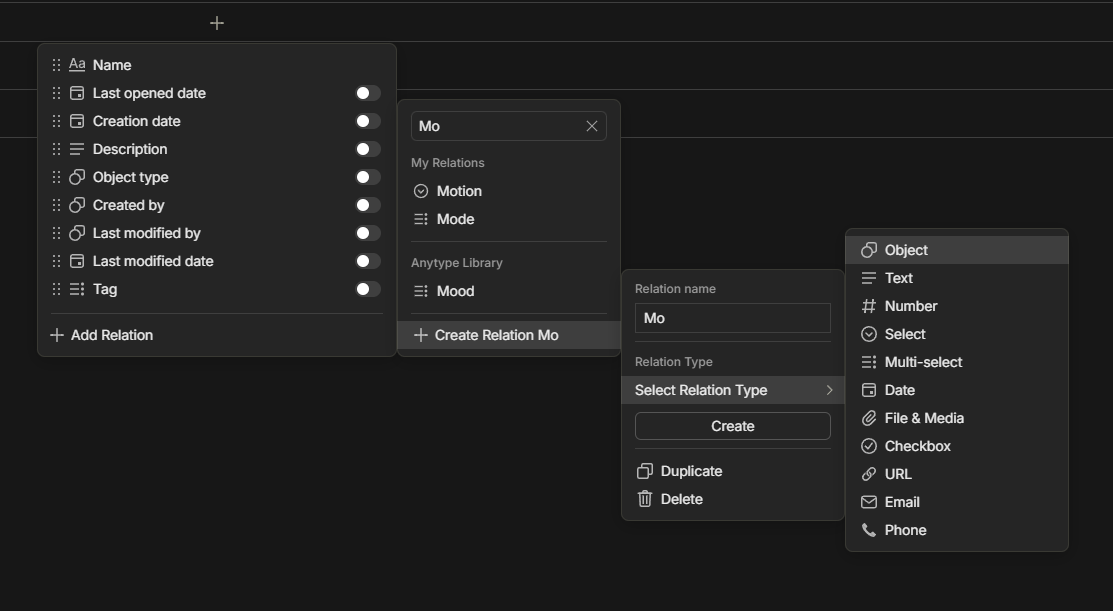
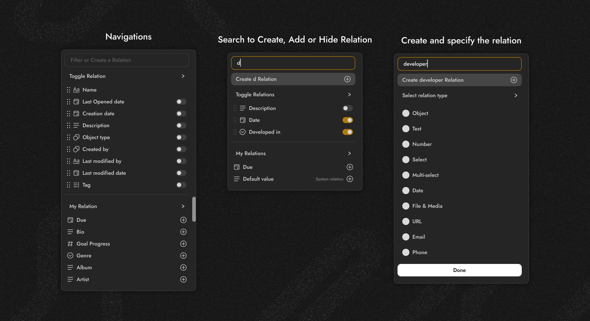
The efficient new look Of Relation window
First thing you will notice is the search bar, but let’s ignore it for a minute. You will notice afterward the two sections. First, the relations existing in your collection/set, which I named Toggle Relations. From here, you can hide relations or reorder them as usual. If you have many relations in the collection, you can swipe the navigation bar to show the rest, or better yet, you can click on Toggle Relations to expand it and easily reorder them. And note I didn’t choose the best name here I know.
My addition here is the My Relations section, which also has a navigation bar to show all my relations in the library. Alternatively, you can expand all relations by clicking on the My Relations tab, as demonstrated in the following video. and best part it doesn’t pop-up another window it’s just overlay in the current window and this’s the neat part.
And here is the thing: you can add relations easily by tapping on the plus icon, and it will be included in the collection without closing the window, so you don’t have to open it again.
.
Now you may be asking how to create a relation. this’s why you have Search field to works as filter or create relation by the name you add on it like in the following video. and it’s so powerful that you can shows also the relations existed in the Collection and hide them obviously this will suspend the ability to reorder. but when you click in the Create relation button it will not open another window instead it’s just overlay which’s looks more modern instead of Windows 98 vibes
Now three done from this list
Toggling and Hiding existed relationsAdding Relations from (My relations library)Creating New relation for real- Adding Relation from (Anytype library)
What about the Anytype Library? I decided to simply remove it. Even though I have the ability to add another section for the Anytype Library, I found it to be just useless. Why does it exist? If anyone wants to add a relation from the Anytype Library, they will already do so from the library tab. It’s simply not the right place to add it. and I feel everyone will agree with me.
Now for Filters
Filters face the same problem. I always wonder why I can’t just click on the relation to change it from a dropdown menu, and the same applies to other elements. So, I made these quick concepts. I didn’t have the time to visualize them in a video, but I will explain them. Here, you have a toggle icon to change the relation easily, and the same goes for conditions. This is just easier than the current method.
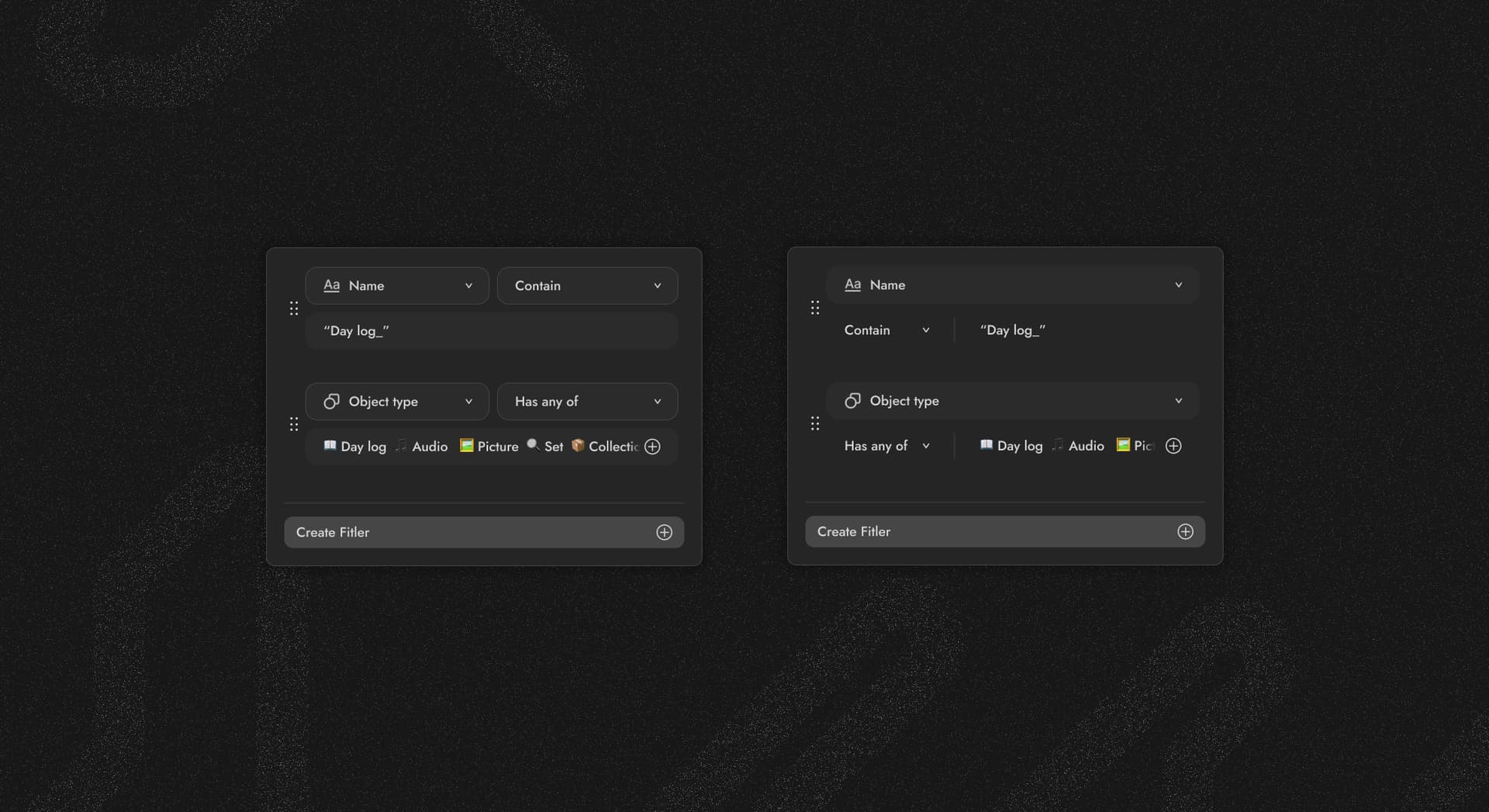
Now I want to note, this is not the best concept I made since I didn’t have enough time because of my exams. But I hope I got you all the ideas. If I dive deeper, I will probably find more. I can continue and do better research and take a deeper look to find similar things. But my point here is to try to abandon the concept of pop-up windows within other windows, because this is not efficient design. It feels like I’m in the era of Windows 98 when I had to navigate in the Start menu for a different sub-windows to get what I want. and thx.
 Thanks!! I challenge you to go study for your exams and have the best grade!!!
 (especially with me suggesting to
  )
)
