Hey, Readers. In my previous post, Every Missing Thing About Collections and Sets, I wrote about everything that was irritating me and blocking me from using Anytype. It was literally everything that was preventing me from using the app. I felt very appreciated by the community and the Anytype team for responding to my concerns and sooner the implementation  . My previous post was like the structure of building couple of layers for the perfect cake, and since I mentioned cake
  , this post will be like the icing on the cake it’s not necessarily something I can’t live without it but, I promise it’s the best icing you will ever see
  .
.
 Introduction
This post will discuss UX improvements related to the Anytype interface, covering aspects such as the Space & Account interface, Library, and others that could potentially be controversial  .
.
The Plan is to redesign them in a more efficient and clear way. Along the way, tips and suggestions will be provided that could contribute to the development of additional interesting features. Additionally, genuine feedback will be given to improve online collaboration and membership in general. So, grab a warm drink  and let’s begin.


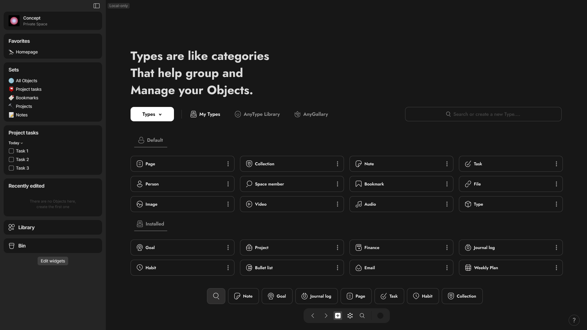
 Icons everywhere
Before starting, in order to redesign the following user interfaces, I need special icons that can be universally used across the Anytype interface. so, I spent a long day designing these icons from scratch as a concept for the Anytype identity and brand. For some, I immersed myself fully in the creative process, for others, not as much. There are some icons for which I didn’t spend much time fixing the flaws, while others received more attention. Regardless, these icons were created primarily for showcase purposes.
I split the Icons in anytype to two separate types, System icons and Icon packs.
The system Icons for the overall interface and can’t be used for use cases unlike Icon pack for pretty much every use case like applying icons in objects, Types, Relations, Callouts, List/Collection views, side widgets title, and make it even further for writing it in tags.
.
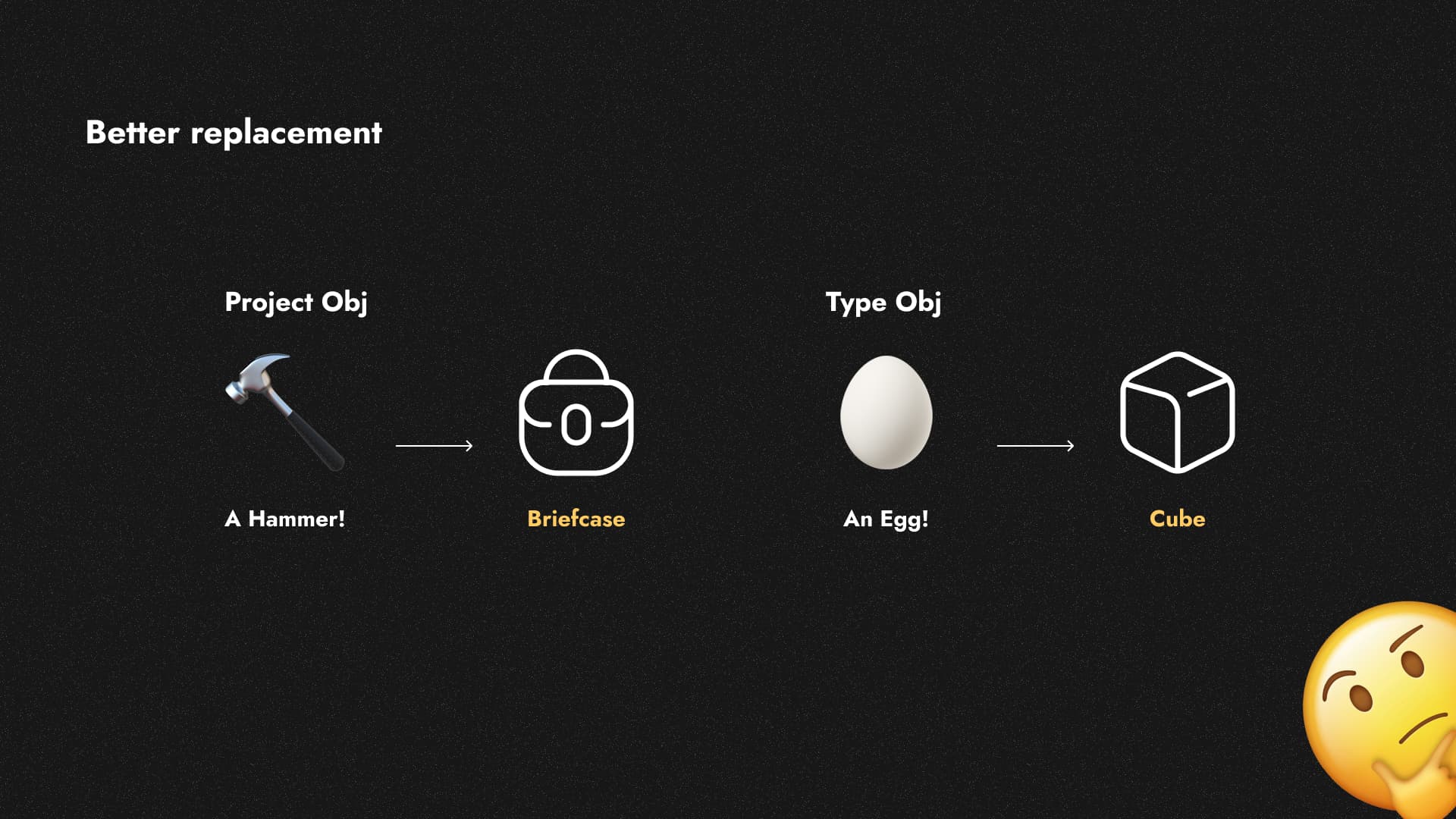
As much as I enjoy using emojis to differentiate between pages, they can’t be used for all scenarios due to their limitations. Additionally, they aren’t aesthetically pleasing for every situation. Even these limitations have led to some poor decisions regarding Anytype’s library object types, which make me reflect. I can imagine Type icon be a circle or like I made it cube and many others.
*One small tip I wish I could change the default types of emoji to whatever I want. If I feel like changing the emoji for a page object type to a strawberry image, let me do this.
.
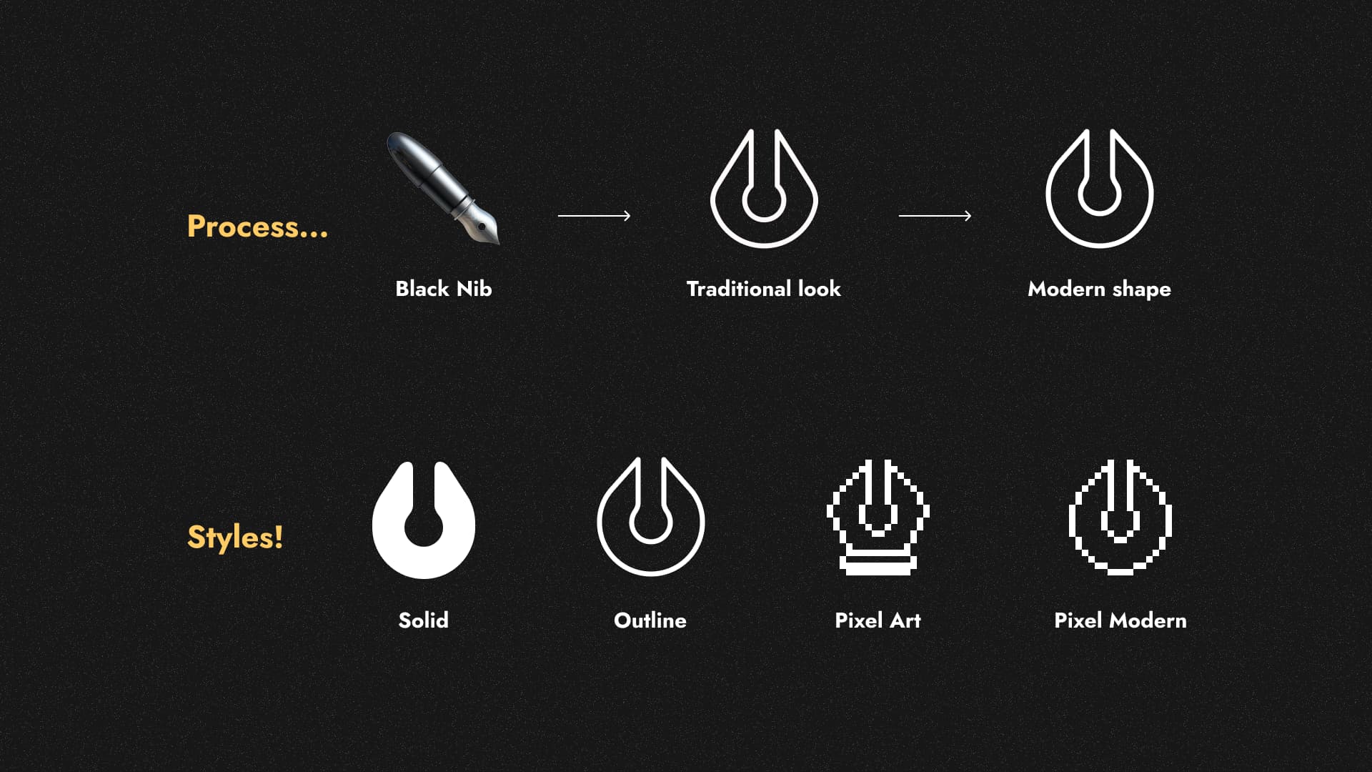
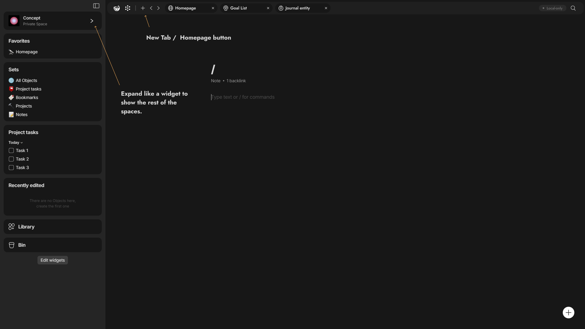
I will give you a glimpse of how I created this icon pack and achieved a simplified and natural look that anyone can understand. I found that the outline style works best for the Anytype brand, as exemplified by this Journal Object.
If anytype team decided to implement something like Iconpack it should be minimum of 2 hundred
.
 Account / Application interface.
Designing every single tab in this interface would be challenging for me, so I will focus on the most important ones. In this interface, there will be both Tabs and Sub-Tabs. Sub-tabs that act as accordions, allowing you to toggle specific sections within a tab.
 Overall, the interface —>
- I made the pop-up slightly bigger with the darker colors in the side bar,
- I made a toggle for account for multi account switching with ability to add passwords or others in the security options.
- I added a few tabs and merged some that are suitable together, such as Spaces and Data Management. I also renamed the Recovery Phrase to ‘Login Key’, and the Pin code to ‘Security’. This allows for the possibility of additional security options or ways to recover or access the account.
- I add 3 extra tabs for future stuff like Notifications, Plugins and Public Site
- The interface also displays your membership plan.
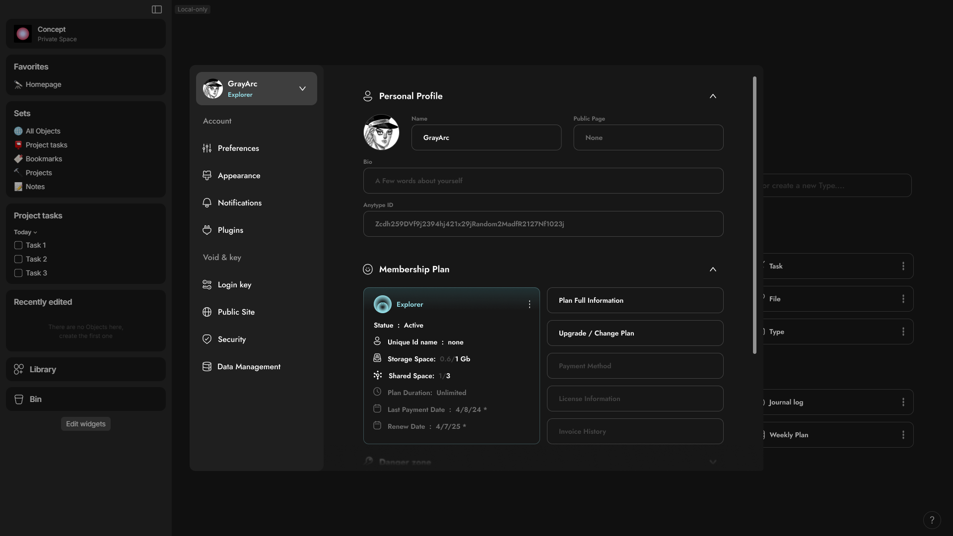
 In the Account Tab —>
- the account tab has 3 sub-tabs First the Personal Profile, Second the Membership Plan for any information related to the membership plan. and third the Danger zone to delete the account I removed from data management to account tab because it will make sense later.
.
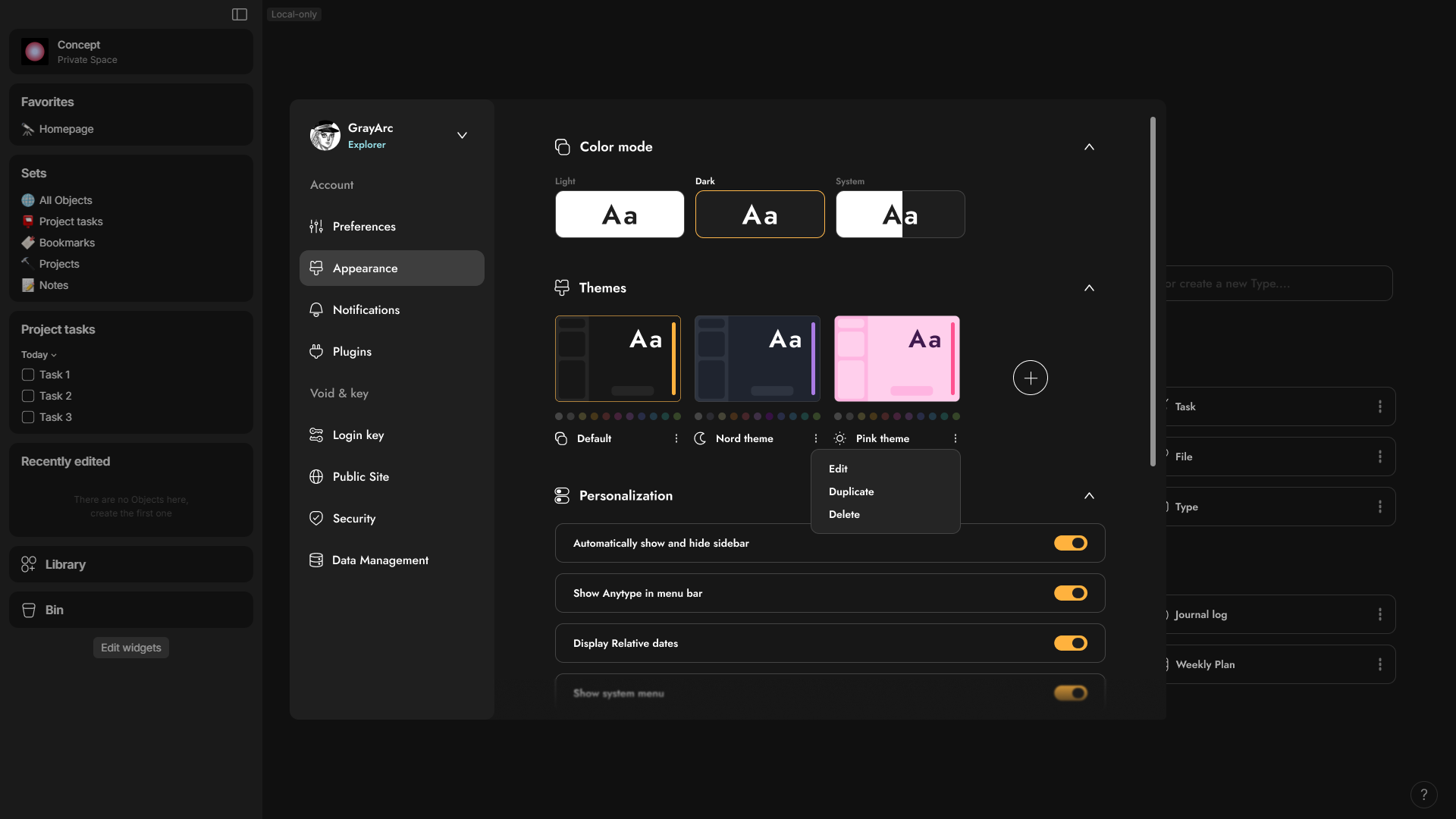
In the Appearance Tab —>
- I made extra Sub-Tab for Themes so you can install themes some of them labeled is only dark mode or light mode and some of them is whole package for light and dark theme.
- There’re indicators of choosing themes like the changing of accent color or the 11 colors that you can change as well and also margin, padding, border radius, and many other that you can do.
- You can edit, Duplicate or delete themes.
.

In the Data Management Tab —>
- I moved Spaces from a tab to a sub-tab in the Data Management section. Now, it includes Your Local Spaces, Joined Spaces, and even Spaces from other accounts that you have in the device. You can open it up like an accordion.
- Local files become a Sub-tab that you can do multiply stuff like offload your data into the nodes, move your file to any location, export the whole spaces from account and export the settings preferences like the themes, plugins and other settings.
.
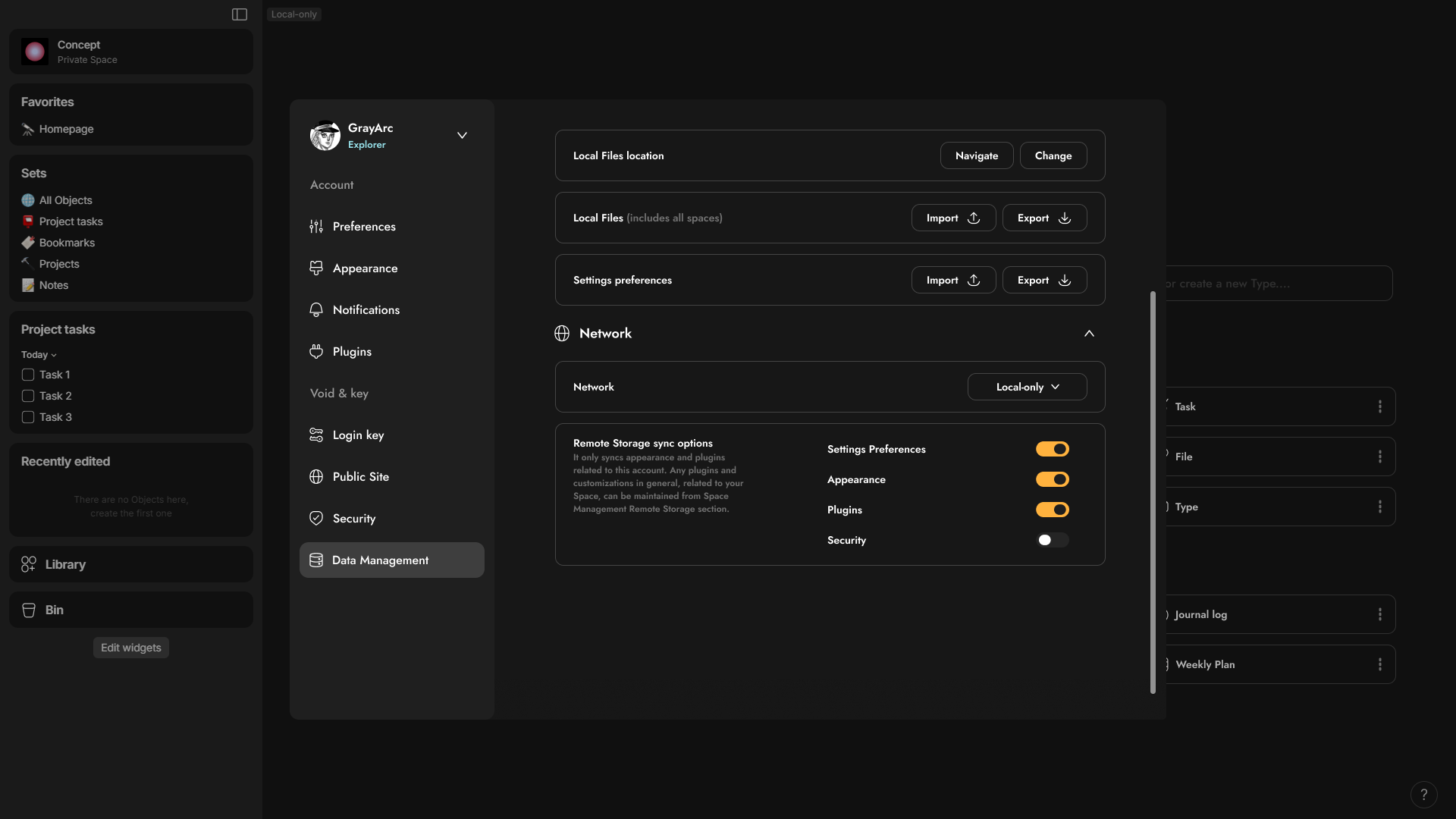
- Also, there’s a Network tab this’s previously only in the login page but I include it in the Data management tab so you can switch easily.
This is also a great feature to add, and I’ve always wondered why it’s not enabled by default. It would be beneficial to be able to specify remote storage for backing up things like appearance, plugins, setting preferences, and more. In my case, since I will be on the Explorer plan, I don’t prefer using remote storage at all. So, why not take advantage of the 1 giga remote storage to back up other stuff? so, when I go to login my anytype account to other device all I do after I login in as moving my files and all the other settings will be previously synced. across the app /:
.

 Two types of Plugins, Appearance and Security
Before I will show the space management interface, I was confusing whether adding plugins and appearance to the account or the space interface, so I had idea came to my mind why not to have two types of plugins and appearances let me explain.
Imagine you have plugins that can change and add widgets, like a stopwatch or Pomodoro timer, or even charts for blocks. These types of plugins directly impact the space itself, such as widgets, blocks, or new views. These ideas integrated seamlessly with the Space plugins.
And this’s amazing, because when you join a new space, you may encounter non-native elements like plugins, new types of blocks, and many other features. It’s like entering a whole new world, where these plugins are specifically associated with that space. When you return to your personal space, you will find your own set of plugins and so on.
For the plugins related to your account, they work in any space. These types of plugins are more helpful than transformative. all for example, all I had in my mind an AI assistant, a plugin that adds tab functionality or non-native powerful web clipper can enhance your experience in any space. However, it’s also possible for owners to completely block certain plugins or specific plugin categories in their own public shared space.
.
 Space interface.
Currently, the space interface has a different design from the account interface. However, I find that the space management interface needs to be more like the account interface than the account interface itself. Since I believe you will have a lot of things to manage in space unlike the account interface, the ability to add tabs and sub-tabs will be future proof to add more options and it will be categorized.
Overall, the interface —>
- Similar to the account interface like the tabs and sub-tabs,
- it displays the role, whether Owner or Member.
- It indicates whether the space is private, shared, or public.
- The tabs change depending on the role, such as owner or member.
- It has a dropdown menu to switch from one space to another without leaving the settings.
- I separated the space information into a separate tab.
- I added a Sharing & Member tab, which is only visible to owners.
- I introduced a new feature called Classes Control, which I will write about.
- It also has additional tabs for plugins, appearance, and security, each with its own unique features.
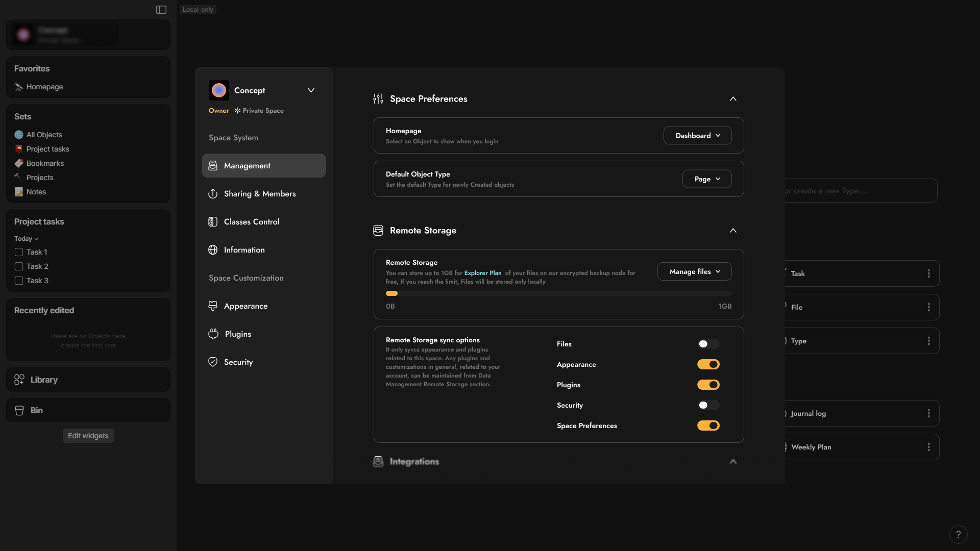
In the Management Tab —>
- You have 3 sub-tabs for the Preferences, Remote storage for spaces, and integration for import or export option.
.

in the Sharing & Members tab —>
- You can switch the space type from Private to Shared or Public from this section.
- When you switch to the Public type, it will display additional options as sub-tabs underneath the Sharing & Member tab, or as a new tab. These options will show information like reputation points, Karma, and many others.
- You can specify the default classes for viewers and editors (I will explain this in more detail shortly).
- You can manage the members and their classes here, with the ability to perform bulk editing.
- You can view only the members who are editors or viewers, and there can be a button to open the space member library object.
.
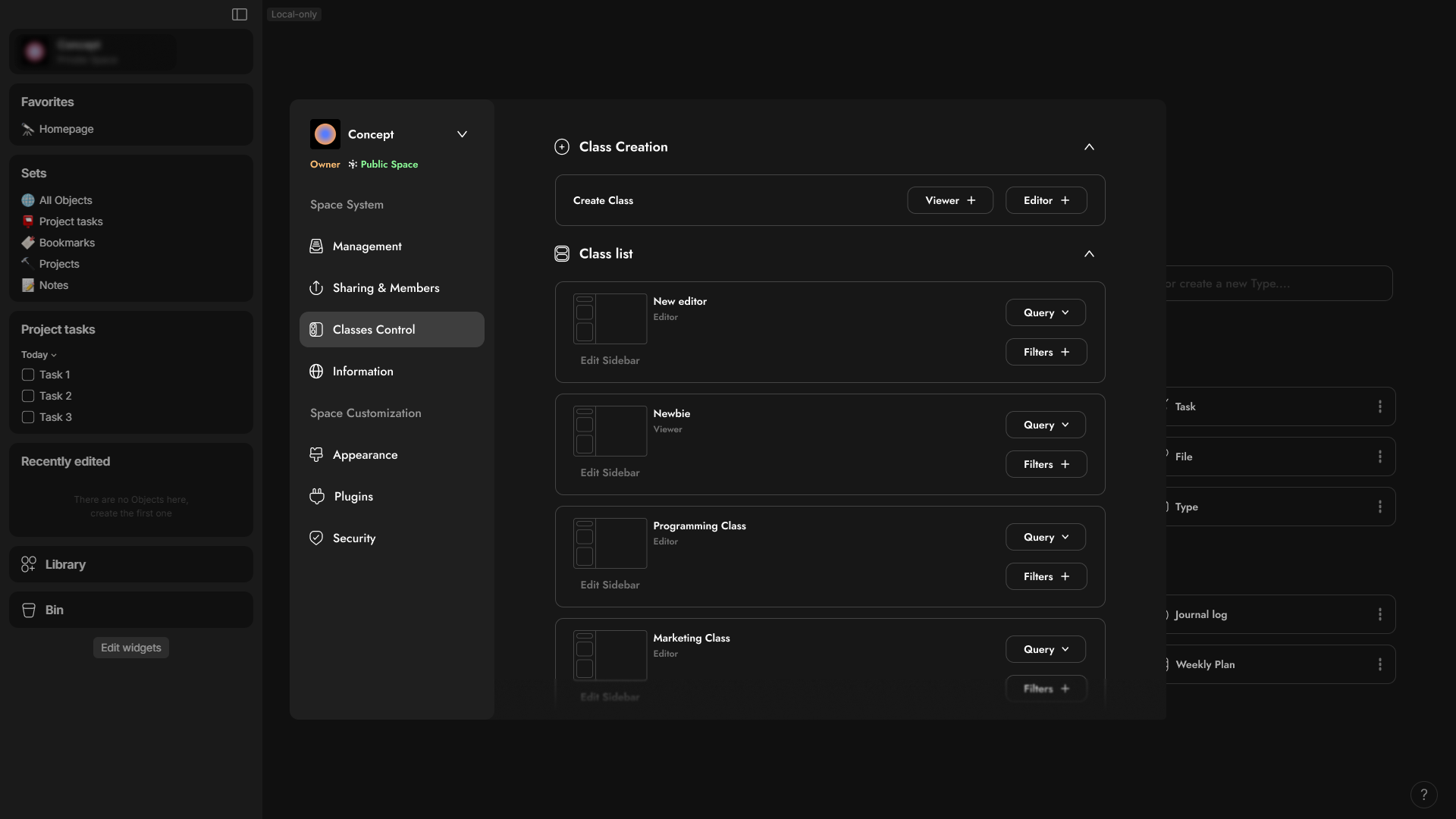
in the Classes control tab —>
This a new feature I will submit request for and since it’s really powerful specially for small studio or companies.
Imagine you have a company with different specialties, such as Marketing, Finance, Programming, UI/UX Design, and many others. You want to add specific permissions and conditions for each section. To do this, you can create classes for viewers or editors, allowing you to put queries by certain objects or relations. This way, they will only have access to these specific objects. For example, for the Finance section, you can have objects like Reports, Expenses, Inventory, Page, Tasks, Notes, and Financial Accounts. You can also specify filters, which can be thought of as conditions. These might grant certain access to specific tags. So, as an owner, if I move some object from Tag 1 to Tag 2, it may disappear from some people’s view and become visible to others. In the case of editors, you can specify what they can edit and what they can view, unlike viewers which only controlling the view.
Permissions —> Objects/Relations | Conditions —> Filters
In the Classes section, you can edit the default Side-widgets for new editors for each class. Additionally, you can create a mini dashboard with essential widgets for each class. You also have the option to allow or prevent customization or additions to the dashboard.
And can you imagine how cool it would be to see the graph view change from one Class/Person to the another?
.
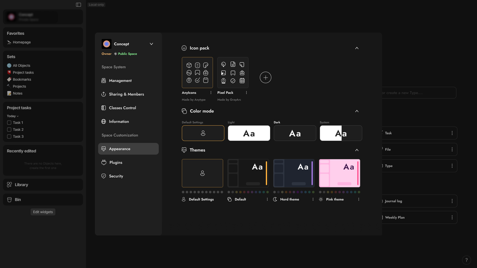
in the Appearance Tab —>
- You can make the theme it changes from space to space.
Imagine entering a public space where the theme changes, similar to entering a subreddit. In this scenario if you didn’t like it, you have the ability to switch it back to your default account theme, even if you’re just a member.
- You can specify the default Icon pack for your space.
This is really useful because the icon pack can be changed from space to space, adding a touch of personality. This is especially beneficial for communities. and as it automatically updates the icons for every object you’ve set an icon for it. This eliminates the need for manual changes.
.
Here’s is a look for how Space or account interface well look like in mobile devices.
.

 My thoughts for any gallery
Now, before I show you the more refined Library design, I want to mention that I have previously made a redesign. It was my first post published in the Anytype subreddit. Anyway, before we dive into the design, I’d like to talk about the Any Experience Gallery, which I call Any Gallery. Currently, Any Gallery only includes installing spaces.
However, if it possesses the ability to install object types such as finance trackers and collections/lists with customizable views either as a bundle or separately, it could be a game-changer. And also, for relations this might seem pointless at first but imagine if version 2.0 of the abilities had far-reaching customization capabilities. For example, consider the formula relation feature. Suppose you wanted to use this to install formula relation to convert a currency into three other currencies within the same field. The possibilities are endless what You can install add to that Themes, Icon pack, Plugins, Templates, and many others.
I wanted to redesign Any gallery because I have a lot of cool ideas for it, but I didn’t have enough time to do this, and I will make this post even longer.
.

 Now for the refined library
- You have any gallery button to install Types or Relations
- and You can pick color for anytype or relation.
- Two groups for installed types or relation and one for default unremovable types or relation
.

 Picker
Now, for the Picker, I want to improve its usability. I suggest making the Picker not only capable of adding icons but also allowing users to use images, videos, and audio files from the Image, Videos, or Audio types. This enhancement would add an interesting dimension to the Picker. Additionally, it would be beneficial if the Picker could also be used to set relations, such as displaying tags or categories, similar to what is shown in this picture.
Obviously, some options will be disabled when you are applying icon or cover.
Adding a shortcut to open the picker can also be beneficial, as well as accessing it from the property’s menu through a left click.
.
 Better Distribution for Navigation Dock to delete it.
I’ve saved the most controversial aspect for last because, for some, it’s an essential feature of Anytype - the NAV Dock. You heard me right. I believe that every element in the NAV dock can be distributed to eliminate the need for the dock.
- For instance, when Anytype introduces Tabs in the near future, the navigation buttons for moving back and forth will be located in the Tab bar, along with an extra button to open a page that will always be set as the home page.
- I’ve relocated the graph view and account icon from the NAV Dock to the tab bar, placing the search function on the far right. This may seem like an afterthought, but people typically use shortcuts specifically for the search function.
- For space management, it would be beneficial if the space widget could expand to show other spaces or allow the addition of a new one. After selecting another space, it should automatically collapse.
- And what if you could make an option to make any widget sticky at the top, so that it remains in a fixed position as you scroll?
- And when you press account icon it will show other accounts to switch easily instead of choosing between spaces
—
For the Creating object button, I don’t have a perfect idea for its placement. Currently, I have positioned it on the far left. However, I haven’t yet figured out how to display the other object types using a left click.
.

Another better design in my opinion
.
 In The end
I feel that I only offer criticism without expressing my appreciation for the developers and the team in general. I don’t post frequently, having only made three posts including this one. After I’ve requested all the features I mentioned, or mention existing ones here, I will likely make my final post as a little gift for anytype team. This post will discuss the features I appreciate in Anytype that differentiate from any other software and compare it with Notion as a +3.5 years Notion user, The post will be the last, and I plan to create it somewhere in 2025 when I move into anytype  .
.
One final point to note is that the terminology and placement of certain elements can be improved based on the design. As needed, adjustments can be made. It’s important to keep in mind that my design may become outdated, and there’s always room for improvement over years. so, if you have some feedback don’t forget to write it down.
Related:
 , This post directed more toward anytype team.
 .
. ).
). .
. Personally, I just got used to it, but an option to customize it or relocate would be ideal.