Since this topic is about UX improvements, I want to share a strange approach the Anytype team took in the app. I always find this makes the navigation a bit chaotic.
And It’s the “click count” throughout the app in general, and it’s the number of clicks it takes to perform certain actions. I always find it’s annoying to navigate through 4 pop-ups/windows to do something like creating a new relation like in the following image:
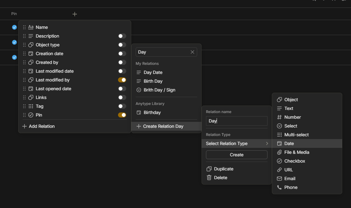
This isn’t just about creating new relations. I always find this aspect present in everything throughout Anytype, including filters. I understand this approach is intended to make something like filters to look cleaner by hiding everything in drawers within other drawers, but it makes them harder to reach. I can think of a better way to present these elements without making them look cluttered.