Add an option to make the cover area vertical (height > width)
HOW COULD IT BE DONE?
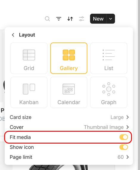
Give it a higher height.
REAL WORLD USE CASES
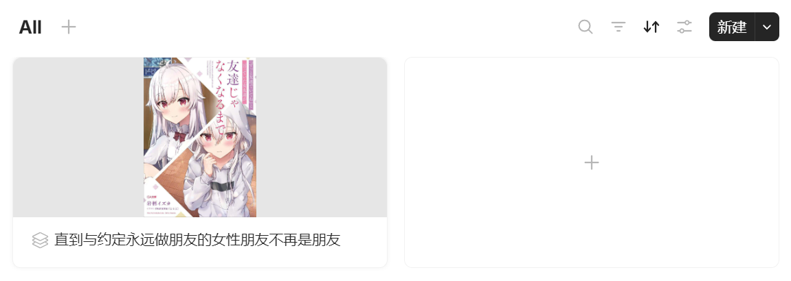
I store some interesting novels in Anytype for reading without a book in my hand. The novel cover is vertical, while any type gallery view only supports horizontal cards, resulting in a large amount of blank space with a big strangeness.
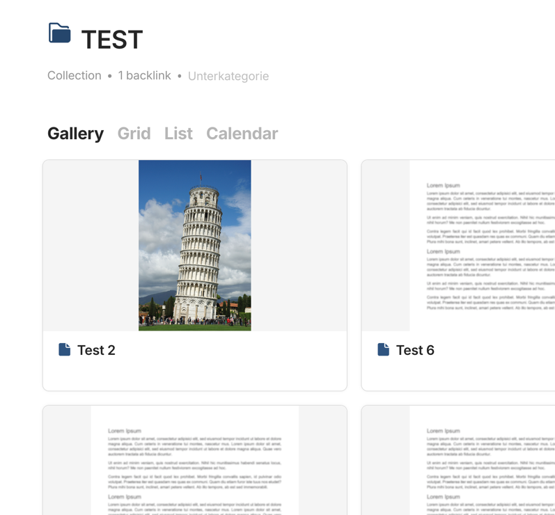
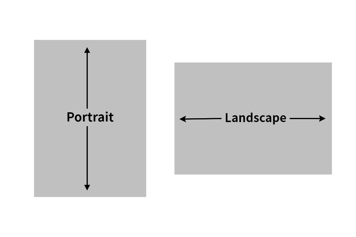
@typed-sigterm wants the size of the cards in Gallery View to have a higher height. Or perhaps easier said, he suggest having portrait cards in the Gallery View eliminating the grey fillers left and right of images that have a higher height. Currently the cards in Gallery View are all portrait.
@Jeroen I don’t understand. So how should the cards behave? They contain not only the cover image, but also the name and relations.
Do you think a card with a cover image in portrait format should adapt its width to the image width and therefore be correspondingly narrower than cards containing cover images in landscape format?
Or should it become higher according to the height of the portrait image?
Or should the cover image area of cards be square so that portrait and landscape formats fit equally?
I don’t know how it should work, I am fine with how it is now. But I think what @typed-sigterm means is the following:
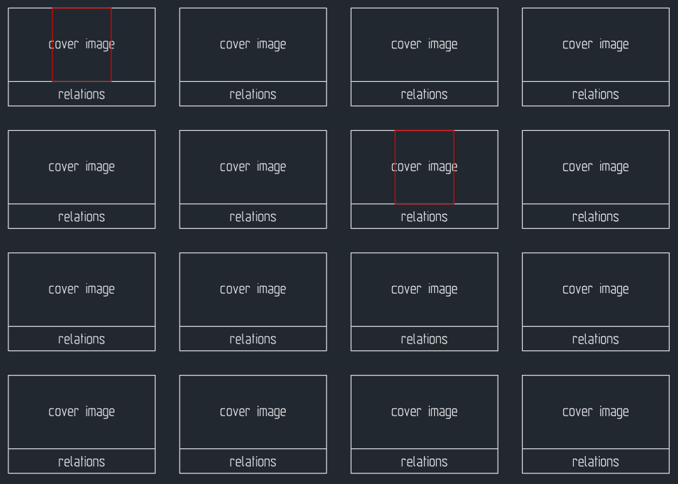
Current Gallery view, red are cover images (or any image source used in this view) that are portrait. Which then have the grey areas left and right in Gallery View.
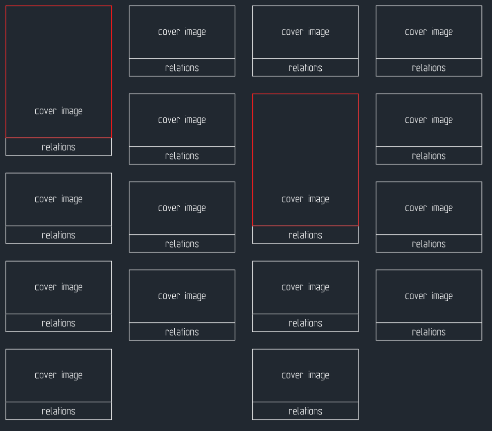
A bit overdone in height but it is to prove the point. If I remember correctly, a few years ago this was how Gallery View worked but many (including myself) didn’t like this view.
Some apps call the bottem image Wall View and have both options to choose from.
This view is called Masonry, but this is not an image viewer or a web gallery that displays thumbnails.
It is totally clear to me that the cards of the gallery view for objects should have the same sizes and aspect ratios.