This will be a rant about my opinion on the use of models of anytype for the past few months.
I am aware that many people will probably disagree with my viewpoint, and they are welcome to do so. I’m not saying my opinion is correct, it’s just my opinion.
The problem.
Modals != navigation.
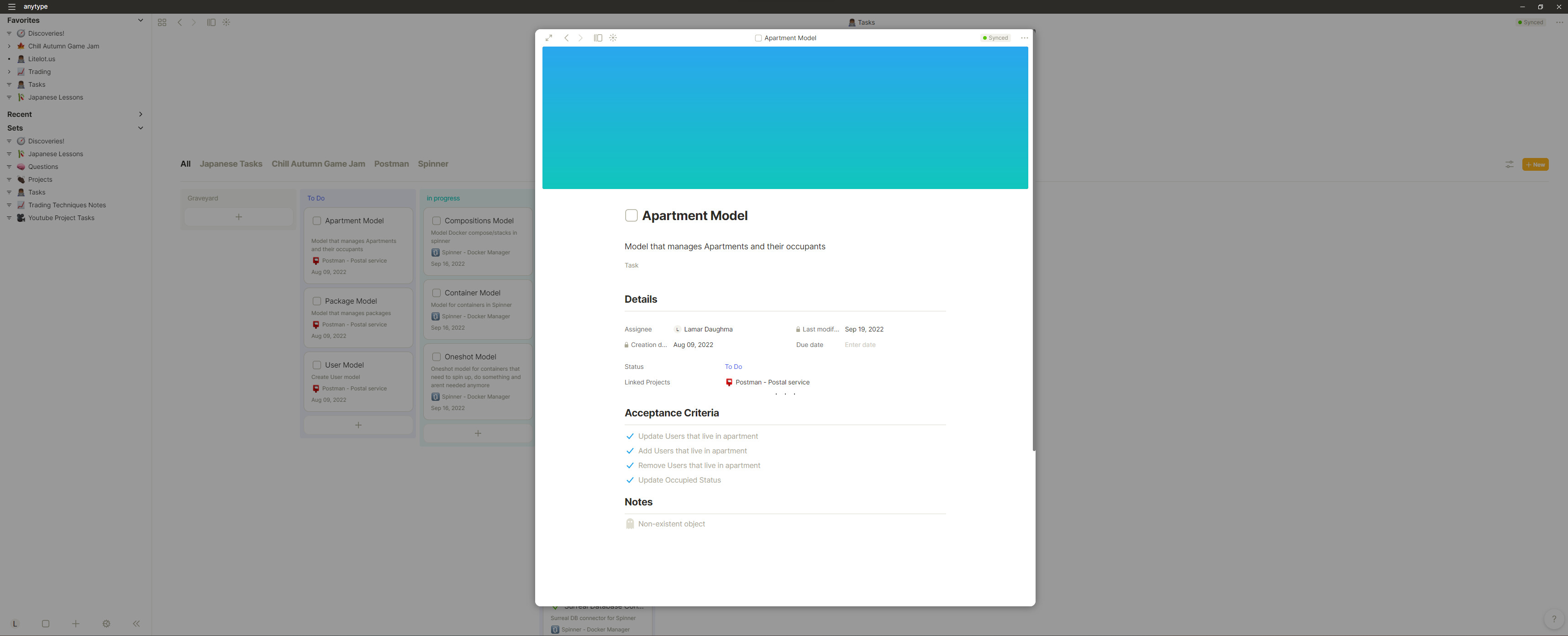
Modals are to show something. they shouldn’t be used as an editor or part of navigation. modals just show something. they waste space and add an extra click to get anywhere. It’s a waste of space. I have a 21:9 display. a modal looks ridiculous. example.
(I gave the window extra height here and it still looks wimpy)
all that screen real estate. for what? nothing. and what makes it worse, is if I want to browse the explorer on the left I have 2 options. maximise the page, which it should have done in the first place IMO
or click off the modal and lose the page that I was viewing in the first place
They only seem to fit in one place for me. the cloud/graph view.
I mean it’s still tiny, but at least it’s not getting in the way of anything. so why does this work…
The Modal Mystery
Where do modals work?
Something needs the user’s immediate attention.
for example, let’s say a user needs to make an immediate choice for the program/web page to function as expected or to confirm an action. (confirm to save, alert that there are unsaved, notify an action succeded/failed) it captivates the user’s attention away from what was happening.
do something that the current layout/form cannot
this in my opinion is where the cloud/graph view fits. you can’t just smack a high-level navigation/overview page in a hierarchical browser-like system as the anytype sidebar uses. they just don’t jell well together. (at least I can’t think of a way they could.) However, slap it in a modal and it fits perfectly. it’s another tool, a separation between a file browser and a cloud view. they don’t work well in the same view, so separate it with a modal. (just make it bigger. please.)
Why don’t they work here?
Multiple reasons ill bullet point them here.
space waste
navigation separation
constant flow interruption
constantly entering and leaving the modals
even though we are constantly in them, they are never the final state. they are always mean to an end. increasing navigation input.
SPACE WASTE (I got real estate for a reason)
Alternatives and related issues
tabs
Tabs, in the application, would be perfect. I know you guys added support for multiple anytype windows, and it’s great, however, I never use it. I open anytype once, and never open another window. take gimp for example (the photoshop alternative not the guy in the corner wearing latex). not even they stuck with the multiple window system they created for multiple reasons
Impossible to manage windows on Linux. too many DM’s manage windows in too many different ways. you always end up dedicating a workspace to one application which no one wants to do. it defeats the purpose of workspaces also. it just looks ugly. it’s chaotic and relies on the operating system to work together. it’s a similar story on Mac OS. if I want to full-screen the application it gets its dedicated workspace. if I open another window and full screen, I now have to work between 2 workspaces… chaos. pure chaos. put modals on top of that and it’s just madness. it’s not organised, it’s not clean and it adds so many barriers to ease of use that it hurts my tiny dev soul. Windows is somewhat better at this than the others, but look at this.
0 wasted space. clear and clean. nothing wasted completely flexible. (I’m aware this is on windows terminal, I’m not at my linux machine rn. point still stands)
I’m very aware that not everyone knows how to use vim. and i don’t expect something this simplistic to be the default. especially with the lovely aesthetic anytype has rn. but at the very least use your tools efficiently.
I do like modals but there really should be an “open as” default that we can control. For a lot of my sets it’s very useful to be able to pop a page open, edit it, click to the next page etc but in some cases I’d like to be able to tell a set to open as object.
Notion example:
I would also like to be able to open a modal and then interact with AnyType behind it without dismissing the modal. Like to jump to a different set and find a different doc I want to cross reference. That’s more a use-case for a side peek style overlay.
Modals also have a huge amount of issues with resizing windows after opening one eg completely losing access to the navigation panel
agreed. honestly feel like a side peek would be a great addition. maybe just window splitting in general. (probably a replacement for the Vim UI suggestion)
I agree with most of your points. For the editor itself a modal just takes away space for me. It makes a lot of sense for me in parts where have something that is “on top” of another part which I only want to open for a limited time, like showing the enlarged image when I click on it.
Yeah I get that, but the problem is, that there is no “preview” state. we arent opening a modal to a preview state, we are opening it to an editor. and you always get it whether your opening it from another object, the cloud view, or a set. (sets are something I use everywhere) and it does nothing but get in the way. i could understand if it was a preview, or export or something, but it always opens an editor… maybe make the preview an option in future, but editing should be done in the main window IMO. not sidelined into a modal until you say otherwise.
I think Notion may have started the “editor in modal” disease, or at least heavily contributed to it. We can see that they too are now moving away from it, and I agree it was never a great idea, at least as-implemented. Obsidian now has tabs too btw, and they are very nice indeed, especially in combination with “panes” (not multiple windows, splitting 1 window into multiple areas, each of which can have tabs). Multi-window is nice too, but I agree it’s not the solution (but I think an easier one to implement than tabs and panes, thus why it came first?).
I really thought that I would use multiple windows more, but they are for me basically just modules that don’t go away until you manually close them so there’s limited usage for me. Hopefully tabs and panes, and navigation in general with get some love after the release.
Hey, same for me. I use multiple windows when reordering stuff between multiple pages. There it is very useful. But for daily use I also think, that tabs would be used me a lot more.
@LiteLotus thank you for your opinion! It’s always great to see people really thinking about improvements/adaptations to Anytype and sharing them here.
The Modal Mystery
I don’t use them much and I don’t like them either. When I edit a page, I would like to see the whole page. Right now I’am working with multiple open pages. In order to reduce the whole switching in between pages, I would prefer to have a Split view feature. That’s my only concern, but I do understand your point that modals on a larger screen, which you would like to take fully advantage of, seem to be even more distracting than helpful…
@sambouwer Thanks for linking the feature request in question. There are some feature requests which go in the same direction, but that are closed. So I was confused until now if there is actually an open request on this topic (multitasking / navigation).
While I think modals prob work for some folks, I agree that they don’t work for me. It would be amazing to have some customizability on that front (panes or a side peek option).
What makes modal hard for me is the inability to reference more editor/block/object. A smaller modal might work. Sidepane and tabs are definitely what I like to reference the whole object.
The other constrain is that modal as quick access is not accessible anyway. A command to open pop-up at anytime will probably make modals better. However, I like command palette or line way more. Just a single line for quick add and it doesn’t block out anything. FR Obsidian command palette FR Tana command line ← Maybe I prefer tana version more (but haven’t used it)
PS slash command (notion style) is not my thing because it locates within the contents which interrupt my thought flow: content part of mind, and action part of mind (always temporary in note-taking app)…
Panels are just better for this. When you open a modal, you can’t see the original page at all, and even more importantly, you can’t edit it or do anything outside the modal window or else it will close.
taking a closer look at this image, i have to whole heartedly agree, there are a plethora of options that dont require a modal
with regards to this
i whole heartedly disagree. again, this is an opinion, but i believe modals do exactly the oposite. it pulls you into a new context, doing the equivalent o opening up a new window in this case. which in my experience pulls me out of the flow every time.
I agree here, an option to fully open the object is absolutely an execlent option, however i feel that it dosent solve the core problem, why we have the modal in the first place. i feel like its designed to be an “undoable” navigation action since you can choose to fully open it, or fully close it. its half assed in both aspects, it dosent commit to anything while still having the inconvenience of both. My personal solution to this, would be to split the window.