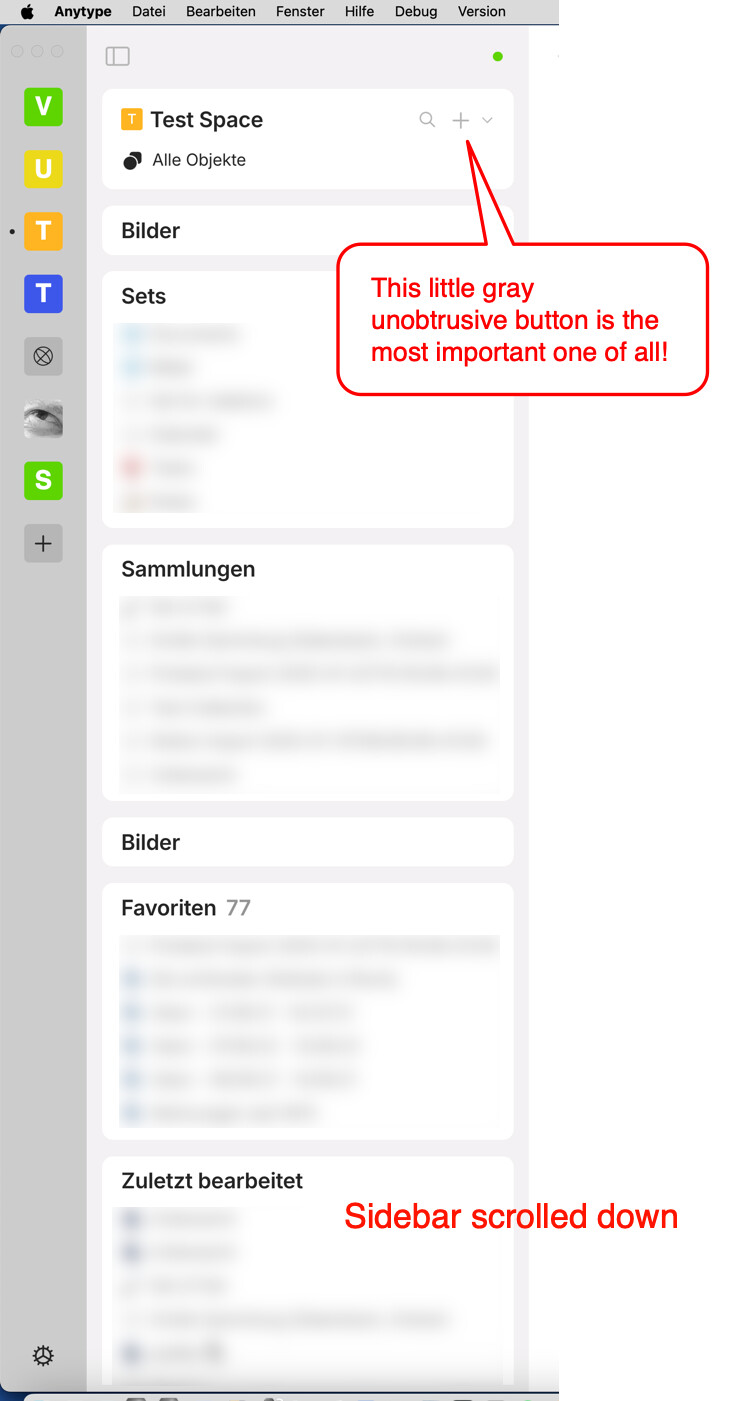
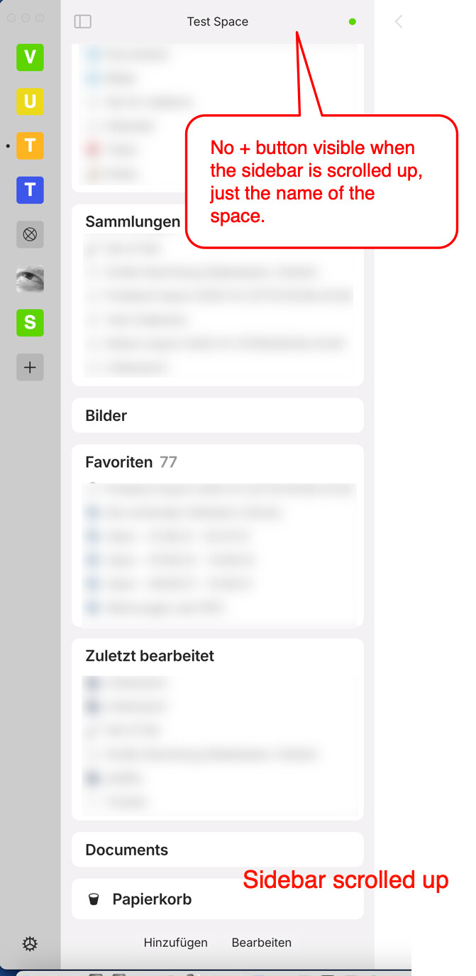
If the sidebar for widgets becomes larger than the height of the app window and you scroll down the content of the sidebar, the space widget with the button for adding a new object (+) disappears and only the name of the current space is visible.
Since the button for adding new objects (+) is the most important of all, it should always be accessible, regardless of how large the sidebar is. Therefore, I suggest making the space widget with the + button “sticky” so that the button is always accessible.
One of the most important functions is carefully hidden.
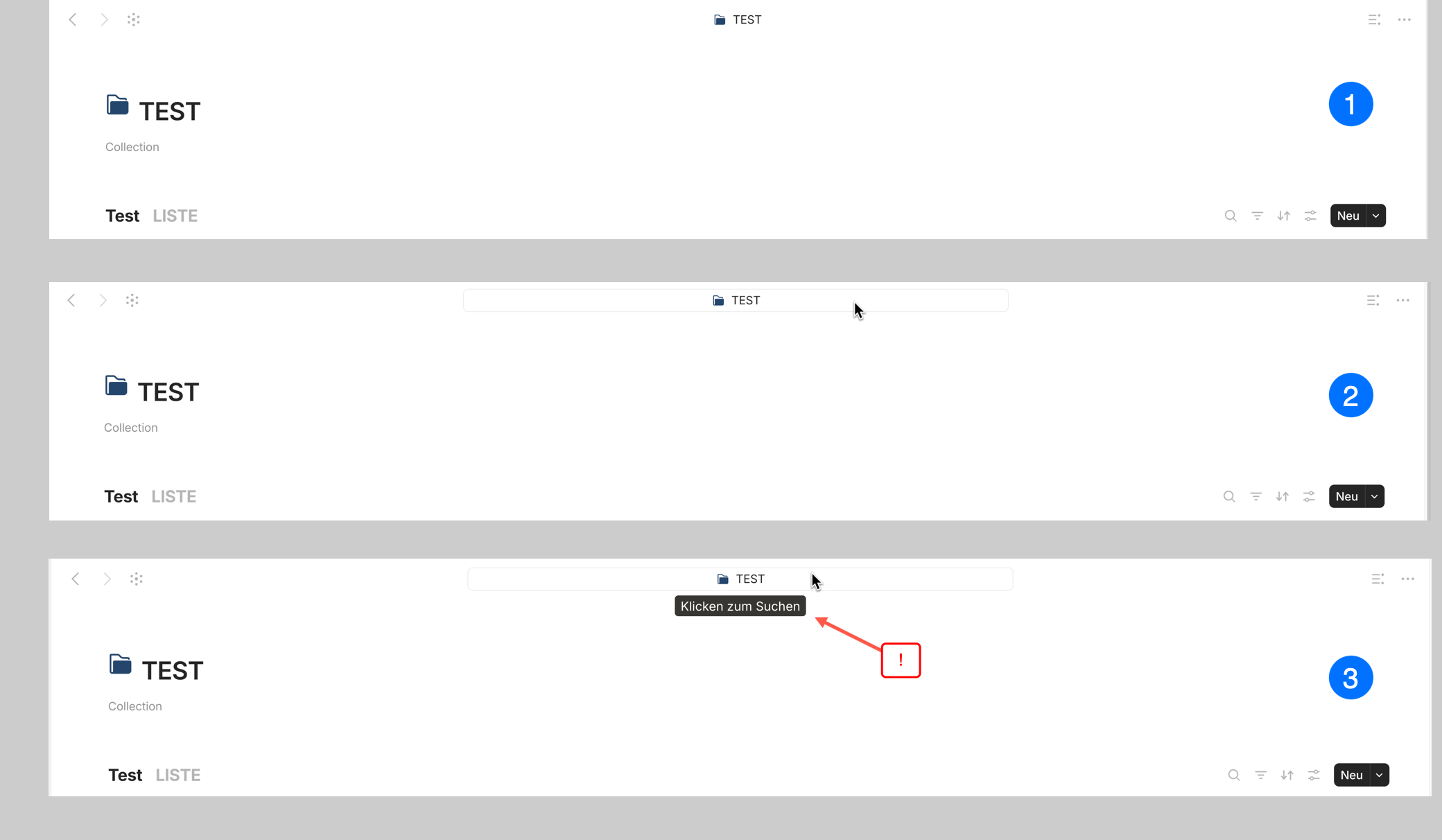
The search function, which is actually prominently located on every page, is well hidden/camouflaged.
The top (fixed) bar on each page not only contains the icon and title of the page, but also, hidden behind it, the important search function. And you only notice that this is the case when you move the mouse pointer over the page title and a “Click to search” tooltip pops up.
Of course, those who are familiar with Anytype know that this is the second way to open the search window (after the loupe icon at the top of the left sidebar). But new users will probably only come across it by chance. And when the sidebar is scrolled upwards, the page title remains the only way to permanently access the search function (as the top bar of the page is fixed, but the main widget with the search function is not).
I think that access to the search function should always be visible, clearly recognizable and permanently accessible. All comparable applications known to me have the search function prominently placed and permanently accessible. Anytype unfortunately is still an unfavorable exception here.
Dear Anytype team, I wanted to provide another argument why I believe that the widget offering the most important functions (space name, buttons for search and “New” and “All objects”) should be fixed at the top of the left toolbar, assuming you want to keep the current design of the search with just the loupe icon.
Please look at other comparable applications with regard to the search function: Notion, ClickUp, Capacities, Lark, Coda, Affine, FuseBase, Evernote - In all these applications the search function and the most important function buttons are prominently placed and permanently accessible, almost always in the form of a dedicated search bar.
Nope, never knew before you mentioned it… There is nothing intuitive about this, as I never hover or click on a title for no reasons.
You can’t be good at everything, that’s what hiring is for, but the bitter truth is that for years now, the role of UX designer has been taken on by the community.
Good UX design doesn’t require a lot of experimentation and trial-and-error, which in the end wastes a lot of cumulative time, whereas good design is almost timeless, is useful for everyone and enables progress to be made on subjects that require deep thinking.
UX design doesn’t need much thought, it’s all about logical and obvious layouts and behavior.
So thank you and congratulation for the patience your have to explaining very obvious and basics UI/UX design, often.
Very nice to see that this has now been implemented! At least that’s what I see in version 0.47.12-alpha and it’s a pleasure! Anytype’s interface is getting better and better - thank you, Antype Team!
Just got this on v0.48 on my laptop and unfortunately I’m not too pleased. While I agree the “new” button should be more accessible, the 3 extra options below it take up a lot of space from the sidebar at all times now. As someone who doesn’t use those options much or never, I would suggest making that system widget collapsible like the others. For those who need more widget space.