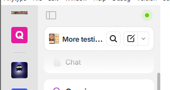
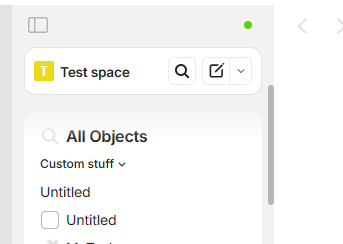
Surprise in latest version, the space widget is fixed.
I know @VisualNotes suggest that in this post. And I was agree because it was for search
But as it’s implemented, it takes up a lot of space by imposing elements that are often unnecessary!
- Search take more place than before
- we must have “All objects” even if you don’t use it (and in my opinion, even in that case, it’s not the most useful feature in the widget bar!)
- we must always see “Invite Members” (even if it’s a private space…)
WHAT DO YOU RECOMMEND?
Improve to have an effective widget that is truly useful and doesn’t take up space for nothing.
HOW COULD IT BE DONE?
Option 1 : let a reduced space widget when scrolling, with only useful tools (someone made a nice suggestion somewhere on the forum, by the way). why not keep space title (to keep access to option), create and a smaller Search icon whe widget bar is scrolled.
Option 2 : I have already suggested this elsewhere, but making the elements of this widget optional (especially “All Objects” and “Invite”) solves the problem both when scrolling and when not scrolling.
There is an isScrolled class, we should be able to improve that, but it’s a shame to have to use custom CSS for these elements.
REAL WORLD USE CASES
I have really useful widget used frequently. Now I have less space to see them, in favor of something that is not useful…