Is this a temporary test, or even the final version of a new logo?
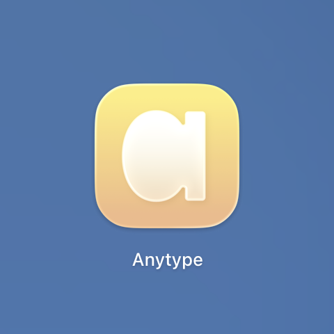
This logo is a lot better than the previous try, and more believable that it could work imo, though it is a very drastic change from the current logo. If this is true, it’s an especially bold move. For some reason I don’t get a hint of ‘privacy’ when looking at this logo though, which is a big part of Anytype imo.
If so, I can see how Anytype wants to come across moving forward. This evokes the feeling of warmth, cheerful/friendliness, and approachability; almost a 180º from the current logo which evokes confidence, sophistication, professional, premium feel. Basically dropping all the current brand design and colors for something entirely different, The few that I can think of that did a change this drastic in their branding is Jaguar, Facebook’s logo changing to Meta’s, Twitter’s logo. It’s more drastic than Crackle Barrel’s. The website will need a rehaul if this is the case.
I know the team want to position Anytype as both a notetaking/documenting app and also a chat app. The feeling this new logo gives off may help with the chat side of Anytype, but I’m not convinced yet that people seeing this logo will think of a messaging app like how the current logo matches the block base, structured yet flexible environment of the note taking side of Anytype.
I don’t know if my suggestion from here affected the logo in any way… Overall, a lot better than the generic star, but this will be an uphill battle. Might take a lot of marketing effort to get it right, especially with aligning this with the privacy and encrypted side of the brand.
Not final of course. We experiment with an icon.
Excellent analysis of the logo design. I really liked it.
tbh, I love the current logo. It’s simple, but not generic. That one looks pretty generic.
It’s good to hear that this isn’t final, and I can’t help but comment on it.
I think a logo or app icon has to meet certain basic requirements, which a professional designer will probably be able to name right away.
In my opinion, a logo or app icon must above all be visually clear, which means it must have sufficient contrast. And ideally, what it represents should have a recognizable meaning.
These are just two very basic requirements. Unfortunately, neither of them is met here.
This design looks extremely washed out, the contours of the geometric figure are barely recognizable, and even if you do recognize them, no possible meaning comes to mind. The yellow also makes no concrete sense, or rather, you can’t see any meaning in it; it could just as well be any other color. White on a light yellow gradient is also a particularly poor choice as regards color/contrast.
In this context, I think the old logo is a thousand times better.
Please take a look at your competitors’ logos and analyze them visually and in terms of content!
Check the visual visibility of this icon in the dock bar among 80 other app icons on a 27" iMac!
For me, Anytype has the most appealing and clear design and layout of all comparable applications, so I wonder why attempts to redesign the logo have all gone so wrong so far.
I also like the current logo most! It’s simple and easy to see, and it stands out from the other applications I have. It gives me the feeling of organizing/cleaning up things which is what I use it for.
have you tried to make the back transparent liquid glassy and the letter opaque?
Whether we personally like this new icon is less important than understanding the identity it serves. A logo isn’t the brand, it’s shorthand for a broader system, voice and tone, product experience, typography, color, motion, iconography, and the values that tie all of those together. In other words, the logo should make sense within an ecosystem and a strategy, not just on a standalone screenshot.
I personally like the current logo and overall the Anytype identity across platforms, with its mix of retro pixelated elements and modern touches. But before we start the like/dislike debate on the new one I’d like curious to know why the team wants this change now, and why they chose this proposal.
First and foremost, it’s about whether a logo or icon works visually or not. In my opinion, this one doesn’t work.
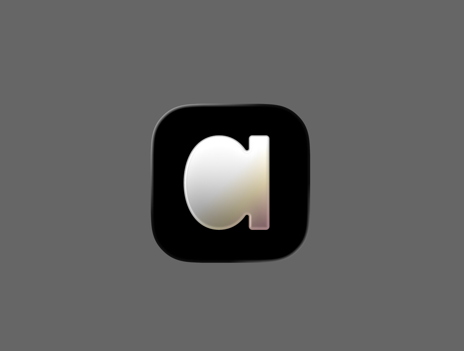
we are still experimenting, and everyone on our team agrees the contrast is low. we’re working on another version.
as for the “why”: we’re emerging into a new category — communication software. this symbol merges the idea of “typing” with our name. it’s basically the letter “a” emerging from a caret — the one you always see when you’re typing.
you are right 100%
great read! thank you!
I like it, it has the Anytype gradient touch and better contrast
(I didn’t give my opinion on the yellow logo… work in progress, etc… and it wasn’t positive ;-))
I’m torn because I love the original logo, but the “a” logo is growing on me in the high contrast black.

Makes sense, thanks for the explanation.
@anton Thanks for the info!
Unfortunately, visually speaking, we’re still at the beginning of the century.
-
The “a” as a symbol makes sense in terms of meaning.
However, the gradient in the lower area makes it unclear, so the “a” is hardly recognizable in practice.
Suggestion: Either do away with the gradient altogether or tone it down to maintain contrast and legibility, or rework the shape of the “a” to make it legible. -
I don’t like the multicolored gradient at all. As far as I know, Anytype doesn’t have a brand color, so why is a colored gradient necessary at all? And even a multicolored one! This looks so outdated. At a certain distance, the yellow and pink blur into a dirty, indefinable tone. This makes the icon look worn and dirty, like an old bedroom door that hasn’t been painted in 20 years.
You seem to love gradients, but hey, it’s not 2005 anymore. In the age of flat design, you have to be very careful with gradients so they don’t look outdated.
Personally I love the gradient. Though I agree the logo they posted above does have a “used/worn out” look to it. I think the gradient adds a bit of contrast (which we’re all in agreement is missing). They do use subtle gradient in a bunch of spots on their website: https://anytype.io/
In the age of flat design
That’s why I dislike the yellow logo. It’s flat and imo uninspired. Too many companies have gone the route of boring flat, single color, sternal, logos. The gradient helps adds add boldness and life to the logo. It helps it stand out.