Curious what made the team think a rebrand is needed? Not saying that it won’t help (depending on how it eventually turns out), but this could be another example of bikeshedding.
If you’re sure a rebrand is needed, then:
There is nothing wrong with the current Anytype logo. You should at least take bits and pieces from it to use in the new logo if anything. Transferwise kept the same logo when they changed to Wise. Look at Discord logo change, Reddit logo change, Pringles, Mastercard, Burger King, Warner Brothers, Dominos Pizza, Pepsi, Thunderbird.
And now look at the logo of Twitter becoming X. I bet you understand what I’m saying instantly.
Whatever you do, the star logo has to go. Let me simply help you understand why. Imagine Tana changing their current logo to the star and then trying to justify it with some weird marketing copy about how they represent the singularity of notetaking and the second brain and the universe. Yup. Ridiculous. I bet their users would puke. Now switch Tana out with Coda, or any other app in this space, or any other logos in general: Gucci, Uniqlo, Manscape changing their logo to a generic star with some weird marketing copy to justify it. Part of me thought this whole thing with the star logo was actually a joke, and there is no way on earth Anytype would do something like that.
I can definitely see how the website needs changes, as the layout on desktop is not intuitive like how users are used to when they visit a SaaS website (get rid of the hamburger iron and sidebar on desktop). I think the pink on the website can be dropped as well like what @dxn0 said above. I build websites for a living and know that users expect a certain layout when they visit a website of a certain kind. SaaS websites have a layout, video streaming websites have a layout, blog websites have a layout, ecommerce websites have a layout; and if an ecommerce website sway too far away from that known layout that users are already so familiar with, conversion rate drops. That should tell you something.
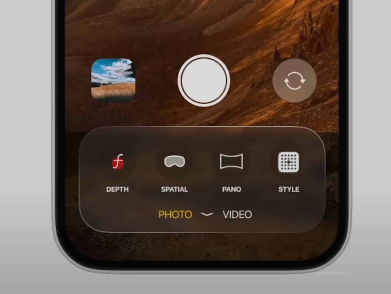
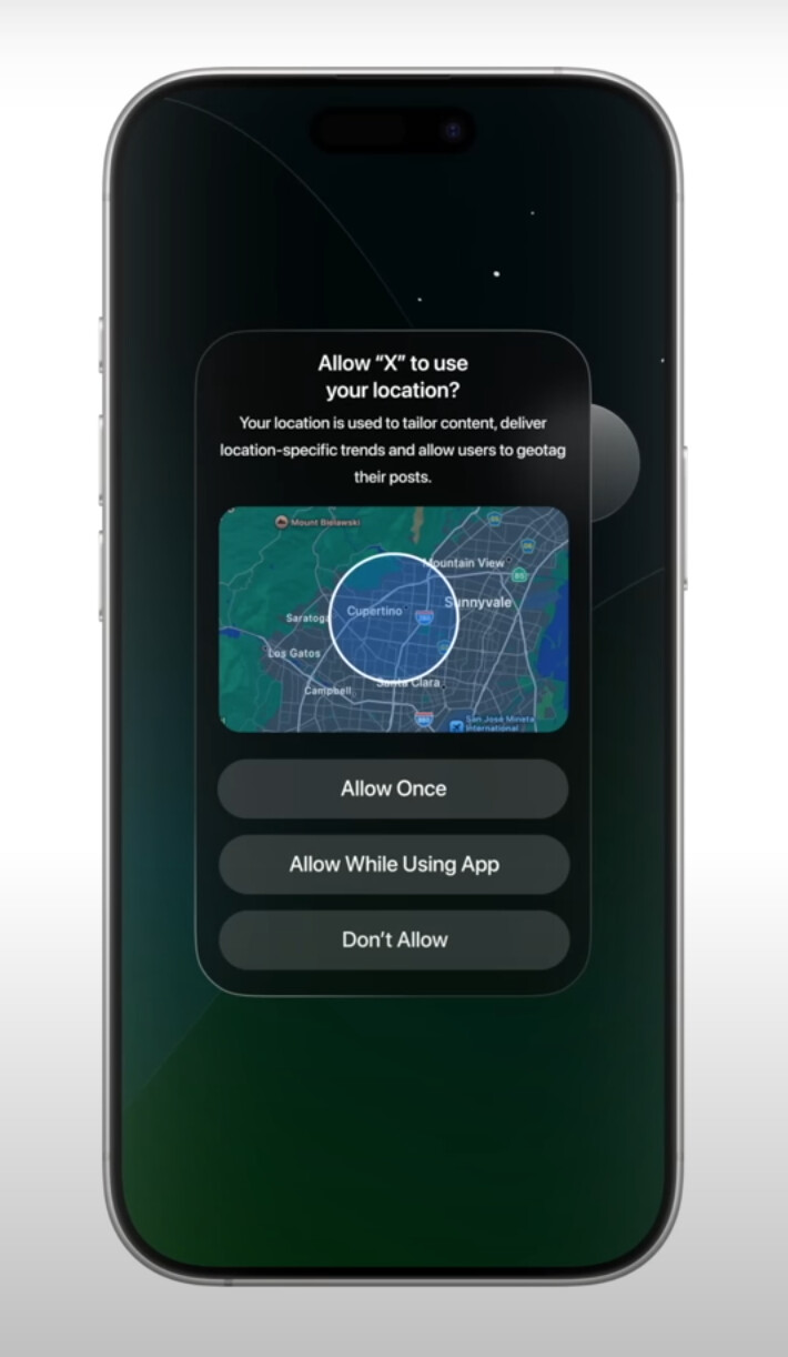
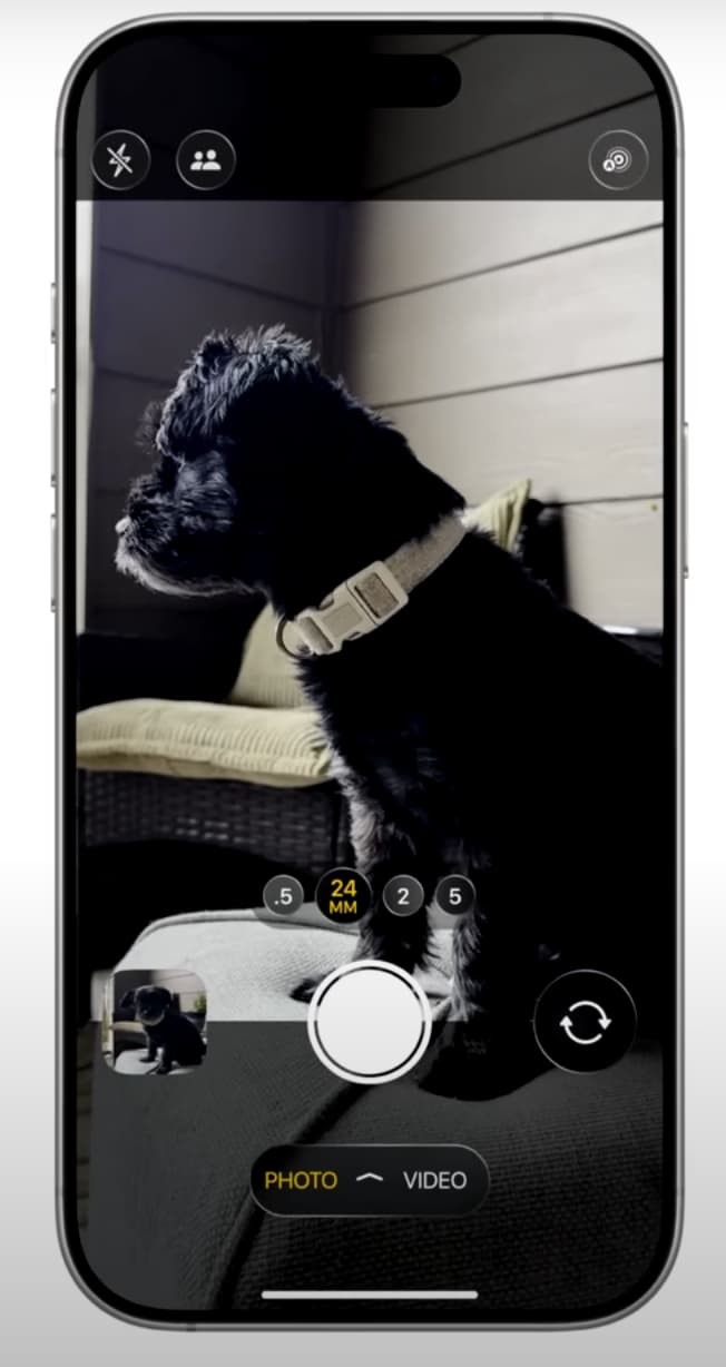
Another tip for you, just like how rounded corners became a thing in UI in the last few years (and is here to stay), the next design thing will be translucent and glassy blocks/popups/buttons etc. to make things look more 3D (not Reddit logo kind of 3D, but like translucent glass kind of 3D, examples below). Shopify is going this direction, Apple is also going this direction in their upcoming OS. Take a look at what one of your competitor (and a very very cool competitor) www.kortex.co is doing, see their design style and how they use the translucent/glassy gradient thing for their buttons and pop ups. They don’t overdo it, and it’s just nice. Here are some of what this glassy style looks like for people wondering:
Regardless, please, no generic star logo. This is coming from me as someone who has done branding and logo designs.
I say all these to improve the look of the app, because I recommend this app to many people. I don’t want to have to tell someone about how good Anytype is just to follow up with “Trust me the app is great, but yeah just ignore their star logo design”
Edit: Just checked out Craft.do and it’s such a beautiful app as well. They also do the translucent/glassy 3D pop ups for certain elements of the app and does it well and just nice. Of course, they win lots of awards for their app design because they use the glassy 3D style beautifully. Like I said, this is where the next wave of UI will head towards, just like how rounded corners in UI became the norm.