sorry, couldn’t resist ![]()
I’m fine with whatever happens to the icon.
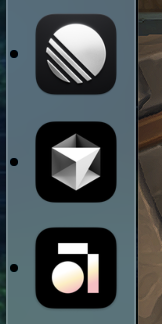
cool thing about macOS is, you can just paste in your own image in the app information ![]()
I think what I love best about the new, temporary logo is that it’s polished and has symmetry. I’m honestly here for it to stay and think it looks way better, especially in the menu bar on MacOS.
What is the need for a temporary icon? Albeit not pushed out to the public release (yet?), if this was some sort of a ‘test’ to see how the users will respond, it would’ve been better to make a straightforward post about it and get our votes instead.
not sure if the users should vote how the brand should move forward. if they have corporate designers they should have the lead. general users don’t have the expertise about marketing to make a right decision. users have their background and ideas what this product should look like, based on their needs. this usually is not a base for making senior design decisions.
ChatGPT, create a star icon, that shines bright, is blue-ish on a dark background:
done. can we now have inline sets on mobile? ![]()
I find this logo quite repulsive and screams cheap generic (personal taste of course) just as demonstrated Google can pull up hundreds of other similar designs and you can create it in seconds.
Now that you mentioned is, that make sense. It reminds me of “bikeshedding” where people will feel qualified to have an opinion; which will eventually lead to just noise from incompetent people on the topic. That would be horrible if done at the ideation phase. My vote suggestion however was only as a replacement to the idea that this whole thing was actually a test to see how users’ respond, which would’ve been a better way to do it in this situation, because I can’t think of any other reason why there would need a temporary logo (anniversary? cultural awareness? seasonal event?). But yes, totally agree that the logo should be done by legit designers, and I doubt one did for this temporary logo. Looking forward to Anton’s reply on the reason for a temporary logo.
Fitting in amongst other well known excellent (and non-competitive) apps if you ask me. ![]()
Might I even say other ‘stellar’ apps (pun intended).
I think your dock looks cool, and they are not alternative apps to Anytype.
It’s not like Morgen and Sunsama, they are both calendar / task manager tools and they both overlap in audience, yet they both have almost the same logo.
This, in my opinion, is a big no for logo design (aside from being cheap and generic like the star).
Do you remember when BP completely changed its logo? That was a really big thing and the result was successful despite an expected familiarization phase - because it was obviously planned with foresight. A switch like that is huge.
Other companies pursue the strategy of only adapting their logo to the requirements of the times in small nuances from time to time, which usually works very well.
In any case, changing a company’s logo is certainly not a “matter of taste”, but a profound decision in terms of content and strategy. It’s definitely not a question of: people, which logo do you want? But that’s unfortunately how it feels at the moment, due to cryptic comments from the team.
The currently presented “star” image says nothing and everything (=meaningless) and has no recognizable content background for the company “Anytype”. In my opinion, it is a completely arbitrarily chosen illustration that is also technically unsuitable as an icon.
And Anytype’s current logo looks naive and somehow homemade, it has a childish touch - not only because of the shapes, but rather because of the clumsy color gradients.
I find the way the new icon is being imposed on us alpha/beta users unsatisfactory. First there is complete silence for days, then a comment from Anton that everything will be fine anyway, and finally a comment from Razor that the new logo is “cool” and would “stand out”.
I am really surprised that the team is dealing with this issue in this way.
I agree with everything in your post, but I’ll just add that this illustration has no singular shape of identification either, the first quality of a successful logo.
Also disappointed by the revealing approach and ambiguous irony in the communication.
Totally fair reaction — and you’re right, changing a logo is a big deal.
This wasn’t meant as the final rebrand, but more of a teaser — a glimpse of the direction we’re exploring and, yes, a small experiment to see how it lands with people. The full rebrand will come later, with the context, story, and thoughtfulness it deserves.
That said, your feedback helps a lot. What specifically feels off to you — the symbol itself, the lack of context, or something else? We’re listening.
Appreciate you engaging with it so directly. This kind of honest reaction is exactly why we put it out there in the first place.
Thanks for clarifying this!
I hope you are not telling me that you design a logo based on your dock and what you have in there ![]()
Not sure if I get the point here tbf.
A good logo test is the ballpoint pen test. if it works still on there, stands out and is instantly recognizable, then it most likely should work in general.
I really did a double take when I first saw it because it threw me off that I hadn’t seen anything about a redesign/rebrand ![]() .
.
That being said, I personally love a little chaos now and then. It also got me back here to find out if the rest of the AT community had heard anything ![]() .
.
Maybe to assuage everyone who isn’t happy, you could add a setting to change the icon style between the primary and a few variations?
I do not design anything)
Yes, there’s definitely something endearing about it, it also has to do with new beginnings, hope and development, and I think that’s why many of us are here.
Curious what made the team think a rebrand is needed? Not saying that it won’t help (depending on how it eventually turns out), but this could be another example of bikeshedding.
If you’re sure a rebrand is needed, then:
There is nothing wrong with the current Anytype logo. You should at least take bits and pieces from it to use in the new logo if anything. Transferwise kept the same logo when they changed to Wise. Look at Discord logo change, Reddit logo change, Pringles, Mastercard, Burger King, Warner Brothers, Dominos Pizza, Pepsi, Thunderbird.
And now look at the logo of Twitter becoming X. I bet you understand what I’m saying instantly.
Whatever you do, the star logo has to go. Let me simply help you understand why. Imagine Tana changing their current logo to the star and then trying to justify it with some weird marketing copy about how they represent the singularity of notetaking and the second brain and the universe. Yup. Ridiculous. I bet their users would puke. Now switch Tana out with Coda, or any other app in this space, or any other logos in general: Gucci, Uniqlo, Manscape changing their logo to a generic star with some weird marketing copy to justify it. Part of me thought this whole thing with the star logo was actually a joke, and there is no way on earth Anytype would do something like that.
I can definitely see how the website needs changes, as the layout on desktop is not intuitive like how users are used to when they visit a SaaS website (get rid of the hamburger iron and sidebar on desktop). I think the pink on the website can be dropped as well like what @dxn0 said above. I build websites for a living and know that users expect a certain layout when they visit a website of a certain kind. SaaS websites have a layout, video streaming websites have a layout, blog websites have a layout, ecommerce websites have a layout; and if an ecommerce website sway too far away from that known layout that users are already so familiar with, conversion rate drops. That should tell you something.
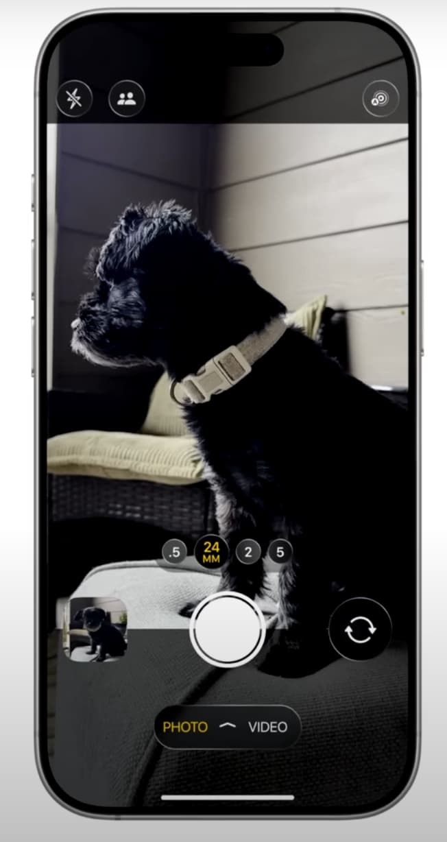
Another tip for you, just like how rounded corners became a thing in UI in the last few years (and is here to stay), the next design thing will be translucent and glassy blocks/popups/buttons etc. to make things look more 3D (not Reddit logo kind of 3D, but like translucent glass kind of 3D, examples below). Shopify is going this direction, Apple is also going this direction in their upcoming OS. Take a look at what one of your competitor (and a very very cool competitor) www.kortex.co is doing, see their design style and how they use the translucent/glassy gradient thing for their buttons and pop ups. They don’t overdo it, and it’s just nice. Here are some of what this glassy style looks like for people wondering:
Regardless, please, no generic star logo. This is coming from me as someone who has done branding and logo designs.
I say all these to improve the look of the app, because I recommend this app to many people. I don’t want to have to tell someone about how good Anytype is just to follow up with “Trust me the app is great, but yeah just ignore their star logo design”
Edit: Just checked out Craft.do and it’s such a beautiful app as well. They also do the translucent/glassy 3D pop ups for certain elements of the app and does it well and just nice. Of course, they win lots of awards for their app design because they use the glassy 3D style beautifully. Like I said, this is where the next wave of UI will head towards, just like how rounded corners in UI became the norm.
The star has disappeared with version 0.45.49-alpha.
Anytype’s modern yet old-school branding is a significant part of its appeal for me. If they were to change it to some cheap AI crypto sparkle bullshit, I feel the product would lose much of its current charm.