Changing a logo is a big deal. Did you really just do it like that, or is this a test?
It’s stylish, but what’s it supposed to say?
it looks a bit too generic for my taste
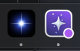
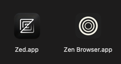
If Star Citizen would have a macOS version, I could have 3 similar star icons next to each other ![]() - the secons one is the Orion browser.
- the secons one is the Orion browser.
Personally I would love to see an icon in the style of the pixel art of their website (https://anytype.io/)…
…within the style of the Zed and Zen icons:
I dig that minimalistic black and white look.
I think it’s a teaser for next primitive update.
It reminds me of ‘singularity’ – and the way I perceive Anytype as a solution, somehow relates conceptually. However, the artistic execution has room for improvement.
Although I find the old logo lacking in terms of finish, it makes sense for me visually. But I find any Shining Star or even Singularity association a bit presumptuous for a software in beta status that is currently in the middle of changes and further development.
Seriously, when I saw the new logo, I thought it was just a placeholder and that the old logo had been forgotten. This one, with its sci-fi vibe, I’m not sure if it really conveys the product well in addition to be too generic and lacking contrast.
perhaps it is just a separation for the beta branch so the user always knows what’s currently running - we will soon find out
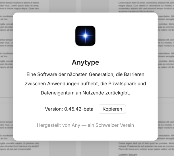
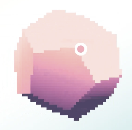
I think the new logo is nice. I like the idea of it being a star shining bright in the Anyverse ![]()
![]()
I liked the logo, but I agree that it could be stylized like @krst mentioned. Kind of 8-bit.
I really hope this is no the case. That logo is such a generic and forgettable logo.
I guess, but if you put that logo anywhere, people wouldn’t care to think about Anytype.
Let me give you an example: Put Notion’s logo anywhere, people would know it’s Notion; put Obsidian’s logo anywhere, people would know it’s Obsidian; same thing for Evernote, Bear, Logseg, Raycast, Steam, Bitwarden, DuckDuckGo etc. But if you put this star logo (as seen above) anywhere, people wouldn’t even give it thought let alone try to figure out what app it is.
Anytype literally hired a designer to come up with the designs for Anytype in the beginning, it’s extremely hard to believe that this would be the next logo.
The current Anytype logo is already a great logo. No changes needed.
@_sky
That’s exactly what I think. A little modernization in terms of color would certainly be useful, but basically the recognition value of the old logo should not be abandoned.

A comment on this topic from the team would certainly be welcome.
In addition I’m also a bit concerned about the UX of the current beta. A lot of things feel unpolished and inconsistent (like the new sidebars and how different right sidebars behave and feel).
The UX in general hasn’t been improved since the new left sidebar behaviour got introduced.
I wonder if there is even time for UI and UX design before an implementation gets coded at this point.
Personally I really dig the new logo. It’s simple, has a deep vibe and is futuristic.
I don’t know whether it would be permanent or not, but even as a placeholder, I think it’s a huge improvement.
anytype.io branding is a perfect blend of retro and modern computing
I think that giving up on that is a bad idea. I’d give up on the white yellow pink gradient but not on the modern retro…
Hopefully just a dev/alpha specific icon like how browsers do canary builds.
Any’s current logo resembles a lowercase a, looks good in positive and negative space, and already has visual recognition building.
Whatever this is just looks like a random star or AI sparkle. That is never going to standout on my taskbar or home screen.
Technically speaking this is not even a logo, this is an illustration. 3 days after, still not a word about this.
Do they test our reactions, are they indecisive, do they prefer to communicate with each other rather than with us? I don’t know, and apparently we’re not likely to find out.
nothing to worry about - it’s temporary. New logo will come later.