wouldn’t go that route. it lacks physicality (no shades or highlights).
flat design dying. a new imagined skeuomorphism is coming (and already there with liquid glass). pure flat designs are obsolete very soon and will feeld deprecated. it will feel like material design feels now.
Yes, when it comes to button design, but app icons may be a little different. Take a look at the icons of current apps of major companies. I have about 80 different icons on my desktop here - to me, not a single one of them looks like skeuomorphism.
I doubt that Adobe will change its app icons anytime soon.
true. It was more like a reaction to the flat black / white a-logo above where the highlights and borders got removed. there is a small gradient but it otherwise lacks depth.
Sorry this time I’m voting for for Anton and his “old school multicolored gradient”  .
.

 I like that the colors are similar to the current icon (= smoother transition).
Much cleaner and fresher, I like it!
This new design looks really cool — I especially appreciate its clarity and strong recognizability. At the same time, it’s not too drastic of a change compared to the current logo, so it feels like it stays true to the brand’s roots while still introducing a fresh, modern touch. From my perspective, this logo fits Anytype really well.
This comment is a long one, but in my opinion a needed one.
I like the current logo better, but if a change is inevitable, then the new logo with the black background is preferred over the yellow (and I’m sure everyone here feels the same) because it keeps the brand colors that you have already established. I also like the modern touch like what @siousu is saying.
The explanation makes sense, however I doubt people will understand it without explanation when they see this in public. I don’t think any of us here knew of it until you brought it up, and even then it’s a little of a stretch.
Is the back square (confines of the app icon) a part of the logo as well? Like if this was on the website would it just be a lower case “a” all by itself? Because this comes back to the topic that was brought up previously with the star logo on whether this is recognizable enough to stand on its own. The “a” by itself can work, sure, maybe I just have a high standard for things. Will this work if it’s just the “a” on a social media profile picture? Because this “a” is very different from the “a” that is the current Anytype logo. The current logo stands on its own, I don’t know if I can say the same for this new logo. If this new logo was showcased on a different website, would it stand it’s ground?
You’d know all these logos presented here at first glance because of how they are distinct, if there’s an “a” would you know that it’s Anytype? (I’m aware YouTube’s logo here is generic. Keep in mind that YouTube changed their logo to the generic play button only when they’ve got 1.6 Billion monthly users (1/3 of everyone on the internet at that time) and that is a branding strategy that they can use to their leverage, something 99.99% of companies can’t.)
Regarding the gradient, I’m somewhat indifferent about whether it stays or goes; but gradients need to be used correctly, not just because. The gradient here has less so of a vintage/retro feel (not sure why Anytype went with this in the beginning) instead the gradient here makes the new logo look more so faded, weathered, and muted – as if the logo has lost its shine and vibrancy. Like how metal starts to patina, or how a transparent clear phone case starts to turn yellow due to time and exposure. Just want to give you the perspective that some people will see when looking at the logo, and some are already seeing in this thread alone. I’m not sure if I would want this feeling tied to the brand.
I agree with the new wave of skeuomorphism, however I still believe a flat logo is important to have. Skeuomorphized icon is great for a upcoming digital sphere like an app icon; but a flat icon is useful almost everywhere else. We can always skeuomorphize something and it’ll still look good if the base flat logo looks good to begin with, but we can’t always go the opposite direction.
I always start off with a flat logo when designing a logo for a brand, it’s extremely vital to start off flat while incorporating the style/feel and color first, and only add the skeoumorphic elements later if we want to to match the upcoming norm.
A fully flat black minimal logo is also what I would consider to have in the brand’s repertoire when presenting the brand assets to a company. There are many instances where this would be used instead of a 3D like logo, such as merch, website, prints/paper, etc.
I gotta be honest here and respectfully disagree with a few people here, this new logo is a nice and simple logo, but it’s not easily distinguishable/recognizable, nor does it convey Anytype’s values (that I’m aware of). It’s a “fine” logo, infinitely (pun intended) better than the previous generic star logo, but it’s not a chef’s kiss logo. There are many fine logo’s out there and that is okay as long as you’re aware and fine with it yourself. Here are some competitors’ logos that I think are “just fine” and nothing more: Logseg’s, Capacities’, Affine’s, Appflowy’s, Standard Notes’, Joplin’s, Milanote’s Simplenote’s, Supernotes’; and then we got horrible one’s like Google Keep’s, Reflect Notes’, and the previous attempt with the generic star. I’m sure those companies have their reasons to justify internally why they chose to go with those as their logo (and likely a lot of confirmation bias due to seeing lots of times and rationalizing it within themselves), but to us the general public those reasons are nothing when we look at the logo.
This is just for the logo while assuming the brand colors stay the same, we haven’t gotten to the workmark and the fonts of the brand, nor any of the deeper non surface branding like the brand’s values and principles (which ideally we start from when creating a logo and weave that into the logo).
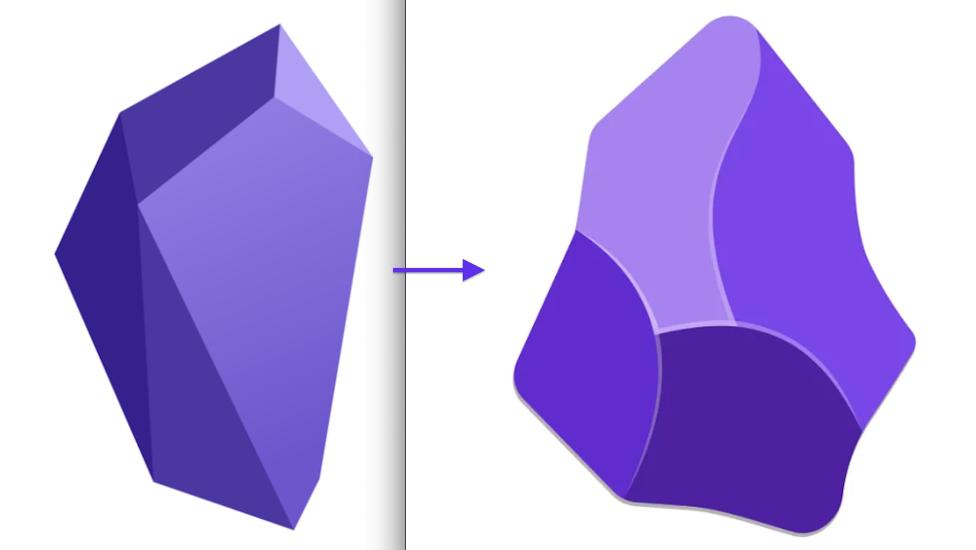
Look at Obsidian’s logo change, the change is subtle yet it conveys so much about what they want to communicate with the change. Threw away the straight rigidness, and brought in the curve adaptable corners that overlaps while still keeping its sharp edges. Implying that Obsidian can be used in the way the user wants to, especially with all the plugins; it’s not strict, yet it remains hard and future proof with its markdown first approach that it’s always had. I see this from Obsidian’s logo before reading their reasoning on the new logo (<— there is also a fun way to customize the logo to one’s liking in that url)
And also look at Notion’s logo. Phenomenal. It doesn’t just stand out, but it also tells us what Notion is all about: blocks that can be stacked and built upon, unlike traditional note taking apps.
These two icons above are instantly distinguished from the rest, chef’s kiss.
Coda’s logo is like a jigsaw puzzle piece that can fit in with a bigger whole, while still retaining the letter “C”, they all incorporate what they stand for into their logo; like the current Anytype logo representing shape toys that helps a child understand forms and spatial relationships or building blocks meant for stacking and how that relates to Anytype’s note taking style, while put into an “a” shape. I don’t see the same with this new logo for a soon to be communication software like Anytype.


A great logo does a ton of heavy lifting when it comes to branding and brand recognition; envisioning Anytype be up there amongst the other very well known great softwares in the future, this logo doesn’t fit right imo… I think this new “a” logo with the black background looks fine if you wanna go with it, but it’s a step backwards from the current logo imo. That said, it looks fine.
@_sky I completely agree with you!
I do not think calling someone incompetent is a very polite way to express your opinion.
Hi Elias - just wanted to say that I’ve seen several comments from you and they’re always well-written, balanced, and relevant. Thanks!
Thanks @Josephak . I appreciate it. I’m doing my best to contribute in a meaningful way and giving up on heated topics before my inner troll awakens.
That said, I know nothing about app development, but branding is my bread and butter. I do believe that this kind of topic, where in the end everyone is just expressing who has a better taste than someone else’s, is quite counterproductive. It’s why I respectfully disagree with @VisualNotes when he wrote
A logo is just a logo, a small piece of a way bigger picture about brand identity. First and foremost, it’s about “why” it exists in this form and colors and for which audience.
But well.. recent history is full of re-branding dramas (Jaguar, Gap,..) There’s no reason Anytype, who has way less funds to spent on it couldn’t face the same discussions, especially with such a passionated community.
Edit: Typos
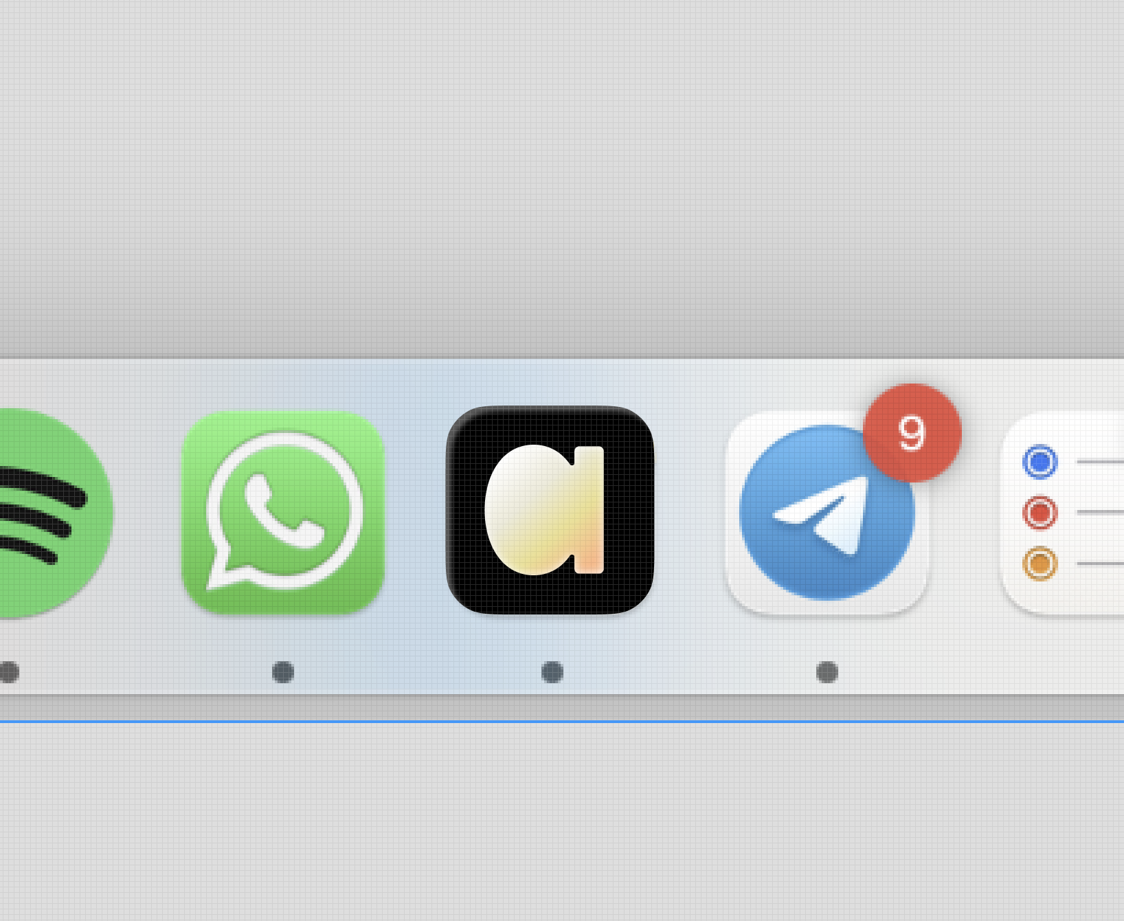
Since I got the yellow alpha version logo in my dock (app toolbar on Mac), every time I want to open the Anytype window, I have to poke around in my dock with the mouse pointer for a while because I can’t find the icon right away. It’s as if the logo has camouflage coloring.
So I can say that it clearly doesn’t work, at least for me. That’s my practical reality when working with Anytype and has nothing to do with what the Anytype brand means to me.
could also just be that you are too used to the old one. It’s like with my split linear keyboard, I have to adapt over time so that I don’t have to think about it anymore.
and btw @anton it doesn’t work well with liquid glass set to dark:
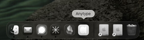

90% of all icons in my dock have strong contrasts, so an icon with very low contrast is difficult to recognize among them.
0.49.53-alpha - Thank you for restoring the Anytype icon to its original shape! It’s nice to be able to recognize the brand again, but in a “cleaner” form.
In my opinion, the grayscale gradient is still a little too dark. You might be able to see what I mean on a 27” screen: at this small size, the icon in the dock looks a little like the graphite in a pencil drawing has been smudged. That’s why I personally would prefer a slightly lighter grayscale gradient. I think that would make the icon even easier to recognize and give it a cleaner look.
I’m not a graphic designer, but if you want to have the “a“ and express the aspect of privacy (shielding off), then you could even modify the current logo.
Here’s a really interesting logic to try to incorporate into the new logo! With some kind of horizontal bar above the ‘a emerging from the caret’. Recognisable, fits with the typing, clear a, and it incorporates the privacy notion that is so central to Anytype’s premise (imo). I do agree the current logo is somewhat abstract but recognisable; the new logo is very clear but tends towards generic. I feel like there’s a valuable direction here.
Just some dabbling in paint here…