New Icon:
I think it looks even better than the old one. more elegant and consequently using blocks as an icon while also better utilizing the space.
I had an ideia like that: modernize the old one  (round corners a necessity). But looks pretty good (with the bevels or what is called, not native engrish speak language), I like it. (although I also kinda liked the “a” idea).
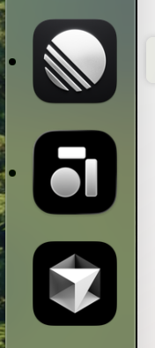
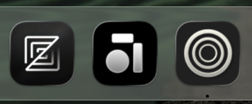

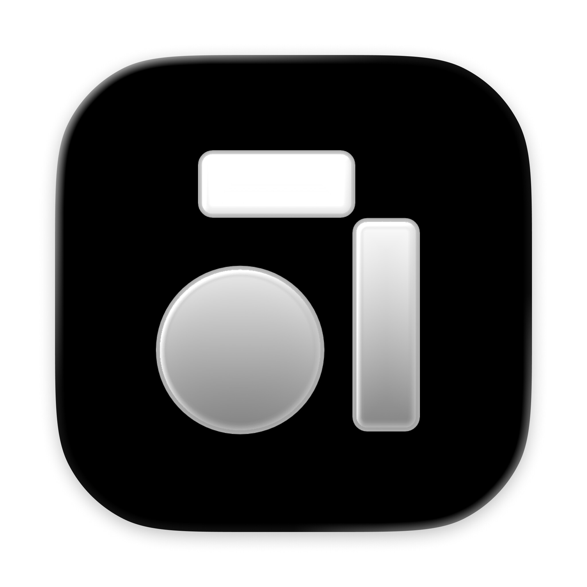
I think this is the best one (GitHub). It is distinctive, ties in with the original Anytype identity, but looks cleaner and fresher. The shapes are well balanced, the contrast is good, the curves are very appealing and soften the angularity of the two bars, and the icon’s visual language is strong. Well done.
As said, I just would brighten the gradient gray just a little bit. At least for the 64x64 icon.