I would like to be able to visually compare stats against another value recorded in a set. So I propose another view for sets that lets you see various charts and graph views of those parameters set.
HOW COULD IT BE DONE
*ᅟDefine the parameters to represent and what style of chart or graph to do it. Could be implemented into sets or collections themselves or to the relation or object specifically, or just as a block to be added into a page or another part of the overall graph view.
REAL WORLD USE CASES
If I am tracking the progress of several projects I am working on I can see I have the majority in progress for the month or I have more done this quarter than I have left to do. There are countless real-world uses for data tracking like this.
RECOMMENDED ALTERNATIVES
Being able to do calculations from various cells in a table or from certain relations in a block.
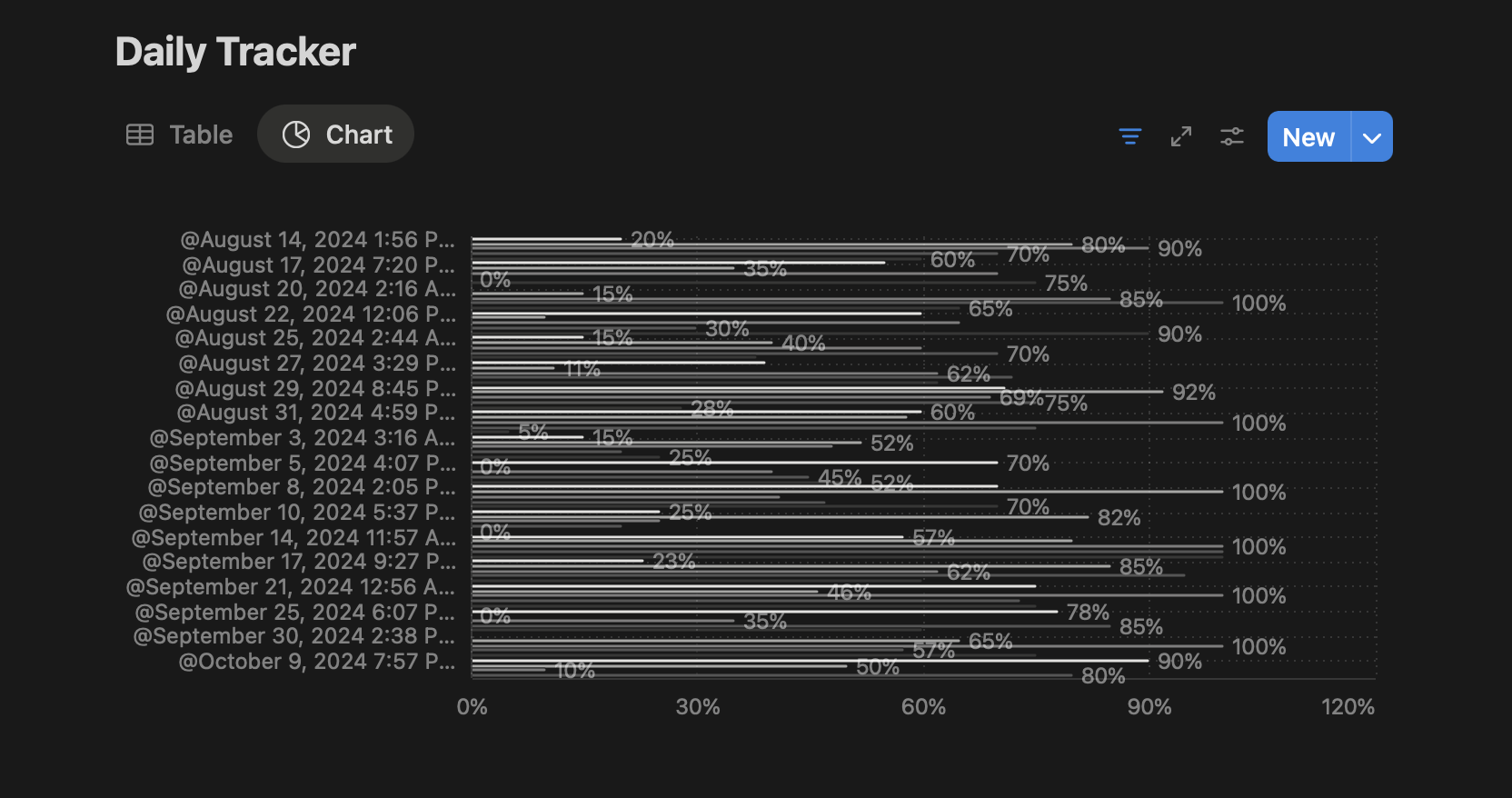
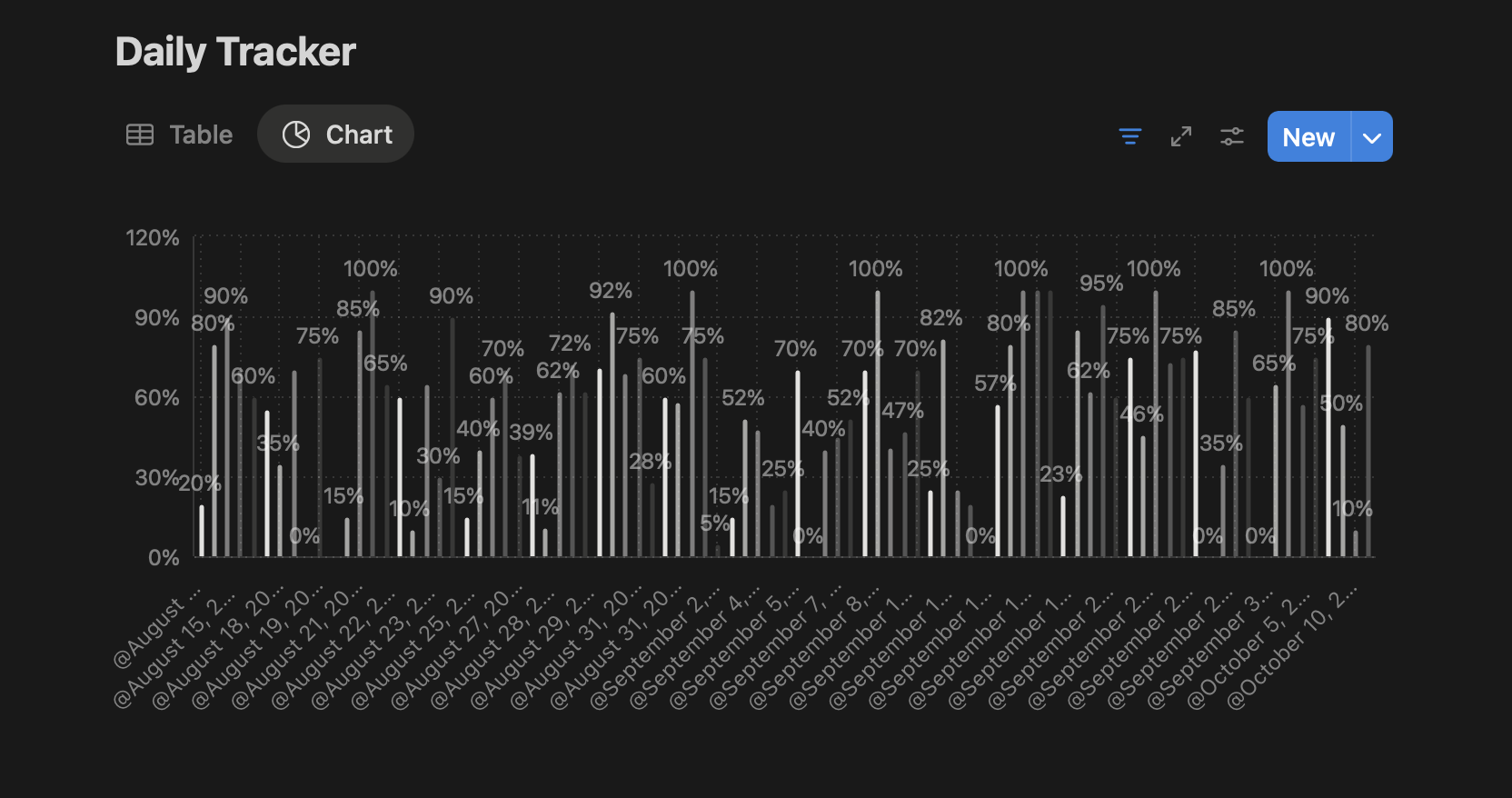
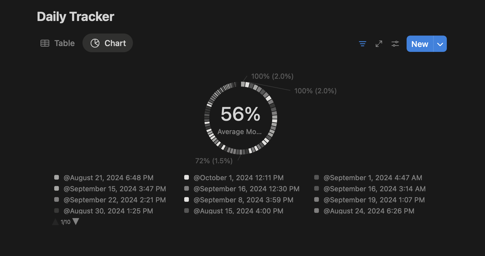
I think it would be cool if we could add statistical chart views to set and collection, like line charts, bar charts, pie charts.I think it would be cool if we could add statistical chart views to set and collection, like line charts, bar charts, pie charts.
How Could It Be Done?
I create a set
I choose a line chart view for the set.
I set the two numerical relationships to the horizontal and vertical coordinates of the line chart.
I now have a statistical line chart.
Real World Use-Cases
Basic
I’m a user who cares about my health, so I keep track of my weight, so I added a relationship called “weight” to my diary to record my daily weight measurements, and then I created a set that filters all my diaries, and then I set the view to a line graph, and I set the time of creation of the note to the horizontal coordinate, and the weight value to the vertical coordinate. Then I created a set, filtered through all my journals, and set the view to a line graph, with the time the note was created as the horizontal coordinate and the weight value as the vertical coordinate. Now I have a graph of my weight trends
More aggressive
I run a bookshop and for every book I sell I record a note labelling the type of book. I then create a set that filters out my book sale notes, view selects bar chart, the horizontal coordinate is the date and the vertical coordinate is the number of book sale notes per day so that I have a sales bar chart. I created another set, filtered out my book selling notes, view selected pie chart, pie chart slice category is book type, and statistic is total number of notes, so I have a sales book distribution pie chart
Create a layout option that allows for numerical properties to be used to create charts/graphs.
HOW COULD IT BE DONE?
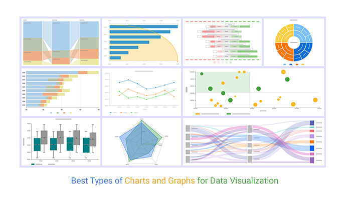
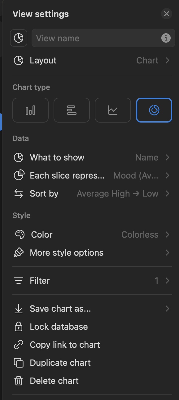
Notion introduced this mid-last year I believe, and the way they went about it is pretty good. There’s different chart options: vertical bars, horizontal bars, line graph, and donut/pie chart.
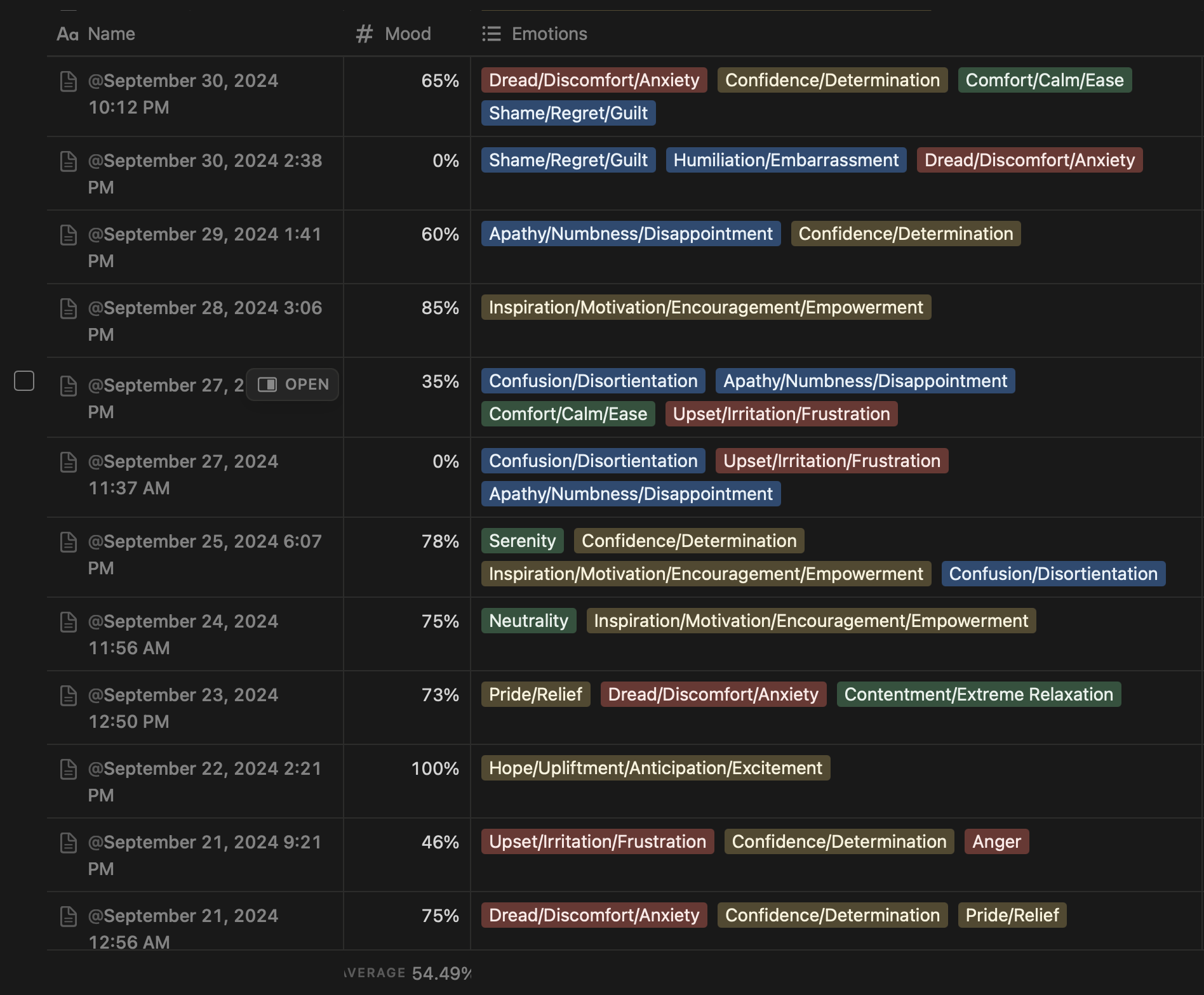
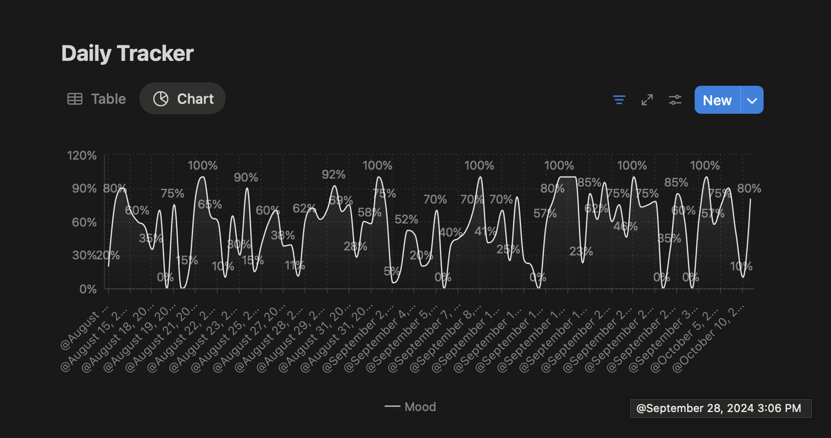
As shown above, I tracked emotions (wasn’t sustainable, though, having to use a whole other app just for a few things. Plus, I need to figure out a way to make the ratings more accurate to lived experience, but that’s another topic). I also plan to use it to track productivity (task completion) and habit completion.
RECOMMENDED ALTERNATIVES
Writing down the information and using websites online or Notion to graph the numbers (Notion charges you if you want to use the chart layout on more than one database. I wasn’t willing to pay since it didn’t seem worth it to pay for that feature alone when I could duplicate it using online websites).
ADDITIONAL CONTEXT
That’s all I think. Basically allow a layout option that creates charts using the data from a query, would be insanely insanely helpful. Thanks Anyteam!
A new type/query view and a block where users can query and aggregate properties and visualize them.
REAL WORLD USE CASES
bar graph of quarterly spending generated from individual transactions
pie chart of spending/earning per category
line graph of average sleep time during past week
scatterplot and regression line for game scores
RECOMMENDED ALTERNATIVES
Using external tools to store and visualize data.
ADDITIONAL CONTEXT
There are lots of service that are essentially nice-looking spreadsheets for specific field (e.g. finance, athletic progress tracking, sleep, etc.). I tried every solution under the sun from pen&paper, mobile apps, no-code DB, plain old spreadsheets, and even built my own app from scratch. I have currently settled on PocketBase for data input and Grafana for visualization because every other solutions are either too expensive, non-extendable, unmaintained, not pretty, or clunky to use. Using no-code DB such as airtable was the closest thing to perfect for me even self-hosted solutions such as Grist, nocoDB, and baserow locked features behind paywall (yes, even for self-hosted versions).
I highly recommend Anytype team to try no-code DB (I recommend nocoDB) and Grafana to see how powerful data-visualization can be and how much demand there are for it. If AnyType could capture even a fraction of the interest it would surely result in a lot of new users for Anytype.
I was going to duplicate the same request as well:
WHAT DO YOU RECOMMEND?
Add a Chart View to collections/queries with some (even basic) chart visualization based on data attributes.
Define a specific feature that is missing or could be improved:
HOW COULD IT BE DONE?
ᅟJust take a look at Notion → Chart view – Notion Help Center
But in general I think even a super simple implementation with only 1 dimension would be good as starter, like it has been done for for the timeline view.
REAL WORLD USE CASES
Any dataset with more than a few rows would benefit from a graphical visualization of the data, especially for numeric data like prices, quantities, etc.
RECOMMENDED ALTERNATIVES
Embed a Chart.js and manually insert/update values (manual = )
Use the APIs to extract data and visualize somewhere outside the app ( kind of defeats the purpose of having the data in anytype in the first place)
ADDITIONAL CONTEXT
Maybe I did not search enough, but I find quite curious that this feature was not yet requested. Especially because, looking at Notion, it seems quite “business relevant” as there, with free account you can only create one “chart view” (at least, it was like that the last time I tried)