Slight grievances with the UX and UI

Hey there, Anytype team! :upside_down_face:

I must begin by absolutely commending the tremendous amount of work going into a project as promising and innovative as this. I’ve seen so many note-taking apps out there, many of them having a couple of great features and tricks up their sleeves and none of them are without their attractions. Using Anytype, however, I quickly realized that Anytype is hoping to do much more that what a conventional note-taking app can or would do. In fact, calling Anytype a note-taking app is a huge understatement in light of the true vision for the platform.

That said, I believe in Anytype so much and I care about the direction it’s headed in and that’s why I want to air certain slight grievances I have with the app’s user interface.

Just before coming on over to write this, I checked out this other quite new note-taking app called SuperNotes and downloaded the software for a test-run. One thing that became so obvious to me was how much attention was paid to the User Interface and User Experience. In general, the app felt more… friendly… more… intuitive.
(I could probably say the same about Capacities as I’ve tested it before now)

Here’s the thing:

  • Give users so little control over the layout of the software and they begin to feel restricted.
  • Give them so much control and it quickly turns into chaos for a new user to try to figure out how the app works.

I think the key is in finding that balance; giving users control but not so much control that they get overwhelmed by options. I think this is the problem with an app like Obsidian with its hundreds of plugins. I know you guys might have plans to introduce plugins in the future, so please, don’t make this mistake of giving functionality that should be built into the software over to plugins created by volunteer developers that would have to be downloaded separately :pray:t4:
It doesn’t really support a great user experience; and things tend to get really messy with compatibility across plugins.

All that said, I was hoping to suggest a few improvements to the UX and UI.
(DISCLAIMER: I’m using a bit of custom CSS created by an amazing member of the Anytype community. Tutorial of custom css. I actually changed my font to Supernotes’ free, open source font: SN Pro)

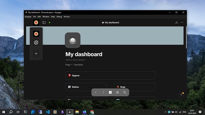
  1. I simply can’t get over just how hidden away dark mode is in Anytype. It almost feels deliberately hidden :joy: 
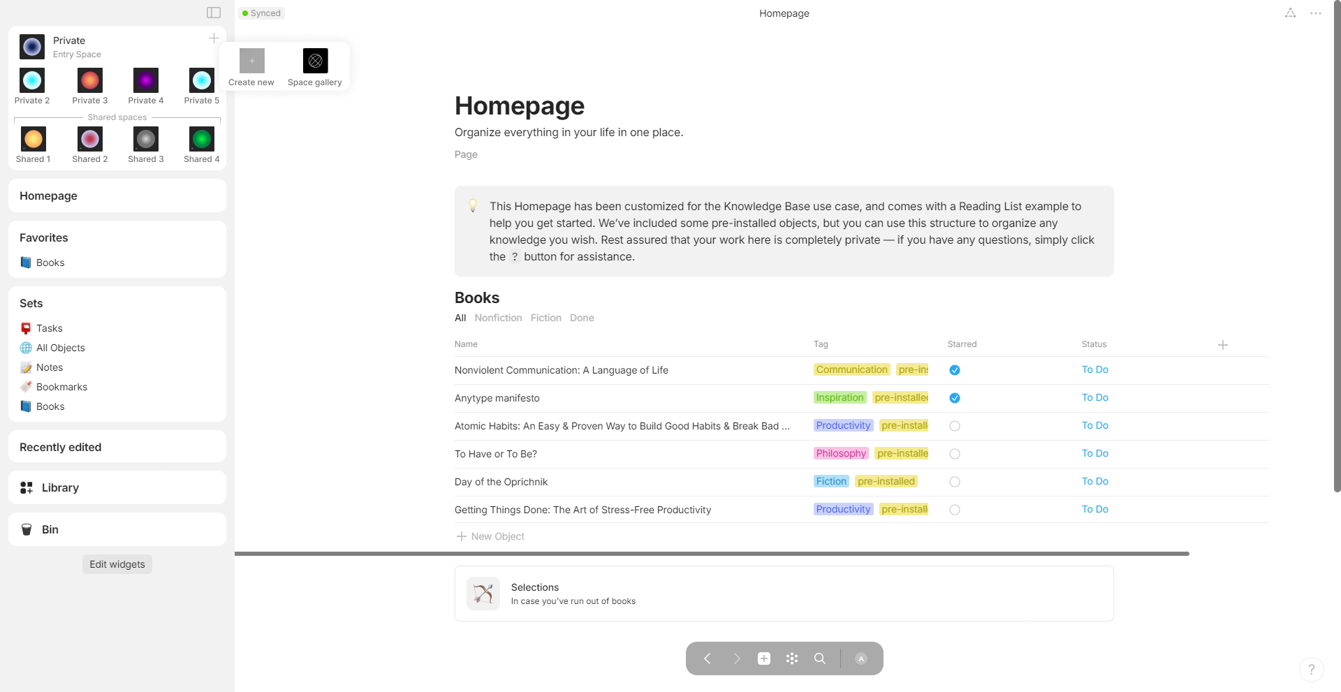
Here’s a comparison between Anytype and Supernotes

Anytype:

Supernotes:

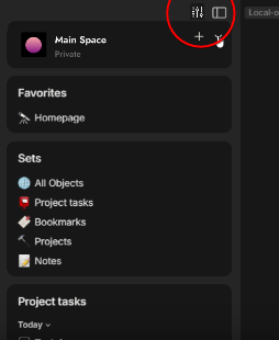
  1. I feel like the sidebar could be fleshed out a lot more. Widgets are amazing. Having widgets that allow you view multiple context of notes, sets and collections are great. But there could be other things added to the sidebar, like the settings, or even the dark mode option I just talked about.
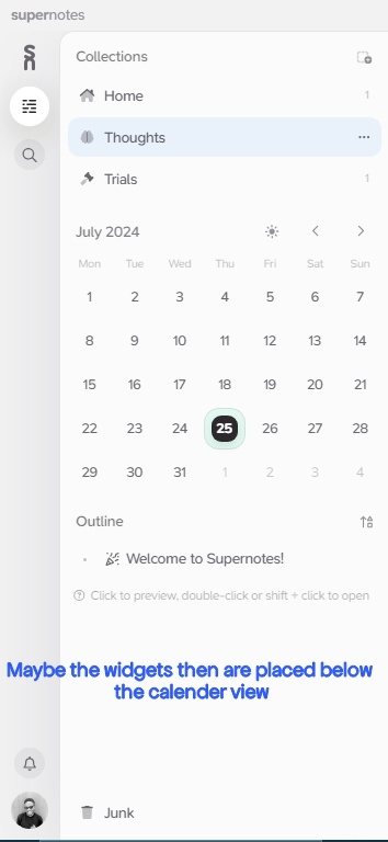
    Maybe push the widgets down a bit, then add a calendar view that allows users to quickly create notes for specific dates, with each new note bearing the date(or maybe time inherently). It’s quite a hassle at the moment to create daily notes and have to name them based on the day’s date all the time.
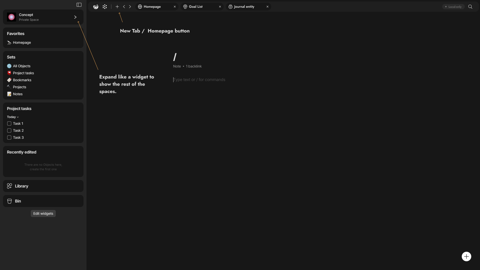
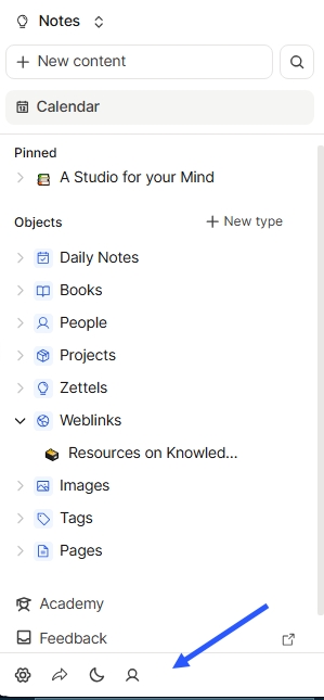
Anytype’s Sidebar:

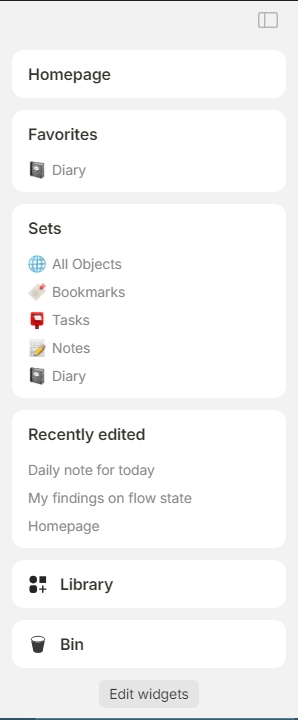
Supernotes’ Sidebar:
I point out a suggested position for where widgets could be - below the calendar view. If not, maybe the calendar view could even be on the right side of the app.

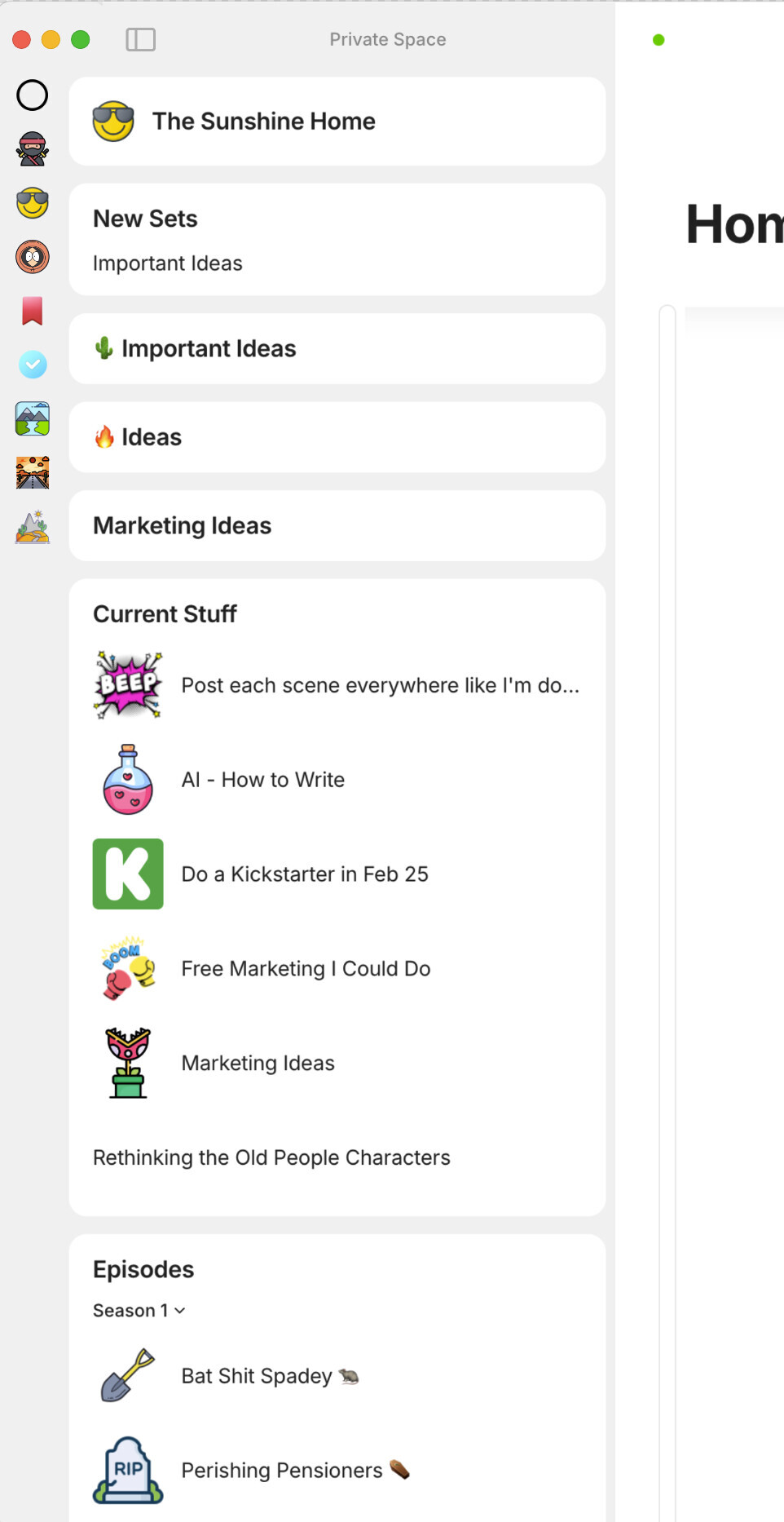
Capacities’ sidebar:
I point out how accessible the settings are.

  1. You might call me petty, I know :smile: but I really don’t like how the horizontal scrollbar on embedded sets and collections looks. It keeps nagging at me all the time. If I may suggest, make the sets/collections auto-resize so that there won’t be any need for a scrollbar in the first place as I think this will solve the issue in most cases.

In a case where a user actually wants to view multiple relations for a set or collection, maybe there could be a better way of implementing a scrollbar. I think this one doesn’t really look good and the fact that it’s always visible is just… I dunno… :face_with_diagonal_mouth:

  1. I find that the audio player’s volume slider isn’t quite accurate. The audio begins playing at the loudest volume while the slider shows that the volume is reduced to the least. Just a minor bug, I guess.
    I would also really love it if the volume slider could remember the volume the audio was last played at and stay at that level whenever next the audio was played. It would also be nice if we could get functionality like the ability to loop the audio, or adjust its speed. I work a lot with audio and so, having a great audio player in Anytype would be a delight!

  2. For someone like me that would’ve loved to view or read PDF’s inside Anytype, I find the PDF viewer a pain to work with.
    I know that there’s an option to open PDFs in a native viewer app, but it could enhance user experience to be able to view them conveniently from within Anytype, I think.
    It’s a bit difficult to view PDF’s in a full size that’s readable at the moment.

  3. Whenever I add an inline tag relation, hoping to create a new tag in the middle of a note, the newly created tag doesn’t appear even after I’ve selected it. This has happened to me multiple times. I eventually keep recreating the new tag and they still don’t appear. When I then restart the app, I see that the tag had actually been created and added multiple times.

  4. I love how certain note-taking apps(Supernotes, Capacities) have an integration with messaging platforms like WhatsApp and Telegram. That way, one could easily send a direct message into the note-taking app and have it saved under the Daily Notes. The idea behind this is that one could be randomly messaging on WhatsApp or Telegram and want to quickly store an idea.
    I’m not a developer; and I have no idea just how difficult this will be to implement given Anytype’s architecture… But I’m merely suggesting :man_shrugging:t4:
    I know there’s a mobile app. But sometimes, it could be more convenient to save ideas quickly directly from a social platform.

Having said all that, I want to say again that I understand the explanations offered by the Anytype team about how difficult it is to implement a wide variety of features especially given the kind of architecture that Anytype is built on (P2P and stuff). I’m just hoping that with time, a lot more features will be implemented that will boost the user experience and improve functionality.
Thank you! :sparkles:

I am very particular about UI design and among similar software, I tend to gravitate towards the one with the more user-friendly interface, an aspect which Anytype has room to improve upon.

Me too!
I know Anytype has a lot of nice design choices. But I believe there’s room for improvement.

I second point number 3 (the inline set scroll bar)

Point 1:
It is usual to have the switcher on right on the toolbar, but I would not call that hidden.

Point 2:
Already possible in the upcoming release, and works very well, either for journaling or task management.

Point 3:
Yep, don’t like it too. Removed it from Anytype long ago, forgot that it exists. See custom.css templates on how to do it (also fixes flicking on Linux).

Point 7:
Not against, but hope it comes after all this year’s roadmap and maybe plugins. Running after third party services is a race of its own.

Thanks @Victory for the nicely presented feedback! I’ve shared it with our team :writing_hand:

Thank you so much😊

I think anytype is over designing this. Not to hate great job but a simple folder, tag, template and some nice designed gallery pages would make everyhting much better. I also want to point to this OS app thats also pretty good but you are locked into desktop [Preformatted](https://github.com/UdaraJay/Pile/releases/tag/v0.9.7) text

I am not one to only complain, if the team wants I could share some design.

Alright!
Version 0.42 is here :slightly_smiling_face:
I’ll be contributing a few more UI/UX things that jumped right at me immediately I opened this new release soon.
Great work, Anytype Team

Spoiler: It has a lot to do with the sidebar… Lol

So, I opened up Anytype’s latest release yesterday and I was excited to see how the new, refreshed sidebar looked and how other things like the new widgets were implemented and I must say, that’s a lot of good stuff :slightly_smiling_face:

However, a few things:

  1. I like the whole animation thing with the sidebar automatically closing few seconds after the mouse moves to the other side of the screen… But (at least on my computer), the animation isn’t smooth and is somewhat laggy. I’ll attach a video below to (hopefully) show what it’s like.
    I also very much prefer if the sidebar acted more like a floating window the way it did before (when set to automatically close) instead of dramatically pushing the whole content area as it expands. I must say, the transition really doesn’t look good. It’s more like a case of overengineering a functionality. I think it’ll be a lot nicer if it was a simple floating window that expanded over the content area.
    (I’ll attach a video referencing Opera Browser’s collapsible sidebar)

  2. I found that the Settings icon is now positioned in the “side-sidebar” to the extreme left (which is great!) and much more accessible than it was in the previous version. But for some reason, it all goes away once I set the sidebar to only show widgets and not spaces. Then, the part of the sidebar that contains the settings icon disappears!
    Someone like me who has no extra spaces asides the one I use would probably want to show only widgets and not spaces but then that user (or say, a new user) who doesn’t happen to know that Ctrl + , pulls up settings, they’ll be left wondering how to get to Anytype settings.

Opinion:
Let this part of the sidebar be always visible:

Let this part of the sidebar be collapsible(and let it be more like a floating window that overlaps the content area):

  1. I love that in this release, there’s an option to see a widget in a calendar view (only if the view set within the collection is a calendar view as well). This is really great for a use case like Daily Notes where one could easily pick a date and create an object for that date. I guess this is a harbinger of the upcoming feature, ‘Date as an Object’ but I have a few dislikes about the way it is implemented at the moment:
    - I wish there is an option to have a widget in a calendar view that is independent of the view in the set or collection itself. I don’t like that the view of the widget changes when I change the layout in the set from say, the calendar view to a gallery view.
    - I also realized that for my use case which is for Daily Notes, if I have the widget for my Daily Notes collection set to Calendar View and I select a date and choose to create a new object for that date, the new object is not added to the collection and instead is created as a free-floating object in my space which I would have to manually add to the collection.
    If the ‘Date as an Object’ feature was already implemented, then it would have been the case that instead of having a collection for daily notes, I could instead have my daily notes organized under the object, “Date”. But this is not the case and so, having the calendar view doesn’t work for me at all. I’m better off adding the new daily note directly inside the collection.

I’ll update this writing if I figure out any more issues. These are the biggest ones so far. As always, keep up the good work! :heart_hands:

  1. A agree.
  2. I disagree, spaces should be in a widget or a drop down menu. This Space bar is the worst UX choice of all, really.
  3. Not really an issue. As you say yourself, Date as an object is on the horizon. :wink:
  1. I’d love to see the kind of drop-down menu you’re suggesting and how it might be implemented. I guess Anytype was going for a Discord-inspired aesthetic🙂
  2. Well, I can’t wait to see the Date-as-an-object feature. The calendar view now feels very incomplete.

About the way to redesign the Space UI/UX, there is plenty of better alternative mockups on this board.


By @a44 from New Space Selector - sidebar / CTRL + Tab Switcher - #23 by a44


By @Marie.D from Bring back the floating mode for the side menu (and put the Spaces in a widget) - #30 by Marie.D


By @GrayArc from 🖌️ Improving Anytype UX: Redesigning Space, Account Interfaces and more

I am beginning to like this post. It is always great to discuss better and more convenient solutions for every aspect related to UI/UX. Hopefully, this post will always remain relevant and alive, encouraging people to post here more often.

I wanted to quickly share a concept related to an old post that I wrote. I didn’t have the time to create the concept of a space selector back then, but now I have. I am a fan of the idea to transform the Space button into a widget similar to the side widgets, with the same standard look. This will make it look symmetrical with the overall design of the app.

And I’m aware this might make some issues so it will be good if this widget in fixed position so whatever you scroll it’s in the same place and the widget expand as overlap and when you choose a space it will close automatically this’s for me the perfect idea to implemented.

You’re not alone, but no one may have offered a good solution to this visual problem, if I’m not mistaken, there is the same annoying scrollbar in Notion

I did this kind of thing in Python at some point through the telegram api and PyAutoGUI, and it worked fine, but this printing worked in real time. After several versions of the application, I realized that it was tedious to update the button coordinates every time due to changes in the appearance of the application, I realized that it was better to wait for the Open API and official support for plugins for the application.
Well, the plugins will appear in 2024Q4

by the way, I can disagree with this, as for me, Notion, a direct analogue of Anytype, is much more overloaded compared to it, and the design is much more minimalistic. I just wanted to remind you that with my level of perfectionism, the design of Anytype is still good, but as you said, do not turn a blind eye to design errors and inconveniences.

I really don’t like the idea of the spaces as a widget and taking up valuable sidebar space. I like the spaces sidebar but I would definitely like it to be thinner.

This is still my favourite idea for it (so it’s thinner with smaller icons):

What a fantastic UX mockup! This is nearly perfect! :heart_eyes:

I’ve taken the liberty of (clumsily) integrating one of your icons so that you can insert the settings icon in your layout (the current icon is too ugly).
qq8QSCsEYp

It’s up to you to decide if it’s the right place, but it seems to me that it would make clever use of that unused space at the top. On the top left might also be a good idea.

And as for @MikeyP 's unfounded fears, he doesn’t seem to understand that this doesn’t take away any valuable sidebar space, all the contrary!
I did the math on my 1080p screen:

  • The current space bar makes me lose 71 352 pixels of visibility.
  • @MikeyP’s, although much better aesthetically integrated than Anytype’s, still causes me to lose 44,595 pixels of visibility.
  • While @GrayArc’s redesign makes us lose literally 0 pixels.

But to be fair, we’d have to see a widget deployed with the same style and icon size as the current space bar to calculate the number of pixels occupied. But in any case, it’s obviously less than 25,000 pixels, so that makes it the big winner IMO.

@GrayArc Maybe you could make him a mockup that would take the style of the current Space bar (no titles or space type indicators) and thus be able to insert 5 or 6 Spaces icons horizontally in your drop down selectors. A bit like what @MarieD has done, but more streamlined, with no text or lines. As we can add custom icons/images to Spaces, displaying the title and type of Space only on hover is sufficient.
image

The title and type of space could appear on the icons hover.
And the widget in question should, in my opinion, not overlap the other widgets, they should do what the others do, shift them down dynamically.

What do you think?

PS: How did you do this functional mockup? Figma, Framer, something else?

I didn’t think much about the vault settings icon, but your placement seems very vaild in fact it will be great as well if there’s bar on top to show more information like your account, navigation buttons, Graph view and later tabs like in this image
.

You know something it will be good if you have anyway different views for the space
selector like a grid, list and other views like we have in the side widgets of the objects

I want this as well but to make the space selector widget convenient first thing it should be in fixed position so whatever you are scrolling up or down it will be fixed position so there’s no way to make it shift the widgets down unless you in the top of the bar.

@Morgan1989 I’m using Figma to design and make prototype (:

Wow! There’s not much more to say. Am I allowed to daydream about Anytype giving you the job of lead UI/UX designer?

giphy (5)

@Morgan1989 Thx for compliment

:thinking: Sounds like great idea I was thinking to apply to job here before. But I don’t know the requirements nor the job hours since I haven’t worked before. I’m a college student and I have no prior work experience with clients. anyway, I might submit if there’s space for that.