In mobile, clicking the Home button (4 squares in Android) leads to what we know as the sidebar in desktop. (Let’s call it Home in this post.) While I love the convenience of having quick access to my widgets (Navigation, Favorites, Recent), I find the experience lacking because my desired view, shortcuts, and color-coded ‘sticky notes’ are another tap away in my Dashboard.
I’d like for my desktop Dashboard to be my main view in mobile, as well, without sacrificing the current Home that has my widgets.
WHAT DO YOU RECOMMEND
An option to enable an existing object (like the Dashboard) as an extension or a part of Home (sidebar widgets) in mobile.
In desktop, we have a setting to select a desired Homepage. I would like for a similar setting to be present when editing the Home in mobile. (Currently “edit widgets”)
The ‘dropdown’ options can include:
- Widgets/None — the sidebar remains the Homepage (current setup in mobile)
- Existing object — allows you to pick a page to ADD to the existing widgets
This way, the user is free to include his/her own customized Dashboard without having to change the way Home works in mobile.
HOW COULD IT BE DONE
When optimizing websites for mobile, it is normal behavior to stack blocks vertically to fit the screen. Depending on its position, the group of links can be above the page content (header menu) or below it. (Sidebar, footer menu) I think Anytype can follow this format and stack the widgets (sidebar) and the object (page content) together instead of choosing one as a mobile Homepage.
Since Anytype’s sidebar is on the left and it contains essential features like the Library, I suggest we keep it on top and simply add the mobile version of an object below it.
It may require some thinking on the design part because of the colored background, but it could be as simple as this one (see the 1st mockup) to cater to whatever customization is within the selected object. (Just a suggestion.)
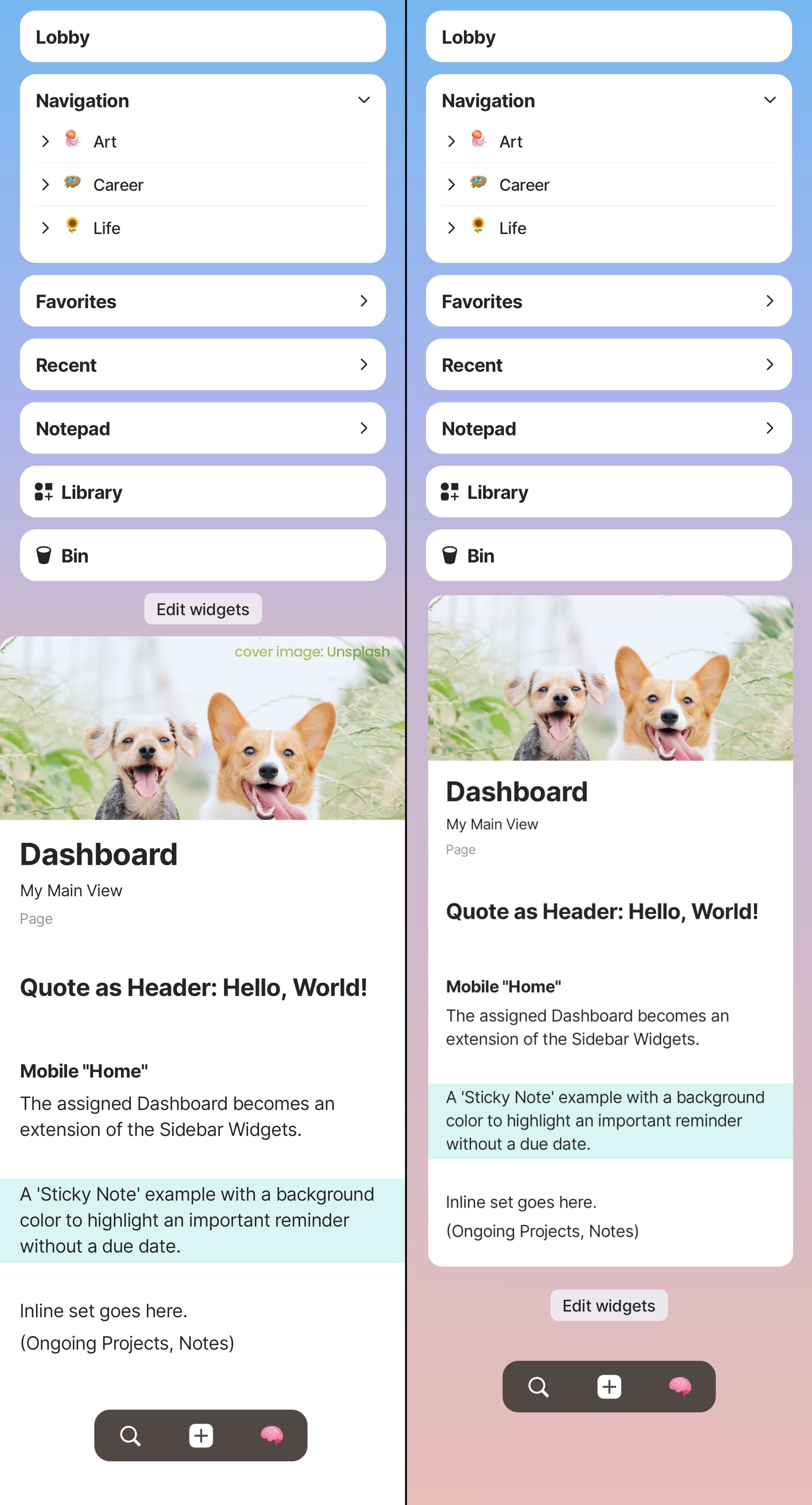
Left idea: Add the page, text-editor-style. No scaling adjustments.
Right idea: Frame the whole page like a widget for aesthetics.
REAL WORLD USE CASES
As mentioned above, this would enable me to still use my Dashboard in mobile. I can have my sets and colored notes in a layout/view of my choosing, in a place where I can always see them.
This will also address the need to customize the current Home in mobile. If the user prefers a different Dashboard, they can assign another object and it basically just adds their own setup in Home without requiring customizations to widgets or changing its uniformity in all devices.
RECOMMENDED ALTERNATIVES
-
Just tap the Dashboard link in widgets — Not really a “Dashboard” if it’s not the main view.

-
Custom Sidebar Layout for Mobile (seperate from desktop) — I like this idea, but a lot of the things in my Dashboard are not possible for Widgets, (blocks with background colors, inline sets that aren’t even on mobile yet) so it will lead to more FRs. I do think it can be combined with my FR to maximize customization.
-
Sidebar: Appearance Full Object — No option to be mobile-home-exclusive, but can be combined with the above FR to be an alternative to achieve what I’d like to do.
-
Sidebar for Anytype Mobile — the Dashboard can be the Home in mobile, with the Sidebar a swipe (or a hamburger menu) away.
ADDITIONAL CONTEXT
-
One thing to think about is the Graph. If, like me, the user has many objects linked to their Dashboard in desktop, then creating another one for mobile use may lead to more links/clutter in their Graph View. But I suppose that is up to the user to decide.
-
Would be more beneficial in mobile once features like Calendar view & Timeline view and inline Sets/Collections are implemented.
-
Make “toggle” a feature of every block instead of/in addition to a block type can help lessen the scrolling.

 No Home Opens to navigation on entry
 Add Navigation Include navigation on selected object