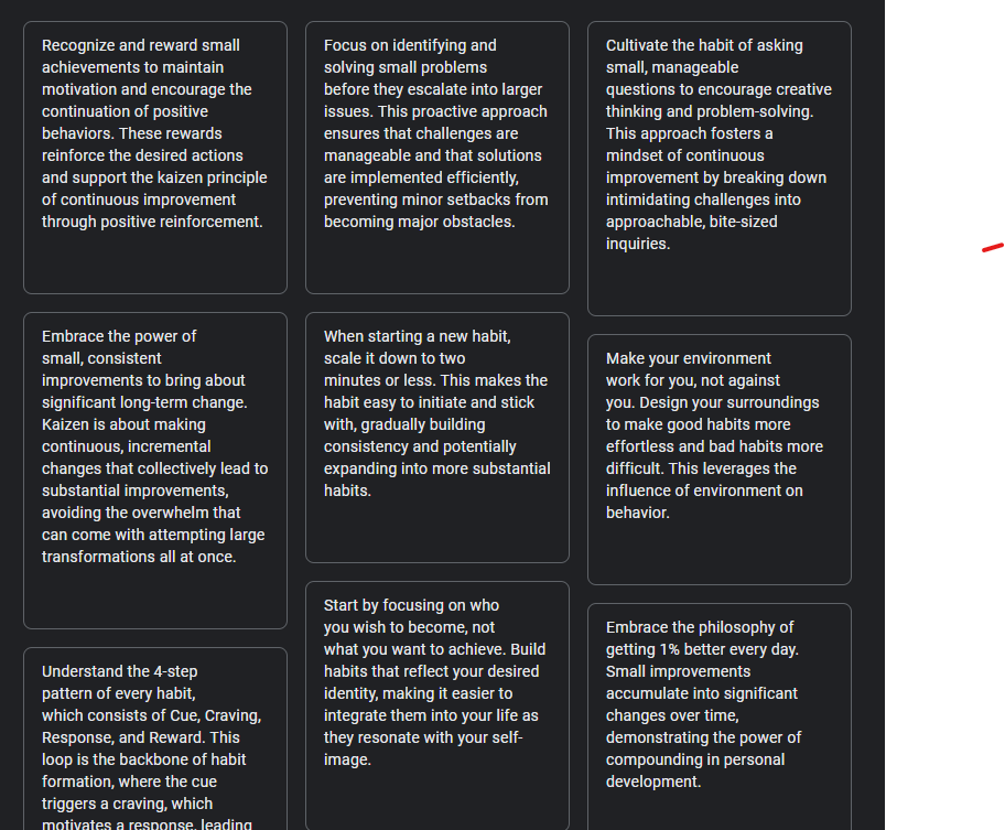
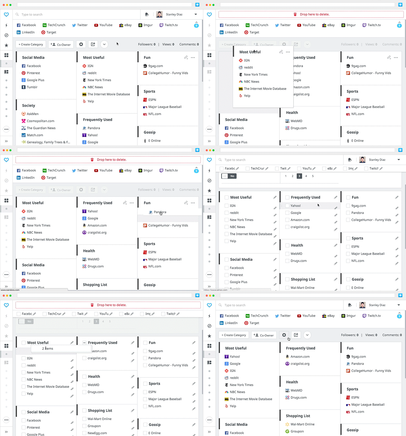
I genuinely want this to be implemented, and I want to highlight some subtle features from how this has been implemented by others so the AnyType team can see what works for this set/collection view.
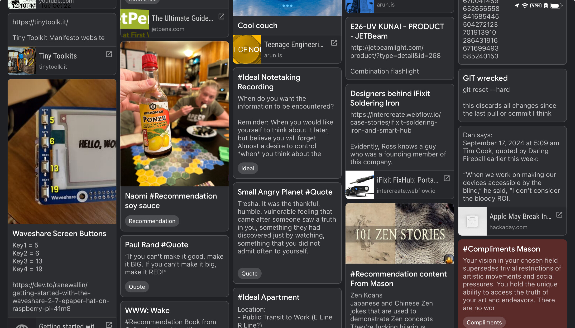
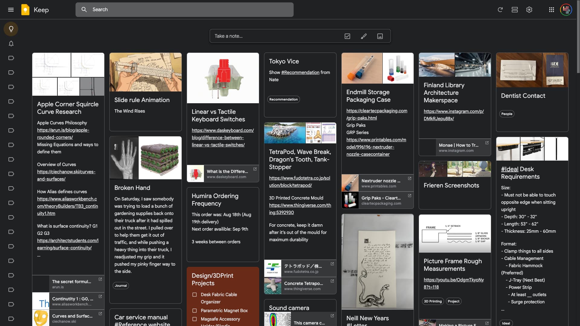
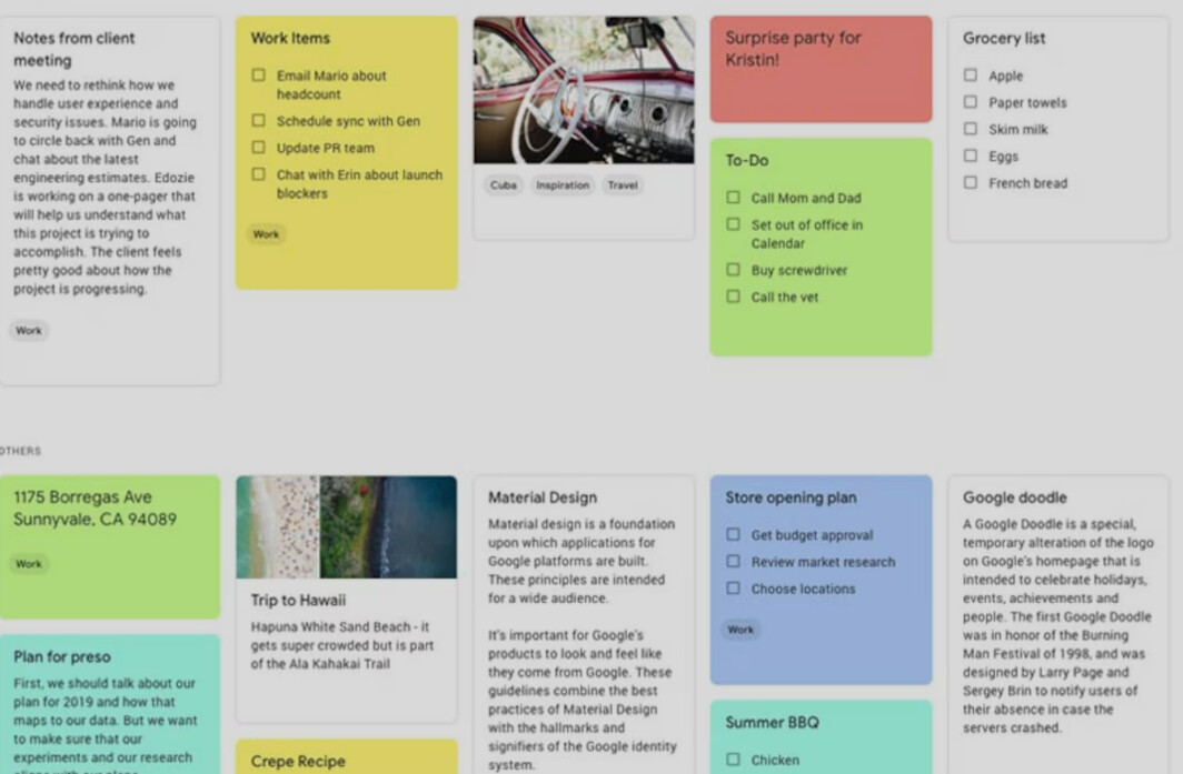
Google Keep has the best implementation of this view that I have seen today. It is information dense, but extremely readable.
Notes Have Different Heights to Fit Content
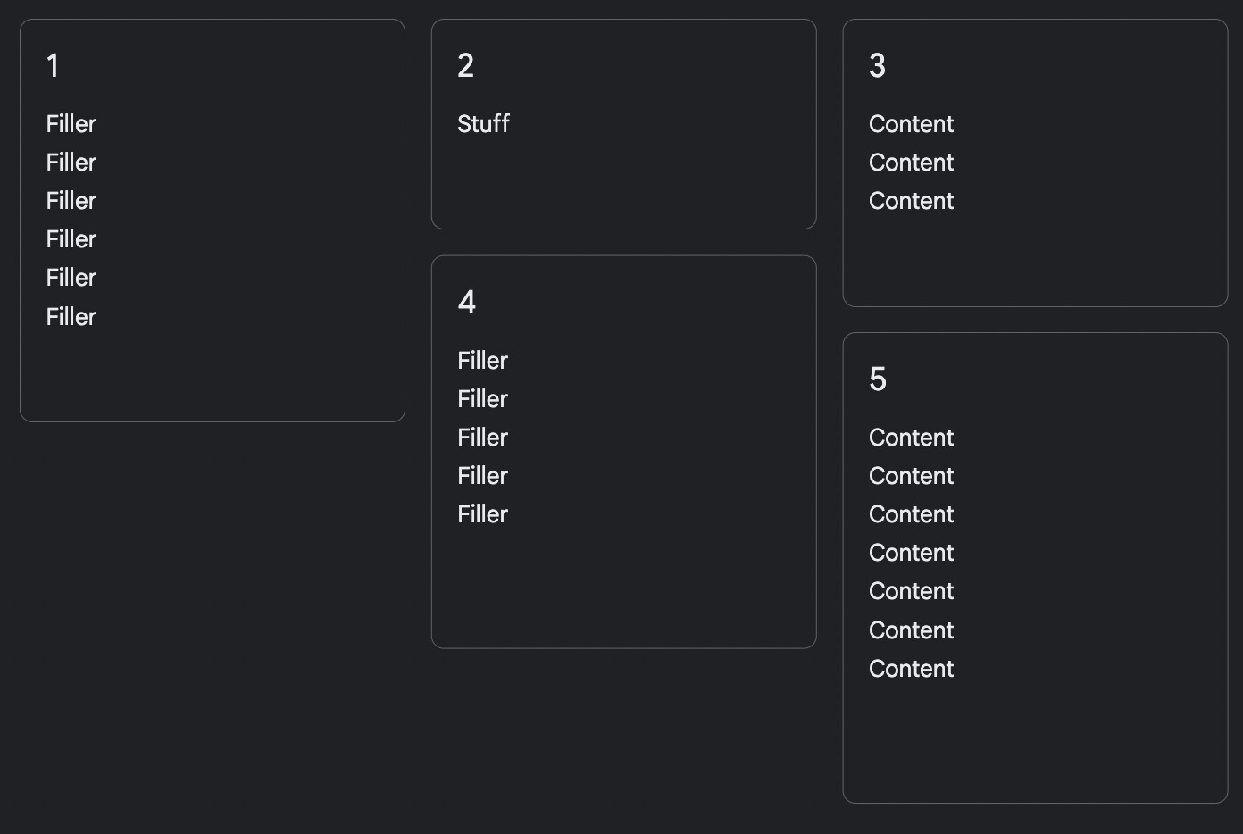
Since the idea is to display the content of the note, and different notes have different lengths, then all the cards must be of different heights.
There should be a maximum height, so long notes may get cut off, but you can show that the note is longer than the preview by adding a “…“ at the end, or maybe by having the preview fade out at the end.
Sorting
There is also the problem of, where to put each card when sorted. If there aren’t distinct rows, which card comes first? The answer that Keep has devised, is that the higher the top of the card is to top of the screen, then the more recent the note is. If there are two cards with equally level tops, then the leftmost card is the most recent. This same mentality can be used for any sorting property. Date created, project status, tags, etc.
Separate Display Sections
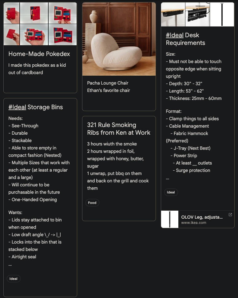
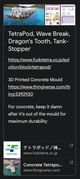
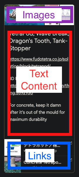
Notice how Keep has separated the images from the text, and generated little previews for the links at the bottom.
I expect they made this decision to make it easier to look at a lot of notes that are close together. It makes it intuitive to spot the beginning and end of each note, because the notes have a definitive head and tail. Keep also tries to present the most important information without having to open the note. Photos are easy to spot when searching for information, and Links are often the goal of referencing the note.
Since AnyType allows for rich text, and interweaving media with text, this might work differently. The easy answer to this is to simply display the note as-is, rich text, cover images, and media intact. Like a narrow window displaying the note.
Alternatively, there could be some options in the view layout to draw out some of the note’s properties or content into distinct sections like this. So text, images from the note, links, properties, cover photo, could all be configurable to be displayed in a stack.
Conclusion
This is my most wanted feature in AnyType. I believe it has the highest benefit for me of any other feature request.
I’ve written more in depth about why this view is important here: Forum Discussion: Why I Can’t Stay in AnyType
- The cards must have different heights to fit different lengths of notes
- The sorting must be: Highest sorted is top left
- Care should be taken with how the note preview is formatted.