WHAT DO YOU RECOMMEND
Mobile layout (the icons and titles, specifically) to follow the alignment set in desktop.
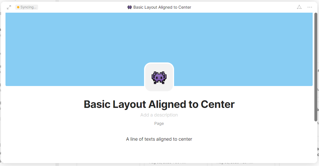
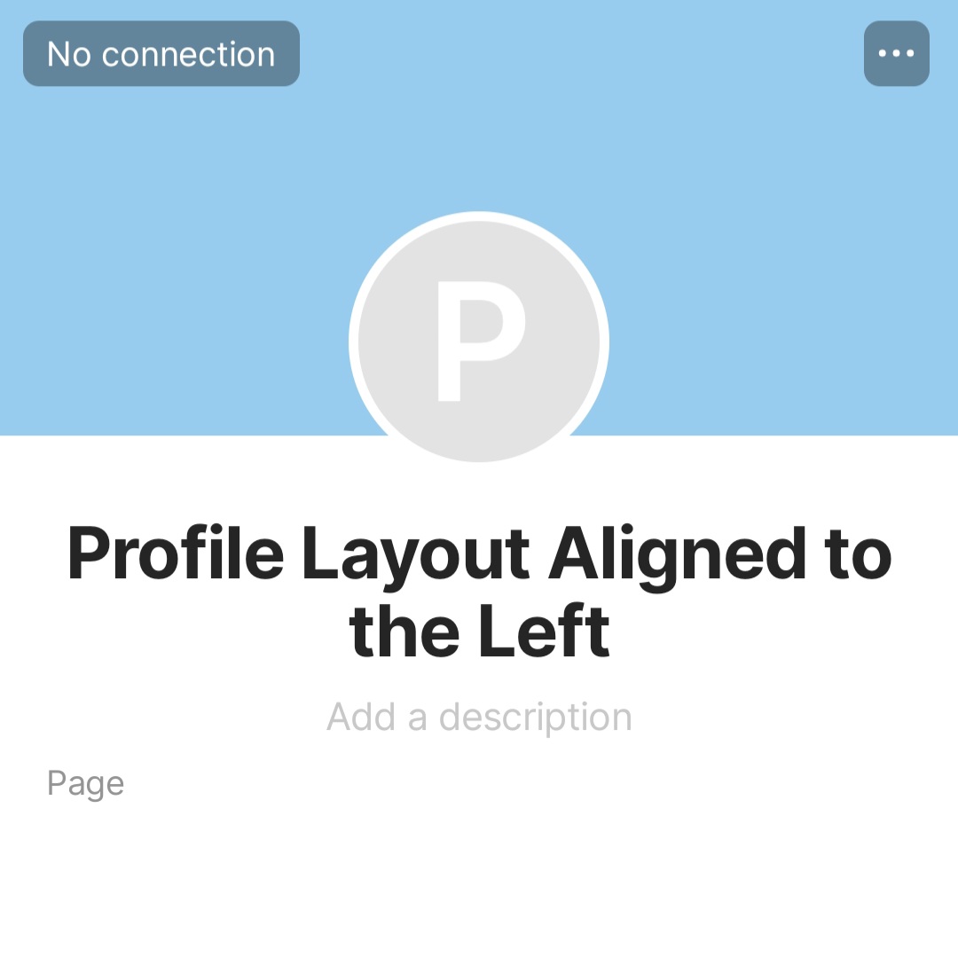
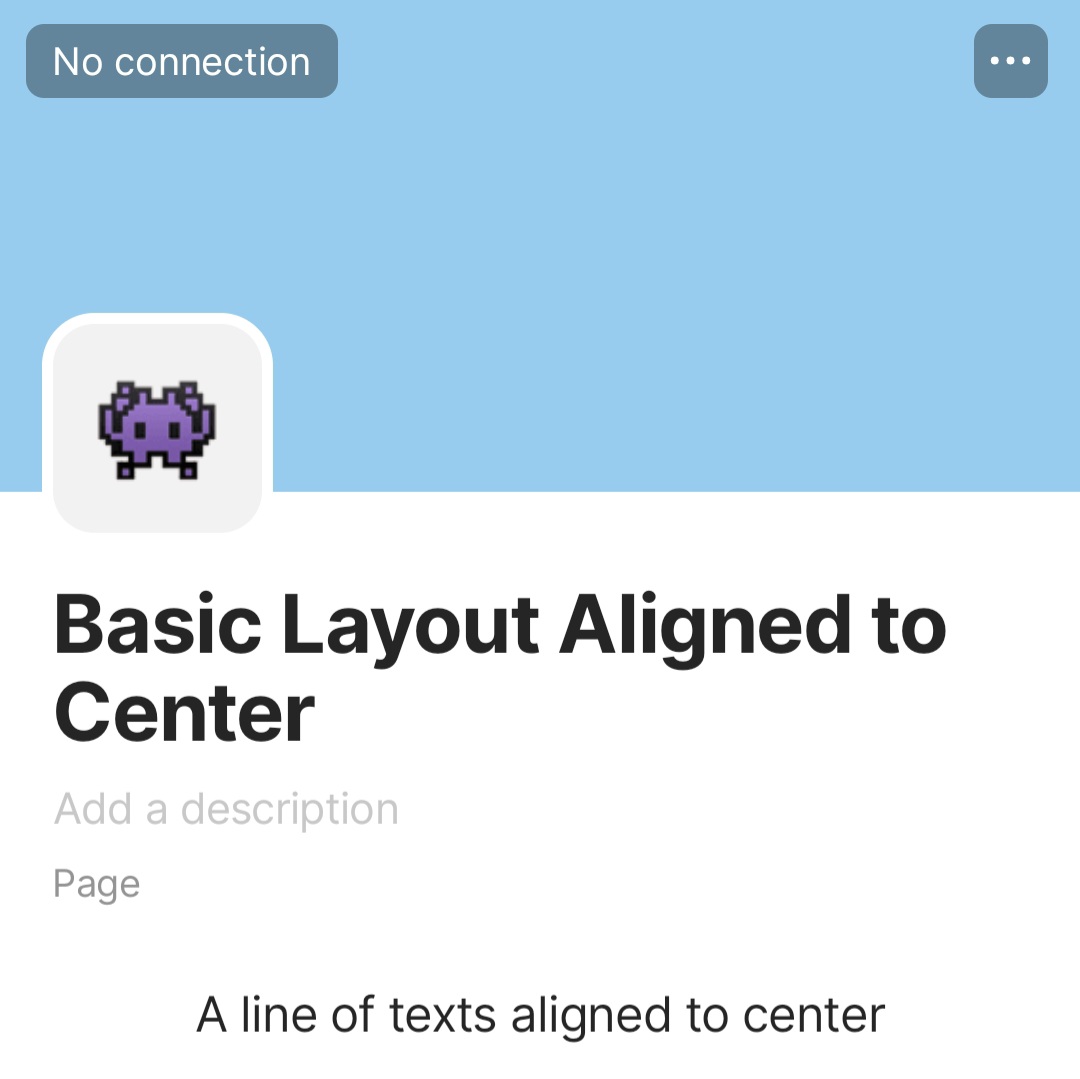
In desktop, we have Basic (square icon) and Profile (circle icon) layouts, and then we have Alignment where you can set the icon to align on left, right, or center.
The team’s examples in use cases – and the behavior in mobile – show the Basic Layout always aligned to the left and the Profile Layout aligned to center. However, I have many use cases where my Basic Layout is aligned to center, and my Profile Layout is aligned to the left. The misalignment can be an issue at times.

HOW COULD IT BE DONE
Follow the alignment settings in desktop. Plus points if we can also have that setting in mobile.
REAL WORLD USE CASES
Reasons why I think it’s worth implementing the settings in mobile:
-
Oftentimes, I would change alignment (in desktop) to give way to the design in the cover image. If the image has a character or a face positioned in the middle (as it looks good in Gallery View cards), I will have the Profile icon moved to the left. If this kind of setting is viewed in mobile, the icon (forced to align to center) covers the subject in the cover image.
-
In one use case, I have my Basic Layout icon and my block of texts all aligned to center. The description and the Type name hidden. It looks weird in mobile to see the large title on the left while the rest of the texts are on the center of the page.
RECOMMENDED ALTERNATIVES
None.
ADDITIONAL CONTEXT
I’m not sure if design issues can be considered bugs, so I put it under FR. Still, I hope you’ll fix it asap. Thank you.
Other posts about things that don’t translate well in mobile: