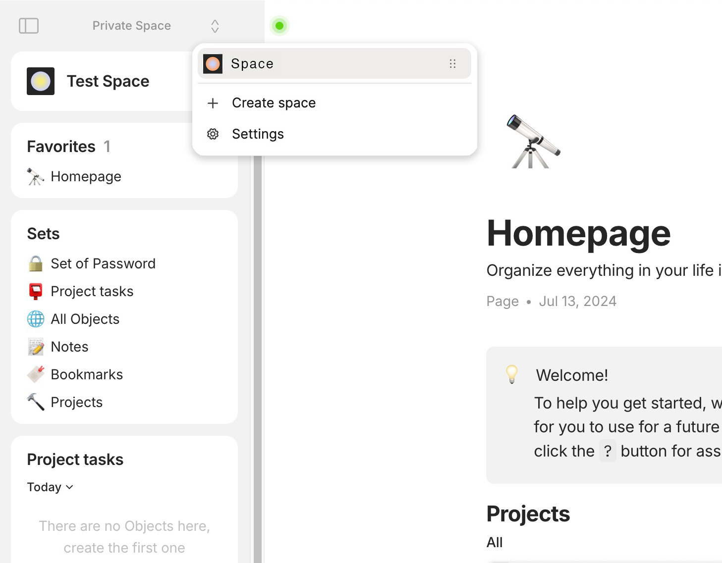
To remove the side menus floating mode AND to waste permanently space on the Screen for the sticky Spaces menu on the left side was in my opinion a somehow goofy twofold mistake in the concept.
Lets think:
How often do we switch the Space and - in relation to that - how often do we have something to do in the side menu?
– I will tell you: we need the side menu much much much more often then the Spaces menu!
But it makes no sense to have the side menu always open, because it wastes even more space on a “normal” screen then the Spaces menu.
In the result we presently need to toggle the side menu on and of many many times a day.
Each time we toggle the menu, we need to move the mouse precisely to that small toggle button and do a click.
In the “good old days” it wasn’t so cumbersome. A fast move to the left side was enough to open the menu and it closes automatically.
– Why did you change something that was good and made it unnecessary cumbersome?
Please bring back the floating mode!
And about the Spaces menu:
In case a user needs to switch between Spaces very often - it should fulfill his needs to have the Spaces in a widget in the side menu.
No need to waste screen space permanently for the Spaces!
RECOMMENDED ALTERNATIVES
Instead of putting the Spaces into a widget, it may be an even better way to give the side menu a kind of a tab menu.
The main tab contains everything from the normal side menu; the second tab is for the Spaces.
The App should remember the active tab if the user changes to another Space.
OR:
Hovering the mouse in the most top entry in the side menu (where the Space setting is located) could open the Space selector.
I think this would be satisfyingly fast and smooth to use.
One quick move with the mouse to the upper left side, then we see the same Spaces menu as we have presently.
It’s absolute nonsense, I don’t even see how a UX designer could legitimize these choices.
Adding a problem and removing a solution at the same time, that’s pretty strong…
I don’t think it’s a good idea, but I’d be happy with anything else, even if I’m more inclined towards Spaces Widget .
I’d vote for this if I had any left. If possible, I prefer to be able to hide as many UI elements when not in use as possible. I certainly am not moving between spaces often enough that it has to constantly take up a decent bit of space on my screen.
I did not try the beta version (can someone post a screenshot?), but that gets me worried. I often work on a laptop, screen split between Anytype and other windows. Horizontal space is pretty important for me and I’m struggling enough, even with the floating menu bar (which is far from perfect, would need a hard toggle sometimes).
Agreed – this definitely feels like at step in the wrong direction to me. I use the side menu all the time (and like the floating mode), but maybe use the spaces menu a few times a month, since I don’t use my second space a lot
@Alan71 you can get an impression already from the video preview picture in this post:
See the sticky Spaces menu on the left side.
It’s permanently visible, wasting place on the screen.
But that’s not the only issue:
if you want to use the normal side menu, it’s no longer enough to simply move the mouse to the left side, no no no!
No, now you need to activate the side menu by pressing a tiny button.
– Sounds goofy?
Yes!
And to let the side menu disappear again, it no longer disappears automatically if you move the mouse out of it, no no no!
No, now you need to press the tiny button a second time, to get the menu away.
– Sounds really really absolutely goofy?
YES, it does!
But that’s the way it is now!
The simple fact of making it gray makes it so much less violent and intrusive, thank you .
In my opinion, it’s still a waste of space in a large proportion of use cases. Allowing you to choose between this bar and a swich menu is still relevant, but I can live with it.
I have already expressed my overly negative feeling about the space switcher integration in the Slack forum so will not argue further here.
All applications like Anytype today use a switcher to not make the UI cluttered and it should be the way.
(Quick and dirty mashup with Capacities for illustration)
I appreciate that v0.41.39-beta now blends out the disturbing Space selector.
But still: please bring back the floating mode for the side menu!
I can’t see any good reason why since a while we need to move the mouse precisely to that tiny button on the top left and click it, instead of simply do a quick swiping move with the mouse to anywhere on the left side, as it was before.
And I completely can’t see any reason why it’s no longer enough to move the mouse out of the side menu to let it disappear again. Instead we need to move to and click that tiny button a second time for that …
Some dozen times a day we need to click that side menu manually open and close again.
That wasn’t necessary before, why is it now?
– What’s the point in making a once fluid user experience more cumbersome and slow?
[Irony ON]
Off course, you could make it even more cumbersome.
Suggestion: let a dialogue box appear after clicking the tiny icon:
“Do you want to open the side menu?”
… and then let the user solve a Captcha for confirming he is a human before the menu finally shows up …
[Irony OFF]
They practically changed almost everything since first Feedback already!!! In my opinion, the Devs have “way too much consideration” for every little nitpick. They are allowed to do what they want and their vision, they aren’t our slaves.
The bulky bar that wastes space is always present.
The Floating mode has still not returned.
The space selector is still poorly integrated compared to what a proper UX designer would have done.
I’d really like to know who made the decision to redesign the Spaces selector this way. It’s been done in the worst possible way in terms of UX, and it’s accompanied by the deletion of a function that even Notion wouldn’t dare to remove, namely the floating mode for the sidebar.
Either the co-founders @sharipova@anton imposed their “vision?” on the Design department, or the latter @sebyakin@Unicon@yura convinced the co-founders.
It’s either:
That co-founders have imposed this choice which are outside their area of expertise.
That obvious incompetence has still not been detected.
This new version is indeed better, and thanks to the team for listening.
That said, even if it’s less visually invasive, the vault bar:
Still wastes the same amount of horizontal space for a feature (multispace) that not all users want to use extensively.
Still removes the floating mode (yes, I know the shortcut, but I think there is something very smooth and organic about reaching with the mouse to make it appear).
While still advocating for a more subtile switcher like I expressed here if this implementation has to stay, I hope it will be possible to hide the vault bar independently of the widget bar.
I guess you are looking at things from the single-player mode perspective and not taking into account some technical limitations that we have. Due to the local-first and P2P nature of our app, at this stage, we have very limited ACL as it is assured fully cryptographically. This leads to the concept of “one space = one group” – a model very similar to what you can find in messengers like Telegram and Signal. You can also think of one space as one private communication channel.
The products you refer to in terms of space selector have a different ACL model. For example, in Slack, within one workplace, you can have many 1:1 chats, many private groups, and channels. You can’t have these in Anytype space. For every 1:1 private discussion, you need to have a new space; for every private group, you need to have a new space. To replicate a Slack workspace with 40 people, you would need to create more than 800 spaces, so each of these users would have a minimum of 45 spaces.
This simply does not work with the model of the space selector in Slack or Notion, as there are more convenient ways to navigate these groups. You see this better navigation every day in the messengers you use. I know it may sound unconventional and certainly is not necessary for people who just want to have one “PKM” space.
We’ll introduce in the next update a mode for people who need only one space. The floating mode is not aligned at all with the new multi-pane navigation we are currently developing, so it’s a donation for a better future.
“The space selector is still poorly integrated compared to what a proper UX designer would have done.”
Are you still sure, although it’s in context? If so, please elaborate.



 .
.