I have the mouse already in my hand if I “surf” through my structure to read some notes. But I don’t have my both(!) hands on the keyboard at the same time only for being ready to hit a key combination that forces me to use both(!) hands AND forces me to look away from the screen onto the keyboard for finding the necessary two keys!
(Yes, there are still people on planet earth who are not able to type blind!)
My brain has limits. It can’t store endless lots of key combinations.
But even my restricted brain is easy capable to do a quick move with the mouse to the left side!
That works even if I’m drunken and tired at the same time.
That works also in the late evening or night, if the light in the room is dimmed down (so that I can’t recognize the details of my keyboard).
The user @Logic nailed the point with his counter-question.
There was nothing unfriendly in his sentence, why do you react this harsh way, @Razor?
Look: a professional programmer like you may be able to type blind and fast with two hands. Maybe such a professional even has a large monitor on his desk, so that he can let the side menu always open.
But I suppose most “normal” users are not able to type blind, they prefer using the mouse.
In case they use a mobile notebook computer with a touchpad (for example in a train), instead of a mouse, the UX is simply a pain now in this point, it was so much better before! @Logic is right: why don’t the devs show more consideration for those who prefer to use the mouse? A quick mouse swipe to the left is even on a touchpad fast and easy possible, while it is a pain to move to that tiny button, or to use both hands to perform that keyboard shortcut.
It’s distracting if you need to look on the keyboard for that.
He literally (as in really literal terms) explained why in his answer.
Serious question @Code-Jack :
Would you find it easier to switch with the keyboard, if the shortcut was Ctrl+Space? Seems much easier for “non programmers”, and it’s actually wasted on showing the keyboard shortcuts help.
I personally have:
Alt+e → show/hide sidebar
Alt+w → show graph
Alt+a → Back
Alt + s → Home
Alt + d → Forward
In my keyboard, both Ctrl+. and Ctrl+k are in the “right zone” of the keyboard, so a shortcut for the left hand is handy, in case the right is on the mouse (which unfortunately, still is needed).
I don’t get it.
What’s so wrong with asking a counter-question?
– Is it maybe seen as a somehow bad style in some cultures etc.?
While I needed to write half a novel to explain @Razor the points, the user @Logic hit the nail simply with one single sentence, in form of a good counter-question.
Of course.
This would be a one hand key combination and clearly better.
But that’s not the point - this would only ease the pain but not remove it.
My right hand is always on the mouse while I’m “surfing” in my notes for reading here and there. A quick swipe to the left is easy, fast and intuitive.
My left hand can do other important things meanwhile, like holding a cup of tea, or scratching my shoulder full of pimples, or playing with my best part etc. etc.
It needs only 0.2 seconds to swipe the mouse to the left.
But it needs about 2 seconds to move my left hand to the keyboard for hitting Ctrl + Space.
And for Ctrl + Dot I even need more then three seconds and I have to refocus my eyes.
And that not only for opening the side menu, but also for closing, what wasn’t necessary before. Why is it now?
What’s the reason for making once good things cumbersome?
Anytype always was and still is in many details much more cumbersome then necessary.
The UX should be go better, not worse.
The floating mode was excellent!
It was one of the very few things in the App that was really excellent quick and easy to use!
Unbelievable that the devs screwed up such a delightful feature for no apparent reason!
Visual Studio has more than 100 keyboard shortcut, Windows too. Slack more than 50, like Notion.so or Evernote. Google chat has “just” more than 20.
If each apps say “No UX with mouse because we have keyboard shorcut”… honestly, check your apps and tell me if it’s ok for you?
Keyboard shorcut are usefull, of course, CTRL+C and CTRL+V are familiar to everyone. We retain those that are essential for our purposes.
But it’s a mistake to ignore mouse usage.
100% or 100% keyboard use, that’s an old debate, but in the end, ignoring one of these uses is tantamount to rejecting some users and uses.
Besides, having seen a few UX conferences, this is one of the basic principles, isn’t it?
Let’s go a step further: why make an interface, a command-line Anytype would be so much more powerful?
Sorry, just kidding, I’ve often seen this kind of discussion
Exchanges don’t have to be heated.
Personally, I don’t want to learn keyboard shortcuts (and when I go through my notes, I often only have the mouse in hand, so saying “too bad for you, use the keyboard” saddens me every time ).
@Logic We are designing a new way of navigating that takes into account multi-column navigation and the ability to work with two different spaces simultaneously (split screen mode). Unfortunately, these features are incompatible with a floating sidebar.
In fact, (which is personally disappointing for me), Anytype is currently a mouse-first app, not a keyboard-first one. I hope to change that soon and bring first-class keyboard navigation without degrading the mouse experience.
I am puzzled as to why Razor asking “why not use the keyboard shortcut” makes Anytype 100% keyboard use and 0% mouse. If anything, Anytype is more mouse driven than keyboard driven.
I am sure that when the restrictions allow it, things can change and try to fulfil everyone’s needs.
Anytype devs are in here in the forum, in the telegram channel, constantly answering, make town halls explaining what they are doing and answering questions. I think that is enough, and actually makes them one, if not the most accessible team.
Note: I am not against floating mode, I am not against putting the spaces again on the toolbar, I suspect neither is the Anytype team. If they choose to, they have their reasons. Claiming that they don’t care to mouse users, or that they are incompetent, is not correct in my view.
Anyway, this conversation is going places I honestly don’t want to be. I also don’t think it’s reasonable someone that makes its second post, calls out all founders and relevant employees, and claims that some of them are incompetent. I came to this forum to get and give solutions, not problems.
First of all, thanks for the detailed answer. You guess is wrong as I use Spaces intensively as I regularly navigate between 7 of them. So my vision isn’t focused on single-space use.
I can understand the technical limitations you’re talking about, but to take your own example, I find it hard to see how a space navigation bar will make it easy to navigate through dozens or even hundreds of groups. In concrete terms, after a certain number of Spaces, the new selector will be slower than the old one, as you’ll have to scroll to identify the desired Space, which will inevitably take longer for several UX reasons, than a simple drop down menu that would have required just one click.
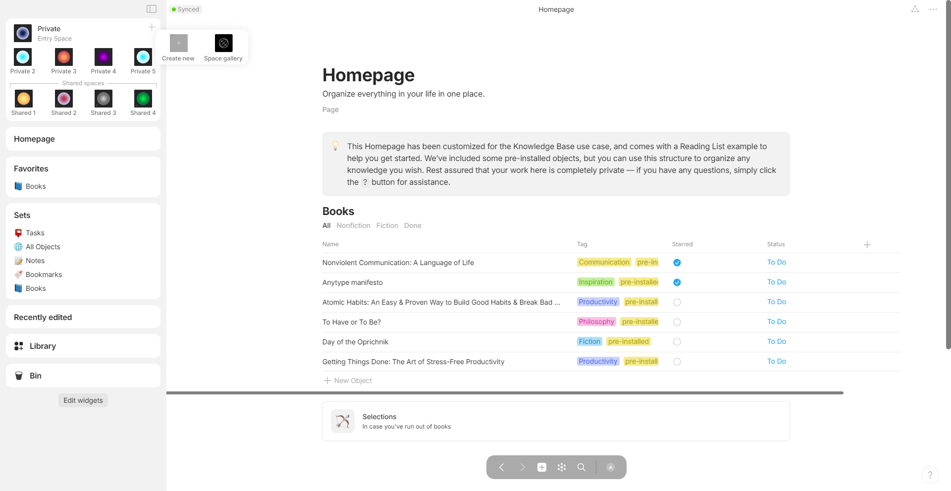
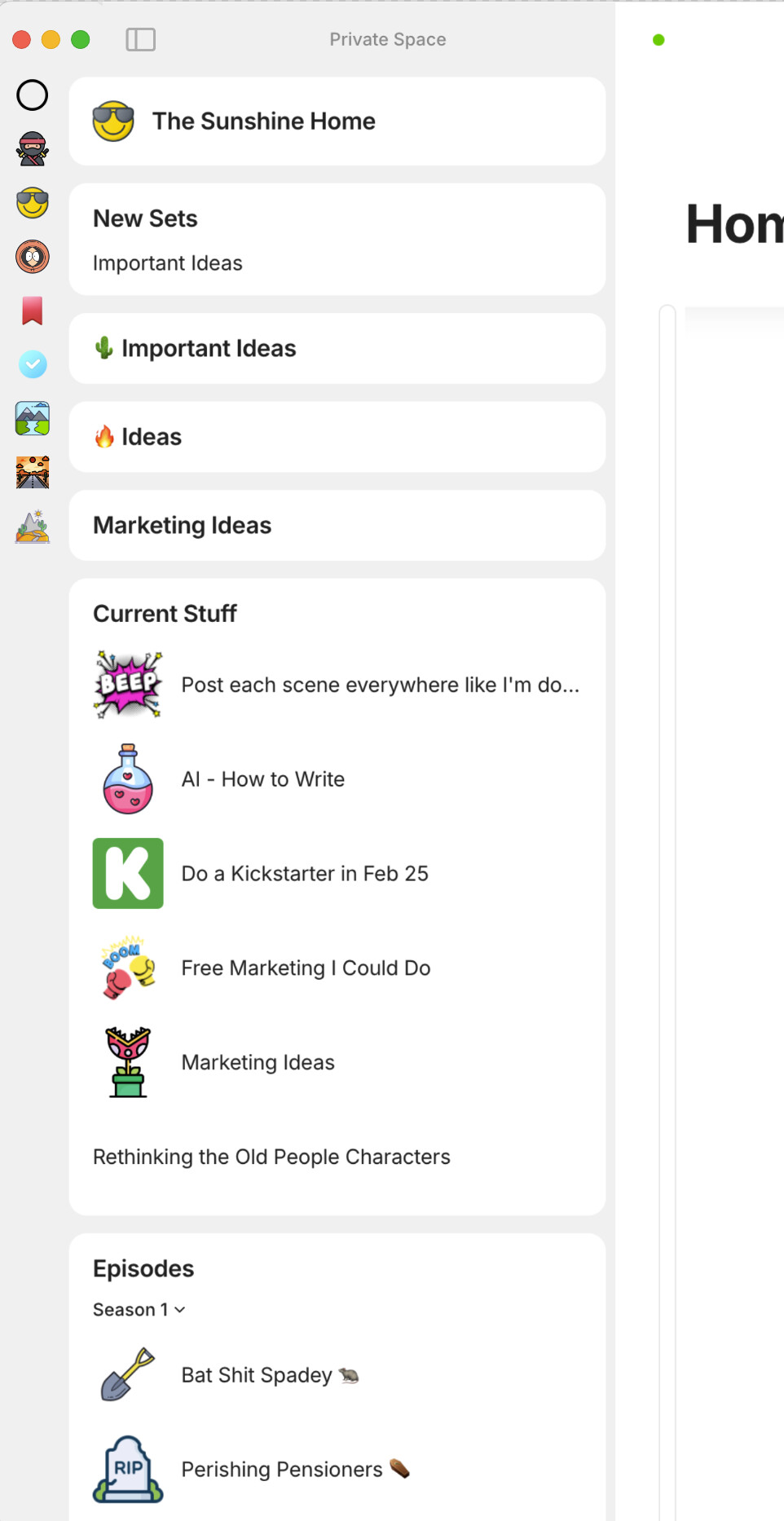
In any case, the best solution IMO has already been discussed by several people on the forum, and it seems both obvious and coherent: Integrate the space selector within a widget that would be independent of the other spaces (like the Library). The easiest way would be to extend the very first widget, like this:
I’ll be waiting to see how Multi-pane navigation is integrated to see if it will actually prevent the use of Floating mode. But I don’t know a single designer who couldn’t rise to the challenge.
@Code-Jack Feel free to put this mockup in your topic description
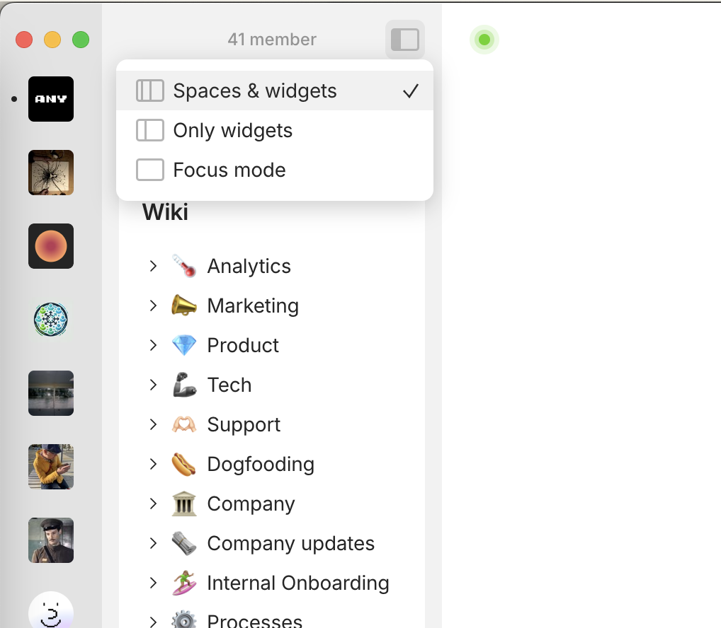
I personally do not like the idea of having the spaces take up valuable widget space as Marie.D has suggested. I quite like the bar idea to be honest, although it could still be a little thinner. I’m guessing the traffic light dots on the mac is part of the limitation in making it thinner. A solution to this would be to have the spaces bar background colour the same as the widget bar background, that way the space icons could be smaller, and also closer to the widget blocks so it would take up less room.
It’s late at night, so might be a couple pixels off, but from the quick test, everything works!
It uses less 22 pixels, and switched the active dot into a vertical bar. In custom.css:
Wonderful. Thank you This resolves this request for me (it is not a widget for spaces, as requested by this request, but good enough for me to hide the spaces bar). I will therefore remove my vote from this AR.
Out of curiosity, are there any plans for how to visualize the “action” of changing spaces? I think that the classic pop-up Alt+Tab application switcher in the middle (or anywhere else) of the screen would fit well for visualizing changing spaces (with the space being switched to shown in the background). Anytype already has the Ctrl+K “search for keyword” pop-up which could be nicely repurposed for visualizing changing spaces (under a new keyboard shortcut) as well. This could maybe resolve this request for even more people with minimal effort, I believe. Is this something being discussed, or should I create a new Any Request to see if people would like that?
Can’t answer on this, no plans for this for the moment and we will be adding more functionality to space switcher and sidebar in upcoming releases, we have huge plans for that.
That is a good point. I will store this idea for later (in my set of ideas inside Anytype ) and when the space switcher and related functions are implemented, I will review the idea again and see whether this is a feasible AR or not. Thank you for the information and wish you all the best.
Just tested.
Fine that the distracting Spaces now out of view (if wanted).
But I still miss the beloved floating mode (that was the main intention for this FR).
Whatever you devs have in mind: please make sure that the navigation feature works as fluid as possible!
The old floating mode was one of the biggest highlight in usability.
Although it seems objective not to be a big deal, I can assure that removing the floating mode took a lot of joy out of my daily usage.
Let me explain two aspects:
There is a difference if someone uses Anytype: a) only on work, sitting on an office chair, having both hands “ready to strike” on the keyboard / mouse … b) OR if someone uses Anytype at home, half sitting half laying on a bed or a sofa, holding his notebook computer with one hand on his knees, while the other hand uses a touchpad for navigating a lot in his whole structure …
Such a guy will LOVE the floating mode, but HATE the cumbersome actual concept!
– As you see, you can’t compare your usage in the office with all imaginable (but real) other “real live scenarios”.
It’s one thing what an App can do.
But it’s a completely other thing how it looks and feels!
Before I came to Anytype I tried Obsidian.
Although I was impressed from its endless features, I simply couldn’t get warm with the UX.
Anytype, on the other hand, was a pain in the ass the first four weeks! Really!
I couldn’t understand most of the concepts. But somehow I liked the UX. Although there was bugs over bugs over bugs (and missing basic features), I finally skipped Obsidian and stayed with Anytype - because of the nicer and somehow addicting UX.
There are still a lot things too cumbersome to feel good, but some other things work really nice; that compensates the issues to a good amount.
The floating mode was one of my most beloved parts.
The side menu is one of the most used functions, this is why it should floate again!
– For the three dots menu I wouldn’t ask to make it float, because I use it much less frequently compared to the left side menu. Once or twice a day I can move the mouse to the three dots, no problem.
But if I need to navigate 50 to over 100 times a day to the tiny button for the left side menu, it simply sucks!
That means 50 to 100 small flinches in my face, instead of the same amount slight smiles.
The worst thing is not even that we need to move to that tiny symbol to open the side menu.
No the worst thing is that the menu needs a second move-to and click-on this tiny symbol for making it disappear again!
Really -after a click on any Page/Set/Collection in the side menu, I expect to be “beamed” to that location and see it in full on the sceen! The side menu should be away then!
If you take an airplane to New York, you expect the see New York after landing there, but you don’t want to see the airplane longer than needed.

 ).
).

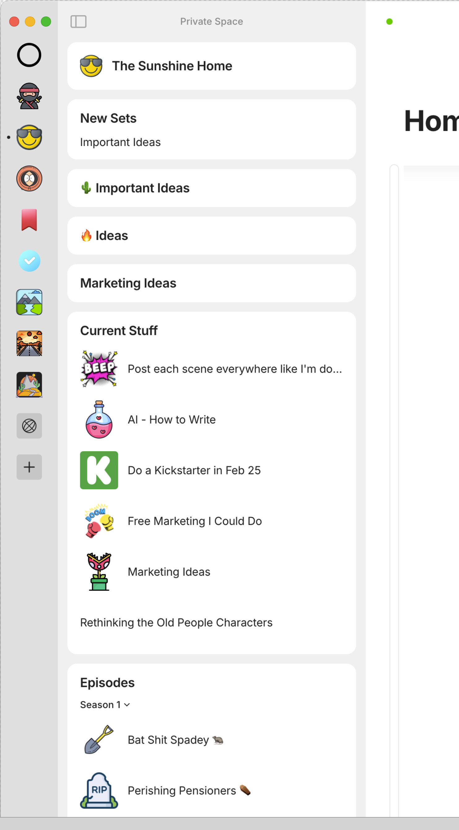
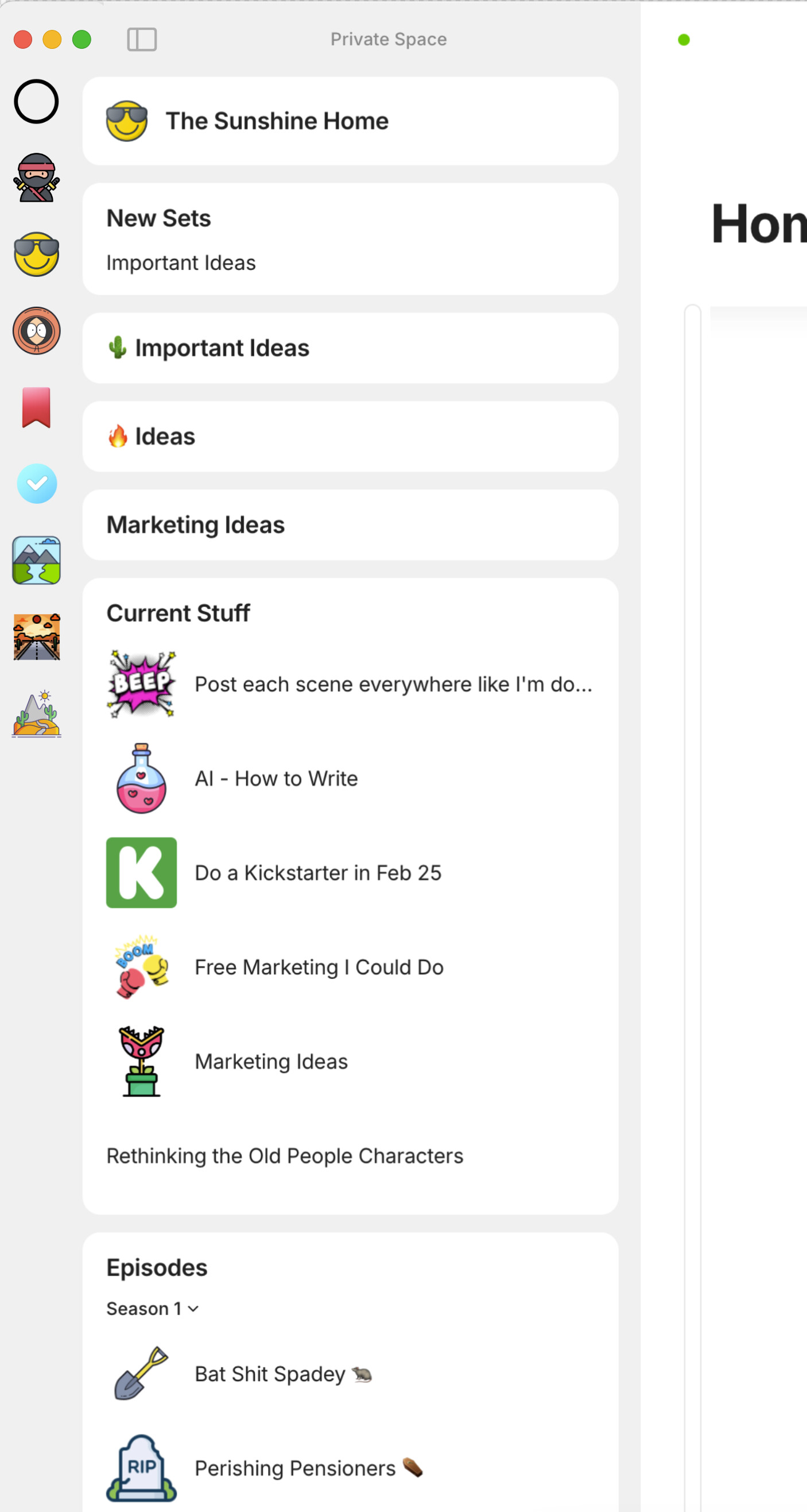
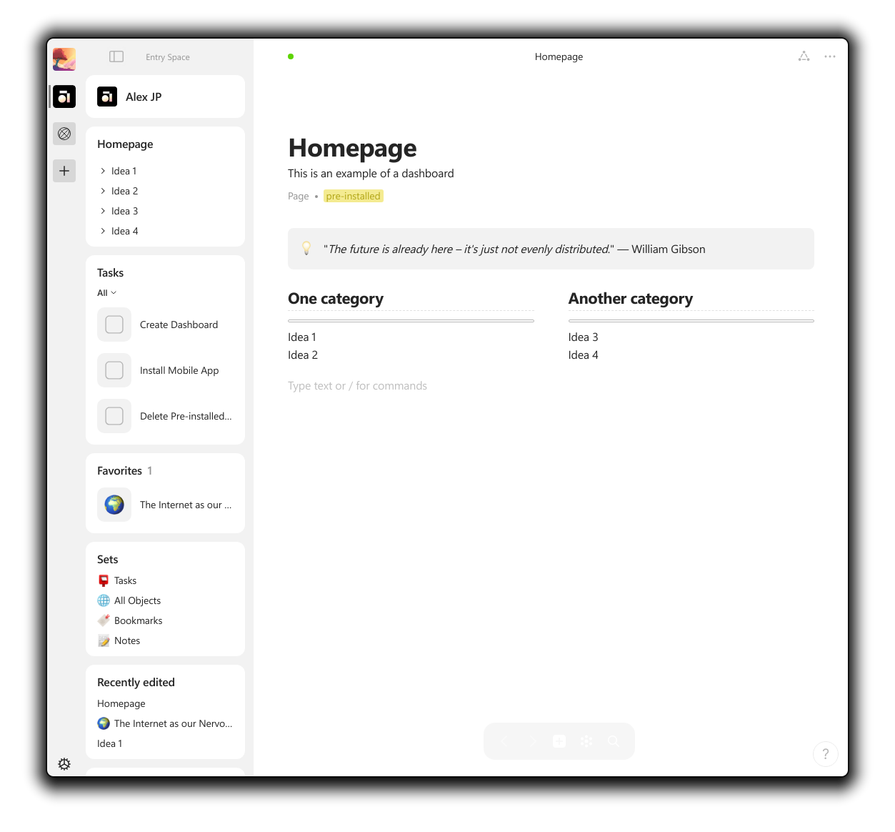
 This resolves this request for me (it is not a widget for spaces, as requested by this request, but good enough for me to hide the spaces bar). I will therefore remove my vote from this AR.