I often split my screen on my laptop between two windows : AnyType and something else (a web page, an online meeting). Screen real-estate is pretty important at this point.
Additional Context
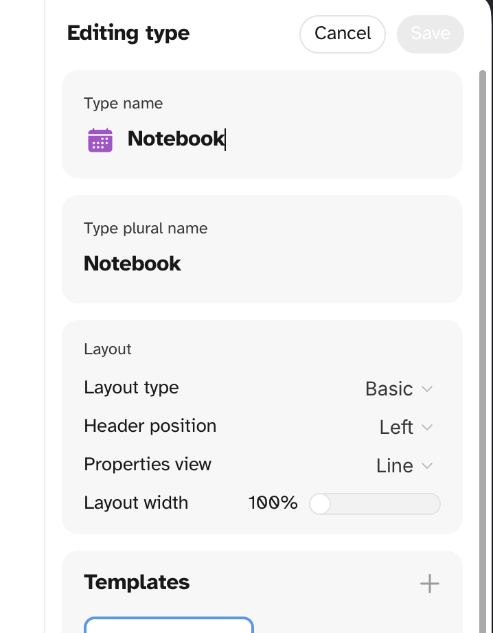
Maybe gray out the “Set layout width” in the layout parameter when width is small and explain this to the user.
I collapse the sidebar manually but another enhancement could be for it to unpin when window size is too small.
would also like to add another voice to this FR. I similarly am trying to cram a lot of windows on my screen, and without custom css anytype really does not behave very well in these conditions. it is something the developers should fix for those of us who don’t have expansive screen space to work with at all times
This helped but the jump from padding to no padding was annoying me. I landed on this custom CSS
.editorWrapper {
  /* 1. max(700px, 50%): Keep content at 50% width
        (which seems like the default padding), but NEVER go below 700px.
     2. min(100% - 64px, ...): ...UNLESS the container is too small,
        then shrink to fit the container minus 32px padding on each side.
  */
  width: min(100% - 64px, max(700px, 50%)) !important;
}

/* removes additional padding from Lists view  */
.editorWrapper.isSet .blocks,
.editorWrapper.isCollection .blocks,
.editorWrapper.isType .blocks,
.editorWrapper.isDate .blocks {
  width: 100% !important;
}
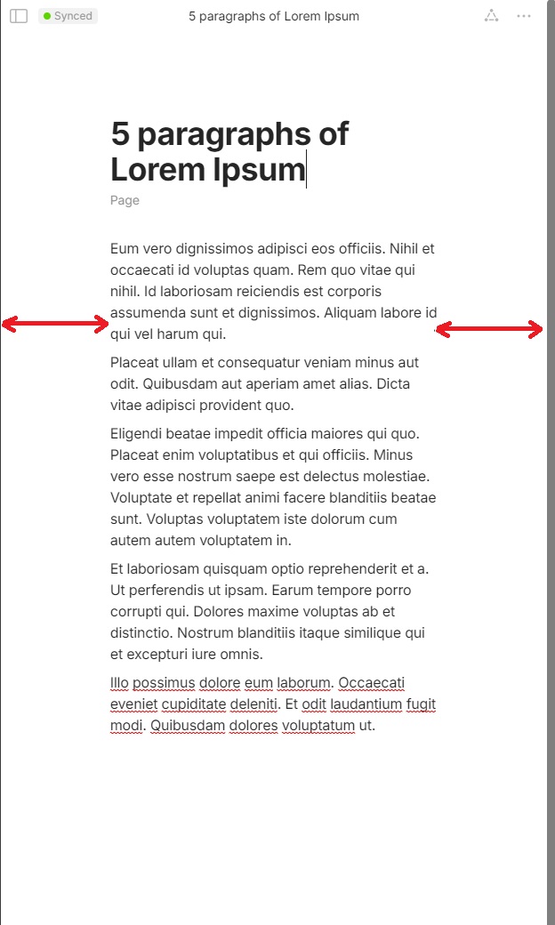
*When the Anytype window is shrunk horizontally, the margins on the sides of the page dont decrease as they typically should. this results in a very awkward reading experience, and prevents users from making the most of their screen. *
as can be seen in the screenshot above, shrinking the window any further would seriously compromise the readabililty of the text, this prevents me from using anytype more flexibly, where i have a very narrow window open for note taking and i can pay attention to the larger window and work more freely.
the only other option is to manually increase page width, but that permanently increases it, and that reflects even when the window takes over the whole monitor and the text gets spread out all over the monitor.
HOW COULD IT BE DONE?
Breakpoints. Ensure that there are breakpoints for width and the default styling makes better use of available horizontal space
REAL WORLD USE CASES
RECOMMENDED ALTERNATIVES
ADDITIONAL CONTEXT
*I’m using Fedora 43, Hyprland, Linux, Anytype 0.53.1.
*
This maybe could be handled with custom CSS if you don’t want to change the layout width universally. I also just confirmed that the custom CSS file respects media queries You can play around with the CSS by going to debug > dev tools. You could maybe do something like this below, but I don’t know how that would affect the channels bar, widgets bar, or the property panel.


 You can play around with the CSS by going to debug > dev tools. You could maybe do something like this below, but I don’t know how that would affect the channels bar, widgets bar, or the property panel.