UX Improvement: Persistent Tree / List View to Avoid Context Switching (Three-Pane Layout)

  • First, make sure you have searched for a similar report by checking the Search Index :down_left_arrow:
  • Delete the instructions, then fill in each part of the below template clear & concisely

WHAT DO YOU RECOMMEND?

I highly recommend implementing a persistent multi-pane layout to ensure the list of notes is always visible on the left while the active note opens on the right. The core goal is to allow seamless switching between notes without losing the context of the parent section or folder.

HOW COULD IT BE DONE?

This can be achieved through two layout variations:

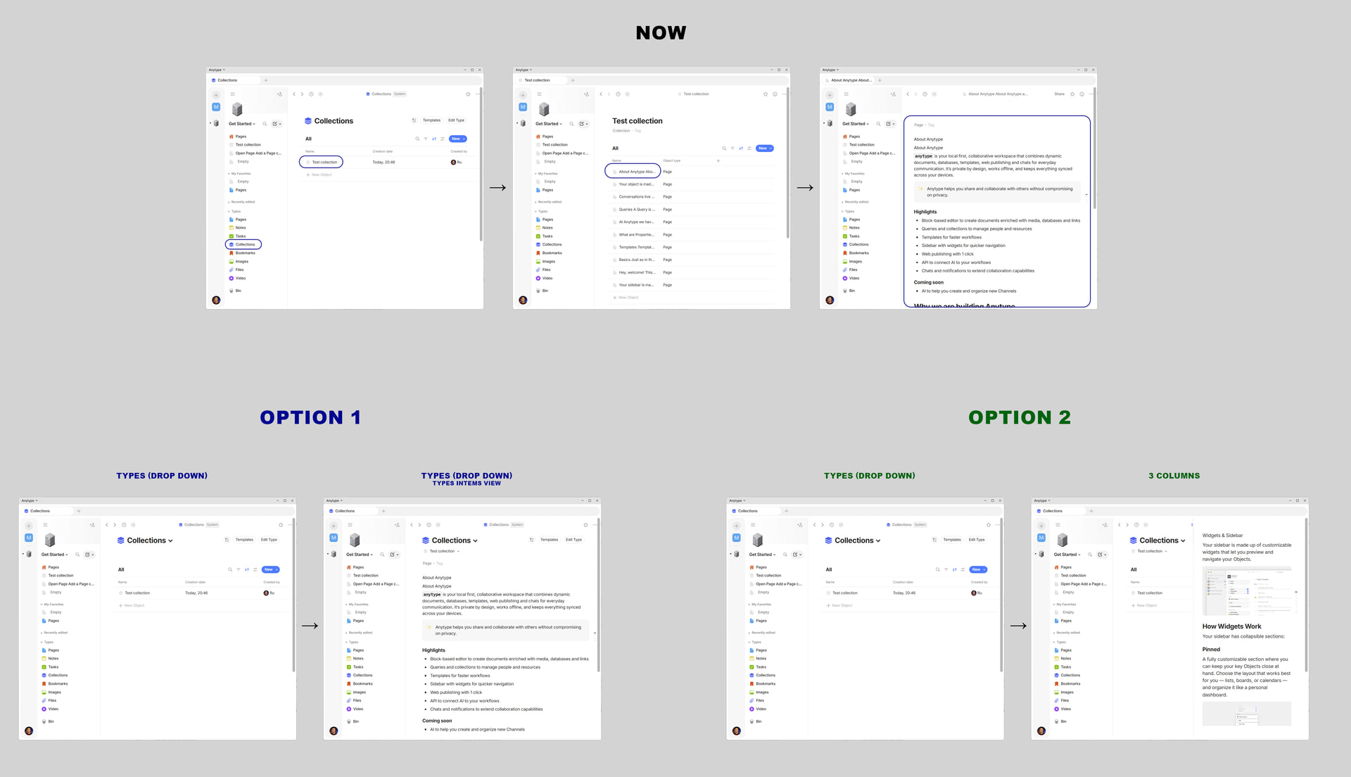
Option 1: A 2-Column Tree View
  • Left Column: Acts as a unified file explorer. Sections/Collections can be expanded as a tree to show individual objects directly underneath them. Below the collections, standard menus like Types, Filters, and Widgets remain visible.

  • Right Column: The main editor. Clicking an object in the left tree opens its content here.

Option 2: A 3-Column View (The Optimal Solution)
  • Column 1 (Navigation): Space switcher, Sections (Collections), and Filters. This column can either be expanded as a list or collapsed into a narrow vertical ribbon with just icons to save screen space.

  • Column 2 (List): When a section/collection is selected in Column 1, this middle column displays the list of objects inside it.

  • Column 3 (Editor): Selecting an object in Column 2 opens its content in this wide right-side pane.

  • Crucial feature: The app must remember the state (the last opened section and note) when reopening the application or switching spaces.

REAL WORLD USE CASES

Currently, navigating a collection in Anytype feels like browsing a website: clicking an object replaces the entire view. If I need to review 5 different notes within a “Projects” collection, I have to constantly go back and forth.

Having a persistent left-side list (either a tree or a dedicated middle column) allows for rapid context switching. It is essential for researching, comparing documents, and organizing large databases. It gives the user a spatial understanding of where they are in their workspace.

RECOMMENDED ALTERNATIVES

Currently, users have to rely on Tabs (Ctrl + Click), opening multiple separate windows side-by-side, or using Peek View (Shift + Click). None of these provide a spatially stable, persistent workspace. Tabs get cluttered quickly, and Peek View blocks the underlying list.

ADDITIONAL CONTEXT

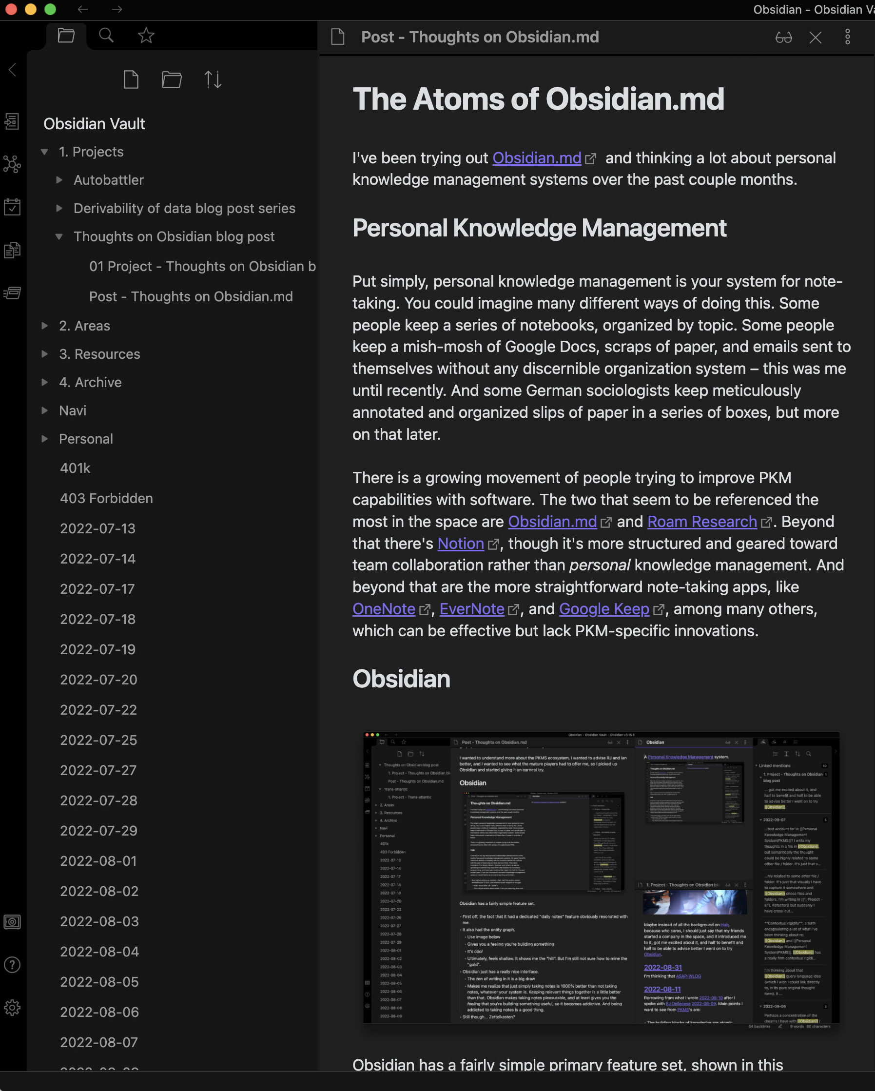
Many users migrating from Obsidian, OneNote, or Apple Notes consider this layout an industry standard for PKM (Personal Knowledge Management) tools. Implementing these layout toggles would drastically improve the desktop UX for power users and reduce the friction of adopting Anytype for large-scale note-taking.

So much yes for the 3-column view.

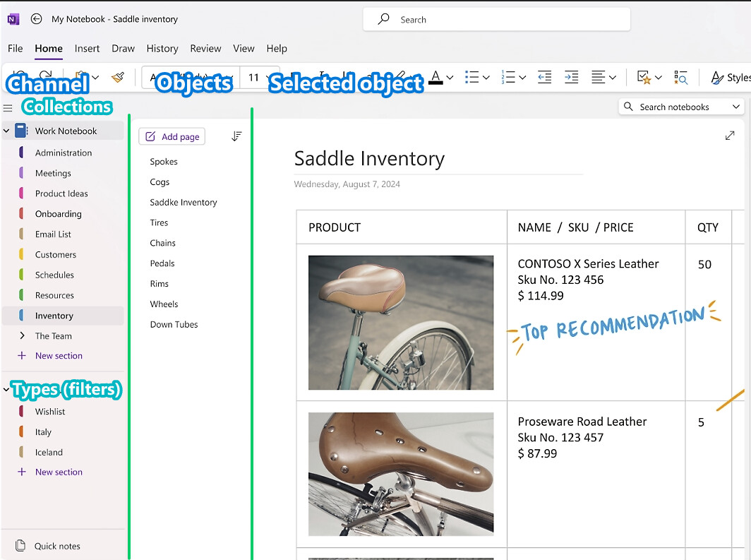
This is the one thing I miss the most from OneNote.

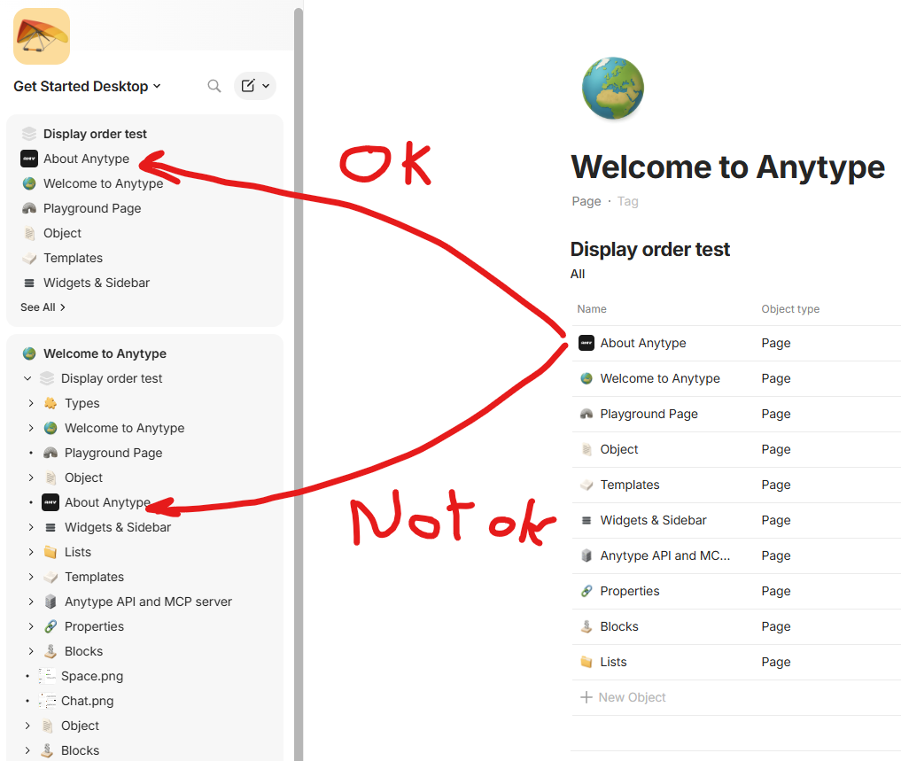
  • The “collection” object does not behave as well.
  • This is not possible to order the items manually as desired (as OneNote). This is the best and most flexible system as one can easily display list items in a menu/column just as desired for a task.
  • Displaying a collection item always lists the items in order of created date, I think. It does not respect the order of the collection, nor allows parameter configuration (when displayed in the object column and expanded).

There should really be a “view” that allows for displaying objects as in OneNote (or UpNote which is quite good too). Obsidian is too basic and inflexible (to this date).

Kind regards!

For Option 1, how does that differ from what you can do today with Anytype? Besides the fact that Anytype is not hierarchical, so the the tree view would be a simulated hierarchy, can’t you organise your sidebar with the relevant favorited queries/collections so that all your desired objects are there?

For Option 2, I don’t think this is a direction we’d go because the first column is breaking mental models. It mixes both the channel/space with the underlying objects/types/collections inside of it. Currently, the first sidebar is your vault and all the channels. The second sidebar is your active channel and all its objects.

By the way @iruben, you knew you can display items in a hierarchical way? Maybe this can help you right now.

If you right-click on a root element in the side panel, you can change the view mode.

If you put a collection, and objects in a collection, then it will display like that automatically (but not up to par with OneNote for example, as far as ease of use and flexibility is concerned; and you must add your objects to the collection).

Kind regards!

Hi, thank you for your comment.

I’m new to Anytype and genuinely don’t know all of its huge functionality yet.
For many years I used Apple Notes > Evernote > MS OneNote.
I also tried Notion and Obsidian, and now I’ve discovered the possibilities of Anytype.

You are creating a wonderful product, and I really want to thank you for it :slight_smile:

Option #1
Yes, you are right. It actually is implemented, even if not exactly the way I imagined it. Thank you for pointing out that this functionality already exists.

Option #2
Sorry, I probably didn’t explain myself clearly enough. Let me clarify what I meant. I completely understand your point about the mental model and the strict hierarchy between Spaces and underlying Objects! Let’s forget about redesigning the first column.

My main pain point is strictly about how Collections/Sets are displayed when I am ALREADY inside a Space. >

When I click on a Collection in the current left sidebar, it opens a List of objects. When I click an object in that list, it completely replaces the screen.

All I am asking for is a “Split View” mode inside the active space: keeping that List visible as a middle column, and opening the Object’s content in a right-hand pane. The Space/Channel logic and the current left sidebar can remain exactly as they are.

Thank you for supporting my idea and for showing me how to enable the display mode I mentioned in Option #1. It worked — I was able to set it up, thanks a lot!

Maybe I’m not understanding something, but this is exactly how it operates today. Your sidebar should never disappear when you open an object, it should still display that entire list. Maybe you can share a screen recording of what you mean.

Hello @kaye,

Could you make it so it is possible to have an option on the display so that the order defined in the collection would be the display order, or have an independent display order when displayed in the left bar?

I want to remove all ordering so I can manually set the position I want for the objects. But this is not possible actually. This is always sorted by dates.

Also, would it be possible to filter only the objects we want to see when expanding a hierarchy? Like only pages, etc. Not the images and links, etc.

These two would have a long way! :blush:

Thank you very much and kind regards!

Isn’t that already the case? The collection widget display shows the view order (and if there are multiple views, you can switch between them)

All of these settings/features that you’re requesting for are in the app. You need to learn how to use views, queries, collections, etc. You can also set it so that files don’t show up.

Hello @kaye,

Is it something new? In the latest version?

Because when I tested it about a month ago it was not working. (And yes, I know about all these features in the views, queries and collections. I am quite comfortable with them, and also that many details and features do not work as expected on Android—which is too bad.) When I tested it it did not refresh the display in the left column at all.

But after your comment, I went back, made the exact same test, and I saw the column refresh immediately.

So I am sorry for bothering you with that. But it really did not work last time. Maybe this was a UI glitch (there was a lot of them in the previous version. I feel this last windows build is much more stable UI wise).

Well, thank you for all the great work!

Oh! I found the case I was testing that is not working:

  • It does not work when you have an EMBEDED collection in a page.
  • Whatever the order you set in that collection, it will not display in the correct order in the left pane.

Should I make a issue/bug report somewhere?

(Sorry for the edit, but the forum does not allow more than 2 consecutive replies.)

Kind regards!

Thank-you for jumping in @shampra! :slight_smile:

Well, when I tested it a month ago, it would not work. I do not know why.

But I tested it again with the latest version, and it does work! :tada:

It was one of the things that held me back for fully using AnyType.

The only other thing holding me back for the full jump is the Android app, which has two UI issues for me:

  1. The embedded collections, queries, are not working as the Desktop version. Filters (on “self”) are not working, etc. This is very problematic for me. I need to be able to have a query filter on pages based on “self”, and see the listing right in the page I am looking at. Not click on a container, have a list that is not properly filtered.
  2. The font color of some properties (page links, etc.) is soo dark in dark mode that this is impossible to read the data. (I made an Issue on that: Dark mode: links to documents in tables not readable · Issue #3219 · anyproto/anytype-kotlin · GitHub).

But I hope one day, both of these will work. :slight_smile:

Kind regards!

Thank you for giving me the opportunity to share my thoughts and help improve your product based on my user experience.

I think my idea may have been slightly misunderstood. I am not talking about object relationships, hierarchy, backlinks, or data structure. I am specifically talking about the interaction model and navigation UX—in other words, the interface itself.

Right now, Anytype primarily works like this:

  • You see Spaces (let’s call this Column 0).

  • You see a list of filters (Types, Favorites, Recents, and so on — Column 1).

  • You click one of them.

  • You then fully navigate into the page of a specific object (Column 2).

The only exception to this workflow is the view mode that allows a list of objects to be expanded under a filter, such as a Collection. However, I will explain below why this is not always a convenient solution.

In general, Anytype currently creates a drill-down navigation workflow, while I am proposing a different primary workflow. I started creating mockups and came up with two possible approaches: Option 1 and Option 2.

Option 1 allows the interface to remain within the existing two-column layout.

In this case, it would be enough to add a sub-filter selector to the top toolbar.

For example:

Collection → Test Collection

This would create the following structure:

  • Left side: a persistent navigation area (Column 0 = Spaces, Column 1 = filters).

  • Right side: the selected sub-filter (list of objects) together with the editor or detailed view of the selected object.

Option 2 (which I personally find more convenient) would introduce a dedicated third column:

  • Left side: persistent navigation (Column 0 = Spaces, Column 1 = filters).

  • Middle column: sub-filters or lists of actual objects.

  • Right side: editor or detailed view of the selected object.

Instead of constantly opening pages and losing context, the user remains within a single workspace and can quickly switch between objects.

The key idea is that the object list should remain visible while editing.

This becomes especially important in workflows involving many related objects: tasks, exercises, goals, workouts, notes, knowledge bases, and similar content.

For example, I may want to review 20 exercises in a row while continuing to see the overall structure or category list on the left.

Today, the navigation feels like this:

Open page → go back → open another page → go back.

The workflow I am proposing looks like this:

Select object → edit on the right + instantly switch to another object.

I would also like to explain why the expandable list in the left sidebar is not always convenient.
The main reason is that it still introduces additional clicks. Let’s imagine we have around 500 objects distributed across six collections.

I enable the expanded list view we discussed earlier. At first glance, displaying up to 50 objects per collection seems like a solution.

However, once I do that, some collections get pushed so far down the sidebar that reaching them requires excessive scrolling. In some cases, I may need to spin the mouse wheel ten times just to reach the desired collection.

There is also the problem that I lose access to items beyond the first 50 entries. Yes, I can click “Show All,” but that again introduces extra clicks.

The moment I click “Show All,” a separate panel opens, I am forced into a different navigation mode, and although I had already found the area I needed in the sidebar, I now have to search for the item again.

In addition, because the left panel alternates between showing a list and showing an editor, if I accidentally open the wrong object, I need to return to the list, find the correct object again, and reopen it.

All of this creates friction and, most importantly, results in unnecessary clicks.

My core idea is therefore to introduce faster switching between objects.
At a minimum, this could be achieved through an additional dropdown selector (Option 1).
Ideally, however, it would be implemented through a dedicated object-list column that remains visible while editing (Option 2).

This is a long-established and widely adopted interaction pattern. It is very similar to what is used in:

  • Email clients

  • File managers

  • IDEs

  • Airtable

  • Linear

  • ClickUp

  • Notion’s Peek mode

  • Evernote

  • OneNote

That is why my suggestion is not really about data modeling.

The main goal is to preserve context and reduce navigation friction by eliminating unnecessary clicks.

Thanks for the suggestion. The main difference with some of the others you’ve mentioned is the layers of depth. We can keep adding more and more columns/panels but it starts to add further complexity as well. Linear’s Column 0 is the equivalent of our Column 1, so some of these comparisons are not apples to apples. They are not the same use case and are optimised for different workflows, some are more collaboration heavy while others are more into bulk editing many similar records.

@kaye
I can share a real-world use case that I personally ran into.

My goal was to learn Google Ads for my project. I was completely new to it, and I needed a place to organize my knowledge. To avoid turning everything into one massive note, I needed either a Google Ads collection or a page with nested (sub-) pages.

And this is exactly where the scenario I described begins.

I needed to document my knowledge in a structured way, across multiple pages within the same topic—Google Ads. Some notes were about campaigns, others about keywords, and others about audience settings.

If you tried working with multiple pages like this for even a couple of days, you would immediately understand the pain point I’m describing. And in my case, it was only five pages. It wouldn’t matter whether I was working on them alone or collaborating with a team.

The important thing is that the nesting functionality already exists in Anytype. What is missing is a more convenient way to switch between related objects.

This could be implemented with a very small UI change—either by adding another dropdown menu or by introducing an additional column.

In other words, I’m not proposing a change to the data model. I’m simply suggesting a small interface improvement that would make navigating between related objects much faster and more efficient.

I think you are proposing a flexible UI like the one in vscode.

@lester1027
That level of customization would be wonderful, but honestly, I would already be happy if the developers implemented even the minimal dropdown solution. And if they eventually added a dedicated third column, that would be amazing.

I completely understand that developers have many ideas and competing priorities, and they need to decide what to focus on first. That’s why it might make sense to start with something simple, so we don’t end up waiting months—or even years—for the feature to arrive.

By the way, if you like this idea, please consider upvoting ▲▲▲ this topic. It will help show the developers that this is a useful and highly requested feature.

@iruben @kaye for what it’s worth, the app Superlist has essentially perfected this. They took it a step further, taking into consideration navigation of deeply nested objects. It’s a complex problem space, but they’ve come up with a pleasant, elegant, innovative solution. Their UI in general is quite nice.

In general the solution is:

  1. When a list or page is first opened, you see only nav rail on the left and the page opened on the right.
  2. When some object is opened on the page, it splits the body into a left and right pane (for a total of 3 columns). Prior to a child object being opened they occupy the righthand pane space with a hero image (versus putting the hero at the top), which prevents objects from shifting down when the UI gets narrower.
  3. If in the child page another child is selected, the columns animate a slide to the left so that now what’s shown is NavRail<>ChildDoc<>ChildChildDoc. They make it simple to get back to the original parent, no matter how deeply you traverse, by introducing a thin slice/column between NavRail and the lefthand pane that has a vertical title on it of the root parent page, on click of which would go all the way back.
  4. Navigation is simple, either using trackpad/mouse to slide left/right between columns, OR you can click to open some other child from the lefthand pane or click an X button in the lefthand pane to close it and to back to the former parent<>child. Of course when scrolling, it’s smooth, but scrolling snaps to a parent<>child pair instead of allowing the user to land in a strange in-between.

Material Design standard, which I don’t know if they follow, is to occupy 50% of the left screen width split between the navigation menu and the lefthand pane (parent doc or list), and the right 50% with the righthand pane (nested child doc). Seems to end up with balanced layouts in principle, though I can see a case being made for having more a 50/50 split between parent and child in the body of the page, which isn’t possible with Material’s spec. I think it makes more sense to have an even split since their spec is thinking List<>Doc whereas this will often end up with two first-class citizens side by side a la Doc<>ChildDoc.

This makes sense for an app like Superlist because those ‘lists’ are effectively nested within each other. From what I can see, it’s a more visually appealing implementation of breadcrumbs, but it’s hierarchical nonetheless. This is not the case in Anytype.

@kaye I don’t think it needs to logically imply nesting, versus just a pleasant way to navigate interlinked non-hierarchical pages. Refer to the Obsidian Sliding Panes plugin, or browse the site below that it’s based on: