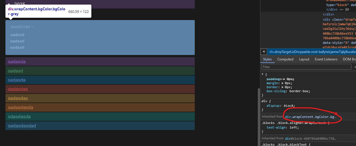
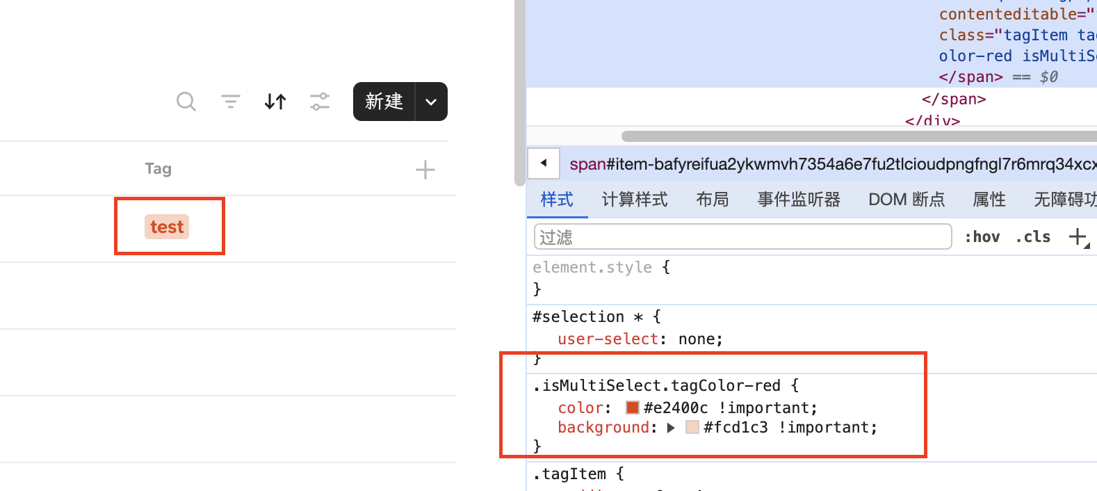
@LavaC what is the declaration for the code snippet background color?
EDIT: Found it using the element selector but Idk how to use it:
@LavaC what is the declaration for the code snippet background color?
EDIT: Found it using the element selector but Idk how to use it:
you can try
.blocks .block.blockText.textCode>.wrapContent {
    background: #color-of-your-choice !important;
}
Thank you @alexandra, it worked!
@LavaC This guide was ported to our official docs. Thank you for your contribution!
Those changes look really slick. Would you be willing to post the CSS for those?
Just wanted to leave a warm hug of gratitude for taking the time to write the tutorial.  Themes will be so nice, and until then this is a life saver for us folks who know nothing of CSS.
Changing the font alone has made the writing experience much better  and P.S importing adobe fonts works too! yey
try this
.blocks .block.blockText .markers{
  align-items: center;
}
Thank you for your code!Unfortunately, it doesn’t work. 
Can you take a screenshot of the place where the style is incorrect?
Hey, sure see the code below.
Please note that I’m not a coder or developper, I just played around based on this tutorial so it’s maybe not at all the correct way to do it properly.
 /*Anytype custom.css code 02.24 */
:root {
    --color-system-accent-100: #59afe1;
    --color-system-accent-50: #adadad;
    --color-system-accent-25: #c9c9c9;
    --color-system-selection: rgba(24, 163, 241, 0.15);
    --color-system-drop-zone: rgba(89, 175, 228, 0.25);
    --color-yellow: #ecd91b;
    --color-orange: #ffb522;
    --color-red: #f55522;
    --color-pink: #e51ca0;
    --color-purple: #ab50cc;
    --color-blue: #3e58eb;
    --color-ice: #2aa7ee;
    --color-teal: #0fc8ba;
    --color-lime: #5cc20c;
    --color-green: #57c600;
}

.menus .menu.menuSpace {
    border-radius: 3px;
}


.widget {
 background: var(--color-bg-primary);
    border-radius: 3px;
    transform: translate(0px, 0px);
    position: relative;
}

.widget .head .clickable .name {
    font-size: 14px;
}

.button.widget {
font-size: 14px;
}


.blocks .block.blockDataview .viewContent.viewGallery .card  {
    width: 100%;
    border: 1px solid var(--color-shape-highlight-medium);
    transition-property: border-color,background;
    transition-duration: .1s;
    transition-timing-function: cubic-bezier(0.22, 1, 0.36, 1);
    border-radius: 3px;
    display: inline-block;
    background: var(--color-bg-primary);
    box-shadow: 0px 0px 4px rgba(0,0,0,.05);
    min-height: 72px;
    position: relative;
}

.blocks .block.blockDataview .viewContent.viewBoard .card.add {
    min-height: unset;
    text-align: center;
    padding: 10px 0px;
    margin: 0px auto;
    line-height: 1;
    transition: all .1s cubic-bezier(0.22, 1, 0.36, 1);
    border: 1px solid var(--color-shape-tertiary);
    border-radius: 3px;
    flex-direction: row;
    justify-content: center;
    background: var(--color-bg-primary);
}


.blocks .block.blockLink.card .linkCard .side.left {
    padding: 16px;
    border: 1px solid var(--color-shape-secondary);
    border-radius: 3px;
    flex-direction: column;
    justify-content: center;
}


.blocks .block .icon.dnd {
    position: relative;
    width: 4px;
    height: 100%;
    background-size: 8px 16px;
    opacity: 0;
    cursor: grab;
    position: absolute;
    right: 6px;
    top: 0px;
    background-color: var(--color-shape-secondary);
    background-image: url(data:image/svg+xml;base64,PHN2ZyB3aWR0aD0iOCIgaGVpZ2h0PSIxNiIgdmlld0JveD0iMCAwIDggMTYiIGZpbGw9Im5vbmUiIHhtbG5zPSJodHRwOi8vd3d3LnczLm9yZy8yMDAwL3N2ZyI+PC9zdmc+Cg==);
    border: 1px solid var(--color-shape-secondary);
    border-radius: 3px;
}

.blocks .block .icon.dnd::before {
    content: "";
    position: absolute;
    top: -12px; /* Adjust the top position to increase the grab area vertically */
    right: -12px; /* Adjust the right position to increase the grab area horizontally */
    bottom: -12px; /* Adjust the bottom position to increase the grab area vertically */
    left: -12px; /* Adjust the left position to increase the grab area horizontally */
    background-color: transparent;
    pointer-events: all; /* Ensures the overlay doesn't block mouse events */
}

.blocks .block .icon.dnd:hover::before {
    background-color: rgba(128, 128, 128, 0); /* Transparent gray background on hover */
}

.blocks .block .icon.dnd:hover {
    background: #6e6e6e; /* Couleur de fond */
    border: 3px solid #6e6e6e; /* Bordure avec couleur */
    box-shadow: 0 0 1px #6e6e6e; /* Ombre portée avec couleur */
    /* Ajoutez d'autres styles selon vos besoins */
}


.editorWrapper .editor .icon.buttonAdd {
    width: 20px;
    height: 20px;
    position: absolute;
    z-index: 5;
    user-select: none;
    background-image: url(data:image/svg+xml;base64,PHN2ZyB3aWR0aD0iMjAiIGhlaWdodD0iMjAiIHZpZXdCb3g9IjAgMCAyMCAyMCIgZmlsbD0ibm9uZSIgeG1sbnM9Imh0dHA6Ly93d3cudzMub3JnLzIwMDAvc3ZnIj4KPGNpcmNsZSBjeD0iMTAiIGN5PSIxMCIgcj0iMTAiIGZpbGw9IiNGRkI1MjIiLz4KPHJlY3QgeD0iOSIgeT0iNC41IiB3aWR0aD0iMiIgaGVpZ2h0PSIxMSIgcng9IjEiIGZpbGw9IndoaXRlIi8+CjxyZWN0IHg9IjQuNSIgeT0iMTEiIHdpZHRoPSIyIiBoZWlnaHQ9IjExIiByeD0iMSIgdHJhbnNmb3JtPSJyb3RhdGUoLTkwIDQuNSAxMSkiIGZpbGw9IndoaXRlIi8+Cjwvc3ZnPgo=);
    transition: opacity .075s ease-in-out,transform .075s ease-in-out;
	filter: saturate(0%);
    display: none;
}

.navigationPanel {
    background: rgba(37,37,37,.4);
    backdrop-filter: blur(16px);
    border-radius: 3px;
    position: fixed;
    left: 0px;
    padding: 8px 16px;
    bottom: 24px;
    height: 48px;
    z-index: 105;
}

.blocks .block.blockDataview .viewContent.viewGallery .card .cover {
    position: relative;
    aspect-ratio: 7/3;
    background-position: top center;
    display: flex;
    align-items: center;
    background-color: var(--color-shape-highlight-medium);
    width: 100%;
    justify-content: center;
    border-radius: 3px 3px 0px 0px;
    overflow: hidden;
}

.blocks .block.blockText.textCallout>.wrapContent {
    border-radius: 3px;
    margin: 6px 0px;
    background-color: var(--color-shape-tertiary);
}


html.themeDark {
    /* Applies to Dark mode */
    --color-text-primary: #dcdcdc;
    --color-text-secondary: #8d8d8d;
    --color-text-tertiary: #505050;
    --color-text-inversion: #171717;
    --color-shape-primary: #555;
    --color-shape-secondary: #3f3f3f;
    --color-shape-tertiary: #2b2b2b;
    --color-shape-highlight-medium: rgba(238, 238, 238, 0.12);
    --color-shape-highlight-light: rgba(238, 238, 238, 0.06);
    --color-control-accent: #d4d4d4;
    --color-control-active: #9a9a9a;
    --color-control-inactive: #464646;
    --color-control-bg: #fff;
    --color-bg-primary: #1e1e1e;
    --color-bg-secondary: #131313;
    --color-bg-tertiary: #373737;
    --color-bg-loader: rgba(0,0,0,0.7);
    --color-system-accent-50: #9f6b00;
    --color-system-accent-25: #f09c0e;
    --color-system-selection: rgba(24, 163, 241, 0.15);
}
        }
    }
}
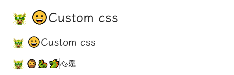
Solved!Thanks to your code, anytype emoji typed by pressing Ctrl + E is aligned with the center of the text.  Just now, only typing emoji through input method can make it correct.
.blocks .block.blockText smile *{
  display: inline-flex;
  width: auto;
}
Before
After
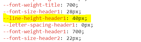
The application is still unable to modify the line height of header1 in CSS file. It’s a bug.
Hope the team can fix these bugs as soon as possible, and add code lines with text margin in CSS. I can’t wait to have beautiful composed pages! 
Trying out having a line below Headings, but not when it has background color:
.textHeader1 > .wrapContent {
  margin-bottom: 8px;
  padding-bottom: 3px;
}
.textHeader1 > .wrapContent:not(.bgColor) {
  border-bottom: solid 1px #d1d1d1;
  padding-bottom: 2px;
}

.textHeader2 > .wrapContent {
  margin-bottom: 4px;
  padding-bottom: 2px;
}
.textHeader2 > .wrapContent:not(.bgColor) {
  border-bottom: solid 1px #e1e1e1;
  padding-bottom: 1px;
}

.textHeader3 > .wrapContent {
  margin-bottom: 2px;
  padding-bottom: 1px;
}
.textHeader3 > .wrapContent:not(.bgColor) {
  border-bottom: solid 1px #f1f1f1;
  padding-bottom: 0px;
}
Could be useful to someone (I like a line below headings… its just personal preference)
Example:
EDIT: by the way, if anyone understands Portuguese, disregard the bottom notes, its all been fixed now.
So that nobody misses it:
The appreciated new user @bakunil found a nice way to hide the (often disturbing) navigation bar until the mouse hovers over it’s area:
Don’t know if its interesting to anyone, but I have made some simple fade in animation, when switching pages or Set views:
/*Animation*/

@-webkit-keyframes fadeIn {
  0% {opacity: 0;}
  100% {opacity: 1;}
}
@keyframes fadeIn {
	0% {opacity: 0;}
  100% {opacity: 1;}
}
.header > .side, .wrapContent, .viewContent {
	animation-name: fadeIn;
	animation-iteration-count: 1;
	animation-timing-function: ease-in-out;
    -webkit-animation-duration: 0.2s;animation-duration: 0.2s;
}
.blockIconPage > .wrapContent {
    -webkit-animation-duration: 0.1s;animation-duration: 0.1s;
}
.blockCover > .wrapContent {
    -webkit-animation-duration: 0.8s;animation-duration: 0.8s;
}
EDIT:
Video of the animation above, like requested in:
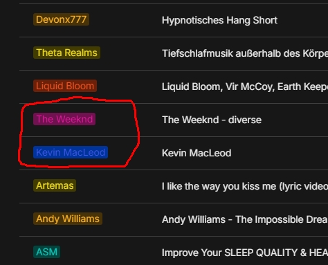
I simply can’t read the marked Tags.
(Is there anyone in the world who can?)
Trying to change the text color (not the background) to nearly white, it affected incidentally also the “color picker” (for the Tag’s color).
Couldn’t bring it to work as wanted.
Can anyone help please?
html.themeDark .isMultiSelect.tagColor-blue {
    color: var(#d8edfd) !important;
}
?
It seems you arrived earlier than me 
Thanks @Shampra
but the code has no effect!?!
Off course I modified the color, then reloaded the window (ctrl + R), but nothing changes.
Here’s my complete CSS:
/* Anleitung: https://doc.anytype.io/anytype-docs/miscellaneous/custom-css */

html.themeDark .isMultiSelect.tagColor-blue {
    color: var(#eeeeee) !important;
}

/* --- Navigationsleiste ausblenden, bis Maus hovert ---\ */
.navigationPanel {
  opacity: 0;
}

.navigationPanel:hover {
  opacity: 100;
}
/* --- Navigationsleiste ausblenden, bis Maus hovert ---/ */