It does not inject new file contents on the fly, you need to restart the app.
In all my earlier experiments it was enough to reload the window by Ctrl + R.
Tried a Restart now, but it didn’t help.
var should contain variables rather than concrete color values, you should delete it.
That was it, thanks @LavaC !
I simply removed the “var” and it works!
And @Razor : Ctrl + R is enough.
Edit:
O guys, thanks so much, FINALLY I can read my Tags! 

– A new live after months of pain! 
One question more:
In Graph View, the thin relation lines are not good visible for me.
How to change their color?
There is no way to modify these through CSS.
Finally recognizable Tags!
With great help from our appreciated @LavaC and @Shampra I was finally able to make my Tags much better recognizable.
- All credits to them!
Here the before-after comparison:
(especially the three red marked Tags was completely not recognizable for me)
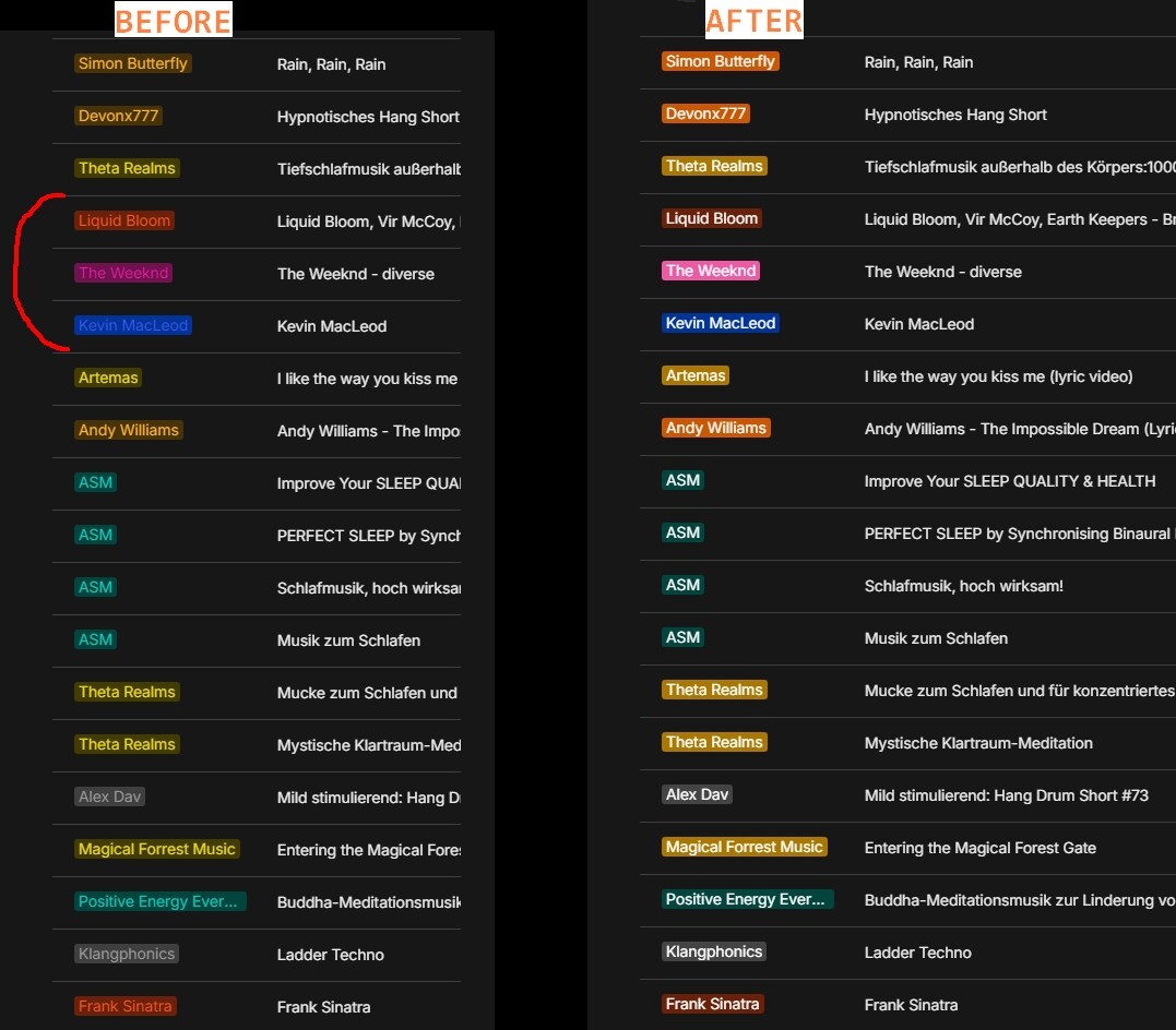
.
And here the CSS code for dark mode:
/* --- Make the text in the Tags better visible --------------------\
*/

html.themeDark .isMultiSelect.tagColor-lime {
    color: #ffffff !important;
}

html.themeDark .isMultiSelect.tagColor-red {
    color: #ffffff !important;
}

html.themeDark .isMultiSelect.tagColor-pink {
    color: #ffffff !important;
    background: #ef59a4 !important;
}

html.themeDark .isMultiSelect.tagColor-yellow {
    color: #ffffff !important;
    background: #aa7700 !important;
}

html.themeDark .isMultiSelect.tagColor-orange {
    color: #ffffff !important;
    background: #cd5601 !important;
}

html.themeDark .isMultiSelect.tagColor-purple {
    color: #ffffff !important;
}

html.themeDark .isMultiSelect.tagColor-teal {
    color: #ffffff !important;
}

html.themeDark .isMultiSelect.tagColor-ice {
    color: #ffffff !important;
}

html.themeDark .isMultiSelect.tagColor-blue {
    color: #ffffff !important;
}

html.themeDark .isMultiSelect.tagColor-grey {
    color: #ffffff !important;
    background: #444444 !important;
}
/* --- Make the text in the Tags better visible -------------------*/
This scheme is made for my personal color perception, in combination with my own adjusted monitor settings.
It may look different on a monitor with standard settings
If anyone is not happy with the result, then modify the code according to your own needs.
Maybe not perfect but simple Kanban auto resizing to editor width:
/* Kanban responsive sizing */

.scrollWrap > .scroll {
  width: auto !important;
  margin-left: 0px !important;
  padding-left: 0px !important;
  display: flex;
}

.blocks .block.blockDataview .viewContent.viewBoard {
  width: auto !important;
  flex-grow: 1;
}

.viewContent .viewBoard .columns {
  flex-grow: 1;
}

.columns > .column {
  width: auto !important;
  flex-grow: 1;
}

.blocks .block.blockDataview .viewContent.viewBoard .card {
  width: auto;
}
EDIT:
Add Icon a little to the top, make white background a little transparent and fade the last 10% of the cover to white:

.editor .blocks .block.blockIconPage {
  margin-top: -32px;
}
.wrapContent .selectionTarget .dropTarget .iconObject {
    background-color: rgb(255,255,255,0.85) !important;
}

/* Cover effect from razor */
.block.blockCover .elements { z-index: 2; }

.block.blockCover::after {
	content: "";
	position: absolute;
	left: 0px;
	top: 0px;
	width: 100%;
	height: 100%;
	z-index: 1;
	pointer-events: none;
	background-image: linear-gradient(0deg, rgba(255,255,255,1) 0%, rgba(255,255,255,0) 10%, rgba(255,255,255,0) 100%);
}
Hello,
First of all, I would like to say, that I find the anytype software very good and useful to work with. I have just started working on the design of the interface with Css. One thing I couldn’t figure out for the dark mode interface is the following.
If a term is searched for within a page, the term is highlighted in yellow. If a term is searched for on the start page, the term is highlighted in blue in the search terms. How can this search term also be highlighted in yellow in the search results? what is the Css code for it? I would be grateful for a tip.
markuphighlight {
  background: organe !important;
}
html.themeDark markuphighlight {
    background: organe !important;
}
markuphighlight - highlight in global search
markupsearch - highlight for search on page
The reason I didn’t understand was because the software wasn’t updated. 
Many thanks for the quick tip. Everything works wonderfully  .
.
Had a quick look, and not that I know of (:empty does not work in the current structure). But I am not a CSS expert/whiz too, so maybe there is still a way.
Hi! thanks a lot for the tutorial. but i have a small question left if you don’t mind
do you know how can i change this offset in fullpage database view? i’ve tried to change many styles but still couldn’t manage to change that

thanks again!
Does anyone know how to change the color of the bullet points in dark mode? I looked in the Dev Tools, but I couldn’t find a setting for the color of the bullet points. How can this be changed with css?
Right now bullet is an image, but you can change this if you will hide the image and attach pseudo-selector and change the color for example.
I would like to change the checkbox image, I could just to hide the default img for the checkbox but still cant replace it with another . Any ideas of how can I do it?

This image is attached in html instead of css, so you cannot directly modify it. However, I think you can hide the original element and then use the after pseudo-element to simulate it.
Thanks I will try it
Come on, I’ll share a little too.
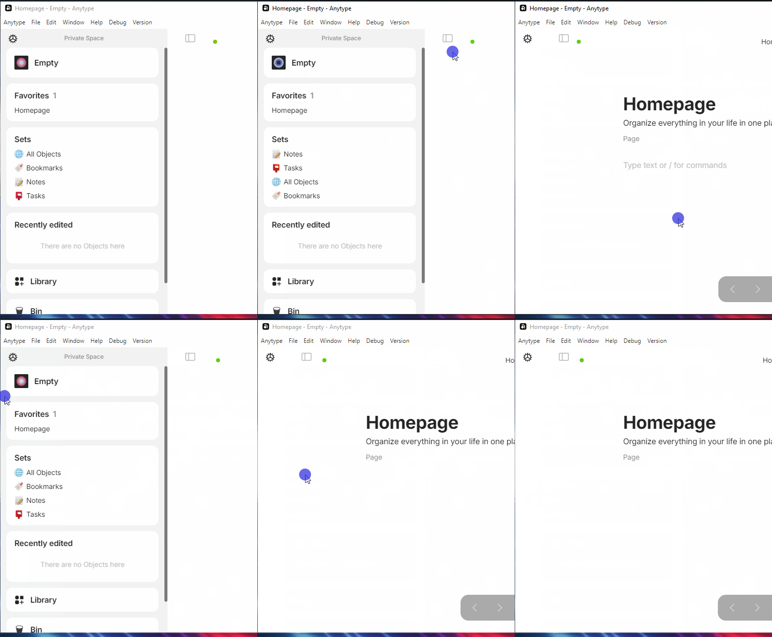
I wanted to manage the space bar better, even though the team is already actively working on it.
Here’s a proposal with what I’ve set up on my side (an example that needs a bit of fine-tuning)
It’s work with auto-hide active/inactive and with widgets hide/shown.
/* Global */
#vault{
    width:50px;
}

#vault .body{
    width:50px;
}

#vault #scroll{
    padding:0;
}

#sidebar{
    left:0;
}

#vault #scroll .isActive::after{
    left:-5px;
}

#vault #item-settings.item{
    width: 30px;
    height: 30px;
    margin:5px;
}

#sidebarToggle{
    top: 5px;
    left:5px;
}

/* Custom for autohide */
#vault{
    height: 35px !important;
    background-color: transparent;
}

#vault .head{
    display:none;
}

#vault #scroll{
    display:none;
}

/* Autohide */
#vault:hover #scroll{
    display:flex;
    order: 1;
}

#vault:hover{
    background-color: var(--color-shape-primary);
    height: 100% !important;
    box-shadow:0 0 3px black;
}