WHAT DO YOU RECOMMEND?
The widgets in the sidebar offer very limited customization. You can choose a source and the way it looks (compact list, list, tree).
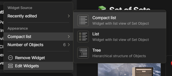
I believe offering more customization options will give Widgets more functionality and the user more freedom. It would also make the sidebar a lot more powerful as it is!
REAL WORLD USE CASES
The real world usecases are more flexibel, powerful widgets and sidebar! With the new source option to be the currently open object in combination with new widget views like the table of content and local graph.
This will tackle a lot of feature requests into a simple customization menu all at ones (like local graph, table of content in the sidebar, show object icon and more).
Additional, if we get a right sidebar in the future, you can expand on these widget settings with things like word count, backlinks and more.
Hope you like this mock-up and feature request.
HOW COULD IT BE DONE?
The mockup has been quickly done in a simple photo editor. Don’t judge on poor alignment or other style errors.
I suggest improving the (right click) customization menu, as shown in my example mockup below:
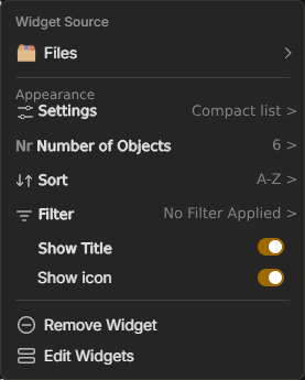
As you can see the following new features have been added:
- Number of Objects
- NEW: Sort
- NEW: Filter
- NEW: Show icon
- Widget Source
- NEW: Settings
Number of Objects
NEW: Custom number
Input custom number between 1 and 25 (for example, max could be limited by performance)
NEW: Sort
Sorts the objects in the widget. Can choose the following sorting settings:
- Sort as in object (shows the order as it is seen in that object)
- Custom (manual sort)
- Object name
- Last opened
- Last edited
- Creation date
All options can be flipped (A-Z too Z-A or Old-New too New-Old). This way you can create different recent object widgets or show the oldest ones.
NEW: Filter
Filters the objects in the widget based on simular parameters currently availible in set views.
This way you don’t have to make a new set or set view just for a widget. For example, you can simply make an Open Task widget based on your task set or make a movie widget with only movies you haven’t seen yet.
NEW: Show Title
This option shows/hides the title of the widget in the sidebar.
Optional you could add an option to change the widget title (without changing the object title).
NEW: Show Icon
I think this speaks for itself. Turns the objects icon on/off in the widget. For some more customization (which has been requested often).
Widget Source
NEW: Current Open object
-Choosing this option makes this widget dynamic showing the content of the the currently open object. This can have many new usecases with new widget settings as seen below.
Settings (Currently Appearance)
Here you can choose how the widget looks, there are three options already available but I would suggest these two new ones:
NEW: Local graph
Shows the local graph as a widget. Can be used with the new source setting: Currently Open Object.
NEW: Table of content
Shows the table of content as a widget. Can be used with the new source setting: Currently Open Object.
NEW: Show File (preview)
If a file like an image, PDF, audio or other file is added as a widget the option becomes availible to show this file. Meaning you can now add images to the sidebar.