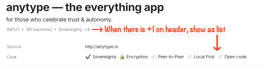
Appreciate team for allowing us to adjust how properties/relation work on canvas. I like the line view (on header) and list view (in block) for different reasons. However, sometimes I want to use both at the same time: some shorter properties in line and longer properties in list.
Also, as @Kerstie mentioned in post 2, many times we need full contents to be displayed and that’s why those properties are pinned. Hence, it would be nice if we can instruct Anytype to display contents in full, without wrapping.
HOW COULD IT BE DONE?
Easier implementation: allow users to assign which properties to go in line and in list. Just like header and properties panel.
More complex implementation: when the contents of properties/relation overflows the compact space of line view (e.g. just like how the +1 is shown when there is too much objects in a relation to be displayed on header), show them in list as blocks on canvas.
For even more sophisticated implementation (and in alignment with richer functions of properties and relation), maybe we can have a “Edit Relation” pane to specify the customisations of properties/relation, just like how we have “Edit Type” for Object Type. A relation library!!
Some examples for the customisations:
Full Display, Wrap, or icon only
As block, or in header
Sequence of displaying property/relation
REAL WORLD USE CASES
If there is not a lot of information, it is nice to be compact as one can. But when there is a lot, it is good to be able to see them all. The best thing is to show just the right amount of information needed.
ADDITIONAL CONTEXTS
If we are to implement relation library or something similar, we might need to consider how template or live template can decide or govern the relevant instructions if there is a conflict or have a way to prevent users from instructing same display format. While relation library might seem too much effort, this will work as the infrastructure of richer relation (and relation data model).
C.c, maybe you can update your FR to include “display all properties on inline header" or something like that? They seem to go hand-in-hand with your request.
I can’t remember how many times I’ve seen this complaint on feedback posts, I’m surprised it’s still not addressed and that this is the first FR. (If there’s another related FR, I must’ve missed it, please tell me so I can vote or comment.)
I believe the whole point of pinning properties to header is so you can find and read important information easily. Turning extra properties into +1s (or +4 in C.c’s example) kills the point of pinning that information.
What’s frustrating is that you can see in the screenshot that there is still so much space beside it.
This issue isn’t just about the number of objects within lists, it applies to longer properties, as well.
Example: I have a page for a property (literally a house) with an address property (address: block x lot x, xxxx street…) that I pinned to header, so I can see this most important info about it all the time. However, even without pinning other properties on top, it still won’t display the full address of the house. When you factor in the extra space beside it and the lack of “…” to indicate “more”, a casual onlooker won’t be able to tell that there is more info hidden in view.
My alternative ideas for the implementation:
simply display all properties/texts and then wrap if necessary, so it extends to the following line, or
Move longer lists/properties to a new row (and display all).
Oh, I did not realize there were uses for the current shortened version and you were specifically asking for both options — editing the existing one and the full list. Not my intention to complicate the FR, but thank you for adjusting it!
No worries. In my current, I also need full texts more than shortened contents, but I imagine when there are reoccurring objects or full function date object, we don’t need to view the complete contents of the same information repeatedly, just like FR icon only.
This is a big problem (that I’ve just discovered) on the iPad app too. I can view a list of properties perfectly well on the desktop app, in the properties sidebar on Android - but on iOS the list is truncated both on the page view and the properties panel.