Is your feature request related to a problem? Please describe.
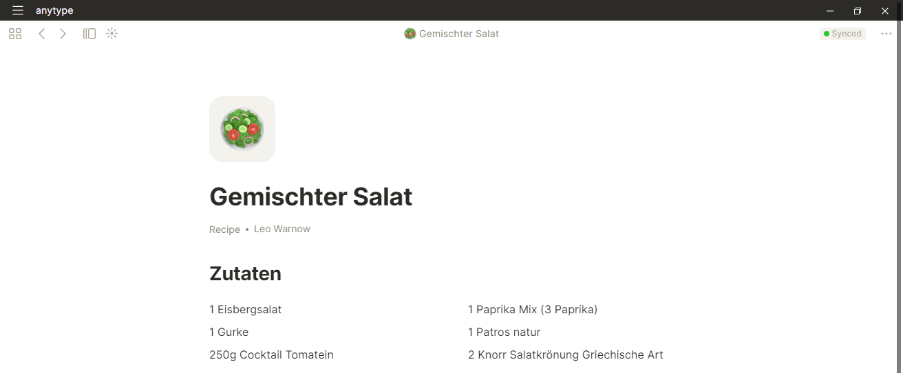
When using the default icons in Anytpe, some padding is added to them in the page view. In particular the padding is nor part of the icon itself, since there is only a small space between the icon and the heading in the title (upper middle of the page).
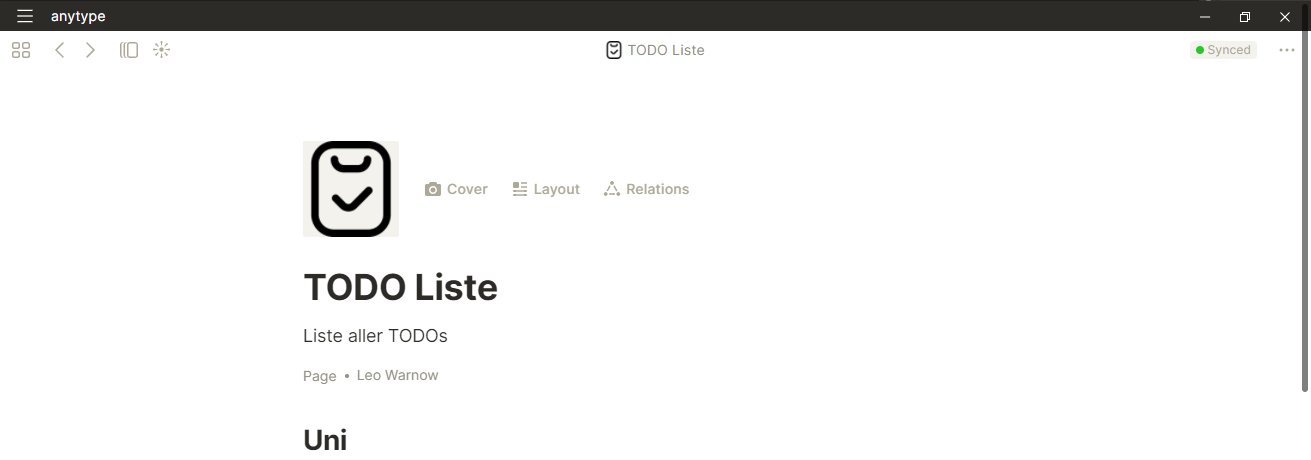
For customized (i.e., user uploaded) icons no additional space is added and hence the behaviour is not consistent here. Also this makes for an “ugly” look.
My second point is the background of the icons in page view. Since an the dashboard and basically anywhere else within anytype the background of icons is white it doesn’t really make sense to me that a yellow-ish background is used in page view - especially if no cover image is used.
Describe the solution you’d like
The solution for my first point is to add the same amount of padding/space around user uploaded icons as it is done for the default ones. This makes the application more consistent and simplifies the use of custom icons.
For my second point I would suggest to simply change the backgound color of icons in page view to white as well.
Describe alternatives you’ve considered
Especially for the padding/spacing problem, one could also ask the user to manually add a padding to the uploaded icons. However, this would not be a good solution since this additional padding would then make the icons smaller everywhere else (for example in the search bar) and also the spacing between the icon and the page title would then be larger as it is when using the default icons.
Additional context
To make clear what the difference between custom and user provided icons looks like, I include a screenshot for each case.
Yes this is definietly needed. I’d also like to have more default icons than just these emojis. The current emojis seem outdated to me (I don’t know if it’s using system icons or a specific emoji set but I don’t like them).
Notion fixed this by making a standard emoji format for all devices so everything looked the same (and they picked a modern flat aesthetic which looks better than the 3D ones).
Please also consider adding different built-in icon sets like Notion did with the new simple icons.
I would also like to have a consistent way of working with icons. In some places there are no background and in other places a background is applied.
Icon on the Home screen:
Same icon on Page view:
To solve this you can add a white background like this:
But this is going to look awful on dark mode:
It’s almost impossible to work with custom icons and make them look more or less fine because of how they are presented depending on the view and light/dark modes.
Can there also be support for importing icon sets? I’d like to use the Remix Icon set. It has more than 2,500 re-colorable SVG icons. Obviously adding them one at a time is not practical. An import process that supports naming and grouping both individual icons and icon sets would be fantastic.
I would absolutely LOVE to see font awesome SVG implementation into this app. They have a massive library and it would be super low on the resources of the app. I tried putting a few svg’s in and they are supported, but the SVG isn’t centered in the container.
If this was implemented, it would be a huge game changer for icons.