i @JorgeE,
Yeah of course you are right.
The Homesscreen would make more work for DevTeam.
But the Collection-Work-Around is still a work around, if you know the smooth workflow with the legacy Homescreen.
All was so simple and obviously before beta to work with a lot new Pages/notes/Objects.
One click on Favorites, done. From any point in App-Deepness one click on bottom-middle and one more to change to next Object.
In any device the same simple path to move fast from different objects bye two clicks.
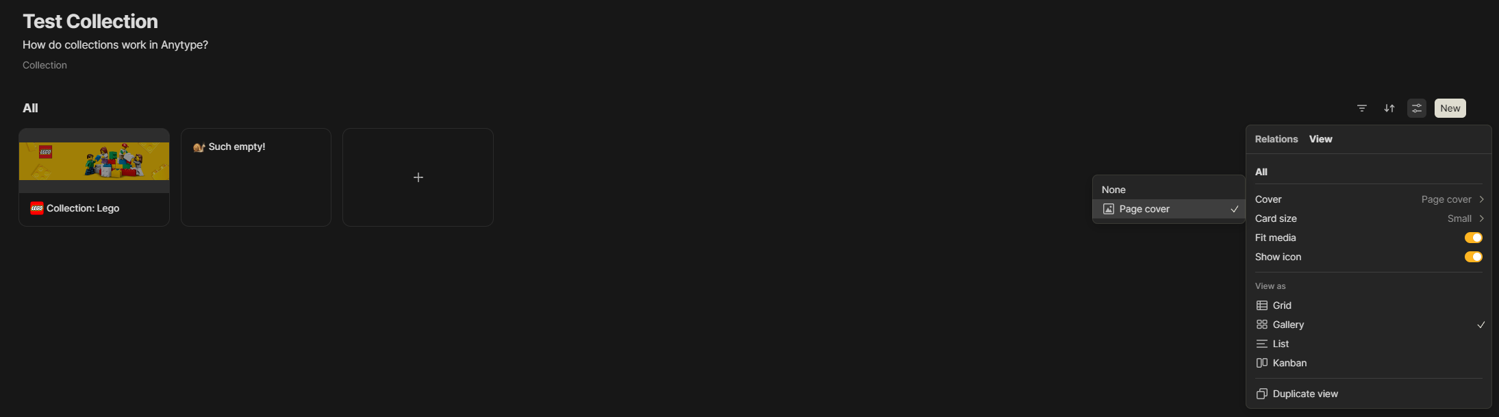
Maybe the Collections will get better. But currently it seams the order especially in mobile is not synced and every change in mobile needs 2 clicks more and the loading for collections is not as fast as the old Homescreen.
Also in desktop there are more clicks to do (open the page full-wtih) and the time until I’m again ready to work in next data-set is longer.
I know 2-3 seconds and 2 clicks more: who cares!?
But if you change a lot every hour and create a lot new data-sets it feels paining.
But yes, without a comparising to the legacy-smooth-fast-and-less-click Homescreen and with only a few pages or only to take some notes every few days, it’s fine.
And yes, anytype is a great tool, I love it.
But the legacy (IMHO) Homescreen-solution was much more intuitiv (The “Add to Favorites” button alone was a blessing, and combined with the “go to Favorites” bottom-middle – ohh I miss both of them a lot) simpler and when switching between many elements, especially in mobile but also on desktop, it feels like there is now extremely more time wasting built in.
But without direct-comparison all is fine. Maybe it could be or will get much much easier, faster and more built-in intuitivity some day or version.
It’s just a pitty that brilliant things are being cut without replacement.
I would immediately switch back to legacy if it wasn’t a dead end and all important data-sets are changed and not backward compatible.  .
.
But it’s not whining or complaining, it’s just mourning…