Thank you!
Can we have a Beta-update?
I don’t know what to do with the github stuff.
Thank you!
Can we have a Beta-update?
I don’t know what to do with the github stuff.
Unfortunately not yet since there were changes on the middleware side so we will build new versions after holidays. I can help you build from branches if you want.
Thank you, but no.
I better wait for the update.
By the way,
could we have a stronger zoomout please?
It would also help if the graph would try to fit all Objects into the screen.
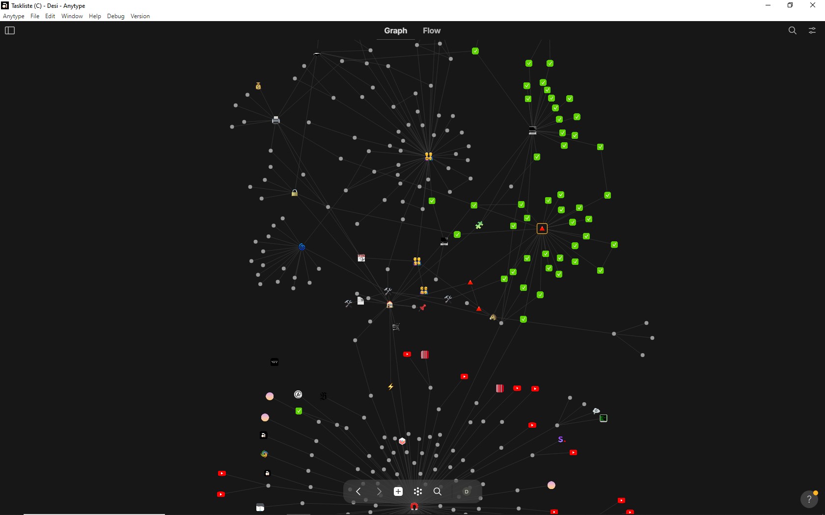
Often it happens, that the graph assembles the Objects in a more vertical order, letting the screens left and right area mostly unused.
The first pic shows a bad result; cropping on top and bottom, despite of much unused space to the left and right:
We can’t as it is minimum zoom value - 1, the only thing we can do is adjust forces so nodes will be closer to each other, but this leads to another problem with nodes starting to overlap each other and clipping relation names on edges.
I think from my perspective that the issue of the amount of nodes present on the screen should be solved with persistent filters and different views, but this issue is stale on middleware, so I’ve decided to bring graph to set views because filters are already there.
Thanks for your thoughts.
Obsidian can Incredible wide zoom out.
Hard to understand, why Anytype can’t …
There even exists an Addon for Obsidian, which can show the graph in 3D …
But OK, one can’t get anything …
But I miss one filter switch, which would also help a lot:
Most Objects are around Collections. Often the linking ends on the first node, because it has no further outgoing links.
The object type “Note” is a good example for that.
There are many Notes, but they often don’t have further links then tho one to/from the Collection.
The filter I miss would switch such “only-one-single-Link” Notes off. Because they’re not relevant.
Relevant are mostly only such Objects which have more than only one link.
If we could switch off the “single-link-Objekts” the graph would become much more compact and fit much better into the screen.
I think we can do it easily if @ignatovv approves.
Btw.: I don’t think that’s important.
Because if we zoom out we all know that the Object’s names become suppressed.
No matter if also the relation names become clipped.
If we want to see them we can zoom in again.
I would find it important to have the possibility to see the whole picture of my structure.
No matter if texts are suppressed or not.
One rotation of the mouse’s wheel for zooming in and the texts are there again, if there’s need to see the details.
We already have such feature request on the forum. Give it a vote.
Oh I finally remember. Edges and nodes/vertices are the language of Graph Theory… I will keep this is in mind and use this language for future graph discussions.
May I suggest bringing back the word orphan instead of using unlinked objects to avoid the confusion with ‘links’ option.
My suggestion:
“Orphans (unlinked Objects)”
Not much longer, but clearer.
This was product team decision, I’ve mentioned Vova in this thread already.
Testing the v0.37.13 I’ve found that the Graph View is a topic again …
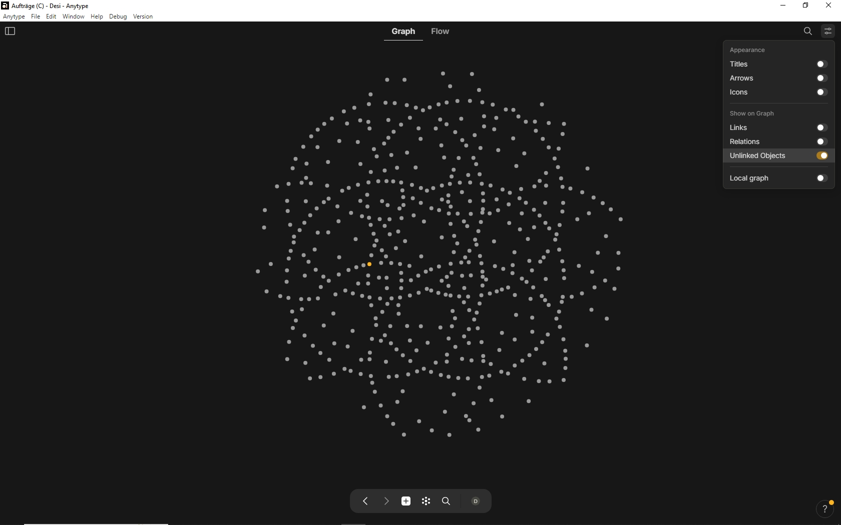
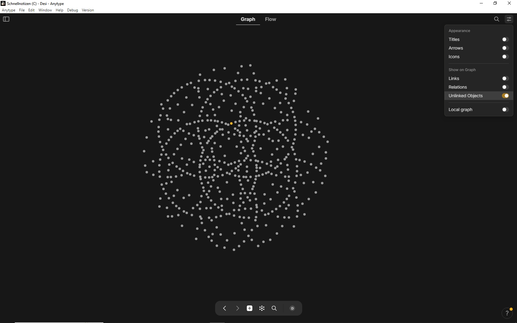
All switches left, but “Unlinked Object” right, I get this picture:
Ehem, these dots aren’t “unlinked” Objects!
There are even Collections in these dots. They have not only outgoing Links, but also at least one incomming Link.
I have no “unlinked Objects”.
So I would expect an empty screen with no dots.
Well, I need some examples of these objects, do they have any links in Links from this object relation?
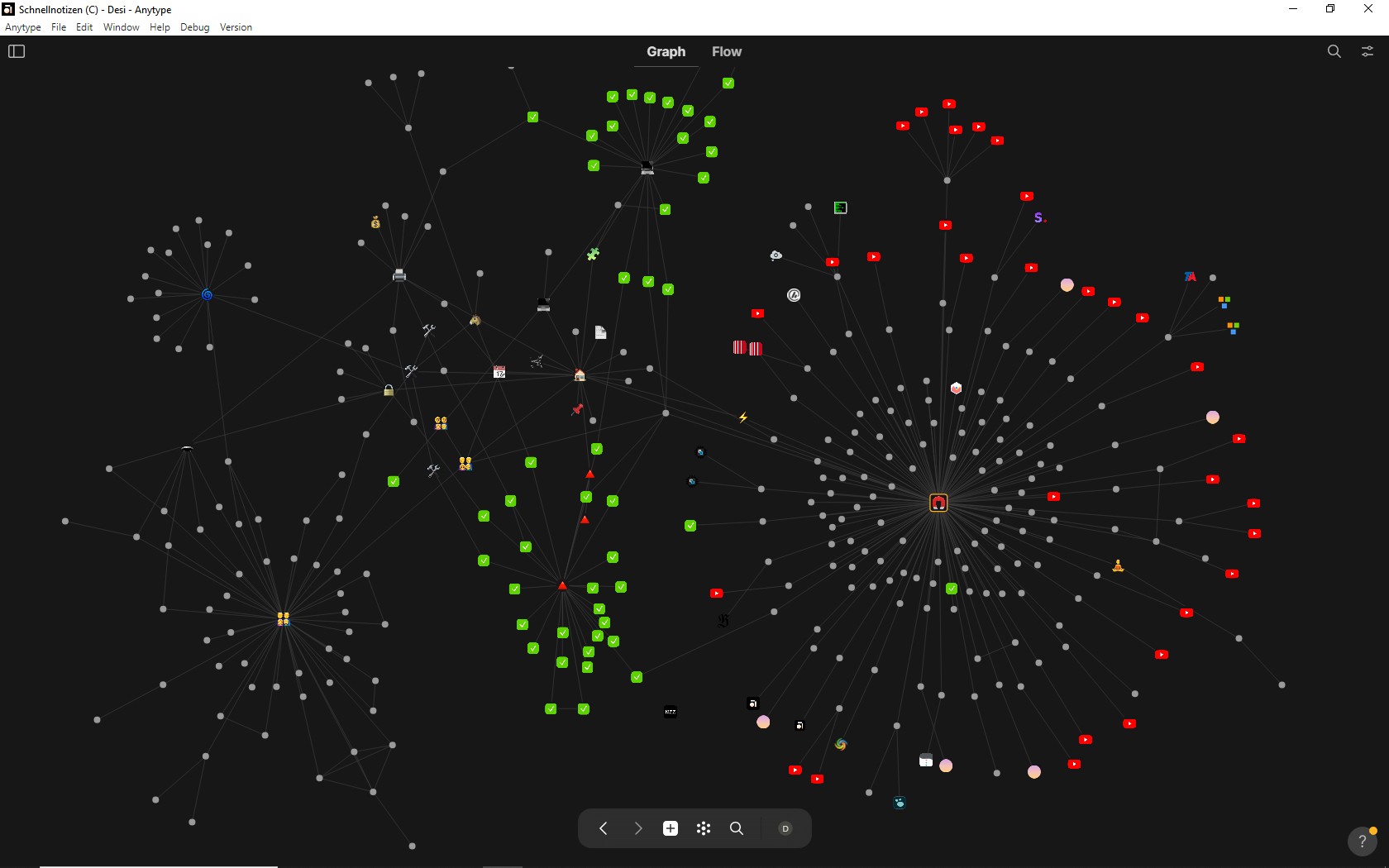
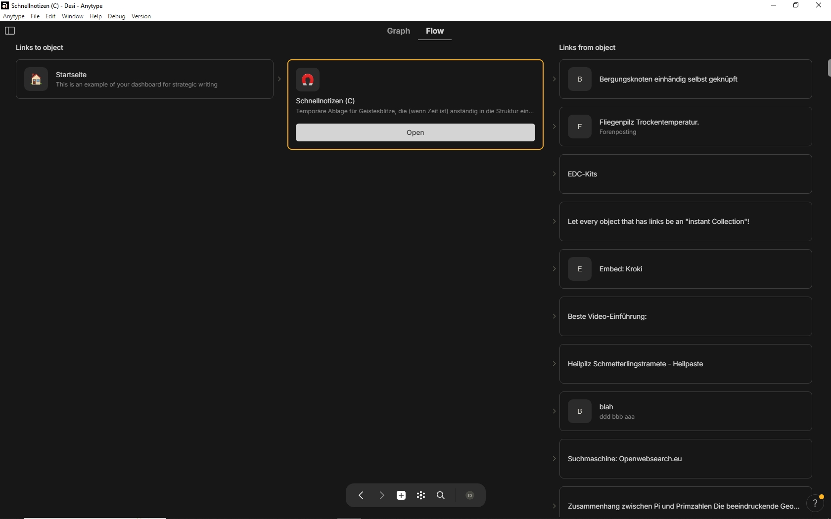
This is the Flow for my Collection “Schnellnotizen (C)”:
.
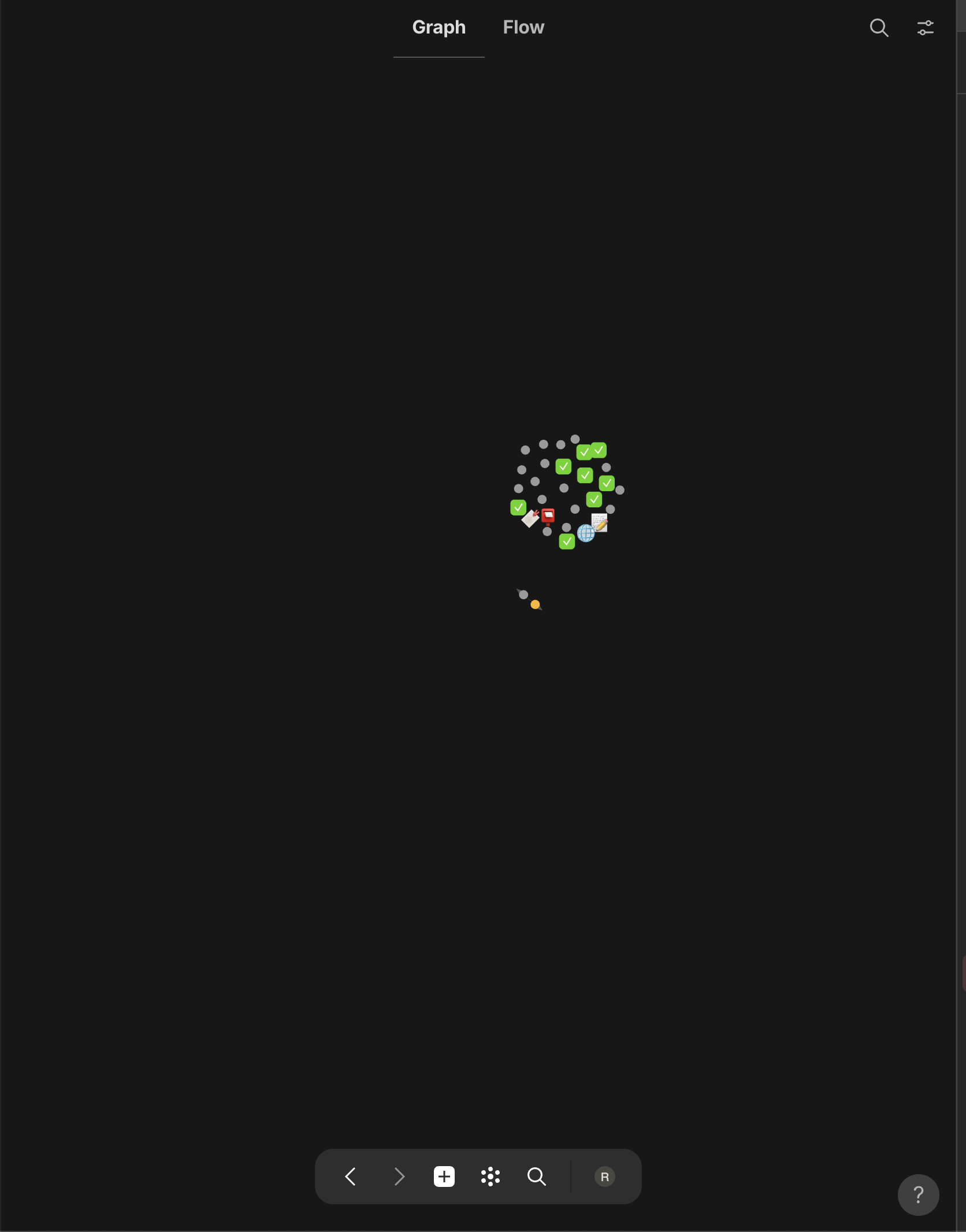
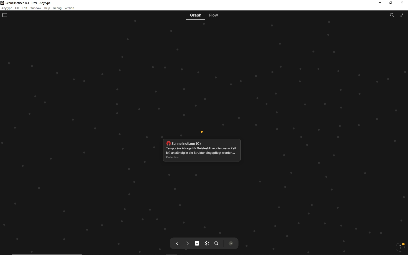
And here is the Collection in the Graph (settings as in my last post):
.
I understand the switch this way:
“Show ONLY Objects which have NO Link at all!”
That means:
The Collection has both! It shouldn’t be visible with this switch setting!
But also the other Dots have some kind of Links (incoming or outgoing, or both).
None of these Dots should be visible; none of then is an orphan!
We have removed collection links from Graph because they were creating huge flowers after import, we can discuss this again I think @y0ur1
I’m not sure if I understand your post correctly?
In v0.37.14 beta the Graph shows Collections. I have no problem with it at the moment.
But this is not the point …
The point is, that I would expect an empty screen in this setting:
But I don’t get the empty screen. Although I would expect it, because I have no unlinked Orphans!
With all switches Off I get the expected empty screen. Fine!
Changing the switch “Unlinked Objects” now to ON shouldn’t change anything on this fact in my case, because I don’t have any unlinked Orphan, so there should be nothing to show.
Why does the screen show a huge lot of Objects in this setting, although all of them are linked?
This is clearly a bug!
What has this bug to do with your last statement?
Actually idk why, looks like a bug but do not have any idea where it is yet.
V3.17.17-beta:
According to the History in the apps menu, the prob in the Graph with the unlinked Object should be solved.
Graph:
Unlinked objects toggle now properly reflects unlinked objects when it is the only toggle selected. Thanks, Balcion!
Updated logic for filtering links, relations, and unlinked objects.
Unfortunately this is not the case