Feedback about the 0.42.28 pre-release

What do you need help with?

Here is my feedback about the 0.42.28 pre-release.

:white_check_mark: Pros:

  • Templates as Objects !
  • New defaults profile pictures, it’s better than the previous very old design style. Even if now it lacks personnality.
  • Better Sidebar icon emplacement.
  • No more Space type indicator “Entry/Private space”. I just hope that you will get rid of this distinction to let us share or delete our private space. Otherwise, it will be more confusing if we cannot easily tell which is the private one.

:double_exclamation_mark: Cons:

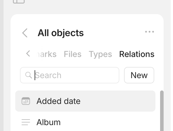
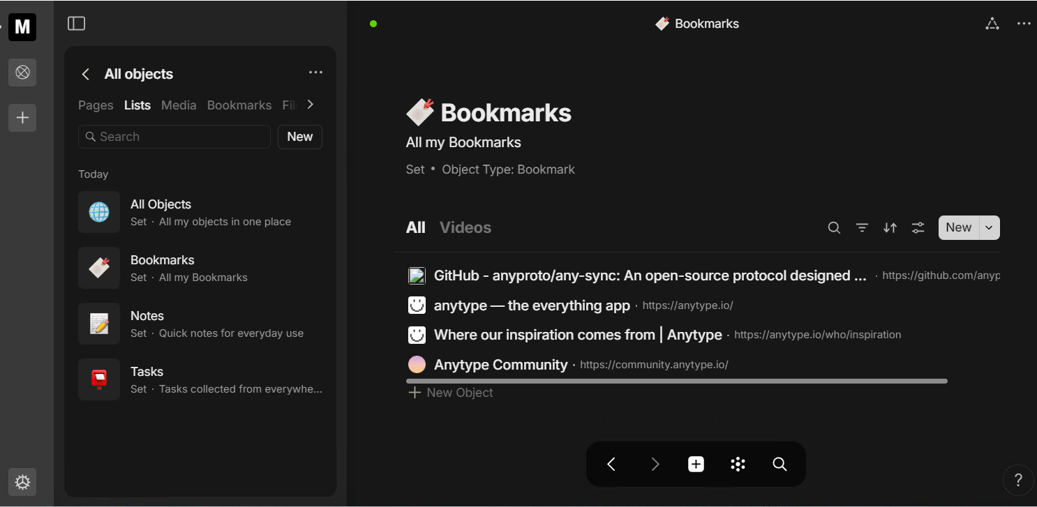
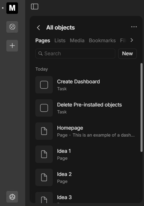
  • The “All objects” widget doesn’t list Relations, why? There is no way to find Relations anymore.
  • The “All objects” widget locked on top which means we lose valuable space in the sidebar.
  • The “All objects” widget displays far fewer objects at a glance than before. I think it’s detrimental to contain such long lists in a sidebar. Another step backwards in UX.
  • The hidden, non-intuitive and nontraditional location of the Bin is a mistake. What’s more, it makes us make more clicks than before, so it’s an obvious UX regression.

OS

Windows 11

Anytype Version

0.42.28-beta

Network Mode

AnySync

We plan on getting rid of this distinction in the near future.

The rest was shared with the team.

Solid feedback, I was about to type one myself but I’ll add mine to this topic.

The All Objects widget is great in my opinion. Though it does require some improvements.

  • The ability to open the All Objects widget into a full screen version (like the bin)
  • Add relations to it, the relation library is gone now (or not accessible)
  • Bin is indeed hidden in the UI now
  • Lists is Sets, that is a bit confusing name-wise
  • Search should get filters (but that goes for search in general, not just for this widget)
    • For example: When you click search in the pages menu, filter on a specifc page type

The new colors in this update for darkmode are really, really dark. In the color picker you can hardly see the colors in the small circles and Yellow and Amber are to much the same color.

Other than this, a lot of great smaller improvements! Thanks.

I agree with much here.

  • All Objects feels crammed to use. It doesn’t feel intuitive. The bin needs to go somewhere else for the same reason.
  • I understand that both Sets and Collections are list-type objects.
  • Colors definitely need more contrast.
  • Quick-capture when opened should accept keyboard input for quick search.
  • I also think the Spaces sidebar is a bit wide, specially on my smallest (14") notebook. (just being picky, i guess…)

I’ve noticed this new update goes well beyond simple placement for some UI elements. Still waiting for the changelog. I think it’s a big one. :slight_smile:

Nice feedback, I’m sharing most of your pros and cons.

The All Objects locked on top is my major concern

I don’t check often the bin so I don’t mind having it hidden but mods must be ready to answer hundreds of time “where is the bin” posts because its really not intuitive.

About pros I really enjoy the new small UI changes (objects icons, editor less yellow everywhere, etc…). great work !

  • We’ll add the relations tab
  • This is a temporary solution and part of the new navigation coming in the release after next.
  • We’ll fix this too
  • Bin - we’ll move it to another place; this is also a temporary solution

thanks!

As one of the people who asked that just today, I agree :skull:

Looks like the Relations tab has been added in 0.42.30, yay!
Screenshot 2024-10-07 at 7.25.38 AM

I want to share my feedback really quick about the all-object menu, I hope really the team take them into consideration as well

First of all, the hierarchy of the all-object menu is currently split into the following:

1, Pages 2. Lists 3. Media, 4. bookmarks, 5. Files 6. Types, 7. Relations

**
First , let’s simplify a few of them. One of these tabs is totally unnecessary and doesn’t need special treatment, which is the Bookmarks tab. In my opinion, if I want to show my bookmarks, I will already have a set to display them.

Especially since even the newcomers, after creating a new space, will have a bookmark set already available under the Lists tab, as shown in the image below. So, please remove it because it wastes space and complicates navigation through more important tabs.

Second, the Media and Files tabs can be merged into one. I don’t have a specific name for this combined tab, but to improve clarity, it would be better if there were dropdown menus for each category: files, music, videos, images, and so on.

Third, why is the first tab named Pages instead of Objects? I find it a bit odd, but you can correct me if I’m wrong. Anyway, the objects need to be more compact to display more items instead of the current layout that suits only the lists because you will have fewer of them.

This all I had in my mind now this will make Hierarchy better
Objects, Lists, Media, Types, Relations.

1st:
I agree.

2nd:
I kind of agree and it could simply be called “Files & Media”.

3rd:
The thing is every Lists, Files and Media are Objects too, so they cannot really called it Objects. They currently are Pages type only, probably because they want to help newcommers that are used to Pages from other softwares, which I understand but not agree with because every Object type should be displayed from the Types tabs only.

  1. Agreed
  2. “Files” is the overarching concept, as media files are specific types of files. So “Files” would be the right label for this tab.
  3. “Pages” is very confusing and really doesn’t work, but there are no easy solutions here because as @Morgan1989 mentioned lists and files are objects too. But one way of dealing with this is that the tab is renamed to “Objects” and includes all objects, including lists and files.

Oh! now I understand. Pages still nice term no doubts but I wish the pages would be more compact to show more objects.

Edited:btw @anton mentions before that collections/sets is no longer called objects and for files, videos, images, music it can be not referred as objects simply since it’s not works like other types, and it can be referred as media instead.

Yes, Files it owns can works to contain all of them.

In upcoming releases, we are introducing the concept of formats. Our basic formats include:

  • Page – a block-based editor (current Page, Note, Profile, Task)
  • List – a data view (current Collections and sets)
  • Link – a bookmark
  • Media – media files (audio, video, photo)
  • Files – all other file types
  • Types
  • Fields – relations
  • Tags – special view for tags

These formats can potentially be extended in the future with options like whiteboards, chats, and more. You can think of these as system types. New users will initially encounter only these formats, which should provide enough context to understand the system and derive value from it. Over time, they can evolve to create a custom type system if needed.

For new spaces, only two objects will be included: the welcome letter and a ‘Get Started’ guide, with no bookmark set. Therefore, keeping bookmarks at the space level is crucial. Ideally, they would be called ‘Links’ instead, as it shortens the term by five characters.

Media and files should also be separated, as media will have it’s own way to consume.

Regarding Pages in ‘All Objects’: they are all objects of different formats (system types). I hope this clarification helps.

The compact view for all objects on it’s way.

Got it, thanks for explaining.

I think the concept of formats make sense given the direction that you’ve outlined for Anytype. But if you introduce a new concept, please please please get ride of one (or more!) existing concepts. Part of the steep learning curve with Anytype is all the concepts: objects, types, relations, layouts, templates, collections, sets… It seems like we’re getting “fields” as another concept (hopefully replacing relations, not in addition to it), and to be honest, this is all too much.

I’m hoping that the concepts of collections and sets completely disappear and that we instead just have lists (it could be automated lists (formerly sets) and manual lists (formerly collections)), but beyond that, there is still a need to simplify the Anytype user experience. There should be less concepts.

Exactly. That’s the idea. You would only need to know simple concepts like pages, lists, and a few other self-descriptive formats. All additional elements, like templates, can be learned as needed. The idea behind lists is to merge them into one. There will be lists (collections) and smart lists (sets).

Good points @anton, But! This will make more unnecessary tabs, the current numbers of tabs are already too long with total 7 tabs so imagine adding Whiteboards, chat and more into the future unless you thought of better ways to navigate between them since. I don’t imagine myself swipe twice to reach certain tab.

in my opinion bookmark is still a block-based editor I can adjust, highlight, or write in the bookmark object I have; it doesn’t need to be separated glorified category. and instead, it should be part of pages.

Media and files it can be simply referred as Files or attachments boring. and be in own tab with drop menu separate each category. think of it like windows default user folders, documents, videos, picture and so on. documents here in windows resemble any type of files like pdf or etc.

In my opinion it should in any in empty spaces it least has few sets of objects like bookmarks, tasks, notes and pages even if it’s empty. If I didn’t like them and I wanna make my own lists I would just delete it. because this’s the purpose of lists anyway. and will be simple for newcomers as well.

Waiting for it. but compact view for me it suits the pages tab and something like lists tab it should be the same. anyway, great improvements

Links will be their own format—not like a block-based editor. I agree that navigation could become less convenient as more formats are introduced. We have some ideas for addressing this. For now, we consider this to be the optimal solution.

Sounds good. If you have an elegant design solution for this, we would be very grateful if you could share it.

This is a bit controversial. We’ll experiment to see what works and what doesn’t.

Yes the same

Yes, Please I’m hoping for better ways to navigate between these sections since I don’t imagine navigating around protentional over 8-9 tabs in the future

For now, all I think of is to have one tab for Files that have drop menus for each category, Files, Videos, Audio and images similar to the kanban widget style. but it might there’re better ways as well.

having it least the necessarily sets like tasks, pages, notes and etc… even if doesn’t have any pages seems for me like good idea for newcomers. since it will categorize it automatically these core lists without extra effort. since already there’s pre-installed relations that it can help me, or I can delete it in the empty space anyway.

And one last note about bookmarks, look I’m big fan of using anytype to collect bookmarks instead of using the current service I have Raindrop. If I wanted to display the bookmarks I had, I would have side widget for bookmark set and even better with the filters and the view I want. and this will make the bookmark tab that inside all-objects pointless. anyway, it doesn’t bother me this much.

All this sounds very interesting! Thanks for sharing!

May I ask how the concept of “Layout” will be continued? Is each format then still possible to have those different Layouts?

image

These layouts will be possible to use for the format - Page. When implemented you will be able to change these layouts for all objects at the same time via type settings.