WHAT DO YOU RECOMMEND
Preview options for relations
HOW COULD IT BE DONE
When opening the relation block’s settings, there could be an option to change the relation’s preview. It can be named “Appearance” (like in widgets) or “Preview Layout” (like in object links).
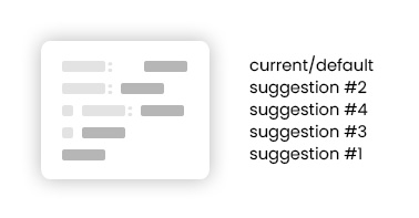
Suggestions for the Appearance/Preview choices:
- Relation value displayed without its name
- Relation name and value displayed close together and not in separate columns
- Display an icon in place of the relation name beside the relation’s value (will this require a separate feature request?)
- Display an icon along with the relation name beside its value
Then, of course, the default appearance that we have now, which is the relation name and value in separate columns. (there’s space after the colon)
I am not sure how to describe these options in fewer words. Perhaps it would be best to offer a visual representation for the popup?
REAL WORLD USE CASES
#1 is for instances where I need to display the relation value without its name. I think, among my suggested previews above, this is the one that I would require the most. Examples of use cases:
- Writing an author’s name below a quote
- Displaying credits, references, and sources – sometimes, labeling a source is just unnecessary
#2 is mostly a design choice. Oftentimes, I find myself wishing the relations wouldn’t occupy too much space. This is especially noticeable when you have other blocks/columns beside the relations.
#3 and #4 are for creating a professional webpage look:
- Displaying social media accounts/credits
- Adding visuals to object links (Example is recreating a widget look inside the canvas)
- Making a page (like a resume) look more visual and professional by adding custom/color-themed icons to relations
- When creating a profile/contact page, the icons also aid and/or better represent the information/relation listed for each person. (Example: home address, contact number, favorite food, etc.)
- Assigning custom icons will also have the benefit of having a fixed visual representation. When adding emojis to tags, the android design is often translated very differently – and way uglier, in my opinion – on Windows. While this FR won’t solve that issue, I’d still like to point it out because the icons for relations will look more professional with its consistency and fixed design across all devices.
RECOMMENDED ALTERNATIVES
For #1 and #2, I just rewrite it as regular text.
#3 and #4 have no alternatives.
ADDITIONAL CONTEXT
I found this feature request where some of the ideas overlap. #1, in particular, can be done by having inline relations. While I have no need for my relations to be inline as of this writing, the FR would make a good alternative for my suggestion #1.
However, I’d like to point out that my FR also has its own use cases and benefits, as it focuses on how relations are separately displayed in a canvas. At present, we only have one appearance/preview for relations, which is constricting, in my opinion. As you add different types of information on a page, the lack of a display alternative can be a design weakness.
I understand this isn’t a priority type of FR, but I hope the team will give it some thought for future updates. Thanks! ![]()
EDIT
There’s also another Appearance request. This one’s directed at Relations in Sets, but I also like the idea of icons-only relations, provided that it’s clickable for objects and URLs.