Is your feature request related to a problem? Please describe.
Current toggle design > is not as useful as it is. It does not provide a hint whether the particular toggle has any content within it when the toggle is closed.
Describe the solution you’d like
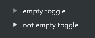
Similar to notion where if there is content within the toggle then it should bold and filled in and if there is no content within the toggle it should be shown in a lighter grey color to hint visually that there is no content within the toggle.
Describe alternatives you’ve considered
Another way could be, instead of having this (>) we could have it like triangle hollowed and closed like this, ∆ (this symbol in with pointed area pointing to right) and filled in triangle like notion to indicate that there are content in the toggle.
The problem
Currently there is no way to identify if a Toogle is full or empty without opening it and in my opinion this is problematic.
The solution
Distinguish the Toggle states with empty and filled arrows. Here is an example of what’s need to be done in my opinion.
ㅤ Alternatives
Indicate by myself if the Toggle is filled or not, but this is not a satisfactory solution.
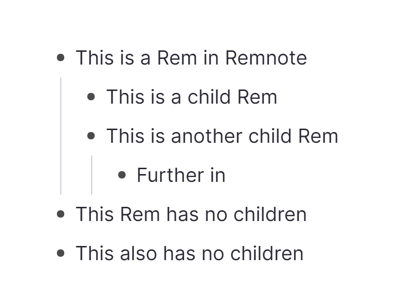
To me, even better would be if instead of having toggles as an explicit type of block, the behaviour would simply be there for any nested blocks. So there would never really be an “empty toggle”…
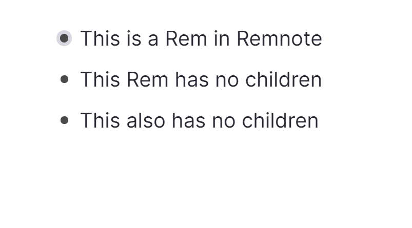
That’s how RemNote does it. It’s very intuitive, simple and powerful.
I am torn by this approach. In theory it’s very practical but in reality I’ve always found this kind of visual hierarchy far too invasive and disturbing.
A note-taking tool should try to be as unobtrusive as possible to invite writing and allow you to quickly spot the distinctive elements.
I’m afraid that programs like RemNote or Dashword are visually too confusing.
If an outlining navigation as to take place someday, I think that the visual approach of Workflowy would make more sense.
What specifically do you find visually confusing in RemNote? It can indeed get quite busy depending on what type of content you have (especially with the spaced repetition features). But it’s all optional. Even bullet points can be removed/hidden (or styled via CSS).
 Subtle yet useful