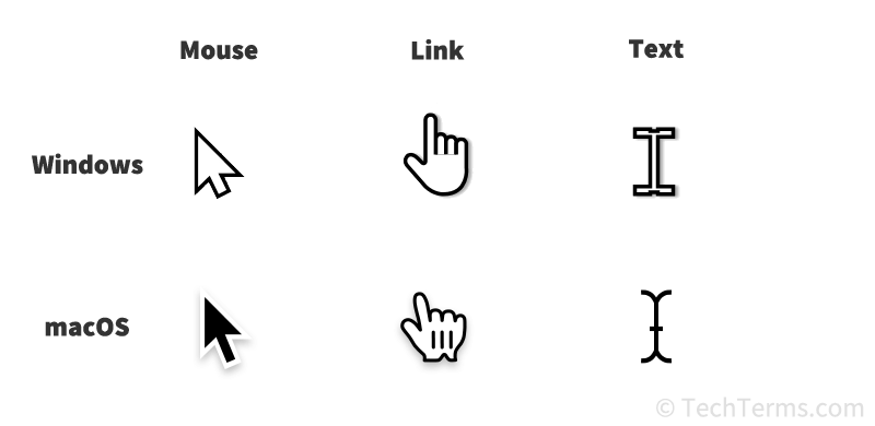
I caught myself thinking that I miss having different cursors for different scenarios when using the app (opening links, navigation, buttons). Basically, right now we only have the default cursor and the text cursor.
Yes, fully agree. I find these AT quirks cool but not intuitive for all users. Hence, making actions explicit and obvious would probably be a way to go for a more widespread adoption (and for me to advertise to non-tech people).
I am also getting confused with links, for example, and what happens if I click somewhere. Editable fields vs (non-editable) labels, etc.
However, I’m quite happy that these are the categories of problems we are moving onto now. It shows that some meaningful progress has been made recently in terms of stability and functionality overall.
Yes, that’s the “app style” that Anytype uses, and I think and it’s unlikely to change. Personally, I prefer a “web style”, where links and buttons are made more recognizable by using a pointer cursor.
My custom CSS only takes into account spaces, widgets, and cards, which is enough for me: