Hi Anytype Team,
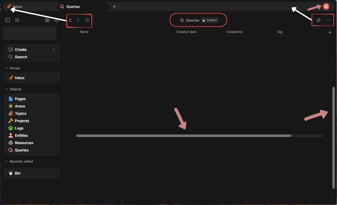
First of all, thank you for building such an amazing tool. I am using Anytype on Windows 11 and absolutely love the experience. However, I’d like to propose a few UI/UX refinements that I believe would significantly modernize the app’s look and, more importantly, maximize the content viewing area. I have attached an annotated screenshot for reference.
Here are the specific suggestions:
1. Modern Overlay Scrollbars
-
Current State: The scrollbars are quite thick, persistently visible, and occupy dedicated viewport space.
-
Proposal: Transition to auto-hiding overlay scrollbars (a standard pattern in modern UI design).
-
Auto-hide: Scrollbars should be completely hidden when the screen is idle.
-
Scrolling state: When scrolling, they should appear as thin, semi-transparent indicators.
-
Hover state: When hovered over, they should expand to a thicker, fully opaque interactive state.
-
Floating: Most importantly, they should float above the content (overlay) rather than taking up permanent layout space, saving screen real estate.
-
2. Unified Tab Bar / Header Bar
-
Current State: There is a tab bar at the top, followed by a secondary header row containing navigation arrows, the page title, and right-side action buttons (pin, more options, etc.). This takes up valuable vertical space.
-
Proposal: Merge the secondary header into the tab bar to streamline the UI.
-
Native Window Controls: Make the tab bar the default top app bar, and include standard native window controls (Minimize, Maximize, Close) directly on the far right.
-
Relocate Action Buttons: Move the functional icons (back/forward arrows, pin, overflow menu) up directly into the tab bar alongside the tabs.
-
Remove Redundant Title: Eliminate the secondary centered page title entirely. The active tab’s name already provides sufficient context for the user.
-
Benefit: This unified approach removes an entire horizontal row from the UI, minimizing distractions and giving maximum vertical real estate to the actual workspace and content.
-
I believe these adjustments will make the desktop app feel much more native, sleek, and focused on Windows 11.
Thank you for your time and consideration! Keep up the great work!