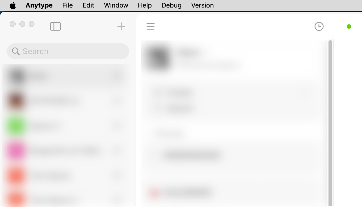
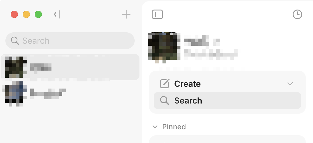
The secondary navigation in the latest version of Anytype lacks clarity due to inconsistent entry and exit points.
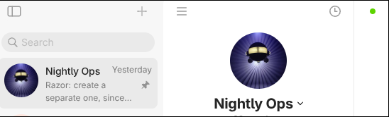
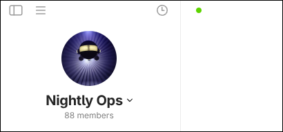
Before opening the vault switcher, there is a clear icon in the upper-left corner indicating how to open the vault navigation. However, after clicking this icon and entering the vault navigation view, the icon disappears. (See pics below)
The only way to hide the vault list is through a button located in the middle of the primary navigation area. This creates an asymmetric interaction pattern and makes the navigation behavior difficult to understand.
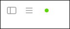
A more consistent design would be to always display both controls: one for showing or hiding the vault navigation, and one for showing or hiding the space navigation.
Device
M2 MAC AIR
OS
SEQUOIA 15.7
Anytype Version
V0.51.0
Network Mode
AnySync
Technical Information
OS version: darwin arm64 15.7.2
App version: 0.51.0
Build number: build on 2025-11-24 13:22:00 +0000 UTC at #56332997cccf1a5126ad0a7789013a1fc37b2f59
Library version: v0.45.5
Anytype Identity: ABEH3njPGe4ZvKWkxuw4AkhDWdMTk18qcXb23ZeaGjXFdUAi
Analytics ID: 23678bf7-3296-49eb-9344-cba37954e10f
Device ID: 12D3KooWKiVJv8xtzRMNWTKysHhxn61hGPzf8RwXjCLVNYQ1ESiB
Ethereum Address: 0x0B5F41957f383bBB2c271f7d3cC05AF6aFcEa286
True. Before clicking, the “Toggle Sidebar” button is rendered as: <div id="sidebarLeftButton" draggable="false" class="icon toggle sidebarHeadIcon withBackground"></div>. After clicking, it becomes: <div id="sidebarLeftButton" draggable="false" class="icon toggle sidebarHeadIcon withBackground sidebarAnimation withSidebarLeft"></div>. It then disappears because the following CSS rule hides it: #sidebarLeftButton.withSidebarLeft {display: none;}.
I don’t understand why it’s implemented this way. There is no reason for it.
And should these tow tabs be in the same column? It should hide the tab, not the button.
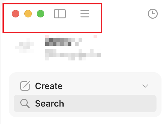
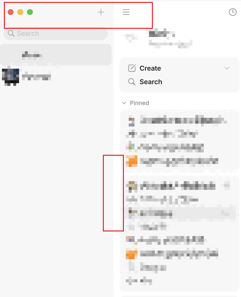
This is what I mentioned some weeks ago. I still don’t understand why the two buttons for Widgets Sidebar and Vault Sidebar can’t be permanently visible, which would be logical and consistent.
Unfortunately, this was deemed “visually heavy and confusing” and instead, the somewhat strange little clickable handles were introduced, which only appear on mouseover and are probably completely unexpected for most people. To me, this solution feels a bit clumsy.
My two mockups show how all buttons can exist side by side. I don’t actually find this solution heavy and confusing, but rather just as one would expect.
This was probably a bug that slipped when this was fixed for Linux last week or 2 weeks ago. I worry that fixing it for one platform, broke the other … but that might just be from vague memory.
Yes, that looks good on Linux, but on macOS you have the traffic light buttons in the upper left corner, so the Channel/Space bar button would have to be next to the + button on the right side of the Channel/Space bar.
 … but that might just be from vague memory.