Just to be clear, what I mean is the highlighting of the related lines of the TOC icon when scrolling a page with headings.
In this case the question is, when exactly is a heading defined as the "active” one when it is scrolled into the viewport? If you scroll down a page, the headings appear from the bottom. In which area does a heading have to be so that it triggers the corresponding highlighting?
The area defined for this is different in each application. Each seem to follow a different strategy.
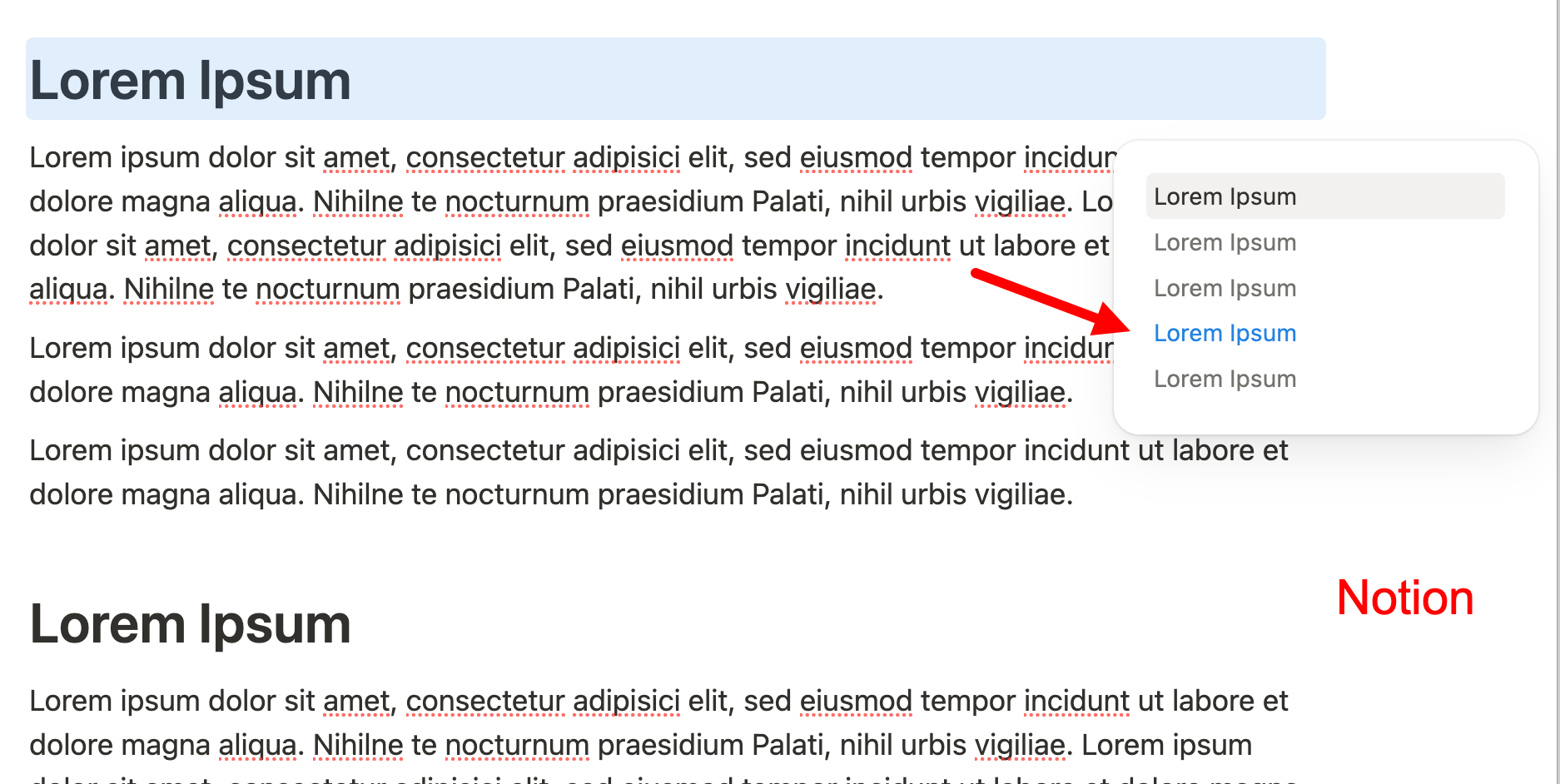
Notion uses an area in the middle of the viewport: if a heading “appears” from below and reaches the middle area, it already triggers the highlighting of the corresponding line of the icon (and not only when it reaches the top of the viewport).
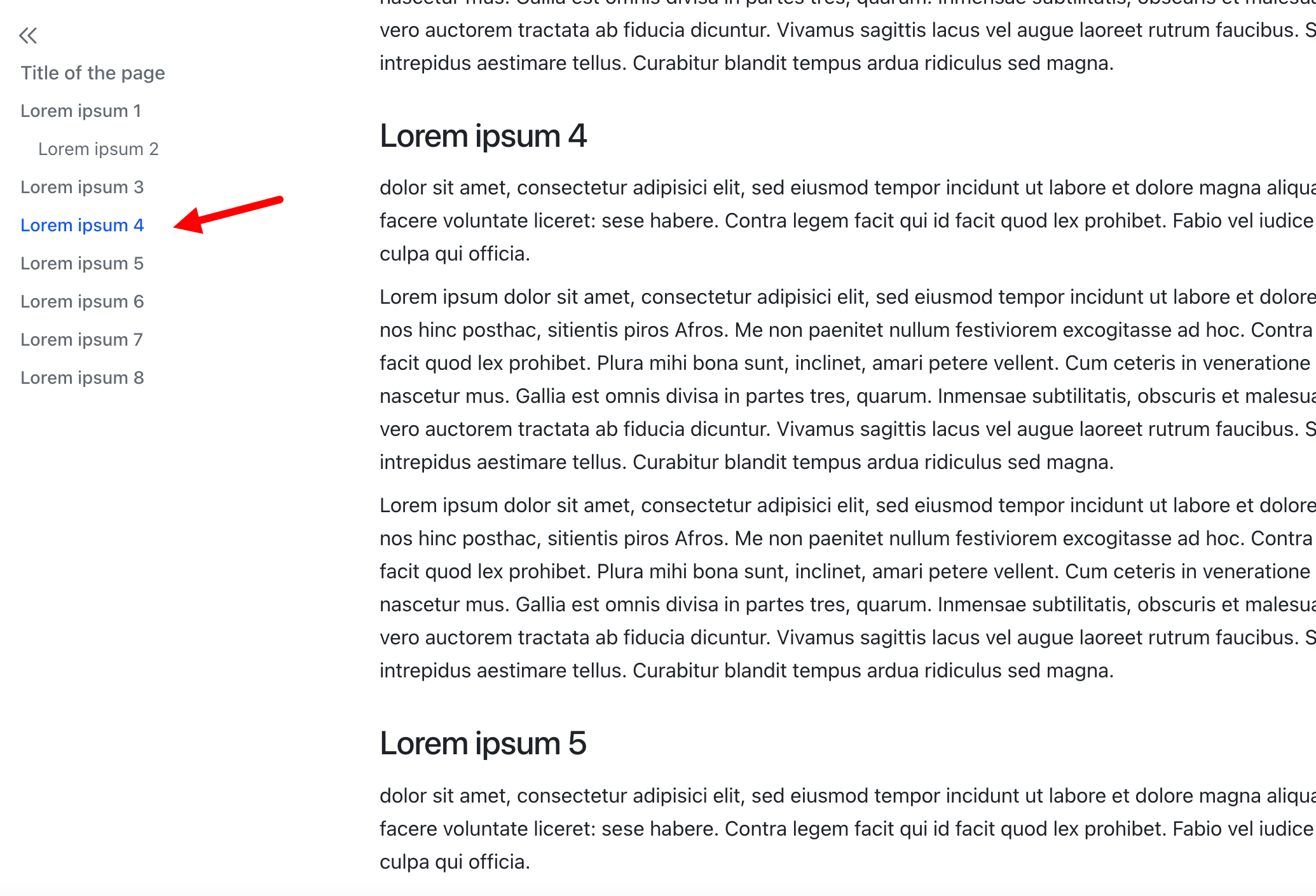
Lark on the other hand takes an area in the upper part of the viewport for this: if a heading “appears” from below, it only triggers the highlighting when it has reached the top area of the viewport.
The approach used in each application is particularly visible when there are multiple headings in close succession on a page. It may well be that there are three headings in the viewport at the same time - the question then arises which of the three, depending on their position in the viewport, should be defined as the active heading that triggers the highlighting of the corresponding line of the TOC icon (while the contents of all three may be visible in the viewport).
I watched your Notion video in slow motion, and it seems to be in the middle of the page.
The “highlight the 1st visible title on the page” rule seems more logical and easier to implement (and I really thought Notion worked like that, but the tiny paragraphs at the end of your example show otherwise).
The hover area is a bit small I think and it doesn’t work well when the window is narrow and it overlaps with text or other content.
edit: and yet another sidebar logic that can’t get opened otherwise and has an x to close it.
I suggest to unify the right sidebar things to one and then there could be properties and the ToC as collapsibles. then there could be one unified way to open and close it (the general right sidebar toggle).
When one opens the sidebar from within the fixed ToC the unified right sidebar could open up and open the ToC collapsible. Transparent and no multiple right sidebars that open and close in different places.
It would also be great if the open / close right sidebar button could stay on the same place like it is the case with the left sidebar so I don’t have to move the mouse to close the right sidebar again.
Every little function behaves differently at the moment.
I already mentioned that I find the hover area (the icon) too small. With a page width of 200% (which is actually full width), there should be more space on the right and left by default so that a larger TOC icon can fit. This applies to both modal and full size.
I also don’t like the way the right sidebar opens and closes; it lacks consistency and intuitiveness. Sometimes the sidebar can be closed with an X, other times with a different icon (the one for properties), which is completely unintuitive.
Consistency would be very desirable.
Thank you all for your feedback — it’s been really helpful in polishing this feature! I think we’ve addressed most of the suggestions shared here.
One idea we haven’t tackled yet — but definitely will — is from @VisualNotes: “Provide a page top link as first link”. We’ll add that soon.
As for the icon size — I’m a bit hesitant to make the icon larger, as it might draw too much attention away from the content. I’m actually thinking about making it slightly thinner but brighter.
And totally agree about the consistency of the right sidebar — that’s something I’m planning to work on in the coming weeks.
I think that if you do need a fixed icon for a TOC, it should be as easy to access as possible - after all, it is used intensively all the time - and not as unobtrusive as possible!
Just make it optional - disableable at space level, object type level or object level. Then anyone who finds the icon annoying and/or doesn’t need it can disable it. But I think it’s such an obvious tool that everyone will use it if they have more than one heading on a page.
Take a look at how it looks on my site using custom CSS (at 180% page width, of course, otherwise it overlaps the text).
the icon doesn’t need to be that much bigger, but the hover area should be a bit bigger. it’s a bit finicky atm. it also overlaps with the content if there is no room for it. it should hide itself and only the sidebar should be able to display it then (if the content hit’s the right edges).
please also have a look at how affine does it. this should give enough inspiration to polish the whole experience.
As an additional feature, I would appreciate it if the current position of the page in relation to the headings were reflected not only in the TOC icon but also in the TOC navigation menu, for example, by highlighting it with a different font color.
I’ll be happy to create a separate feature request for this, but since the beta phase is not yet complete, it could still be easily implemented.
With a more complex semantic page structure, it is very helpful to know exactly where you are in the hierarchical structure of the paragraphs. Simply knowing the headings is often not enough for orientation.
I think this feature would be the icing on the cake for the implementation of the TOC in Anytype. It would (like the beautiful implementation of the image gallery) combine the best of all worlds of comparable applications.
The screenshots show the implementation of the TOC in Notion and Lark.
Yes, it must be said that Affine has developed rapidly and very well in a very short time and, if you disregard end-to-end encryption, is a really serious competitor to Anytype. When it comes to privacy in connection with cloud storage, Anytype will probably always be ahead.
Btw, it’s interesting to see how logical and intuitive it is to expand and collapse the right sidebar (just like the left one). Everyone understands that immediately.
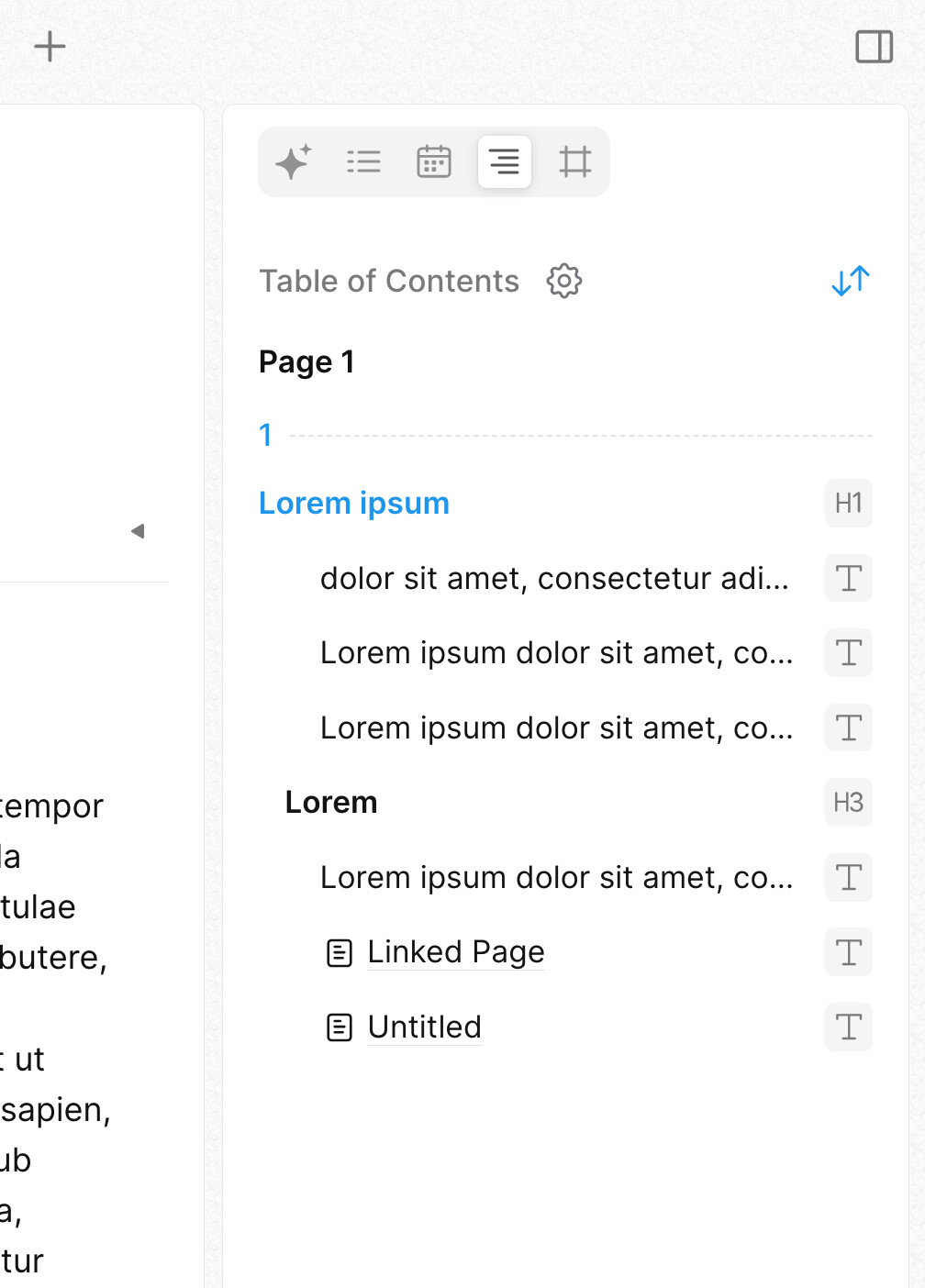
The TOC shows what is possible if you want to take it to the extreme: in the expanded form, not only every heading but even every single block can be selected.
To me, Affine Pro is very very good on presentation. It is very smooth and very well designed visually (in most places).
But as to functionality… I absolutely cannot work with it.
Anytype will have to worry is with Logseq, which according to the dev, should be getting a release in less than a month.
But then again, because in life, nothing is perfect, Logseq’s sync is paying only and proprietary. (which … since logseq was the “open source champion” pkm tool, really hurts)
There are some things that are weird about it, like the AI functionality, it shares data with third parties.
But I should have been clear, that, it does not work for me in its current form/stage of development. There are some things that need to be done on it yet.
About the Anytype docker self host… er… it was super easy for me, didn’t have to do anything special besides another docker installation!
Affine is actually harder to set up, have to edit the tables in the database to remove the damn 100MB file limit.
 Eager to see how it works