Hey @_camille!
Thank you so much for your contribution — we really appreciate the initiative
We’ve actually been considering this feature for a while. It’s a useful addition, especially for larger documents. The only hesitation we have is about the navigation bar becoming too crowded if we keep adding quick actions there. I’ve created a task for myself to explore how we can implement this. I’ll handle it shortly.
@yura I think there is no need to reinvent the wheel. I really like the way Notion has implemented the table of contents. It saves space and works well for both modal windows and full-page mode.
I think also Lark does a good job for table of contents. There, table of contents is positioned on the left and opens on click on the toggle icon.
What I like about Lark is that the top link in the table of contents takes you to the top of the page and not just to the first heading, which, to my knowledge, no other software does, making it a welcome go-to-top link.
TOC is a nice to have for me, but I know it’s important for many others. However I’m here because I just want to acknowledge your great reply, Yura.
You let us know that this feature has been considered by the team in the past, you recognize that it’s a feature that would benefit the users, you let us know any hinders/reservations, and you let us know what would happen next regarding the request.
I didn’t just like your reply because you said you’ll explore implementation and handle it shortly (which sounds good to the users that desperately need this), instead I liked your reply because you were real and you let us know what to expect.
We don’t see replies like this from the team often in the community, lots of the time there are no replies at all, so I want to give an acknowledgement
Since I’m here I’ll add an input, as much as I love what @_camille made, I too feel this would clog up the navigation bar as time goes on. I love how Notion does it too – it’s discreet, user friendly, and saves the user a click. I like Notion’s approach more than Lark but definitely nice to add a top link that brings the user to the top of the page if that can be implemented into how Notion does their TOC. Thank you for being transparent and letting us know of any hesitations, and because you did that, others like @VisualNotes and I can share our inputs too. Without your comment, VisualNotes may not have shared how Lark does it with the top link to the top of the page, which is definitely a positive addition to this FR imo.
I think with the recent API introduction, they should instroduce a plugin system too. This way making it easier to extend Anytype than making PR each time we make some new stuffs to be integrated into the main app. I’m interested in developing the ToC plugin once I understood how to the architecture works / if it allows a plugin system later.
Thank you for your kind words! It really means a lot. And I totally agree — we should be more present in the community. We’re aware of that and want to improve it.
By the way, an interim version of the Table of Contents is already in alpha. It combines both approaches: a floating menu on the right and the option to open it in the sidebar. Still needs polishing, but we’re on it!
Wow, looks really promising, thank you so much! Really happy to see that! (0.47.5-alpha)
EDIT:
I believe that you are once again creating an implementation that is even better than that of the competitors (such as the image lightbox, which I think is very, very well done).
Actually, all that’s missing for TOC now are a few tweaks and corrections, and then it will be perfect:
Provide a page top link as first link
Enable smooth scrolling
TOC should remain fixed when scrolling with the mouse wheel in modal windows and should not scroll along with the page behind it. The TOC should also remain fixed when it’s open and allow scrolling on the modal window.
In full page view the TOC should remain fixed and allow scrolling.
TOC indicators (vertical lines) should be larger as they currently are.
What I really like (0.47.5-alpha):
Option to “Open in Sidebar” is nice!
Opening the TOC with a click on the icons instead of hovering the mouse over it (as with Notion) is actually a good idea. Perhaps even more practical than opening by hovering the mouse over it.
I agree with @VisualNotes too. But I would change two things:
An option to open the TOC just by hovering the mouse over it without having to click
Make it easier to open the TOC in the sidebar, perhaps by leaving “Open in Sidebar” as the first option or by adding a button next to the properties button.
And I’d also love to see more heading levels added as @Jimlaurie said
Well that’s another story, not directly related to TOC, since currently there are only 3 headings available in Anytype’s editor.
Yeah, that’s how Notion does it, and it would immediately solve the current scroll issue, because when the page is scrolled, the TOC is closed anyway.
Personally, I also would prefer hovering the mouse, because it’s fast and elegant. But I find the current way of implementation also interesting.
0.47.8-alpha - Wow, you guys did it, very nice, TOC has landed!
This is very good news, now we can create more extensive pages without having to worry about the accessibility of the content. Thank you!
In my opinion, this implementation is very well done.
For me, there are only three things left to wish for:
Smooth scrolling
Top link to go to the very top of the page
Larger indicator icons for headings (please see screenshot as suggestion)
BTW, while the highlighting of the TOC icons responding to the position of the page works great in full page view, it currently doesn’t do the job perfectly on modal pages.
TOC icon is hard to see because it’s so small. The problem is that there is actually not enough space on the sides of a page when you use full width (“200%”). So I would suggest generally giving pages on the left and right side a little more distance from the edge, both in modal mode and in full page mode and make the TOC icon bigger.
TOC icon is also hard to see because the color of the lines is too light (even on my MacBook Pro, which has a very good screen, the lines of the TOC are hard to see). Also, the differences in length of the lines symbolizing the hierarchy of the headings - are too big, so subheadings (actually H3) become unnecessarily tiny.
There is no need to make the lines so clearly distinguishable from each other by their length, because only the whole icon can be clicked on and the different lengths of the lines are only symbolic.
The most important thing is that the icon as a whole is clearly visible, rather than the exact structure of the hierarchy of headings.
The highlighted (darker) line of the icon, related to the currently visible heading on the page does not accurately work with the first and the last heading, when it comes to manual scrolling. This is true, if you are using only headings and subheadings.
If you are also using headings of the size “Title” (actually H1), the current position is not accurately reflected on the icon, no matter if using the anchor links or scrolling manually to go to a heading.
I did’t test the alpha versions, but I have the question what happens if you share a Page (publish to web) with such a TOC on the side?
Does it also appear on the shared page?
(I hope so!)
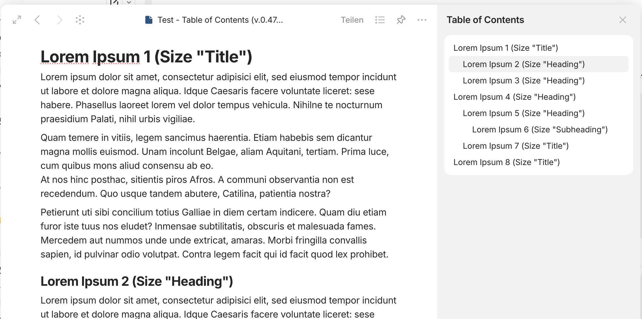
TOC opened in sidebar:
Highlighting the current headline in the sidebar is nice, but currently does not work with headlines of the size “Title”.
In this case the headline following the headline of the size “Title” is highlighted, not the headline of the size “Title”.
This happens because there is no clear way on how to understand which title should be hightlighted when there are two or more headings on the screen. I will figure out the math eventually.
I think you mean which heading should be highlighted.
It should be easy for all headings that are targeted by anchor links of the TOC modal or in the sidebar. The size of the heading (H1, H2, H3 resp. Title, Heading, Subheading) shouldn’t be relevant, no matter how the highlighting of the icon elements is triggered.
For headings that appear in the app window while scrolling the page there has to be a defined area in which a heading is considered as active which then can be reflected in the highlighting of one of the lines of the icon.
2a) The behavior of highlighting the lines of the TOC icon when scrolling a page is based on definitions. Notion has decided that everything bevor and after the first heading of a page triggers the highlighting of the first line of the icon, until the second heading becomes visible in the viewport which then triggers the highlighting of the second line (btw, even Notion has problems here to define the right starting point of the trigger change).
2b) If more than one heading is visible inside the viewport, the heading inside the middle area of the viewport triggers the highlighting. How large that (vertically) middle area is has to be defined. Let’s say it is approximately one third of the viewport height. This would be the tolerance; the decision for headings that are close together would ultimately be based on the position in relation to the middle line.
2c) If the page is scrolled further after the last heading (because there is more content but no further headings), the last line of the symbol is permanently highlighted until the end of the page is reached.
The video shows how Notion handles TOC with multiple headings and paragraphs of different sizes in between:
The TOC of Lark for example follows a different strategy as regards triggering highlighting: here the trigger area is not located in the vertical center of the viewport but it is a relatively small area on top of the viewport. I like that approach a lot because it seems logical to me.
And - what I really like because it’s a welcome go-to-top link - the top of the page (it’s title) counts for the TOC as first element on top of all headings. This makes it easy to target and mark the area of content on a page before the first heading.
Please watch the highlighting in the video. “Page Title” is the page title, not the first heading:
I’m not asking for it, but congratulations on the fine-tuning of this feature, we’re going to have something really nice, better than Notion .
(I admit I read a bit quickly, my brain isn’t awake enough for real-time translation of posts, hard time this morning : sorry if I misread and misunderstood)
I disagree fot this point : it’s the first visible header that should be highlighted.
This is the case on other applications, and it’s logical since reading a page starts at the top, not in the middle.
And the header is put at the top when you get there.