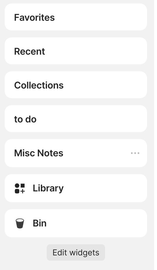
However, having the Space, Library and Bin icons left makes it look a bit out of place, hence bringing them back I believe would make the sidebar look a bit more professional.
Agreed. The visual context cues also make for faster navigation. Not sure why it was removed, it looks great in all the video tutorials I’m watching (must have been recorded on an older version).
@Filip Exactly. We’ll need to think it through so that it’s the same option in all parts of the interface. This would be similar to how it is done now in icons for object names in sets/collections or “link to” cards.