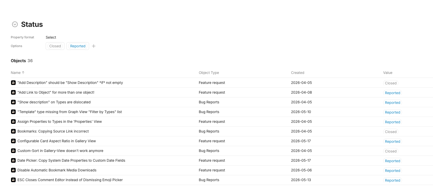
Two related issues when working with a property of type “Select”:
1. Rendering bug: In the vault property view, the “values” (the pills showing the select options) are cut off — they render a few pixels short at the bottom, so they look visually clipped/broken.
2. UI feedback: Separately, the overview of all select options looks a bit unpolished — each pill sits inside a large surrounding box, which feels heavier and less clean than it needs to be. A more compact, minimal presentation would look nicer.