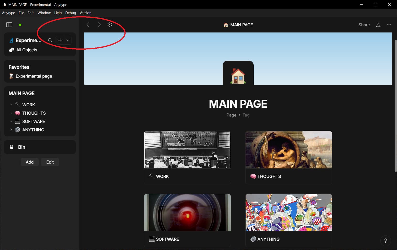
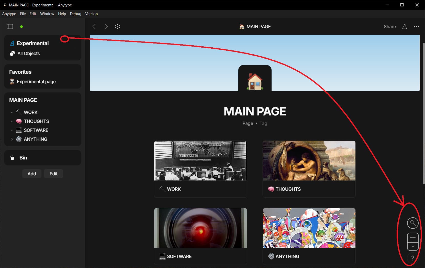
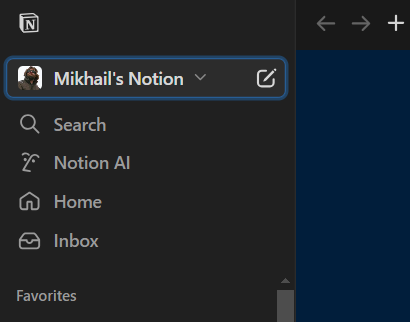
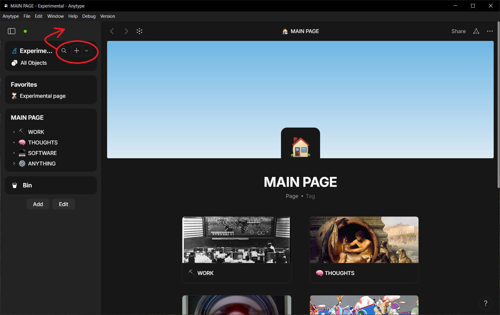
In Notion, Lark, Affine, Coda, ClickUp, FuseBase, Evernote… the “New” button is, depending on the particular concept of the app, in the upper left area or in the immediate vicinity. I don’t think it would make sense for Anytype to place this most important button in a place where it is not generally expected.
I really like this idea. Or even restore it to where it was before.
The current placement doesn’t make sense to me. And depending on the situation, it can mean one extra mouse-click.
I think the decision to move the buttons to where they are now is a good one (also because, as I said, that location is now more or less standard for the “New” button in comparable applications).
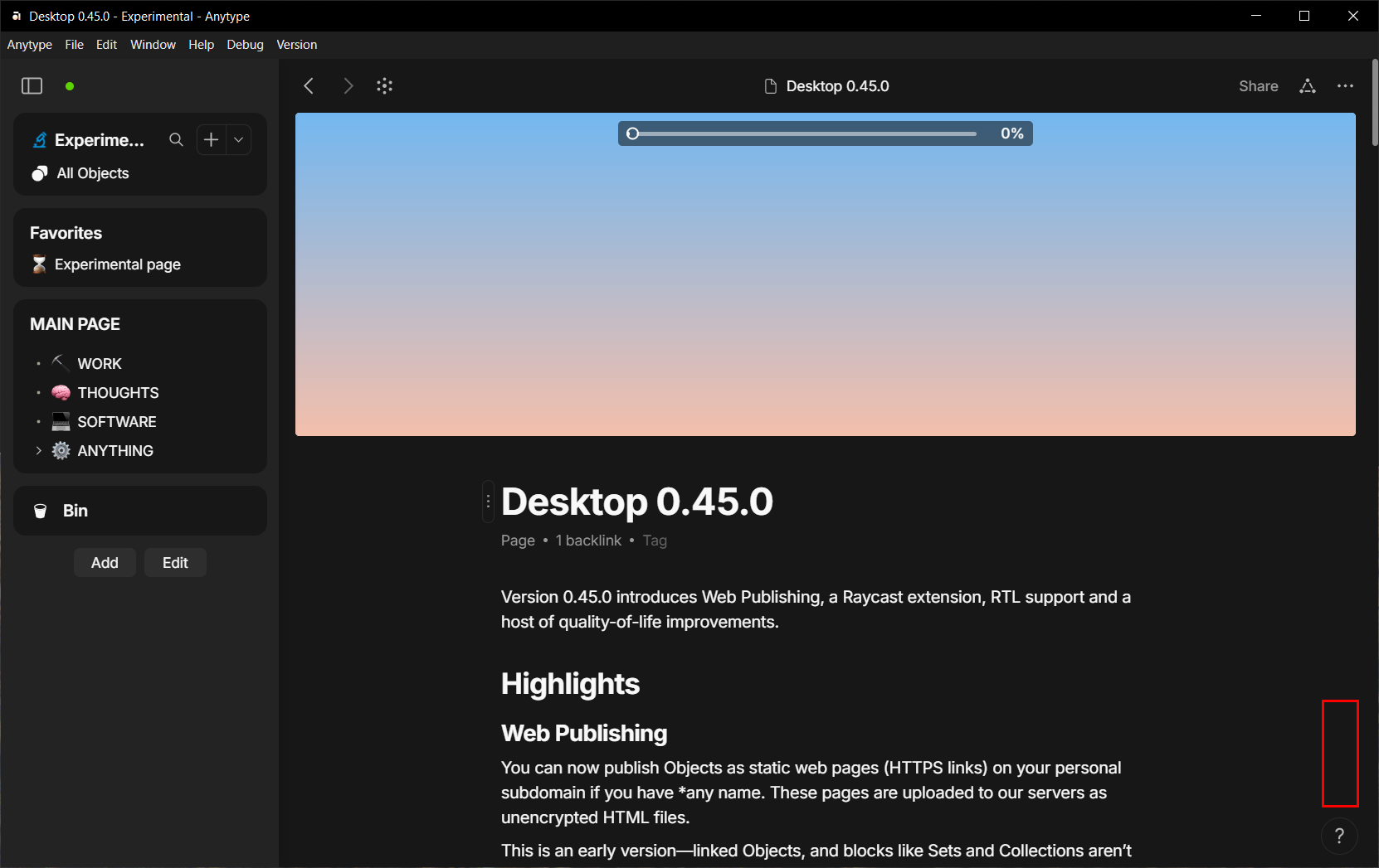
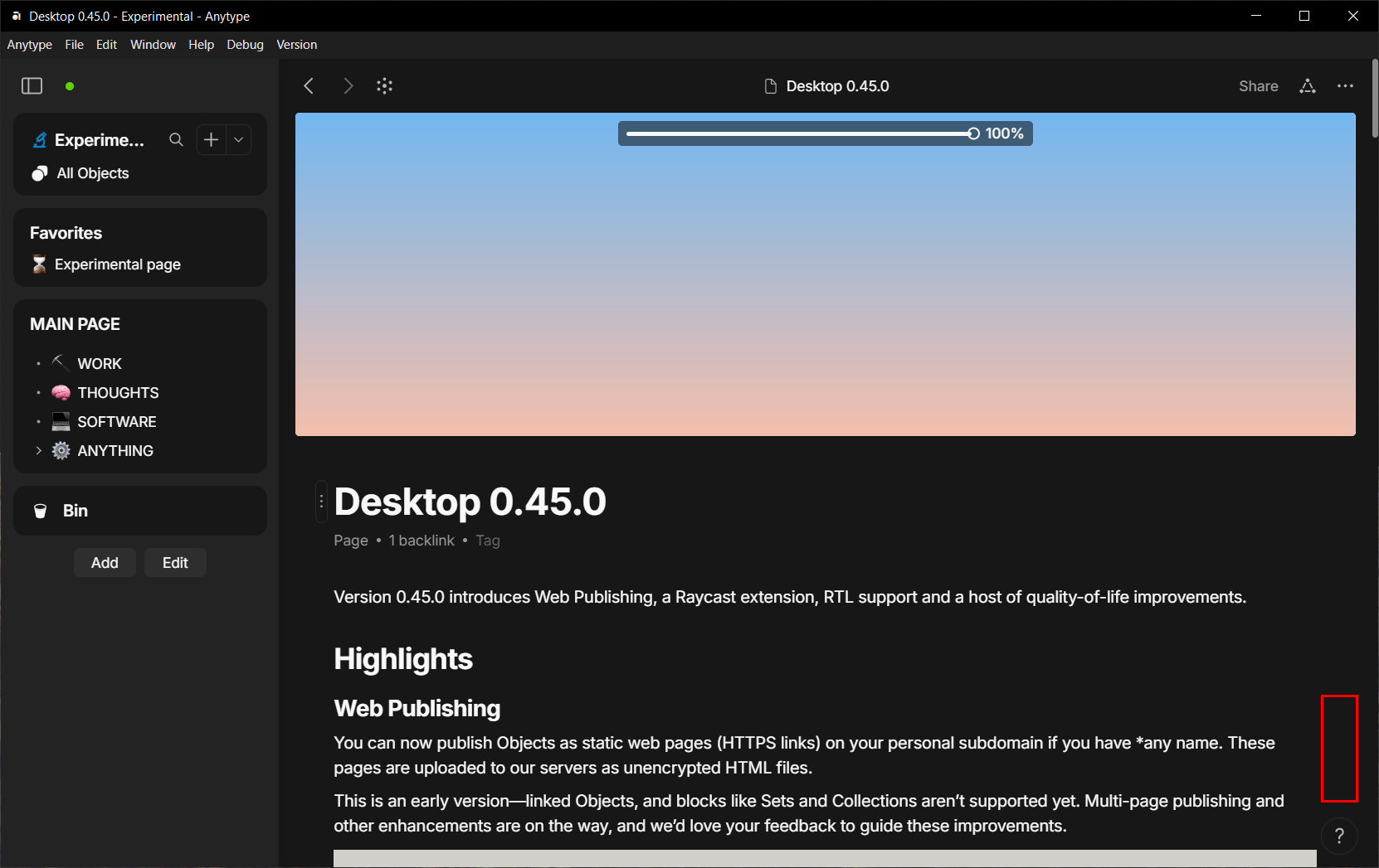
What actually bothers me, is that the two buttons disappear when the sidebar, well-filled with widgets, is scrolled down. I have therefore suggested sticking the space widget at the top of the sidebar so that these important buttons remain accessible when the sidebar (widget bar) is scrolled down.
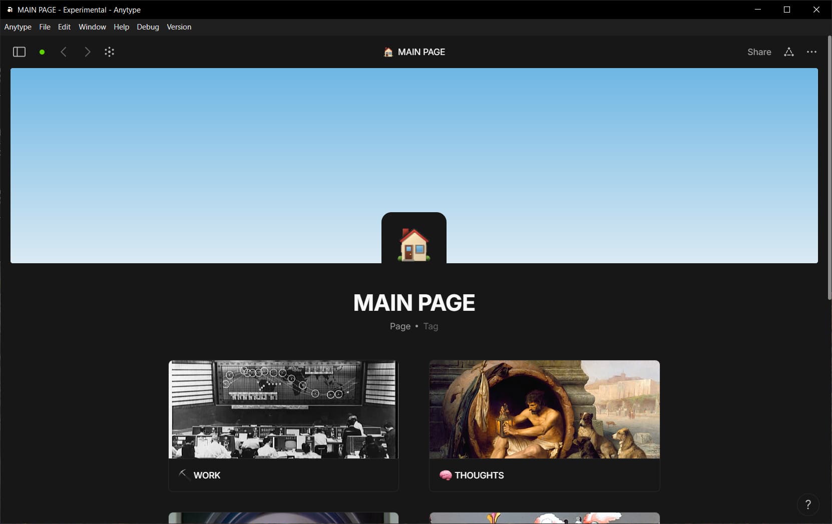
I’m assuming there’s a reason (that I don’t know) why they decided to put the buttons on the “space widget” and not independently above it, where these buttons (new and search) could nicely merge with the other ones (back and forward and graph/flow) when the sidebar is collapsed.
I agree that position near other navigation buttons (back/forth etc.) in one line would look nicely. But now it looks not very good.
Well, I hope someone from the team will read this and may be change its mind