WHAT DO YOU RECOMMEND
To say the least, the header of the Windows Anytype app looks unappealing. I’m guessing a lot of users would even have the old custom header of the Anytype app back. Here is what it currently looks like:

In my case, it doesn’t look terrible because I have transparency affects turned off (literally, simply for the sake that the header doesn’t look as clashy and gaudy and despite the fact that I normally like the transparency affects).
Here’s how it looks then:

(It’s almost always an ugly bluish color).
In addition to this, the buttons in the raw-looking app menu are a wierd pink color when you click on them.
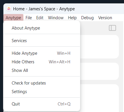
Also slightly irritating is that the window title changes based upon what page you are on, which is what you would want in a web app or if the app had numerous tabs, but not in the app itself. It just gets annoying because in theory it should stay the same.
What I’m suggesting, is that the team neither re-employ the old header, nor retain the new header. I want (as I would guess other users would) a minimal header that moves the menu and window control buttons within the app.
HOW COULD IT BE DONE
First of all, I am going to suggest that the window buttons (to minimize, expand, and close) get moved within the app on the same level as the title of the page that one has open (basically, like how the app is on MacOS only with the controls on the opposite side [the right side - pun intended] and of course, the Windows-style buttons instead of the MacOS stoplight style buttons). As for the menu, I’m going to suggest that a button gets added in the top left corner that accounts for a hamburger-style menu. This could either be a gray hamburger style icon similar to the one that was used in the header of the legacy app, or more preferably, the Anytype logo would function even better as being the icon for this menu. This would preferably, if possible, exist to the left of the sidebar button.
REAL WORLD USE CASES
This improvement, would for one, make the app look way better and also make it appear more polished and professional (apps can look good on Windows, too - good looking apps don’t have to be a MacOS exclusive). This would also give the user more space (which ≈50px may not seem like that much, but for users with smaller screens, it could go a long ways in making the app feel a bit more spacious).
RECOMMENDED ALTERNATIVES
The only other option I would be okay with is employing a header (that is, if it had to be a full bar and take up more space) like the one I talked about when I brought this up about the old app. Look below:
Light Mode:

Dark Mode:

Idea borrowed from the Gmail Desktop electron app (that I quit using because it didn’t send me any notifications when I got new mail).
ADDITIONAL CONTEXT
If the team had any protos of the beta version of the Anytype app in Figma, I would love to get my hands on a copy of it to visually demonstrate my idea.


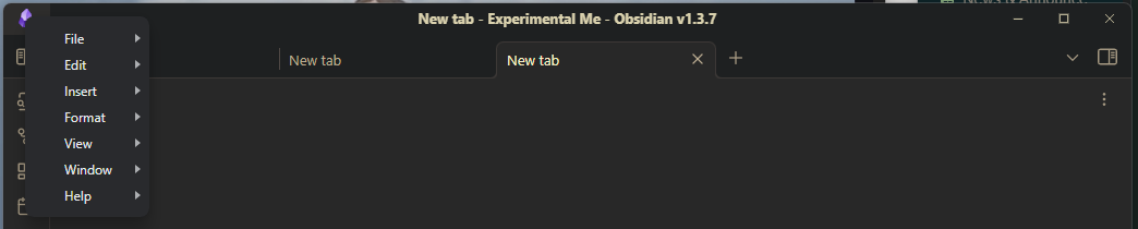
 (so the Obsidian header is good for inspiration, but I would prefer if Anytype would do something a bit different to be unique)


