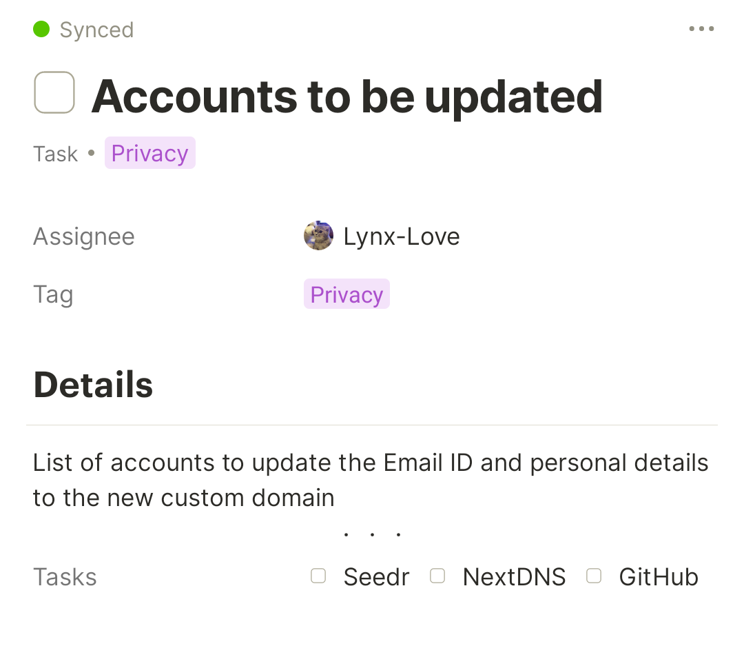
As object names are sometimes difficult to differentiate (and the extra space isn’t always visually pleasing), It would be more ideal to instead have them be separated by a comma, or a bullet (in the same way that featured relations are currently separated):
Additional Context
N/A
Thank you for reading, have a wonderful day (and happy holidays)!
Is your feature request related to a problem? Please describe.
When a relation block inside a page links to multiple objects it is not so easy to distinguish between these objects.
Describe the solution you’d like
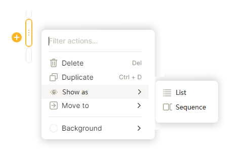
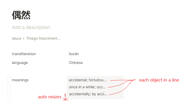
When a relation block links to multiple objects, there should be an option, or even be the default behaviour, to show the linked objects as a list, instead of a inline sequence of truncated names.
Would love the feature in the mobile version of the app as well, currently the desktop app atleast displays all the linked objects however the android app truncates the list. I’m using linked object relation for representing sub tasks and the current behaviour results in only few sub tasks getting displayed
Thanks team again for bring us the link to and link from relations. However, as we have more and more links and connections, the longer the list becomes. These clusters can happen to all relations, including but not limited to link to/from.
As a demonstration, for my Anytype object, I currently have 150 links and it takes a lot of scrolls to reach the second section of relation pane. This could happen to any area/theme/project/client objects..
Therefore, it would be great if more things can be reached at fingertips.
HOW COULD IT BE DONE
Please consider the following options (to be discussed):
Enable toggle / collapse in relation pane
Move links from/to to the bottom of relation pane (like references in academic paper) - this doesn’t solve cluster of custom relations
Enable scrolling within one relation section (like pinned/favourite relation in object canvas)
Consider on-demand display of relation at the top of relation pane
Allow search function for relation pane
REAL WORLD USE CASES
For everyone who is really fond of relations and links.
RECOMMENDED ALTERNATIVES
Full relation pane over the full screen
ADDITIONAL CONTEXT
Obsidian uses the collapse method, also allowing filter or sort.
I used to add keywords for the pages so that I can find them easily, and most of my notes don’t have icons. Therefore, it is hard to distinguish items just based on the spacing between them.
How about adding comma when relation have multiple objects related? it would be great.
RECOMMENDED ALTERNATIVES
Something to distinguish multiple objects! (larger spacing, slash/, line split, …)
Here are some extreme example that I currently have (12 backlinks). Obviously, just clicking backlink on the top and showing it is feasible and having nice UI, but sometimes I want to pull out the backlinks for less friction.
Show Multi-Selects in the Grid separated by breaks
WHAT DO YOU RECOMMEND?
As the title says to have each item on a new line rather than stretched horizontally. The same process could be used for tags too.
HOW COULD IT BE DONE?
With line breaks…
REAL WORLD USE CASES
Currently if you have three options suggested if you want them all to be visible in the grid the column has to be very wide taking up real estate from other columns. If implemented more relations can be shown in a more compact grid.
RECOMMENDED ALTERNATIVES
ADDITIONAL CONTEXT
Conversations have been had about wrapping text in columns, although this is a separate process it links in with the efficiency of grid displays.