Open Sets and Collections in fullscreen

WHAT DO YOU RECOMMEND

I have a Collection for all my Sets.
If I click in its Grid on an entry (Set), the Set opens in a smaller window, but not in “Object mode” aka fullscreen.
That sucks.

It’s OK for Pages, Notes, Tasks etc. to open in a smaller window.
But a Set should always open in max. size

HOW COULD IT BE DONE

Apply a second switch in the preferences, in addition to the already existing one:

– I have this switch OFF because I don’t want that Pages, Notes, Tasks … open in fullscreen mode.
I want it only for Sets and Collections.

The existing switch doesn’t differentiate between normal pagelike Objects and Sets/Collections.
That’s why I suggest to add a second switch so that we can differentiate.

REAL WORLD USE CASES

It reduces friction.
There would be no need anymore for always maximizing a Set manually to fullscreen each time we open one of them from a Grid.

RECOMMENDED ALTERNATIVES

  1. Open a Set (or Collection) always in fullscreen, no matter what the switch in the preferences says.

  2. Or apply a new switch in the View settings for Collections and Sets:
    “Open Objects in this View always in Object mode”.

Maybe alternatively allow users to decide if object types are opened in fullscreen or as pop-up. This will empower users to have both their desired object types at hand or full content display.

  • Mimicking pop-up quick notes or memos (e.g. floating notes in Raycast or in many handwriting apps like flexcil)

Other than setting, library is also a good place for organising these stuff. ← That’s partially why I imagine repurposing library

I dare to ask again for the feature I’ve requested in the start post.
We’re waiting for Collection/Set 2.0 since a year or so.

Meanwhile I have so many Objects in my biggest Collections, but not enough Views for fine filtering, so that I was “forced” to find a better way to organize my Objects.
– A way that mimics a Collection/Set with lots of Views (let’s say over 200 Views).

I’ve found such a way, but that new way would work much better if Sets and Collections would always open in fullscreen.

My new attempt to organize a massive amount of Objects:

  1. There is a Collection with some Views (let’s say 8 Views).
  2. Each View shows no Pages, no Notes etc., but only Sets. A bunch of them.
  3. Each Set has again some Views. These Views show Pages, Notes, etc.

That’s a good way!
– It offers fast access to each wanted Object, no matter where it is in the whole Space.
It is nearly the same as if the main Collection would offer maybe 200 Views!
Very practical!

My main Collection contains about 40 Sets, distributed in its 8 Views.
One click on the wanted View shows for example 5 to 15 Sets.
A second click on the wanted Set, and then a third click on one of its Views, shows a selection of - let’s say - 30 (now fine filtered) Objects.

It works great, but one thing disturbs the feeling of a fast navigation:
The mentioned Sets don’t open in fullscreen. :frowning:
That makes an additional click necessary (and about 3 seconds waiting time) each time I click on a Set.
That may not sound like a big deal, but it’s annoying.

I know, there is a switch in the settings: “Open Objects in fullscreen”.
But this is not what I want.
What I want is, that only Sets and Collections open always in fullscreen.

Everyone is different of course. Personally, I do this via the widgets. It accomplishes the exact thing, and the benefit is that the sets are accessible at all times. I don’t need to navigate first to this superset of sets; the widgets allow me to jump to whatever set I want from anywhere. I do like those widgets!

Good for you, but not enough for me.
The widgets don’t show enough information.

Some basic navigation is possible with them, but I prefer to have the whole Collection (or Set) open to see what I need to see.

Perhaps I don’t get something.

A super set of sets - what possible information could it show beside the set itself (name, creation date, etc)? You still won’t see the underlying objects.
So, you will still have to click on a set within the superset to get to the objects - the data you really want to see.

Same as you would see in the widget. Basically the superset is a dashboard for sets. But unlike this superset, the widget for sets (or favourites) are always there, minimizing number of clicks to get somewhere. You could be on a particular object’s page…and click on the widget to go to a specific set. With your superset approach, you first have to navigate to the superset, and then click on the set you want - an extra click and extra load.

Cheers

I have found out, that I spent the most time in my biggest Collection.
It contains over a thousand Objects.
To organize it in a meaningful way, I needed much more Views then a Collection offers.

To stack a bunch of Sets into that Collection has solved this problem.
Now I need one or two clicks more to reach a specific Object, but nevertheless i’m faster then before. Because I have now much less Objects in the (Set’s) Views.

Again: The collection doesn’t show Objects. It shows in its Views only Sets.
But the Sets show the Objects.
This way, the amount of Views is multiplicated:
(Amount of Views in the Collection) * (amount of Sets) * (amount of Views in the Sets).

It works great, I’m very happy that I’ve found this way!

But:
Often my Objects Names don’t give enough information to decide if I want to open one of them.
I need to see also at least the description and the Tags. In some Views I need also to see the Creation Date and the Last Opened Date.
The Widgets don’t give me all these informations.
I can see it all together only if I have the whole Set open in fullscreen.

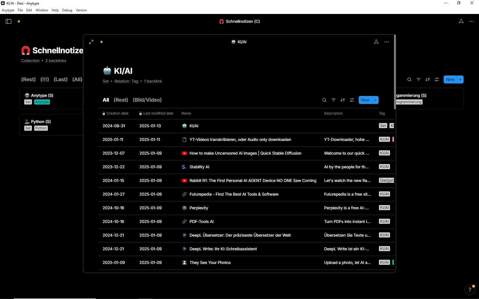
Here an example of one of these Sets in my master Collection “Schnellnotizen”
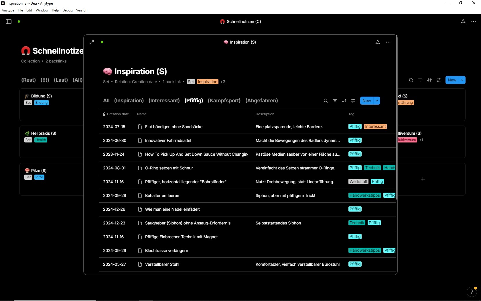
Another example:

There are even better examples, but they are too private to share screenshots, I think you get the basic idea.
It becomes very important in case that the Names are not so good distinguishable.
For example:
Square roots, lection 1
Square roots, lection 2
Square roots, lection 3

In such cases, I need to see the description and often also the Tags.

.

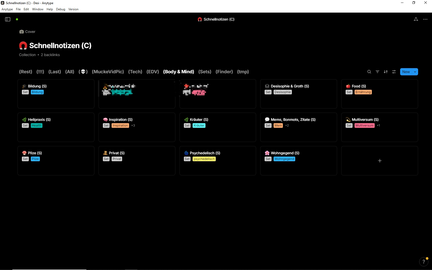
To complete the thing, here you see my master Collection.
The opened View contains 14 Sets.

If I want to open an Object that is in the widest sense “private”, then I open the View “Body & Mind”.
All 14 Sets listed in this View have to do with health, or personal development etc.
And each of them has again Views for finer filtering.

You see, I can reach each Object fast, although there are much more then 1000 Objects, maybe even 3000.
The Sets give me the benefit, that the find Objects no matter where they are located - something a Collection can’t do.

But I need to see more information then only the Object’s names.
That’s why I don’t use the widget navigation.
– Not completely true, I do use it. But in another way, an additional one.

Thank you for taking the time to explain all of this. I think it gives people different ideas how to use it in their own way. So again, thank you for that.

I am on the same page as you. I think we are saying more or less the same thing, but there are some nuances which comes down to personal preference and how each of us organizes our lives.

Cheers!

May I dare to ask again for the requested feature, although if it has only one vote (for unknown reasons)?
– It’s every day such an unnecessary time killer not to have this additional switch in the preferences!

No matter in which position the actual existing switch “Open Objects in fullscreen” stands, the result is not satisfactory,

  1. If the switch stands left:
    Then will Collections & Queries not open in fullscreen, therefore they show less information then in fullscreen.
    The user needs to manually expand them to fullscreen every time.
  2. If the switch stands right:
    The result is now even worse. Now opens each and everything in fullscreen, also normal Objects.
    – That sucks if we need to quickly open many Objects from a Grid, to have a short view into them.
    Each time when we open an Object for a short view, we need to use the “back” button afterwards to come back to the Grid where we started. But our last position in it is lost and we need to scroll to find the last position again.
    And each time when we come back to the Grid, there is that loading time of some seconds before we are even able to scroll in it. :frowning:

The solution for these unnecessary frictions is clear:

  1. Collections & Queries should always open in fullscreen.
  2. Normal Objects should always open in that smaller overlay. We can click it away to come back to the underlying Grid without losing the position in it and without wasted seconds for the reloading of the Grid each time.

If that’s (for whatever reason) not the team’s preferred UX, then there should at least be a switch that allows the user to switch the described behavior on/off.

– Maybe I haven’t explained the benefit well enough in the startpost?
I would think that nearly every user would prefer such a mode over the existing in the daily use.

On mac I can use option (alt) + click on an item in any list and it opens in fullscreen mode no matter the settings. Maybe this helps..

@Anytype-team, it seems this shortcut is not in the shortcuts list, i only find those two:
image

Besides this, I like it the way it is atm. Either open all objects in modal view or not, depending on the switch in the settings. I like the modal view a lot when browsing through Collections or Queries, even if the opened object is another list.

Thanks, but it doesn’t work on Windows.
I didn’t search for a maybe existing other shortcut, because I don’t like to be always “forced” to use both hands (one on the keyboard, the other on the mouse).

I don’t want to take it away with my request.
My request asks for an additional switch so that we can differentiate if opening in fullscreen affects:

  1. Everything (as it is at the moment)
    or
  2. only Objects.

WHAT DO YOU RECOMMEND?

In the settings we can decide if we want to open Objects in modal or fullscreen.
→ Good, I prefer modal (for Objects).
But with this setting, unfortunately also Collections and Queries open in a modal window if opened from another C/Q.
→ In my opinion that makes no sense and I’m tired of the unnecessary friction to expand them manually.many times per day.

My main navigation concept is based on a main Query that shows in its View all available Collections and Queries. I open them always from there. But because they open in a modal window, the visible area is too limited to work with it, therefore I need to expand the modal window to fullscreen, many times per day.
And I ask why there is such an IMHO senseless behavior?

HOW COULD IT BE DONE?

Add a switch to the settings that determines if Collections and Queries should open in modal or in fullscreen.

REAL WORLD USE CASES

Less friction while navigating. And this many times per day.

RECOMMENDED ALTERNATIVES

ADDITIONAL CONTEXT

I believe this little tweak can become implemented in only a few minutes.
And I believe it would save me alone one minute every day.
Each unneccessary click on the expand button is a tiny little frust that sum up over the day.