Just updated to 0.41.21-beta:
I found the old way to switch between spaces much better. I could press CTRL+Tab then a small space menu appeared in the middle of the screen. I hovered over the space I want to switch to and it opened the selected space. Now pressing CTRL+Tab is only switching one space at a time in the order of the sidebar. This is annoying and slowing down the workflow heavily. I used to switch between the spaces regurarly (Privat, Work, Family, Side Business etc.)… Can you please bring back the old CTRL+Tab Menu at least?
In addition I would like the new space switcher sidebar to be hideable.
HOW COULD IT BE DONE?
bring back old Space Switcher when pressing “CTRL + Tab”
make Space Sidebar hidable
ADDITIONAL CONTEXT
The new display modes of the sidebar seem to be very useful. Also the Sync Status Upgrade. But the spaces sidebar and the changed behaviour of CTRL + Tab seems to be a downgrade… at least in my point of view
I fully agree. Currently, it doesn’t add any value in terms of practicality and it wastes horizontal space.
Also, it doesn’t respect the theming of Anytype whether we are in dark mode or not. I really hope the devs at least give us the option of reverting it back to the previous design where we could access spaces via the dock.
One more thing, if we end up keeping this placement, I hope these couple of changes would be applied to it:
make it respect the theme
make the space icons way smaller
the ability to collapse it so we can’t see it all the time
the square space around the icons have sharp edges, and it doesn’t respect the curvature of other Anytype UI elements such as the sidebar, dock, callouts, menus, or literally anything.
And finally, I can’t stress it enough how wasted space it creates in the right side of our workspace.
I agree that at the very least the space sidebar should be hideable. While I’m in school I’ll often have multiple windows open side-by-side, and losing 1-1.5 inches of horizontal screen space on a laptop is quite significant. I think it could be greatly improved by simply integrating it into the existing sidebar, separating the spaces with a vertical line. If you have the extra real estate to leave the sidebar open, it isn’t a huge addition on top of that, and if you close the sidebar, it’s gone.
The fact that it doesn’t follow the theming not only makes it feel less polished, but I find it distracting in light mode, it pulls my attention away from whatever I am working on.
Finally, I think they should bring back the ability to show the sidebar on hover. I always keep it hidden to give myself as much real estate as possible, and would just hover to quickly switch to a different task. Now, however, you have to click to expand the sidebar, click wherever you are going, and then click to hide it again. It isn’t a huge deal, but it is extra clicks that don’t need to be there.
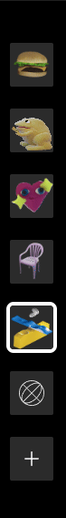
My point for the team is to improve the appearance for those who use GIFs as space icons. It’s aesthetically ugly, if they remove the “gray square” it will be better.
I really appreciate the changes in appearance. I’d be very happy if the team could take my use case into consideration and change that little detail I pointed out.
I’d like it to be narrower. It’s fine on a big monitor but it’s huge on my MacBook air 13 inch so it takes up too much of the screen - about 30% to 50% thinner would be nice (you could fit more spaces in it then too)
The black is jarring, dark grey or nearly black might be better
I think it changes the colour of the side panel automatically according to the emoji / icon of the space but I really don’t like some of the colours it gives me. It would be great if we could choose this colour ourselves. Or maybe if it did pastel colours only or something it might be nicer. Or just choose from one of the 10 colours Anytype uses for highlights etc. or the colours used for the kanbans
Would prefer a transparent background to the icons
Would like to be able to set my own keyboard shortcuts for each space
Love the concept though, and I like that we can change the order of the spaces
Also prefer the previous method where spaces can be accessed from the dock, would love if there could be a toggle in the appearance settings where we can switch between the 2 designs.
I like it because we can now order space and keep this order. The previous “Last open first” was a problem for me personally.
But I don’t switch so many time and I love a clean screen with only necessary objects.
There are several ways to correct this
An option to hide this bar seems important to me. Keeping the opening via a click on an icon (for example, next to the space icon at the top of the widget bar, in the “widget-space”).
Reduce the size of icons (but it’s hard to find a compromise between legibility and space requirements).
Have an icoidget with spaces under the Space item at the top of the widget bar. Keep the mouse wheel scroll! One-click access is maintained, minimizing the space required (and if you hide the menu, the screen is maximized for editing).
I know you don’t like it but my favourite option is to add an icon to the widget: on hover or click, opens a drop-down list of spaces for selection. It adds very little action (hover or 1 click more) + it allows a nicer integration of spaces with their info + it doesn’t take up space
Like Notion.
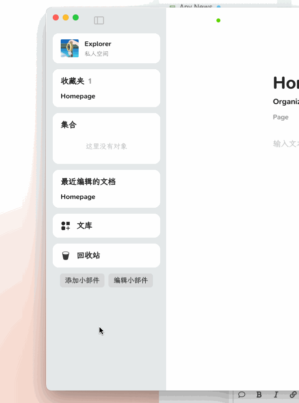
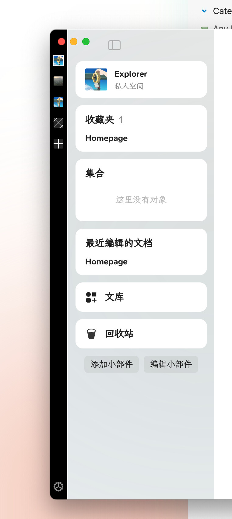
I agree with the opinion that this new way is too complicated. I usually use Anytype with Reader and jot down notes, and in this case, you can see from the screenshot that the space available for writing is limited. I have heard that Anytype has a plan for the right panel too, and I am concerned that in such a scenario, I may not be able to utilize it. Please figure out a better design for the panel
What if we make widget/space selector a two stage design instead of the current two separate bars?
Stage one: the narrow bar (with icons only) demonstrated in June 2024 town hall (for space)
Stage two: expand into the current sidebar (allowing more information) - clickable or non-clickable
Good for users who just want icons for objects could easily access the options by muscle memory
Less occupied screen space unless needed and more likely to be kept on screen; good for mobile landscape too.
Weakness: stage one bar is always nicer looking for objects/spaces with icons… if objects only have names, they would be harder to identify
Method 1
Content display for Stage one: both space and objects
Content for Stage two: full title of space/objects
This way users with one/few space could utilise this bar as well.
Treating space and objects equally (since space selector is technically an object selector as well, but just for the space default homepage object)
Customisability: Have the possibility to users can customise and switch narrow as stage two and broad sidebar as stage one, or always disable one view of sidebar.
Weakness of this method: the boundary/awareness between space thus authorisation of access for space/object might be reduced
Method 2
Stage one: Further divide bar into two sections, with a line between the space (something like macOS’s dock in left/right position where the top is pinned application, bottom is recent application):
For Anytype, I suggest Top for space in use and bottom for ‘pinned objects/widgets’ for the space in use.
Stage two:
Top section for space selector (maybe horizontal display of spaces’ icon?)
Bottom section for title/full widget
Sleek design suggestion for stage two (not necessary): only display ‘pop-up’ for the requested/hovered option. Something like windows’ taskbar, but rather than object preview, have only title/widget. This design won’t work with the customisability mentioned above in method 1.
Edit: I removed my ideas based on wrong observations.
Design which prioritising icons might not serve tabs the best since title of objects are probably needed.
If implemented with method 2, I suggest, for design of stage one, grouping objects with their respective space. This would make working with multiple panes with different objects from different spaces feasible.
One additional thought that I wanted to mention is that I’ve read that some people mentioned that it’s hard for them or their friends when they see anytype to figure out what is what including how the space change should be. But we have to keep in mind that this concept of 2nd brain and linking note-taking is not something simple or general at all and any new user should take their time learning how to adapt this to their productivity system.
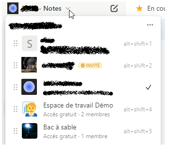
Also, the two most well-known and popular competitors of Anytype which are Notion and Obsidian, have fairly the same layout in terms of navigation between spaces and pages; Both have them in their sidebar as a drop-down menu not displaying them all the time.
If anytype wants to forge its own identity which I strongly agree, they should do that but not at the expense of some design decisions for the sake of simplicity but at the cost of wasted space. In my opinion, the previous method which was implemented in the dock was far more superior in terms of functionality and aesthetics.
I liked the old menu, but I don’t see any big problems for me with the new design. Here is some of my feedback:
Add a shortcut to go back spaces. Since spaces are now manually sorted, I don’t want to have to Ctrl + Tab all the way around to get back to my previous space. Adding in something like Ctrl + Shift + Tab would probably be good
Make the menu open on a button press. Hovering over it would be difficult as it’s at the very edge of the window, and the left side would be taken up by the sidebar. There seems to be plenty of space for a small button up by the sidebar autohide button (at least on Linux).
Someone mentioned better theming with light/dark mode.
There also seems to be no more auto-hide for the sidebar?
I really like drop down sketch you mentioned. It’s unintrusive and the users can switch and see the currently used space all at once.
Also, another point to mention is that the radius of the space icons are boxier and pointier than the rest of the Anytype’s UI elements such as widgets, callouts or the dock. It would be nice to have consistency.
Yeah, I still prefer if we could take the horizontal space back and switch spaces in other ways, but at least the colors match the theme.