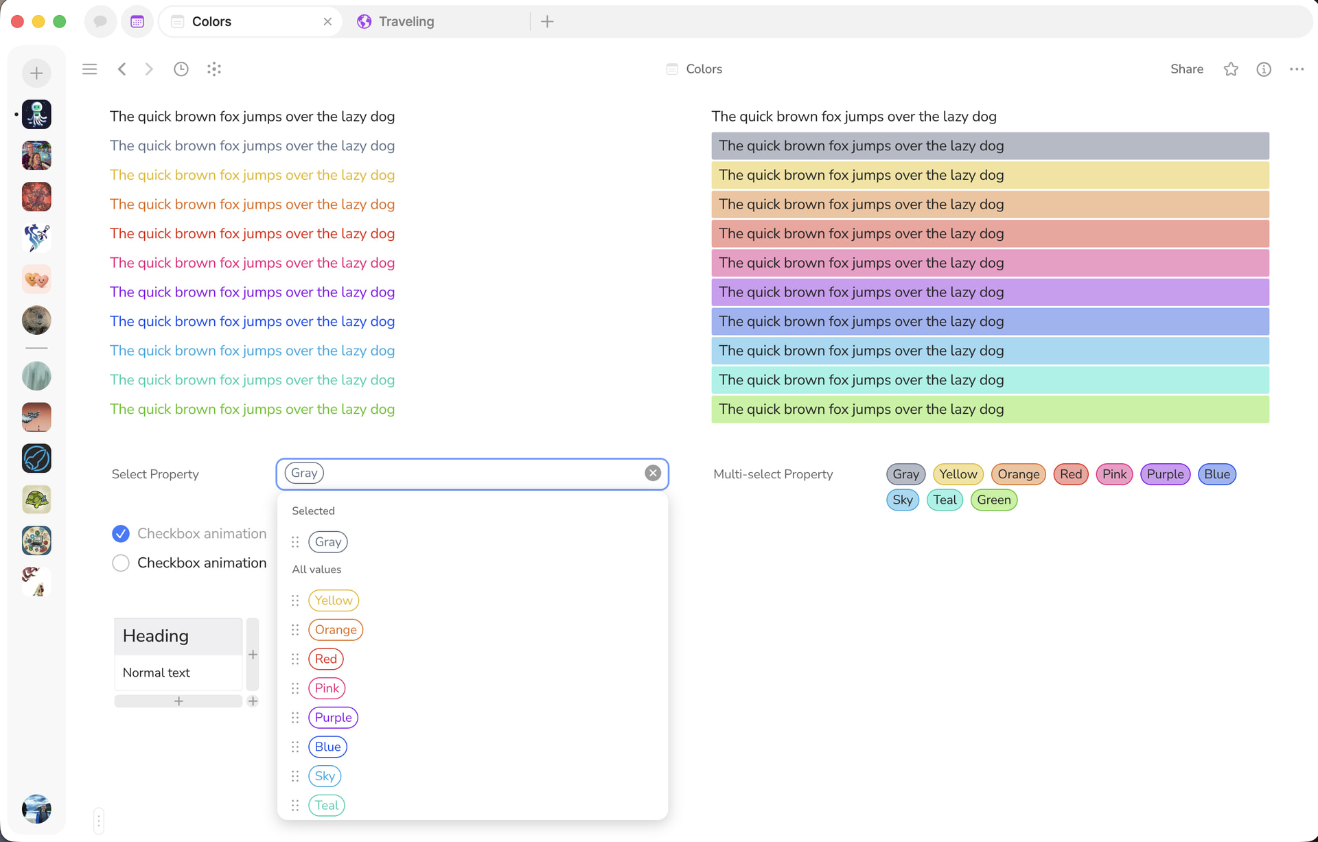
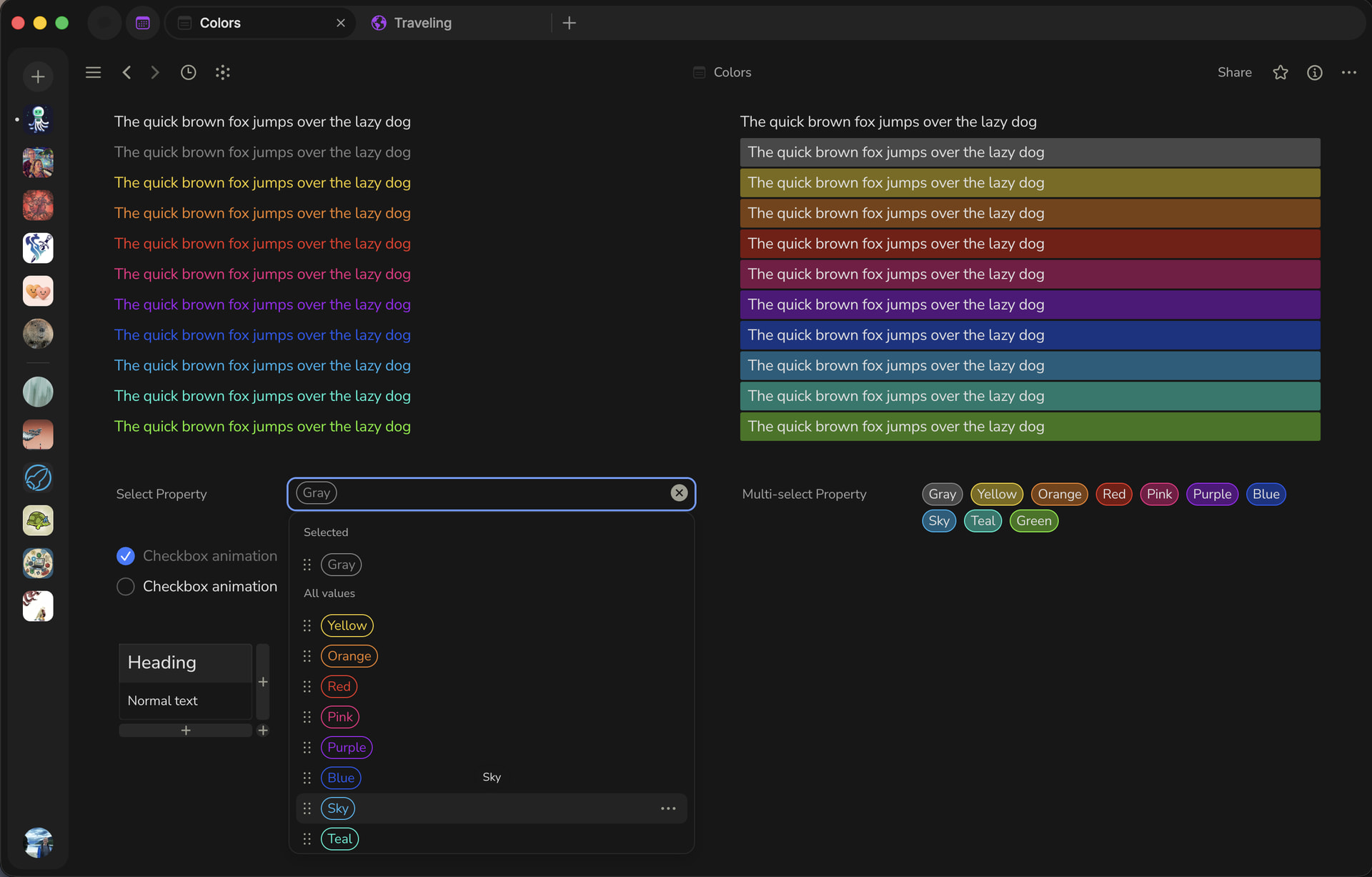
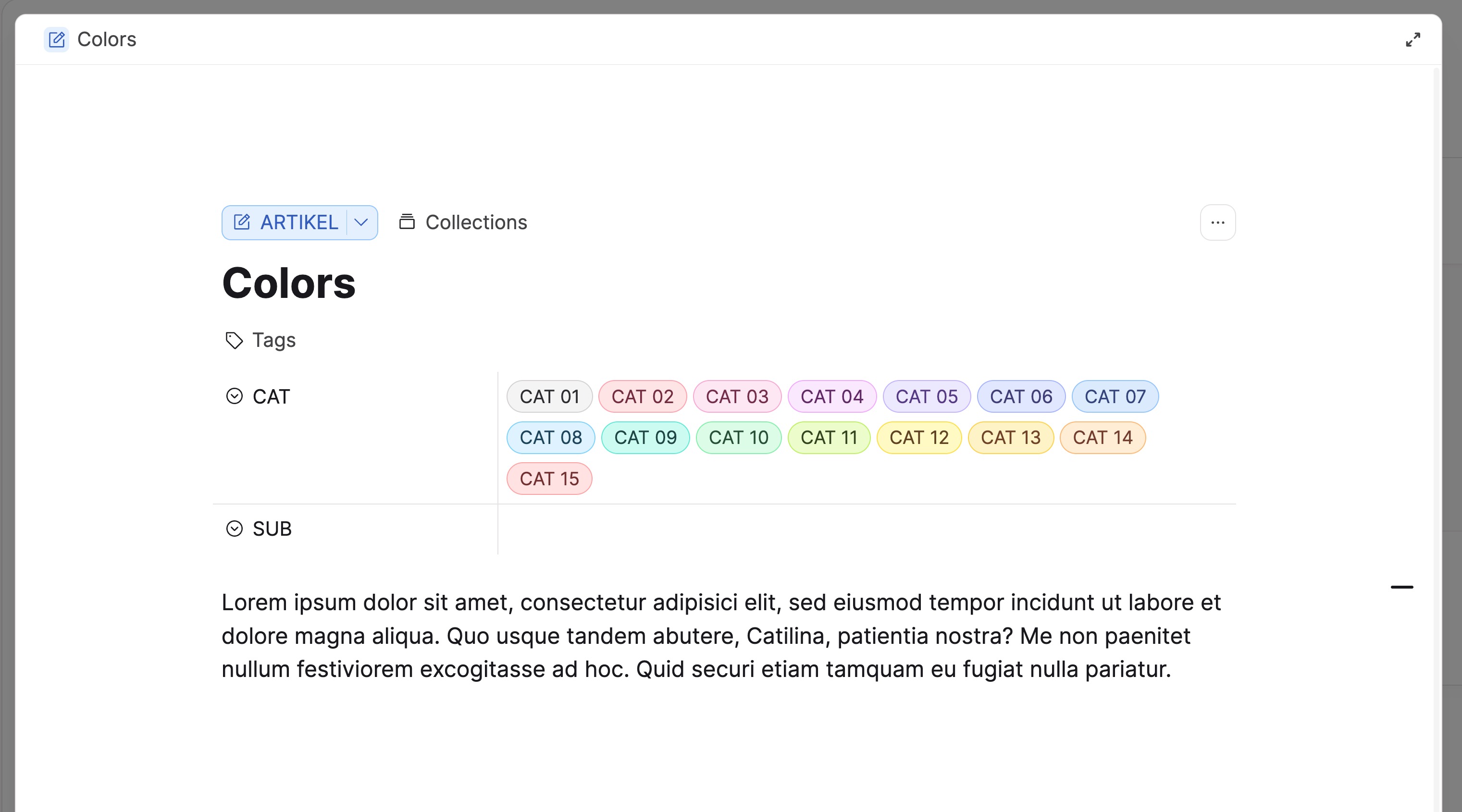
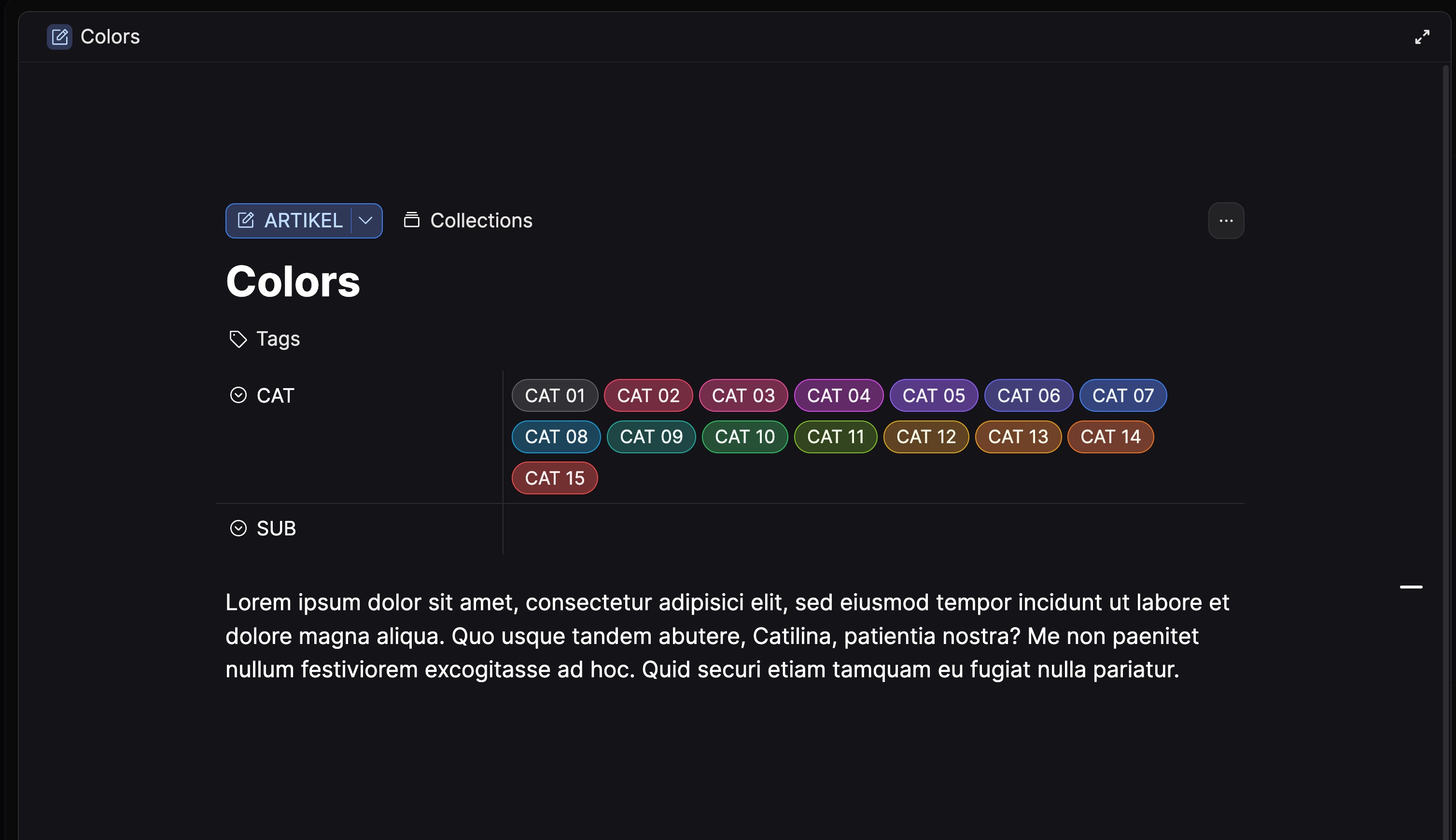
More accessibile-friendly color palette

Hi folks!

Just here to share some new colors I’ve been playing around with. My goal here with this color palette is to get closer to WCAG guidelines. Screenshots first, then CSS below. Hope you like what you see :blush:

:root {
    /* Text */

    --color-text-primary: hsl(0, 0%, 15%);
    --color-text-primary-20: hsla(0, 0%, 0%, 0.2);
    --color-text-primary-70: hsla(0, 0%, 15%, 0.75);
    --color-text-secondary: hsl(0, 0%, 40%);
    --color-text-tertiary: hsl(0, 0%, 75%);
    --color-text-inversion: hsl(0, 0%, 100%);
    --color-text-white: hsl(0, 0%, 100%);
    --color-text-white60: hsla(0, 0%, 100%, 0.6);
    --color-text-primary-inversion: hsl(0, 0%, 90%);
    --color-text-secondary-inversion: hsl(0, 0%, 60%);
    --color-text-tertiary-inversion: hsl(0, 0%, 34%);

    /* Shape */

    --color-shape-secondary-inversion: hsl(0, 0%, 16%);
    --color-shape-secondary: hsl(0, 0%, 92%);
    --color-shape-primary: var(--color-dark-grey);
    --color-shape-highlight-dark: hsla(0, 0%, 0%, 0.4);

    --color-shape-tertiary: var(--color-very-light-grey);
    --color-shape-highlight-medium: hsla(0, 0%, 0%, 0.05);
    --color-shape-highlight-light: hsla(0, 0%, 0%, 0.03);
    --color-shape-highlight-light-solid: hsl(0, 0%, 97%);

    --color-shape-highlight-add: hsla(94, 100%, 42%, 0.2);
    --color-shape-highlight-change: hsla(202, 85%, 55%, 0.2);
    --color-shape-highlight-remove: hsla(15, 91%, 55%, 0.2);

    /* Control */

    --color-control-accent: hsl(0, 0%, 15%);
    --color-control-active: hsl(0, 0%, 71%);
    --color-control-active-inversion: hsl(0, 0%, 45%);
    --color-control-inactive: hsl(0, 0%, 86%);
    --color-control-bg: hsl(0, 0%, 100%);

    /* Icon */

    --color-icon: hsl(0, 0%, 61%);
    --color-icon-hover: hsl(0, 0%, 15%);

    /* Background */

    --color-bg-primary: hsl(0, 0%, 100%);
    --color-bg-primary-90: hsla(0, 0%, 100%, 0.9);
    --color-bg-primary-inversion: hsl(0, 0%, 9%);
    --color-bg-loader: hsla(0, 0%, 100%, 0.7);
    --color-attachment-loader: hsla(0, 0%, 53%, 0.7);

    /* System */

    --color-system-accent-125: hsl(220, 87%, 50%);
    --color-system-accent-100: hsl(220, 100%, 61%);
    --color-system-accent-50: hsl(220, 100%, 71%);
    --color-system-accent-25: hsl(220, 100%, 80%);
    --color-system-highlight: hsla(220, 100%, 61%, 0.15);
    --color-system-selection: hsla(220, 100%, 61%, 0.251);
    --color-system-drop-zone: hsla(220, 100%, 61%, 0.25);
    --color-system-destructive-100: hsl(13, 96%, 58%);
    --color-system-destructive-50: hsl(15, 90%, 88%);
    --color-system-destructive-25: hsl(14, 94%, 94%);

    /* Color */

    --color-very-light-yellow: hsl(50, 58%, 94%);
    --color-light-yellow: hsl(49, 78%, 78%);
    --color-yellow: hsl(48, 92%, 46%);
    --color-dark-yellow: hsl(46, 78%, 24%);

    --color-very-light-orange: hsl(28, 58%, 94%);
    --color-light-orange: hsl(27, 78%, 78%);
    --color-orange: hsl(26, 92%, 46%);
    --color-dark-orange: hsl(24, 78%, 24%);

    --color-very-light-red: hsl(4, 58%, 94%);
    --color-light-red: hsl(5, 78%, 78%);
    --color-red: hsl(6, 92%, 46%);
    --color-dark-red: hsl(8, 78%, 24%);

    --color-very-light-pink: hsl(332, 58%, 94%);
    --color-light-pink: hsl(331, 78%, 78%);
    --color-pink: hsl(330, 92%, 48%);
    --color-dark-pink: hsl(328, 78%, 24%);

    --color-very-light-purple: hsl(276, 58%, 94%);
    --color-light-purple: hsl(275, 78%, 78%);
    --color-purple: hsl(274, 92%, 48%);
    --color-dark-purple: hsl(272, 78%, 24%);

    --color-very-light-blue: hsl(224, 58%, 94%);
    --color-light-blue: hsl(223, 78%, 78%);
    --color-blue: hsl(222, 92%, 48%);
    --color-dark-blue: hsl(220, 78%, 24%);

    --color-very-light-teal: hsl(172, 58%, 94%);
    --color-light-teal: hsl(171, 78%, 78%);
    --color-teal: hsl(170, 92%, 42%);
    --color-dark-teal: hsl(168, 78%, 22%);

    --color-very-light-ice: hsl(198, 58%, 94%);
    --color-light-ice: hsl(197, 78%, 78%);
    --color-ice: hsl(196, 92%, 46%);
    --color-dark-ice: hsl(194, 78%, 24%);

    --color-very-light-lime: hsl(96, 58%, 94%);
    --color-light-lime: hsl(95, 78%, 78%);
    --color-lime: hsl(94, 88%, 40%);
    --color-dark-lime: hsl(92, 72%, 22%);

    --color-very-light-grey: hsl(220, 10%, 94%);
    --color-light-grey: hsl(218, 14%, 74%);
    --color-grey: hsl(216, 16%, 46%);
    --color-dark-grey: hsl(214, 18%, 22%);

    /* Tag */

    --color-tag-grey: var(--color-grey);
    --color-tag-yellow: var(--color-yellow);
    --color-tag-orange: var(--color-orange);
    --color-tag-red: var(--color-red);
    --color-tag-pink: var(--color-pink);
    --color-tag-purple: var(--color-purple);
    --color-tag-blue: var(--color-blue);
    --color-tag-ice: var(--color-ice);
    --color-tag-teal: var(--color-teal);
    --color-tag-lime: var(--color-lime);

    /* Font */

    --font-size-9: 9px;
    --line-height-9: 12px;
    --letter-spacing-9: 0.14px;

    --font-size-very-small: 11px;
    --line-height-very-small: 18px;
    --letter-spacing-very-small: 0.2px;

    --font-size-small: 12px;
    --line-height-small: 18px;
    --letter-spacing-small: 0px;

    --font-size-common: 14px;
    --line-height-common: 22px;
    --letter-spacing-common: -0.12px;

    --font-size-paragraph: 16px;
    --line-height-paragraph: 24px;
    --letter-spacing-paragraph: -0.2px;

    --font-size-title: 36px;
    --line-height-title: 40px;
    --letter-spacing-title: -0.64px;
    --font-weight-title: 900;

    --font-size-header1: 28px;
    --line-height-header1: 32px;
    --letter-spacing-header1: -0.56px;
    --font-weight-header1: 900;

    --font-size-header2: 22px;
    --line-height-header2: 28px;
    --letter-spacing-header2: -0.48px;
    --font-weight-header2: 900;

    --font-size-header3: 18px;
    --line-height-header3: 26px;
    --letter-spacing-header3: -0.28px;
    --font-weight-header3: 900;

    --font-size-description: 18px;
    --line-height-description: 26px;
    --letter-spacing-description: -0.28px;

    /* Menu */
    --menu-width-common: 224px;
    --menu-width-icon: 256px;
    --menu-width-value: 288px;
    --menu-width-set: 360px;
    --menu-width-large: 408px;
    --menu-width-add: 480px;

    --editor-width: 710px;
}

html.themeDark {
    /* Text */

    --color-text-primary: hsl(0, 0%, 88%);
    --color-text-primary-70: hsla(0, 0%, 88%, 0.75);
    --color-text-secondary: hsl(0, 0%, 64%);
    --color-text-tertiary: hsl(0, 0%, 36%);
    --color-text-inversion: hsl(0, 0%, 9%);
    --color-text-primary-inversion: hsl(0, 0%, 12%);
    --color-text-secondary-inversion: hsl(0, 0%, 26%);
    --color-text-tertiary-inversion: hsl(0, 0%, 64%);

    /* Shape */

    --color-shape-primary: hsl(0, 0%, 19%);
    --color-shape-secondary: hsl(0, 0%, 16%);
    --color-shape-tertiary: hsl(0, 0%, 14%);

    --color-shape-highlight-dark: hsla(0, 0%, 100%, 0.11);
    --color-shape-highlight-medium: hsla(0, 0%, 100%, 0.05);
    --color-shape-highlight-light: hsla(0, 0%, 100%, 0.03);
    --color-shape-highlight-light-solid: hsl(0, 0%, 12%);

    /* Control */

    --color-control-accent: hsl(0, 0%, 83%);
    --color-control-active: hsl(0, 0%, 45%);
    --color-control-inactive: hsl(0, 0%, 25%);
    --color-control-bg: hsl(0, 0%, 100%);

    /* Background */

    --color-bg-primary: hsl(0, 0%, 9%);
    --color-bg-primary-90: hsla(0, 0%, 9%, 0.9);
    --color-bg-secondary: hsl(0, 0%, 10%);
    --color-bg-loader: hsla(0, 0%, 0%, 0.7);
    --color-attachment-loader: hsla(0, 0%, 100%, 0.7);

    /* Color */

    --color-very-light-yellow: hsl(50, 52%, 93%);
    --color-light-yellow: hsl(50, 72%, 28%);
    --color-yellow: hsl(50, 88%, 54%);
    --color-dark-yellow: hsl(50, 72%, 81%);

    --color-very-light-orange: hsl(28, 52%, 93%);
    --color-light-orange: hsl(28, 74%, 27%);
    --color-orange: hsl(28, 88%, 54%);
    --color-dark-orange: hsl(28, 72%, 81%);

    --color-very-light-red: hsl(4, 52%, 93%);
    --color-light-red: hsl(4, 76%, 27%);
    --color-red: hsl(4, 88%, 54%);
    --color-dark-red: hsl(4, 72%, 81%);

    --color-very-light-pink: hsl(332, 52%, 93%);
    --color-light-pink: hsl(332, 70%, 28%);
    --color-pink: hsl(332, 88%, 54%);
    --color-dark-pink: hsl(332, 72%, 81%);

    --color-very-light-purple: hsl(276, 52%, 93%);
    --color-light-purple: hsl(276, 72%, 28%);
    --color-purple: hsl(276, 88%, 54%);
    --color-dark-purple: hsl(276, 72%, 81%);

    --color-very-light-blue: hsl(224, 52%, 93%);
    --color-light-blue: hsl(224, 70%, 30%);
    --color-blue: hsl(224, 88%, 54%);
    --color-dark-blue: hsl(224, 72%, 81%);

    --color-very-light-teal: hsl(172, 52%, 93%);
    --color-light-teal: hsl(172, 68%, 28%);
    --color-teal: hsl(172, 88%, 54%);
    --color-dark-teal: hsl(172, 72%, 81%);

    --color-very-light-ice: hsl(198, 52%, 93%);
    --color-light-ice: hsl(198, 66%, 29%);
    --color-ice: hsl(198, 88%, 54%);
    --color-dark-ice: hsl(198, 72%, 81%);

    --color-very-light-lime: hsl(96, 52%, 93%);
    --color-light-lime: hsl(96, 62%, 28%);
    --color-lime: hsl(96, 88%, 54%);
    --color-dark-lime: hsl(96, 72%, 81%);

    --color-very-light-grey: hsl(0, 0%, 94%);
    --color-light-grey: hsl(0, 0%, 28%);
    --color-grey: hsl(0, 0%, 52%);
    --color-dark-grey: hsl(0, 0%, 84%);

    /* Tag */

    --color-tag-grey: var(--color-text-secondary);

    /* System */

    --color-system-accent-125: hsl(220, 87%, 50%);
    --color-system-accent-50: hsl(220, 100%, 71%);
    --color-system-accent-25: hsl(220, 100%, 80%);
    --color-system-highlight: hsla(220, 100%, 61%, 0.15);
    --color-system-selection: hsla(220, 100%, 61%, 0.75);    /* Previously 0.25 */
    --color-system-destructive-50: hsl(14, 59%, 29%);
    --color-system-destructive-25: hsl(14, 33%, 17%);

    /* Icon */

    --color-icon: hsl(56, 7%, 60%);
    --color-icon-hover: hsl(0, 0%, 88%);

    .tagItem.isMultiSelect .inner {
        color: var(--color-text-primary) !important;
    }
}

/* --------- UNIVERSAL STYLES --------- */

.blocks
    .block.blockText.isChecked
    > .wrapContent
    > .selectionTarget
    > .dropTarget {
    color: color-mix(
        in hsl,
        currentColor 30%,
        var(--color-text-primary) 15%
    ) !important;
}

/* FONT STYLES */
body {
    font-family: "Nunito Sans", sans-serif;
}

markupbold {
    font-weight: 900;
}

.tagItem.isMultiSelect .inner {
    color: var(--color-text-primary) !important;
}

.tagItem {
    border: 1px solid !important;
}

markupmention {
    color: var(--color-lime);
    font-weight: 900;
}

a.markuplink {
    color: var(--color-ice);
    font-weight: 900;
}


.blocks .block.blockChat .message .bubble .attachments {
    padding: 12px 8px 8px 8px;
}

/* Make font size of headings in tables larger */
.row:first-child.isHeader .value {
    font-size: 1.2rem;
}

/* Add fun animation to list item checkboxes and task checkboxes */
.blocks .block.blockText .markers .marker.markerCheckbox.active,
.iconObject.isTask .objectCheckbox2,
.markerCheckbox2.hasSvg {
    -webkit-animation: rubberBand 0.8s 1;
    animation: rubberBand 0.8s 1;
}

@-webkit-keyframes rubberBand {
    0% {
        -webkit-transform: scaleX(1);
        transform: scaleX(1);
    }

    30% {
        -webkit-transform: scale3d(1.25, 0.75, 1);
        transform: scale3d(1.25, 0.75, 1);
    }

    40% {
        -webkit-transform: scale3d(0.75, 1.25, 1);
        transform: scale3d(0.75, 1.25, 1);
    }

    50% {
        -webkit-transform: scale3d(1.15, 0.85, 1);
        transform: scale3d(1.15, 0.85, 1);
    }

    65% {
        -webkit-transform: scale3d(0.95, 1.05, 1);
        transform: scale3d(0.95, 1.05, 1);
    }

    75% {
        -webkit-transform: scale3d(1.05, 0.95, 1);
        transform: scale3d(1.05, 0.95, 1);
    }

    to {
        -webkit-transform: scaleX(1);
        transform: scaleX(1);
    }
}

@keyframes rubberBand {
    0% {
        -webkit-transform: scaleX(1);
        transform: scaleX(1);
    }

    30% {
        -webkit-transform: scale3d(1.25, 0.75, 1);
        transform: scale3d(1.25, 0.75, 1);
    }

    40% {
        -webkit-transform: scale3d(0.75, 1.25, 1);
        transform: scale3d(0.75, 1.25, 1);
    }

    50% {
        -webkit-transform: scale3d(1.15, 0.85, 1);
        transform: scale3d(1.15, 0.85, 1);
    }

    65% {
        -webkit-transform: scale3d(0.95, 1.05, 1);
        transform: scale3d(0.95, 1.05, 1);
    }

    75% {
        -webkit-transform: scale3d(1.05, 0.95, 1);
        transform: scale3d(1.05, 0.95, 1);
    }

    to {
        -webkit-transform: scaleX(1);
        transform: scaleX(1);
    }
}

.tagItem.isMultiSelect .tagRemove::after {
    content: "";
    width: 10px;
    height: 10px;
    position: absolute;
    top: 50%;
    left: 50%;
    margin: -5px 0 0 -5px;
    background-color: var(--color-text-primary);
    -webkit-mask-image: url("data:image/svg+xml,%3Csvg width='10' height='10' viewBox='0 0 10 10' xmlns='http://www.w3.org/2000/svg'%3E%3Cpath fill-rule='evenodd' clip-rule='evenodd' d='M2.44194 1.55806C2.19786 1.31398 1.80214 1.31398 1.55806 1.55806C1.31398 1.80214 1.31398 2.19786 1.55806 2.44194L4.11612 5L1.55806 7.55806C1.31398 7.80214 1.31398 8.19786 1.55806 8.44194C1.80214 8.68602 2.19786 8.68602 2.44194 8.44194L5 5.88388L7.55806 8.44194C7.80214 8.68602 8.19786 8.68602 8.44194 8.44194C8.68602 8.19786 8.68602 7.80214 8.44194 7.55806L5.88388 5L8.44194 2.44194C8.68602 2.19786 8.68602 1.80214 8.44194 1.55806C8.19786 1.31398 7.80214 1.31398 7.55806 1.55806L5 4.11612L2.44194 1.55806Z' fill='black'/%3E%3C/svg%3E");
    -webkit-mask-size: contain;
    -webkit-mask-repeat: no-repeat;
}

Hey man,

this is the absolute best CSS that I’ve ever tested! :+1:

I couldn’t find any issue. Even my own multiple times tweaked CSS has always had this or that tiny issue, But your code worked “out of the box” perfect!

This is how Anytype should have looked from start on!
Unbelievable that the team was never able to do that, no matter how often the users complained about poor visibility!

@Kaye who ever in the team is in charge now to modify things in the UI (I got wind about a case with Ra…): now, where the secret is solved, how to make things good visible, please make sure that someone (finally!!!) makes the connection lines in the Graph visible! Because it can’t be done by the user with CSS.

-- Many thank! :pink_heart:

Edit:
Correction: I’ve found an issue:
Text selection is not visible (in dark mode).

(At least for me; I have a weakness with blue.)

What helps: change in this line the last parameter from 0.25 to 0.75:

--color-system-selection: hsla(220, 100%, 61%, 0.25);

Selection needs more testing, there could exist some other flaws with certain elements.

Thanks for sharing this!

It’d be cool if some other users could test it out and see if this works well for them as well. We’d be happy to revisit the colors again to make it better for folks.

Check out the beautiful colors in Capacities. I really like their palette, the harmony between borders, background, label. I’ve partially adapted my own CSS accordingly for my tag properties.


If you have a set that you’re happy with, please share it (the CSS) here and we can take a look.

I’m happy to post my custom CSS snippets for the five colors I’m using for my Spaces - not an entire set, sorry. Also, I’m personally ignoring dark mode colors, since I don’t use dark mode for a PKM tool.
With the help of a color picker, anyone can reproduce the entire Capacities palette accordingly.

/* Colors for multi-select property tags 
---------------------------------------- */

/**** Ice ****/

.tagItem.textColor-ice {
	padding: 2px 10px;
	border: 1px solid #93c5fd !important;
}
.tagItem.textColor-ice .inner {
	color: #35467e !important;
}
.bgColor-ice { 
	background: #dbeafe !important;
}

/**** Grey ****/

.tagItem.textColor-grey {
	padding: 2px 10px;
	border: 1px solid #d3d3d1 !important;
}
.tagItem.textColor-grey .inner {
	color: #444447 !important;
}
.bgColor-grey { 
	background: #f6f6f6 !important;
}

/**** Purple ****/

.tagItem.textColor-purple {
	padding: 2px 10px;
	border: 1px solid #d7b4fe !important;
}
.tagItem.textColor-purple .inner {
	color: #5c377a !important;
}
.bgColor-purple {
	background: #f3e8ff !important;
}

/**** Red ****/

.tagItem.textColor-red {
	padding: 2px 10px;
	border: 1px solid #fda4af !important;
}
.tagItem.textColor-red .inner {
	color: #732d40 !important;
}
.bgColor-red {
	background: #ffe4e5 !important;
}

/**** Orange ****/

.tagItem.textColor-orange {
	padding: 2px 10px;
	border: 1px solid #fdba74 !important;
}
.tagItem.textColor-orange .inner {
	color: #733d2c !important;
}
.bgColor-orange {
	background: #ffedd4 !important;
}

/* Use it at your own risk */

Thank you for the kind words! I really appreciate it. I don’t have any color vision deficiency, so thank you for the feedback. I updated my original post with your suggestion.

As much as I like this, I’d like for the colors to pop a bit more. I absolutely understand your fondness for it though.


For anyone else who would like to play around with this CSS, please let me know your thoughts! Happy to make adjustments if it helps improve accessibility.

One thing more:

If a Tag has a blue background, it looks like a black background for me; not differentiable from the normal black background in dark mode. I know, it’s only my blue weakness, not your guilt.

I tried to fix that, but till now with not the desired success.

The other kinds of “blue” (Teal and Ice) are well recognizable for me, they even look “blue” for me. But the pure blue isn’t visible for me.
My attempts too tweak that in a way, that blue still look “blue” but better recognizable AND differentiable from tile and ice, failed.

I was able to make it visible and differentiable, yes, but at the cost that it isn’t blue anymore. It’s more reddish now.

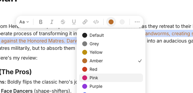
@kaye Anytype makes it unnecessary hard for (some of) us, to tweak the CSS, because the box where we can chose a color for the Tags, doesn’t show a tooltip with the name of the color.

My problem with this is the fact that I have a weakness with blue. That means, I can’t tell the difference between blue, tile and ice. They are all some kind of “blue” for me (but pure blue looks like black).
That has lead to a lot of try and error while I tried to tweak the CSS: which one is the right line I need to edit?

There are at least three possible candidates for the color, and each of them has multiples grades (light, strong …).
Which line is the one I need to modify?

What Anytype could do better:

  1. A quick fix: Simply add tooltips that show the name of a color that’s offered to the user to chose from.
    That information allows someone with a color weakness to find the correct line in the CSS file much quicker.
  2. (A little more work for the devs): Add a color picker, so that the user isn’t forced to tweak the CSS anymore. He could simply pick a color from the whole color spectrum and directly see the result, without the need to reload the window again and again and again and again!

Honestly, the time I’ve already spend to modify the CSS, to test other user’s CSS files, and even to program a tool that makes the tweaking it a little more comfortable, is no longer measured in hours, It has cost me already multiple days, definitely more then one week fulltime work of my life time!

For a programmer, it’s only a thing of minutes, to add at least the tooltips with the names of the colors.
And it needs no longer then half an hour for a dev, to add a proper color picker and to save the user’s choice in the CSS. This would end this endless infamous story immediately and for ever!

-- I don’t write a request for that, because in past, it was already requested, again and again. The team knows.
But I still have the impression, that the message somehow didn’t find their ear, because the team members seemingly don’t have the problem – they CAN see everything clear, therefore they don’t get it what problems it makes for guys with poorer eye sight.

The interesting thing is, that I normally don’t have such problems. For example, in web browsers, on YouTube, etc., also in all kinds of other Apps, everything is well enough visible for me.
It’s only Anytype where I need eye glasses, or sometimes a magnifier glass, or to temporarily modify the graphic settings of my PC, to see things clearly – but at the high cost, that it then burns my exes.

I’m not direct color blind, I reach about 85% in color blindness tests. That’s not so bad as my lines may sound.
But a very pure blue looks extremely dark for me. And with my eye-calming monitor settings, it’s de facto not differentiable from black. But I need eye-calming settings, otherwise it hurts my eyes.
And my graphic settings are everywhere OK; it’s only Anytype that makes trouble for me.

Thanks for the feedback, @Code-Jack. You’re right that if members of the team don’t experience the issue, it’s less likely to be prioritised (as a general premise)—no doubt.

When it comes to the issue with colour legibility on Anytype, I’d say that we have listened to the community and tried to make optimisations (as we have done in recent releases where we changed the whole palette). Often the issue is that it’s quite difficult to please everybody because:

  1. People have multiple different screens (desktop, laptop, mobile, etc.) and they all render colour differently.
  2. People have different preferences for colours, so what is nice to one person is ugly to another.
  3. People have different colour recognition abilities, as you’ve pointed out.

We hope that providing the ability to customise the CSS is helpful enough, but I totally hear you that we can make it an even better experience. As a general priority, we wan’t to minimise how many options/clutter there are in Anytype to not add to the difficulty of use.

I believe maybe the best (ultimate) solution is to have user customisable colours for all major aspects of the UI that we locate in advanced settings. This can exist in addition to the customisable CSS option that more advanced users feel comfortable with. This is not something we can implement soon/quickly though.

As a temporary solution, I could provide you with a Figma file with the Anytype UI elements connected to their colour variables. From there, you can change the colours using a colour picker and see it the changes in real time. Once you’re satisfied, you can then make the changes to your CSS file. I assume this solution could work because once you’ve set your colours, you will unlikely revisit them again (not a regular task).

Thanks for your reply, but this argument has no base:

Nothing becomes difficult to use; a simple right click on a color in the choosing list (no matter if for Tags or for text attributes, background/foreground) could let a colorpicker appear.

The right click there is not used at the moment, it’s still free.
And that a right click brings additional options is the normal thing that any user expects.

So, nothing becomes “difficult”; instead, it becomes more intuitively usable and a lot of friction is eliminated!

.

Oh kay …
Thanks for the offer.
But honestly: I can imagine how much work it must be to create such a Figma file.
Wouldn’t it be the much much better solution, to simply add one line of code to add the operating system’s color picker, plus some code lines more to store the choice into the CSS file?

Really, it’s not a shame to integrate the normal operating systems color picker that only needs one line of code!
There’s no need to program a fancy but work intense own solution!

I hear you, but I think this is a difference in opinion. On-location colour picker sounds intuitive, but it leads to a lot of other UX inconsistencies and there are too many to list.

Your suggestion of applying a color picker here via right-click (additional menu) could also make some users think that they are just changing the colour of that specific line of text—not across their entire channel. We already see this behaviour from people coming to a block-editor for the first time (who are frustrated by the limited color options in the first place). Additionally, if the user changes the colour here for text in the editor, should this also apply to elements using the same colour (multi-select, select, icons, etc.) in other areas? Is that their desire? How would that work in dark-mode?

In my opinion, it’s not an intuitive or effective solution from the various vantage points. But yes, I understand this is a matter of opinion.

Nonetheless, the feedback is certainly heard—users want more control over their colours and an easy way to make edits.

The normal color picker allows to add a line with a short description what it does.

“ATTENTION, changing a to a new color affects globally ALL elements that use the same!”

No, of course not!
In the CSS are separate settings for Tags, for text attributes, etc.
If the user changes the color of a Tag, then it should affect only Tags.
And if he modifies a text attributes color, it should again affect only the related line in the CSS.

The app knows it if the dark mode is active.
Therefore it should of course modify the line in the corresponding section of the CSS.

Sorry, but all these arguments has no base in my opinion.
I find it logically what should happen and I would report it as a bug if the app behaves differently from a healthy human common sense.

.

By the way (OT): can someone please enlighten me what’s the correct English writing: “color or colour”?
Both variants doesn’t pass the spell checking and also deepl seems to translate it differently from time to time.

.

Edit: the devs could (and should!) also add a tooltip on the colors (as already mentioned in an other post). That tooltip could show a larger warning about the global affection the the color picker’s title line.

Tooltips are still a thing that could need a bit more attention. There are still some elements without them, and the other ones are often very short, they don’t explain the thing well enough for new users.
In my own apps btw., Tooltips have mostly ca. five or six lines of text. My philosophy is, that there shouldn’t be any need for a manual. Five lines is still short to read in my opinion, but it quickly gives a lot of information.

The point I’m trying to make is that while all of those things are literally possible (and some are totally fine), it’s not the (subjective) ideal experience that we’d want to design for (changing everything individually on location). We will 100% think about a good way to do this in the next iterations.

In the meantime, I’m happy to supply you the Figma file (it’s not that hard to setup, actually—mostly done).

It’s just the different English spellings. Americans use color, while British (and Australians, me) use colour. This is the same for center vs. centre, summarize vs. summarise, etc. I often have to use American spelling because it’s the most used (annoying experience when I was writing the updated Docs), but I’m obviously more natively used to Australian spelling.

Maybe a good long-term solution would look like this?

  1. Themes for both Dark and Light modes. You can still choose Dark mode, Light mode, or Auto mode. For both Dark and Light mode, you can then choose between several themes that all have different color palettes (think VS Code’s Light, Dark, Material Dark, Material Light, Dark High Contrast, Light High Contrast, Monokai, Solarized, etc). I feel like I’m dating myself by mentioning Material :sweat_smile:
  2. Custom CSS that overwrites whatever theming the user has chosen as part of #1.

Yes, that’s exactly what would be ideal.