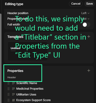
In the last image, We can see that on both the Left and Right sides of the Title Header at the very top, we see the Properties. This is what I am recommending, to add the ability to set these properties on either left, right, or both sides.
I can imagine things would b easiest for both devs and users if there was an extra category in the Properties Pane from the “Editing Type” interface. It could be called “Title Header”
REAL WORLD USE CASES
This would be in my opinion very useful, since you can scroll down through large amounts of data without losing the primary most vital information from sight. Since this little Title Bar is already part of the app, it’s got a very big amount of usable space and since it is already frozen, it would add a tremendous amount of flexibility and increase workflow efficiency.
starting to wonder if im being silently censored as nothing i ever write gets feedback while other things people write with very small details get tons of feedback/reviews/likes/votes.. or what the heck
Surely not; as you see, I answer to you, therefore I was able to read your post.
And btw.: for this forum, I don’t believe that something like silent censoring does exist here.
But I believe I know the true reason why you didn’t get feedback (at least here, in this thread) :
I can tell you, that I’ve multiple time tried to understand your start post, but I wasn’t able to get what you mean.
OK, I’m a German, my English is not so good. So I’ve thought, maybe a native English speaker is able to figure out what on earth you want …
– Seems that also no other user or team member was able to wrap his brain around your topic.
OK, I want to help you.
– But sorry, I’m too stupid to get what you want.
Please try again to explain your thing.
Thanks for sharing your idea. We try our best to respond to what we can. However, not everything we receive (from all channels) is easy to comprehend and can take quite some time.
While I understand your proposal (putting properties into the fixed title bar so that it remains on scroll), I don’t believe this is an elegant UI solution for various reasons:
It would not work well on smaller desktop windows.
It would not work at all on mobile.
It has limitation to the amount of properties that can be shown.
If you require fast referencing to Properties in a long document, might I recommend using the table of contents to scroll up quickly or to put Property Blocks in your doc.