WHAT DO YOU RECOMMEND
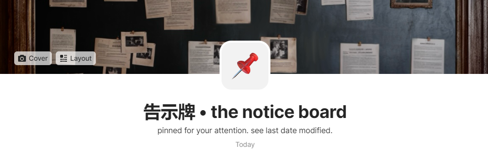
Remove borders from object icons. Alternatively, uploaded png icons that have a transparent background should be treated like emoji icons. See images; above is emoji icon, below is uploaded icon:

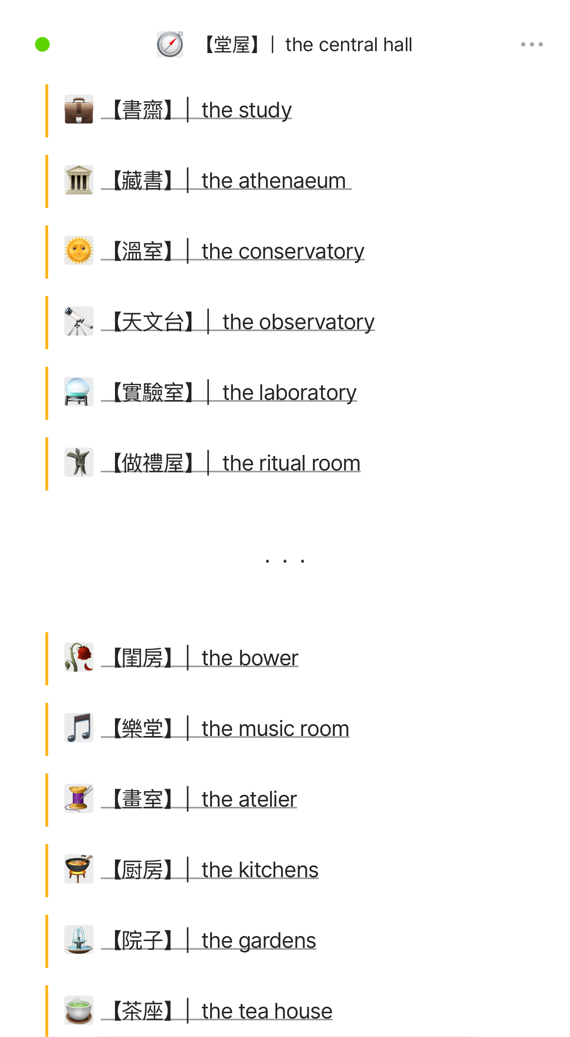
Additionally, uploaded icons (I uploaded the png version of emojis) have a clunky gray background on the iOS app:
HOW COULD IT BE DONE
Ideally, the two examples above should end up looking identical. Solution (1) would be to remove icon borders and the background used in the emoji version to match the result that an uploaded icon would provide. Solution (2) would be to treat any uploaded icon like an emoji and use the same background that changes shade when moving from light mode to dark mode.
As for the mobile app - the same solutions apply, and additionally remove the gray background applied to transparent png icons.
REAL WORLD USE CASES
aesthetics mainly. Notion has an icon system that seems to support uploaded icons in the ways I described above.
RECOMMENDED ALTERNATIVES
none
ADDITIONAL CONTEXT
none