How to make Progress relation more simple and nicer

Hello everyone,

I would like to share with you the following cool method of adding a progress property to your objects:

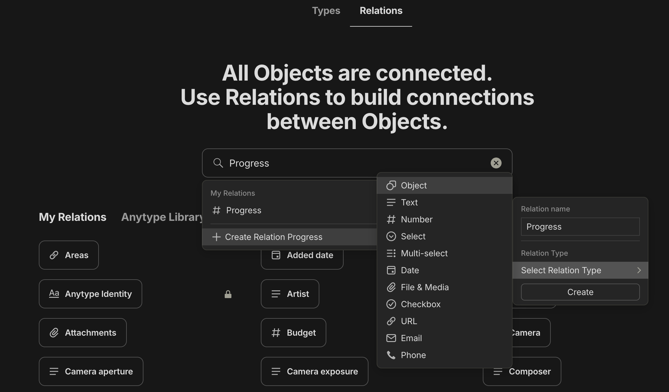
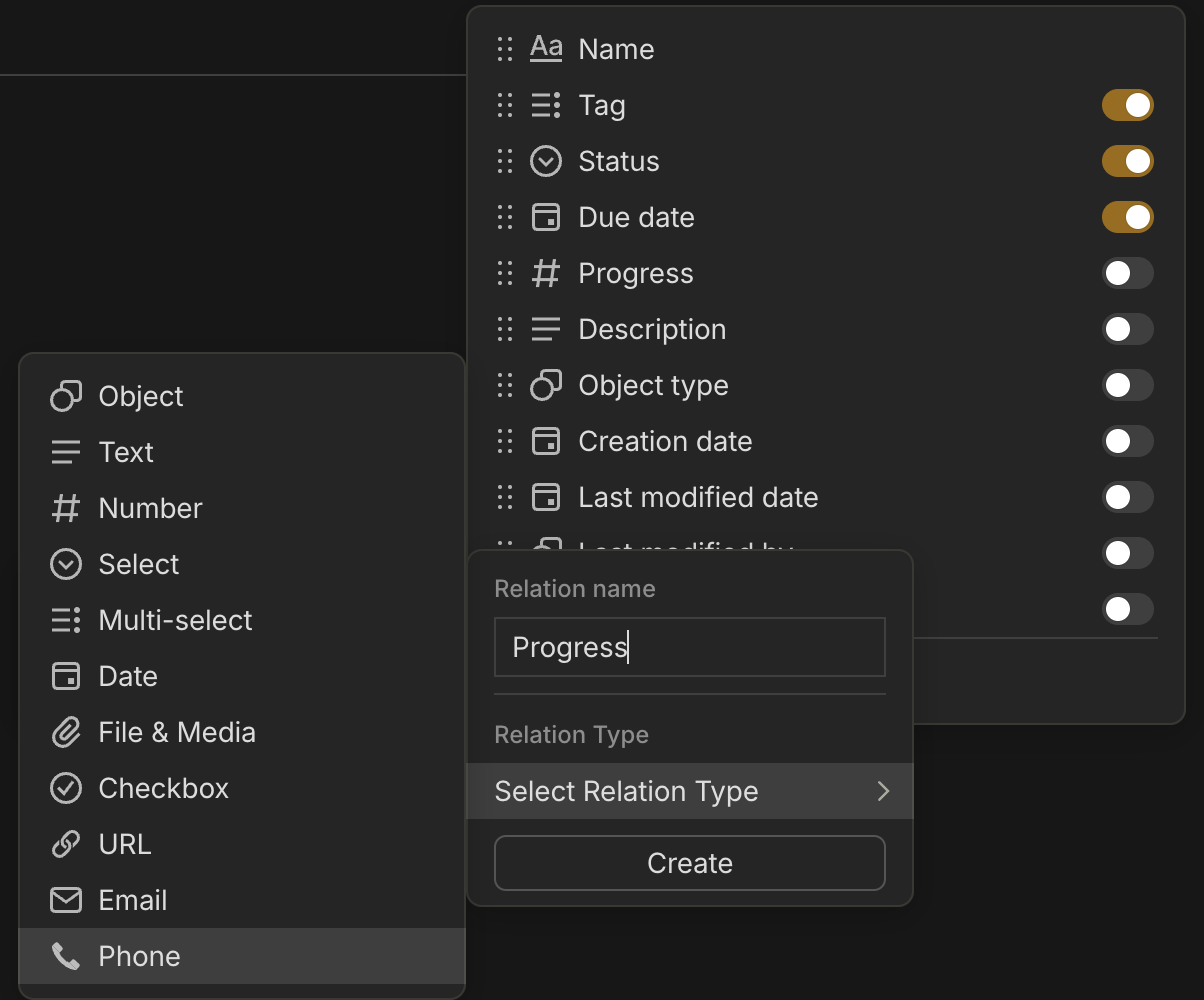
  1. Set a new relation with type “Select” and rename it to Progress or whatever you like
    image
  2. Add the following as options (copy and paste):
    ○○○○○○○○○○ 0%
    ●○○○○○○○○○ 10%
    ●●○○○○○○○○ 20%
    ●●●○○○○○○○ 30%
    ●●●●○○○○○○ 40%
    ●●●●●○○○○○ 50%
    ●●●●●●○○○○ 60%
    ●●●●●●●○○○ 70%
    ●●●●●●●●○○ 80%
    ●●●●●●●●●○ 90%
    ●●●●●●●●●● 100%
  3. Set their color to what you prefer
  4. Enjoy :smiley:
    image

Wow, love this idea!

Great idea bud!

Let’s try again, something went wrong with the previous post haha.

This is an awesome idea, love the use of color! Aditionally you could use emoticons as well:

For example:
:black_large_square: :black_large_square: :black_large_square: :black_large_square: :black_large_square: :black_large_square: :black_large_square: :black_large_square: :black_large_square: :black_large_square: 0%
:red_square: :black_large_square: :black_large_square: :black_large_square: :black_large_square: :black_large_square: :black_large_square: :black_large_square: :black_large_square: :black_large_square: 10%
:red_square: :red_square: :black_large_square: :black_large_square: :black_large_square: :black_large_square: :black_large_square: :black_large_square: :black_large_square: :black_large_square: 20%
:orange_square: :orange_square: :orange_square: :black_large_square: :black_large_square: :black_large_square: :black_large_square: :black_large_square: :black_large_square: :black_large_square: 30%
:orange_square: :orange_square: :orange_square: :orange_square: :black_large_square: :black_large_square: :black_large_square: :black_large_square: :black_large_square: :black_large_square: 40%
:yellow_square: :yellow_square: :yellow_square: :yellow_square: :yellow_square: :black_large_square: :black_large_square: :black_large_square: :black_large_square: :black_large_square: 50%
:blue_square: :blue_square: :blue_square: :blue_square: :blue_square: :blue_square: :black_large_square: :black_large_square: :black_large_square: :black_large_square: 60%
:blue_square: :blue_square: :blue_square: :blue_square: :blue_square: :blue_square: :blue_square: :black_large_square: :black_large_square: :black_large_square: 70%
:blue_square: :blue_square: :blue_square: :blue_square: :blue_square: :blue_square: :blue_square: :blue_square: :black_large_square: :black_large_square: 80%
:green_square: :green_square: :green_square: :green_square: :green_square: :green_square: :green_square: :green_square: :green_square: :black_large_square: 90%
:green_square: :green_square: :green_square: :green_square: :green_square: :green_square: :green_square: :green_square: :green_square: :green_square: 100%

Another example:
:white_circle::white_circle::white_circle::white_circle::white_circle::white_circle::white_circle::white_circle::white_circle::white_circle: 0%
:large_blue_circle::white_circle::white_circle::white_circle::white_circle::white_circle::white_circle::white_circle::white_circle::white_circle: 10%
:large_blue_circle::large_blue_circle::white_circle::white_circle::white_circle::white_circle::white_circle::white_circle::white_circle::white_circle: 20%
:large_blue_circle::large_blue_circle::large_blue_circle::white_circle::white_circle::white_circle::white_circle::white_circle::white_circle::white_circle: 30%
:large_blue_circle::large_blue_circle::large_blue_circle::large_blue_circle::white_circle::white_circle::white_circle::white_circle::white_circle::white_circle: 40%
:large_blue_circle::large_blue_circle::large_blue_circle::large_blue_circle::large_blue_circle::white_circle::white_circle::white_circle::white_circle::white_circle: 50%
:large_blue_circle::large_blue_circle::large_blue_circle::large_blue_circle::large_blue_circle::large_blue_circle::white_circle::white_circle::white_circle::white_circle: 60%
:large_blue_circle::large_blue_circle::large_blue_circle::large_blue_circle::large_blue_circle::large_blue_circle::large_blue_circle::white_circle::white_circle::white_circle: 70%
:large_blue_circle::large_blue_circle::large_blue_circle::large_blue_circle::large_blue_circle::large_blue_circle::large_blue_circle::large_blue_circle::white_circle::white_circle: 80%
:large_blue_circle::large_blue_circle::large_blue_circle::large_blue_circle::large_blue_circle::large_blue_circle::large_blue_circle::large_blue_circle::large_blue_circle::white_circle: 90%
:large_blue_circle::large_blue_circle::large_blue_circle::large_blue_circle::large_blue_circle::large_blue_circle::large_blue_circle::large_blue_circle::large_blue_circle::large_blue_circle: 100%

Edit: Seeing this on the forum, your way looks a lot cleaner then using emoticons.

I used to make it just like this one with square emojis but I found it to be too big compared to the text one :pensive:

And unfortunately those emojis lack the nice light blue color :confused:

I don’t understand the use case for this. Why would you be manually setting the percent completed for an object? You’re essentially just guessing a rough estimate, which defeats the point of a numerical percent.

Long-term I’d like to see Anytype be able to automatically calculate the percent based on how many items are checked off in an object or something like that.

@ccrawford
Its purpose is to show an overall state of tasks whether they need more attention to be finished or they are mid-way or even almost completed.

It’s actually a workaround until there’s an official way of doing it.

I use the smaller shape emojis. But yeah, the colors aren’t all desirable and I hate that it translates differently in desktop. (Android to Microsoft) :weary: I think I will try this one.

@Kerstie
Emojis are bad, they don’t get re-colored according to your preferred one unlike the text based symbols.

How do you even get to step 1? :slight_smile:

@sam2

I didn’t know it was called “Relation”, I edited it in the first post :joy:

Hmm. I’m confused. :confused:

If I go to Library > Relations > Status, then I don’t see what you are showing.

If I go to Library > Relations > Progress, then I don’t see what you are showing.

Why would you create something called “Progress” when there is already something called “Progress” in Anytype by default?

Because the default ones types can’t be changed.

I’m not seeing the Relation Type of “Status” with the three vertical bars. What am I missing here?

It’s better if you create it through a set/collection, much easier.

Still not seeing what you have in your first post, even trying to create through a Set. :frowning:

Now I see where the problem is, “Status” type was changed to “Select” in the most recent release. Choose the Select type then start adding each percentage as an option to this relation.

Love this and implemented it.

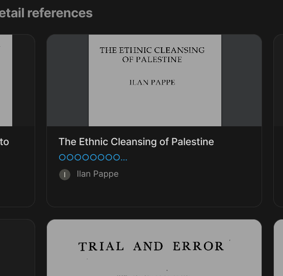
But sadly, in Gallery view, the relation gets cut off, defeating the whole purpose :frowning:

@raph Are you on the latest version v0.38.0? That was a bug and got fixed, it works fine for me now.