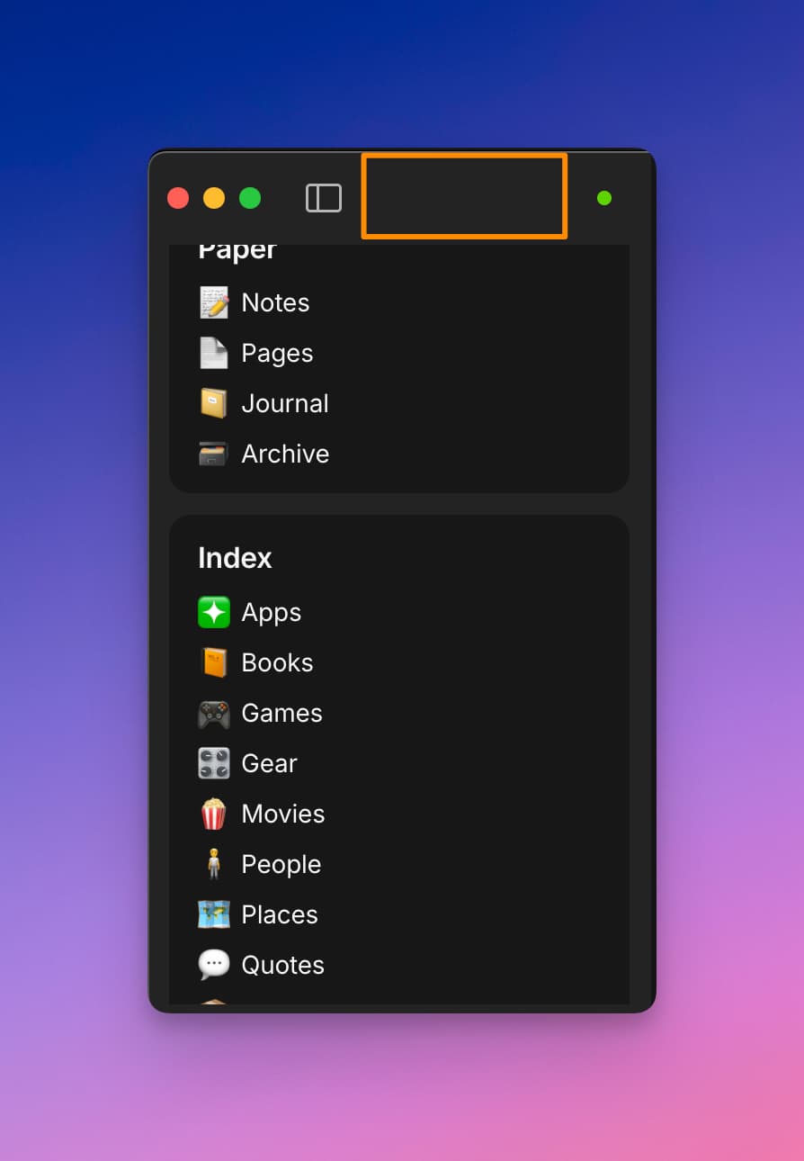
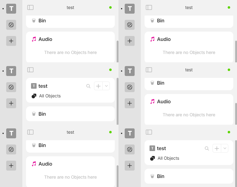
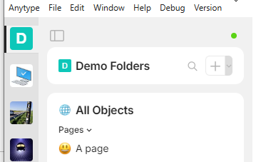
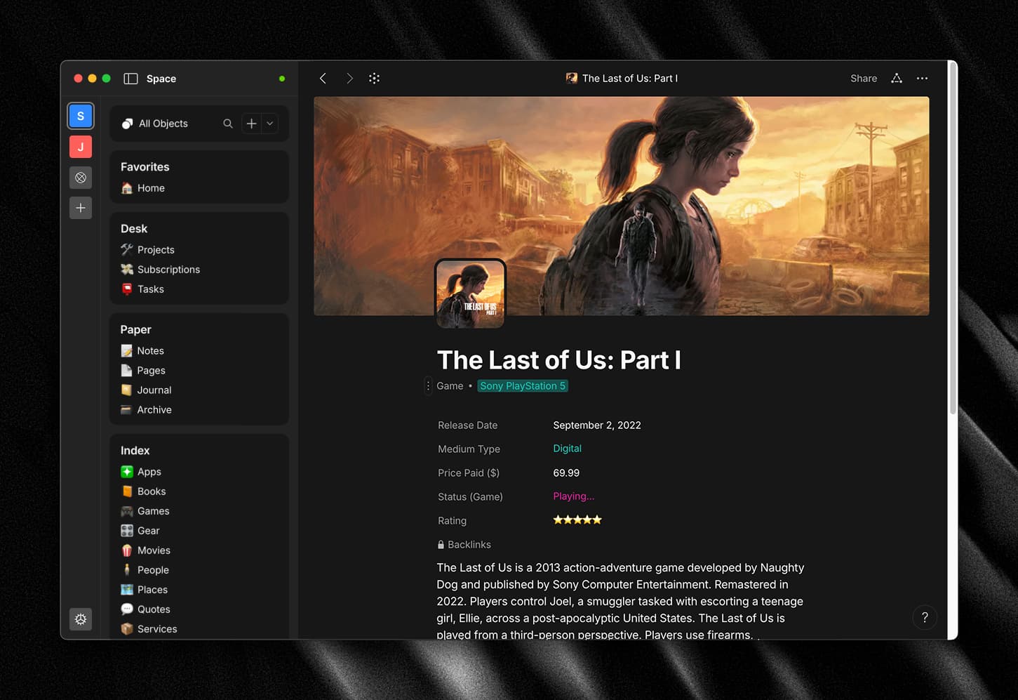
Happy to share that I managed to create the first CSS iteration of the design!
I also added translucent header when scrolling and forced dark scrollbar in dark
mode. Dropdowns got a little facelift, too. Here’s a snippet:
:root {
  --font-size-common: 13px;
  --color-widget-bg: #fafafa;
}
html.themeDark {
  color-scheme: dark;

  --color-text-primary: #e5e5e5;

  --color-bg-primary: #181818;
  --color-shape-tertiary: #121212;
  --color-widget-bg: #101010;
}

body {
  background: var(--color-shape-tertiary);
  font-family:
    system-ui,
    -apple-system,
    BlinkMacSystemFont,
    "Segoe UI",
    Roboto,
    Oxygen,
    Ubuntu,
    Cantarell,
    "Open Sans",
    "Helvetica Neue",
    sans-serif;
}
.vault,
html.themeDark .vault {
  background: none;
}
.vault .body {
  margin-top: 1px;
  padding-top: 7px;
  border-top: 1px solid var(--color-shape-highlight-medium);
  border-right: 1px solid var(--color-shape-highlight-medium);
}
.vault .body .side {
  padding: 8px 12px 0;
}
.vault .body .side.top {
  gap: 12px 0;
}
.vault .item.isActive::after {
  content: none;
}
.vault .item .iconWrap {
  border-radius: 8px;
}
html.themeDark .vault .item.isButton .iconWrap {
  background-color: rgba(79, 79, 79, 0.25);
}
.vault .item.isActive .iconWrap {
  box-shadow:
    0 0 0 2px var(--color-shape-tertiary),
    0 0 0 4px rgba(255, 255, 255, 0.25);
}

html.themeDark .sidebar {
  box-shadow: none;
}
.sidebar > #containerWidget {
  border-right: 1px solid var(--color-shape-highlight-medium);
}
.sidebar > #containerWidget > .head {
  border-bottom: 1px solid var(--color-shape-highlight-medium);
}
.sidebar > #containerWidget > .body {
  padding-top: 16px;
}
.vault .body .side.bottom {
  padding-bottom: 16px;
}

.widget {
  background: var(--color-shape-tertiary);
  background: var(--color-widget-bg);
  border: 1px solid var(--color-shape-highlight-medium);
  border-radius: 8px;
}
.widget.widgetSpace .body .sides {
  padding-top: 0;
  padding-right: 1px;
}
.widget.widgetSpace .body .sides .side.left .name {
  font-size: var(--font-size-common);
}
.widget.widgetSpace .body .sides .side.right .plusWrapper {
  box-shadow: 0 0 0 1px var(--color-shape-secondary);
  border-radius: 4px;
}
.widget.widgetSpace .body .sides .side.right .icon.search {
  width: 28px !important;
  height: 28px !important;
  border-radius: 4px;
}
.widget.widgetSpace .body .sides .side.right .icon,
.widget.widgetSpace .body .sides .side.right .icon.arrow {
  width: 26px !important;
  height: 26px !important;
}
.widget .head .icon,
.widget .head .clickable .icon {
  width: 16px;
  height: 16px;
}
.widget.widgetView .viewList .body.isCompact .item::before,
.widget.widgetView .viewGrid .body.isCompact .item::before {
  border-radius: 4px;
}
.widget.widgetSpace .body .buttons .item {
  background: transparent;
}
.iconObject .iconCommon.c18,
.iconObject .smileImage.c18,
.iconObject .iconImage.c18,
.iconObject .iconFile.c18,
.iconObject .iconCheckbox.c18 {
  width: 16px;
  height: 16px;
  margin-top: -8px;
  margin-left: -8px;
}
.widget.widgetView .viewList .body .item .buttons .icon,
.widget.widgetView .viewGrid .body .item .buttons .icon {
  width: 16px;
  height: 16px;
  background-size: 16px;
}
.sidebar > #containerObject {
  padding-bottom: 16px;
  box-shadow:
    inset 0 51px var(--color-shape-tertiary),
    inset 0 52px var(--color-shape-highlight-medium);
  border-right: 1px solid var(--color-shape-highlight-medium);
}
.sidebar > #containerObject > .inner {
  height: calc(100% - 16px);
  margin-top: 16px;
  box-shadow: 0 4px 8px 0 rgba(0, 0, 0, 0.0625);
  border: 1px solid var(--color-shape-highlight-medium);
  border-radius: 8px;
}
.themeDark .sidebar > #containerObject > .inner {
  box-shadow: 0 4px 8px 0 rgba(0, 0, 0, 0.125);
}
.button.widget {
  gap: 0 4px;
  padding: 12px 16px;
  font-size: var(--font-size-common);
}

.header.isCommon {
  background: color-mix(in srgb, var(--color-shape-tertiary) 75%, transparent);
  border-bottom: 1px solid var(--color-shape-highlight-medium);
  backdrop-filter: blur(8px);
}
.icon.withBackground {
  background-size: 16px !important;
}
.header .side.left,
.header .side.right {
  padding: 0 16px;
}

.block.blockCover {
  width: calc(100% - 32px - 2px);
  margin: 17px 1px -1px;
  border-radius: 8px 8px 0 0;
}

.pageMainEdit #bodyWrapper {
  padding-top: 16px; /* TODO: CHANGE TO MARGIN??? */
}

.pageMainEdit #bodyWrapper {
  margin: 16px;
  background: var(--color-bg-primary);
  box-shadow: 0 4px 8px 0 rgba(0, 0, 0, 0.0625);
  border: 1px solid rgba(255, 255, 255, 0.075);
  border-radius: 8px;
}
.themeDark .pageMainEdit #bodyWrapper {
  box-shadow: 0 4px 8px 0 rgba(0, 0, 0, 0.125);
}
.blocks .block.blockDataview #rowHeadClone {
  background: color-mix(in srgb, var(--color-shape-tertiary) 75%, transparent);
  border-bottom: 1px solid var(--color-shape-highlight-medium);
  backdrop-filter: blur(8px);
}
.blocks .block.blockDataview .icon.plus {
  background-size: 16px;
  vertical-align: baseline;
}

.footer .buttons {
  bottom: 24px;
  right: 24px;
}
.footer .iconWrap .icon {
  width: 16px;
  height: 16px;
  margin: -8px 0 0 -8px;
}

/* dropdown menu */

.menus .menu {
  background: color-mix(in srgb, var(--color-bg-primary) 90%, transparent);
  backdrop-filter: blur(8px);
}
html.themeDark .menus .menu {
  background: color-mix(in srgb, var(--color-bg-primary) 90%, transparent);
  backdrop-filter: blur(8px);
}
.menus .menu.vertical .item {
  background: none;
}
.menus .menu.vertical .item::before {
  width: calc(100% - 16px);
  left: 8px;
  border-radius: 4px;
}
.menus .menu.vertical .item .icon {
  width: 16px;
  height: 16px;
}
.menus .menu.menuSyncStatus .items .sides .side.right .icon.more {
  width: 20px !important;
  height: 20px !important;
}
.menus .menu.vertical .item .icon.arrow {
  right: 12px;
}
.menus .menu.vertical .item.withCaption.withArrow .caption {
  padding-right: 16px;
}
.menus .menu.vertical .item.withCaption .caption {
  line-height: 12px;
}

/* UPCOMING */

.sidebar.right {
  border-left: 1px solid var(--color-shape-highlight-medium);
}
.sidebar > .sidebarPage .head {
  border-bottom: 1px solid var(--color-shape-highlight-medium);
}
.sidebar > .sidebarPage .body {
  padding-top: 16px;
}
.sidebar > .sidebarPage .section {
  background: var(--color-widget-bg);
  border: 1px solid var(--color-shape-highlight-medium);
  border-radius: 8px;
}
.sidebar > .sidebarPage.pageObjectRelation .section.objectRelation {
  padding: 11px 15px;
}
.sidebar > .sidebarPage .section .item {
  padding: 4px 8px;
  border-radius: 4px;
}
.widget .head .clickable {
  font-size: var(--font-size-common);
}
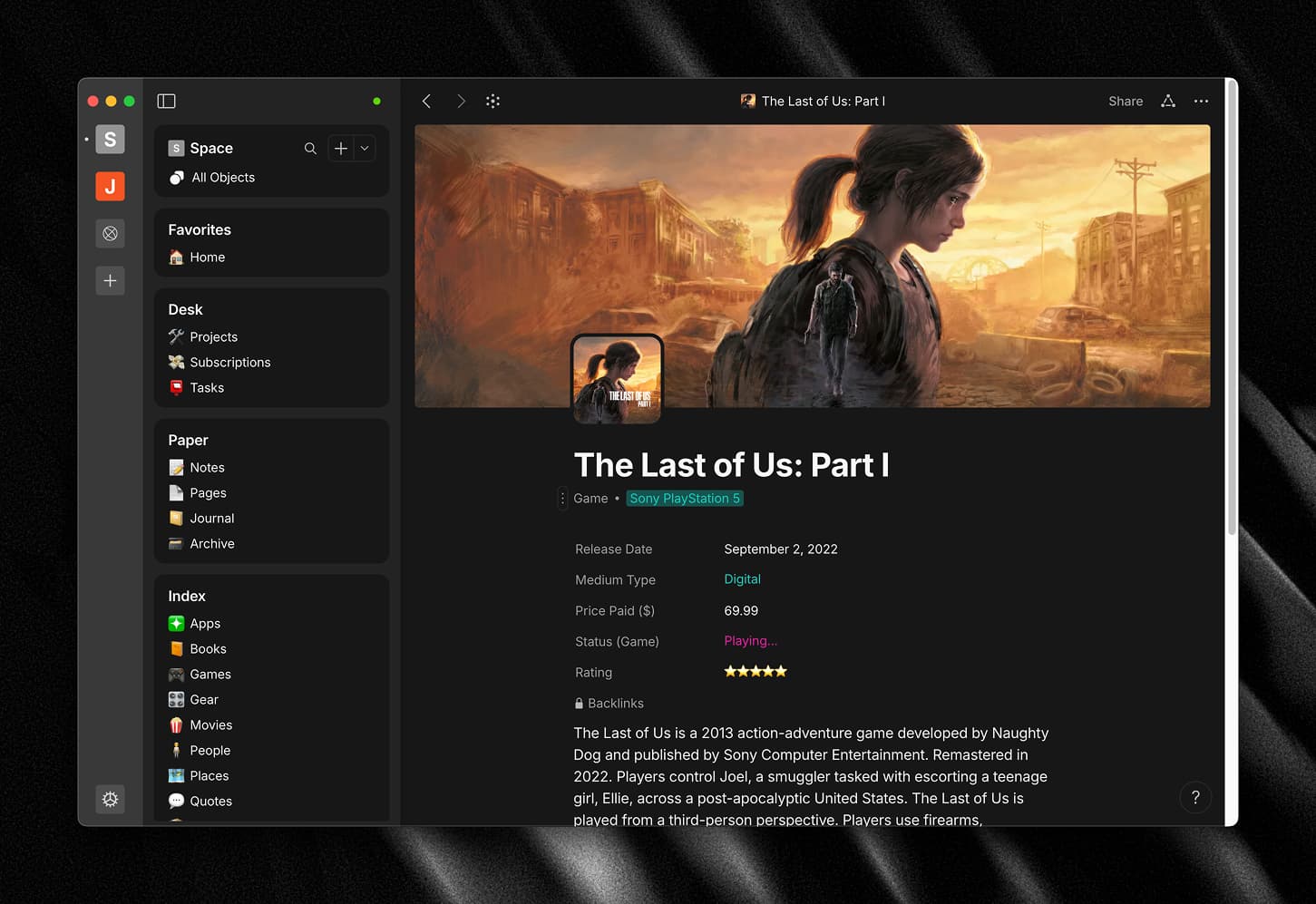
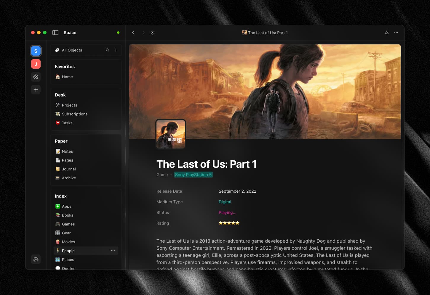
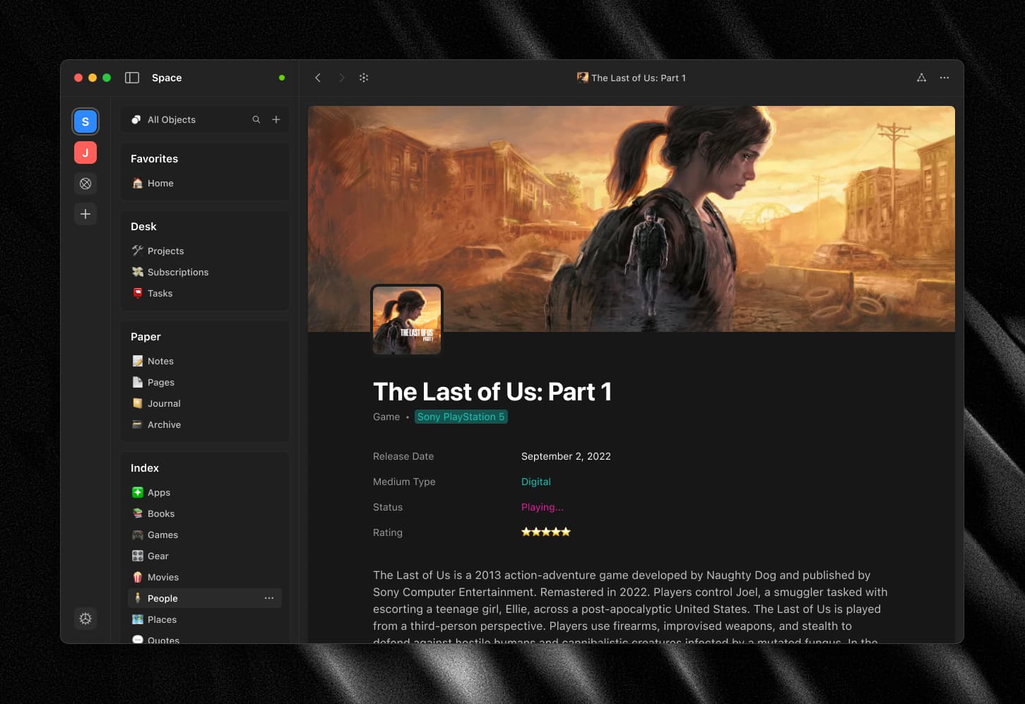
 The rest of the post is just for fun. I couldn’t help but wander what would the app looked like if it was transparent, or at least had a literal “page” on the right side. So I made a few more mockups, just for fun.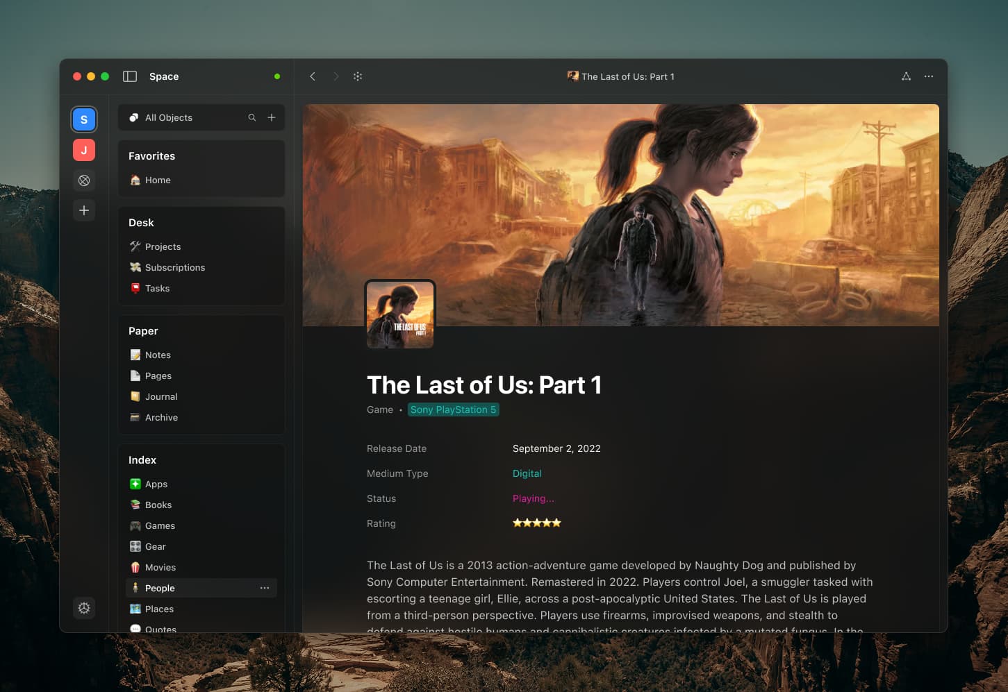
 Bravo! I like your design, and I would like personally to use it as my own default css theme.