Hi everyone!
With the latest update, the new text colors were not really for me so I started touching at the custom CSS and had a lot of fun!
These are just tiny tweaks most of the theme remains untouched, but makes it feel a little more premium.
Here is the custom.css:
/* ================================================
   ANYTYPE CUSTOM CSS
   Design System
   ================================================

   STRUCTURE:
   1. Design Tokens (edit here — applies everywhere)
   2. Tag & Property Pills
   3. Task Checkboxes
   4. Kanban Board
   5. Link Cards

   HOW TO EDIT COLORS:
   - Text colors → Section 1, --color-* variables
   - Tag opacity → Section 1, --tag-* variables
   - Kanban opacity → Section 1, --kanban-* variables
   - Per-color RGB values → Section 1, --rgb-* variables
   ================================================ */

/* ================================================
   1. DESIGN TOKENS
   ================================================ */

:root {
    /* ── Color palette (RGB for opacity flexibility) ── */
    --rgb-yellow: 223, 171, 1;
    --rgb-orange: 217, 115, 13;
    --rgb-red: 224, 62, 62;
    --rgb-pink: 173, 26, 114;
    --rgb-purple: 105, 64, 165;
    --rgb-blue: 82, 156, 202; /* note: bgColor-blue uses ice RGB */
    --rgb-ice: 82, 156, 202;
    --rgb-teal: 15, 123, 108;
    --rgb-lime: 68, 131, 97;
    --rgb-green: 68, 131, 97;
    --rgb-grey: 100, 100, 100;

    /* ── Notion-matched named text colors ── */
    --color-yellow: #dfab01;
    --color-orange: #d9730d;
    --color-red: #e03e3e;
    --color-pink: #ad1a72;
    --color-purple: #6940a5;
    --color-blue: #0b6e99;
    --color-ice: #529cca;
    --color-teal: #0f7b6c;
    --color-lime: #448361;
    --color-green: #448361;

    /* ── Tag pill opacities ── */
    --tag-bg: 0.15; /* tag background */

    /* ── Kanban opacities ── */
    --kb-border: 0.3; /* card border */
    --kb-hover: 0.15; /* card hover background */
    --kb-btn-border: 0.45; /* add button border */
    --kb-btn-color: 0.8; /* add button text/icon */
    --kb-btn-hover: 0.08; /* add button hover background */
}

html.themeDark {
    /* ── Lighter text colors for dark backgrounds ── */
    --color-yellow: #ffd95e;
    --color-orange: #ff9637;
    --color-red: #ff5454;
    --color-pink: #e55899;
    --color-purple: #9a6dd7;
    --color-blue: #2eaadc;
    --color-ice: #72b9e8;
    --color-teal: #22c2a5;
    --color-lime: #5bbd87;
    --color-green: #5bbd87;

    /* ── Dark mode RGB overrides ── */
    --rgb-blue: 46, 170, 220;
    --rgb-ice: 114, 185, 232;
    --rgb-teal: 34, 194, 165;
    --rgb-lime: 91, 189, 135;
    --rgb-green: 91, 189, 135;

    /* ── Dark mode opacity adjustments ── */
    --tag-bg: 0.2;
    --kb-border: 0.15;
    --kb-hover: 0.1;
}

/* ================================================
   2. TAG & PROPERTY PILLS
   ================================================ */

/* Remove default border on all pills */
.tagItem {
    border: none !important;
}

/* Light mode — background tints */
.tagItem.bgColor-default {
    background-color: rgba(var(--rgb-grey), 0.1) !important;
}
.tagItem.bgColor-grey {
    background-color: rgba(142, 142, 142, var(--tag-bg)) !important;
}
.tagItem.bgColor-yellow {
    background-color: rgba(var(--rgb-yellow), var(--tag-bg)) !important;
}
.tagItem.bgColor-orange {
    background-color: rgba(var(--rgb-orange), var(--tag-bg)) !important;
}
.tagItem.bgColor-red {
    background-color: rgba(var(--rgb-red), var(--tag-bg)) !important;
}
.tagItem.bgColor-pink {
    background-color: rgba(var(--rgb-pink), var(--tag-bg)) !important;
}
.tagItem.bgColor-purple {
    background-color: rgba(var(--rgb-purple), var(--tag-bg)) !important;
}
.tagItem.bgColor-blue {
    background-color: rgba(11, 110, 153, var(--tag-bg)) !important;
}
.tagItem.bgColor-ice {
    background-color: rgba(var(--rgb-ice), var(--tag-bg)) !important;
}
.tagItem.bgColor-teal {
    background-color: rgba(var(--rgb-teal), var(--tag-bg)) !important;
}
.tagItem.bgColor-lime {
    background-color: rgba(var(--rgb-lime), var(--tag-bg)) !important;
}
.tagItem.bgColor-green {
    background-color: rgba(var(--rgb-green), var(--tag-bg)) !important;
}

/* Light mode — text colors */
.tagItem.textColor-default {
    color: var(--color-text-secondary) !important;
}
.tagItem.textColor-grey {
    color: #6b6b6b !important;
}
.tagItem.textColor-yellow {
    color: #7a5e00 !important;
}
.tagItem.textColor-orange {
    color: #a04f00 !important;
}
.tagItem.textColor-red {
    color: #b91c1c !important;
}
.tagItem.textColor-pink {
    color: #9a1060 !important;
}
.tagItem.textColor-purple {
    color: #5b2d9e !important;
}
.tagItem.textColor-blue {
    color: #095b80 !important;
}
.tagItem.textColor-ice {
    color: #1e6fa0 !important;
}
.tagItem.textColor-teal {
    color: #0a6356 !important;
}
.tagItem.textColor-lime {
    color: #2e6647 !important;
}
.tagItem.textColor-green {
    color: #2e6647 !important;
}

/* Dark mode — background tints (rgb values updated via tokens above) */
html.themeDark .tagItem.bgColor-default {
    background-color: rgba(255, 255, 255, 0.08) !important;
}
html.themeDark .tagItem.bgColor-grey {
    background-color: rgba(150, 150, 150, var(--tag-bg)) !important;
}
html.themeDark .tagItem.bgColor-yellow {
    background-color: rgba(var(--rgb-yellow), var(--tag-bg)) !important;
}
html.themeDark .tagItem.bgColor-orange {
    background-color: rgba(var(--rgb-orange), var(--tag-bg)) !important;
}
html.themeDark .tagItem.bgColor-red {
    background-color: rgba(var(--rgb-red), var(--tag-bg)) !important;
}
html.themeDark .tagItem.bgColor-pink {
    background-color: rgba(var(--rgb-pink), var(--tag-bg)) !important;
}
html.themeDark .tagItem.bgColor-purple {
    background-color: rgba(var(--rgb-purple), var(--tag-bg)) !important;
}
html.themeDark .tagItem.bgColor-blue {
    background-color: rgba(var(--rgb-blue), var(--tag-bg)) !important;
}
html.themeDark .tagItem.bgColor-ice {
    background-color: rgba(var(--rgb-ice), var(--tag-bg)) !important;
}
html.themeDark .tagItem.bgColor-teal {
    background-color: rgba(var(--rgb-teal), var(--tag-bg)) !important;
}
html.themeDark .tagItem.bgColor-lime {
    background-color: rgba(var(--rgb-lime), var(--tag-bg)) !important;
}
html.themeDark .tagItem.bgColor-green {
    background-color: rgba(var(--rgb-green), var(--tag-bg)) !important;
}

/* Dark mode — text colors (pull from token system) */
html.themeDark .tagItem.textColor-default {
    color: var(--color-text-secondary) !important;
}
html.themeDark .tagItem.textColor-grey {
    color: #aaa !important;
}
html.themeDark .tagItem.textColor-yellow {
    color: var(--color-yellow) !important;
}
html.themeDark .tagItem.textColor-orange {
    color: var(--color-orange) !important;
}
html.themeDark .tagItem.textColor-red {
    color: var(--color-red) !important;
}
html.themeDark .tagItem.textColor-pink {
    color: var(--color-pink) !important;
}
html.themeDark .tagItem.textColor-purple {
    color: var(--color-purple) !important;
}
html.themeDark .tagItem.textColor-blue {
    color: var(--color-blue) !important;
}
html.themeDark .tagItem.textColor-ice {
    color: var(--color-ice) !important;
}
html.themeDark .tagItem.textColor-teal {
    color: var(--color-teal) !important;
}
html.themeDark .tagItem.textColor-lime {
    color: var(--color-lime) !important;
}
html.themeDark .tagItem.textColor-green {
    color: var(--color-green) !important;
}

/* ================================================
   3. TASK CHECKBOXES
   ================================================ */

/* Unchecked & hover — circle ring via SVG path override */
.iconObject.isTask .objectCheckbox0 svg path,
.iconObject.isTask .objectCheckbox1 svg path {
    d: path(
        "M10 2.5C14.1421 2.5 17.5 5.85786 17.5 10C17.5 14.1421 14.1421 17.5 10 17.5C5.85786 17.5 2.5 14.1421 2.5 10C2.5 5.85786 5.85786 2.5 10 2.5Z"
    );
    fill: none !important;
    stroke: var(--color-shape-primary) !important;
    stroke-width: 1.5px !important;
}

/* Checked — hide SVG, rebuild as CSS circle + checkmark */
.iconObject.isTask .objectCheckbox2 svg {
    display: none !important;
}

.iconObject.isTask .objectCheckbox2::before {
    content: "";
    position: absolute;
    inset: 3.75px; /* matches SVG's 2.5/20 padding ratio at 30px */
    background: var(--color-lime);
    border-radius: 50%;
}

.iconObject.isTask .objectCheckbox2::after {
    content: "";
    position: absolute;
    top: 50%;
    left: 50%;
    transform: translate(-55%, -65%) rotate(45deg);
    width: 4px;
    height: 8px;
    border-right: 2px solid #fff;
    border-bottom: 2px solid #fff;
}

/* Smaller variant for inline queries (c20 = 20×20px container) */
.iconObject.c20.isTask .objectCheckbox2::before {
    inset: 2.25px;
}
.iconObject.c20.isTask .objectCheckbox2::after {
    width: 3px;
    height: 6px;
    border-width: 1.5px;
}

/* ================================================
   4. KANBAN BOARD
   ================================================ */

/* ── Column shell ── */
.blocks .block.blockDataview .viewContent.viewBoard .column {
    border-radius: 12px !important;
    overflow: hidden !important;
}
.blocks .block.blockDataview .viewContent.viewBoard .column .head {
    padding: 12px 12px 8px !important;
    background: transparent !important;
}
.blocks .block.blockDataview .viewContent.viewBoard .column .body {
    padding: 0 0 8px !important;
}
.blocks .block.blockDataview .viewContent.viewBoard .column .bg > .bgColor {
    border-radius: 0 0 12px 12px !important;
}

/* ── Cards — shared base ── */
.blocks .block.blockDataview .viewContent.viewBoard .card:not(.add) {
    border: none !important;
    box-shadow: none !important;
    background: transparent !important;
    margin: 0 0 6px !important;
}
.blocks
    .block.blockDataview
    .viewContent.viewBoard
    .card:not(.add)
    .cardContent {
    box-shadow: none !important;
}

/* ── Add button — shared base ── */
.blocks .block.blockDataview .viewContent.viewBoard .card.add {
    background: transparent !important;
    box-shadow: none !important;
    border-radius: 10px !important;
    margin: 0 0 6px !important;
    transition: background 0.15s ease !important;
}
.blocks .block.blockDataview .viewContent.viewBoard .card.add .icon.hasSvg {
    color: inherit !important;
}

/* ── Dark mode cards ── */
html.themeDark
    .blocks
    .block.blockDataview
    .viewContent.viewBoard
    .card:not(.add)
    .cardContent {
    border: 1px solid rgba(255, 255, 255, 0.06) !important;
    box-shadow: none !important;
}
html.themeDark
    .blocks
    .block.blockDataview
    .viewContent.viewBoard
    .card:not(.add):hover
    .cardContent {
    background: rgba(255, 255, 255, var(--kb-hover)) !important;
}

/*
   ── Per-column rules ──
   Shorthand: [scope] = .blocks .block.blockDataview .viewContent.viewBoard
   Each color block sets: card border | card hover | add button | add hover
*/

/* Scope alias for readability */
.blocks
    .block.blockDataview
    .viewContent.viewBoard
    .column:has(> .body > .bg > .bgColor.bgColor-ice)
    .card:not(.add)
    .cardContent {
    border: 1px solid rgba(var(--rgb-ice), var(--kb-border)) !important;
}

.blocks
    .block.blockDataview
    .viewContent.viewBoard
    .column:has(> .body > .bg > .bgColor.bgColor-ice)
    .card:not(.add):hover
    .cardContent {
    background: rgba(var(--rgb-ice), var(--kb-hover)) !important;
}

.blocks
    .block.blockDataview
    .viewContent.viewBoard
    .column:has(> .body > .bg > .bgColor.bgColor-ice)
    .card.add {
    border: 1px solid rgba(var(--rgb-ice), var(--kb-btn-border)) !important;
    color: rgba(var(--rgb-ice), var(--kb-btn-color)) !important;
}

.blocks
    .block.blockDataview
    .viewContent.viewBoard
    .column:has(> .body > .bg > .bgColor.bgColor-ice)
    .card.add:hover {
    background: rgba(var(--rgb-ice), var(--kb-btn-hover)) !important;
}

/* orange */
.blocks
    .block.blockDataview
    .viewContent.viewBoard
    .column:has(> .body > .bg > .bgColor.bgColor-orange)
    .card:not(.add)
    .cardContent {
    border: 1px solid rgba(var(--rgb-orange), var(--kb-border)) !important;
}

.blocks
    .block.blockDataview
    .viewContent.viewBoard
    .column:has(> .body > .bg > .bgColor.bgColor-orange)
    .card:not(.add):hover
    .cardContent {
    background: rgba(var(--rgb-orange), var(--kb-hover)) !important;
}

.blocks
    .block.blockDataview
    .viewContent.viewBoard
    .column:has(> .body > .bg > .bgColor.bgColor-orange)
    .card.add {
    border: 1px solid rgba(var(--rgb-orange), var(--kb-btn-border)) !important;
    color: rgba(var(--rgb-orange), var(--kb-btn-color)) !important;
}

.blocks
    .block.blockDataview
    .viewContent.viewBoard
    .column:has(> .body > .bg > .bgColor.bgColor-orange)
    .card.add:hover {
    background: rgba(var(--rgb-orange), var(--kb-btn-hover)) !important;
}

/* yellow */
.blocks
    .block.blockDataview
    .viewContent.viewBoard
    .column:has(> .body > .bg > .bgColor.bgColor-yellow)
    .card:not(.add)
    .cardContent {
    border: 1px solid rgba(var(--rgb-yellow), var(--kb-border)) !important;
}

.blocks
    .block.blockDataview
    .viewContent.viewBoard
    .column:has(> .body > .bg > .bgColor.bgColor-yellow)
    .card:not(.add):hover
    .cardContent {
    background: rgba(var(--rgb-yellow), var(--kb-hover)) !important;
}

.blocks
    .block.blockDataview
    .viewContent.viewBoard
    .column:has(> .body > .bg > .bgColor.bgColor-yellow)
    .card.add {
    border: 1px solid rgba(var(--rgb-yellow), var(--kb-btn-border)) !important;
    color: rgba(var(--rgb-yellow), var(--kb-btn-color)) !important;
}

.blocks
    .block.blockDataview
    .viewContent.viewBoard
    .column:has(> .body > .bg > .bgColor.bgColor-yellow)
    .card.add:hover {
    background: rgba(var(--rgb-yellow), var(--kb-btn-hover)) !important;
}

/* red */
.blocks
    .block.blockDataview
    .viewContent.viewBoard
    .column:has(> .body > .bg > .bgColor.bgColor-red)
    .card:not(.add)
    .cardContent {
    border: 1px solid rgba(var(--rgb-red), var(--kb-border)) !important;
}

.blocks
    .block.blockDataview
    .viewContent.viewBoard
    .column:has(> .body > .bg > .bgColor.bgColor-red)
    .card:not(.add):hover
    .cardContent {
    background: rgba(var(--rgb-red), var(--kb-hover)) !important;
}

.blocks
    .block.blockDataview
    .viewContent.viewBoard
    .column:has(> .body > .bg > .bgColor.bgColor-red)
    .card.add {
    border: 1px solid rgba(var(--rgb-red), var(--kb-btn-border)) !important;
    color: rgba(var(--rgb-red), var(--kb-btn-color)) !important;
}

.blocks
    .block.blockDataview
    .viewContent.viewBoard
    .column:has(> .body > .bg > .bgColor.bgColor-red)
    .card.add:hover {
    background: rgba(var(--rgb-red), var(--kb-btn-hover)) !important;
}

/* pink */
.blocks
    .block.blockDataview
    .viewContent.viewBoard
    .column:has(> .body > .bg > .bgColor.bgColor-pink)
    .card:not(.add)
    .cardContent {
    border: 1px solid rgba(var(--rgb-pink), var(--kb-border)) !important;
}

.blocks
    .block.blockDataview
    .viewContent.viewBoard
    .column:has(> .body > .bg > .bgColor.bgColor-pink)
    .card:not(.add):hover
    .cardContent {
    background: rgba(var(--rgb-pink), var(--kb-hover)) !important;
}

.blocks
    .block.blockDataview
    .viewContent.viewBoard
    .column:has(> .body > .bg > .bgColor.bgColor-pink)
    .card.add {
    border: 1px solid rgba(var(--rgb-pink), var(--kb-btn-border)) !important;
    color: rgba(var(--rgb-pink), var(--kb-btn-color)) !important;
}

.blocks
    .block.blockDataview
    .viewContent.viewBoard
    .column:has(> .body > .bg > .bgColor.bgColor-pink)
    .card.add:hover {
    background: rgba(var(--rgb-pink), var(--kb-btn-hover)) !important;
}

/* purple */
.blocks
    .block.blockDataview
    .viewContent.viewBoard
    .column:has(> .body > .bg > .bgColor.bgColor-purple)
    .card:not(.add)
    .cardContent {
    border: 1px solid rgba(var(--rgb-purple), var(--kb-border)) !important;
}

.blocks
    .block.blockDataview
    .viewContent.viewBoard
    .column:has(> .body > .bg > .bgColor.bgColor-purple)
    .card:not(.add):hover
    .cardContent {
    background: rgba(var(--rgb-purple), var(--kb-hover)) !important;
}

.blocks
    .block.blockDataview
    .viewContent.viewBoard
    .column:has(> .body > .bg > .bgColor.bgColor-purple)
    .card.add {
    border: 1px solid rgba(var(--rgb-purple), var(--kb-btn-border)) !important;
    color: rgba(var(--rgb-purple), var(--kb-btn-color)) !important;
}

.blocks
    .block.blockDataview
    .viewContent.viewBoard
    .column:has(> .body > .bg > .bgColor.bgColor-purple)
    .card.add:hover {
    background: rgba(var(--rgb-purple), var(--kb-btn-hover)) !important;
}

/* blue */
.blocks
    .block.blockDataview
    .viewContent.viewBoard
    .column:has(> .body > .bg > .bgColor.bgColor-blue)
    .card:not(.add)
    .cardContent {
    border: 1px solid rgba(var(--rgb-blue), var(--kb-border)) !important;
}

.blocks
    .block.blockDataview
    .viewContent.viewBoard
    .column:has(> .body > .bg > .bgColor.bgColor-blue)
    .card:not(.add):hover
    .cardContent {
    background: rgba(var(--rgb-blue), var(--kb-hover)) !important;
}

.blocks
    .block.blockDataview
    .viewContent.viewBoard
    .column:has(> .body > .bg > .bgColor.bgColor-blue)
    .card.add {
    border: 1px solid rgba(var(--rgb-blue), var(--kb-btn-border)) !important;
    color: rgba(var(--rgb-blue), var(--kb-btn-color)) !important;
}

.blocks
    .block.blockDataview
    .viewContent.viewBoard
    .column:has(> .body > .bg > .bgColor.bgColor-blue)
    .card.add:hover {
    background: rgba(var(--rgb-blue), var(--kb-btn-hover)) !important;
}

/* teal */
.blocks
    .block.blockDataview
    .viewContent.viewBoard
    .column:has(> .body > .bg > .bgColor.bgColor-teal)
    .card:not(.add)
    .cardContent {
    border: 1px solid rgba(var(--rgb-teal), var(--kb-border)) !important;
}

.blocks
    .block.blockDataview
    .viewContent.viewBoard
    .column:has(> .body > .bg > .bgColor.bgColor-teal)
    .card:not(.add):hover
    .cardContent {
    background: rgba(var(--rgb-teal), var(--kb-hover)) !important;
}

.blocks
    .block.blockDataview
    .viewContent.viewBoard
    .column:has(> .body > .bg > .bgColor.bgColor-teal)
    .card.add {
    border: 1px solid rgba(var(--rgb-teal), var(--kb-btn-border)) !important;
    color: rgba(var(--rgb-teal), var(--kb-btn-color)) !important;
}

.blocks
    .block.blockDataview
    .viewContent.viewBoard
    .column:has(> .body > .bg > .bgColor.bgColor-teal)
    .card.add:hover {
    background: rgba(var(--rgb-teal), var(--kb-btn-hover)) !important;
}

/* lime + green (same rgb) */
.blocks
    .block.blockDataview
    .viewContent.viewBoard
    .column:has(> .body > .bg > .bgColor.bgColor-lime)
    .card:not(.add)
    .cardContent,
.blocks
    .block.blockDataview
    .viewContent.viewBoard
    .column:has(> .body > .bg > .bgColor.bgColor-green)
    .card:not(.add)
    .cardContent {
    border: 1px solid rgba(var(--rgb-lime), var(--kb-border)) !important;
}

.blocks
    .block.blockDataview
    .viewContent.viewBoard
    .column:has(> .body > .bg > .bgColor.bgColor-lime)
    .card:not(.add):hover
    .cardContent,
.blocks
    .block.blockDataview
    .viewContent.viewBoard
    .column:has(> .body > .bg > .bgColor.bgColor-green)
    .card:not(.add):hover
    .cardContent {
    background: rgba(var(--rgb-lime), var(--kb-hover)) !important;
}

.blocks
    .block.blockDataview
    .viewContent.viewBoard
    .column:has(> .body > .bg > .bgColor.bgColor-lime)
    .card.add,
.blocks
    .block.blockDataview
    .viewContent.viewBoard
    .column:has(> .body > .bg > .bgColor.bgColor-green)
    .card.add {
    border: 1px solid rgba(var(--rgb-lime), var(--kb-btn-border)) !important;
    color: rgba(var(--rgb-lime), var(--kb-btn-color)) !important;
}

.blocks
    .block.blockDataview
    .viewContent.viewBoard
    .column:has(> .body > .bg > .bgColor.bgColor-lime)
    .card.add:hover,
.blocks
    .block.blockDataview
    .viewContent.viewBoard
    .column:has(> .body > .bg > .bgColor.bgColor-green)
    .card.add:hover {
    background: rgba(var(--rgb-lime), var(--kb-btn-hover)) !important;
}

/* grey */
.blocks
    .block.blockDataview
    .viewContent.viewBoard
    .column:has(> .body > .bg > .bgColor.bgColor-grey)
    .card:not(.add)
    .cardContent {
    border: 1px solid rgba(var(--rgb-grey), var(--kb-border)) !important;
}

.blocks
    .block.blockDataview
    .viewContent.viewBoard
    .column:has(> .body > .bg > .bgColor.bgColor-grey)
    .card:not(.add):hover
    .cardContent {
    background: rgba(var(--rgb-grey), var(--kb-hover)) !important;
}

.blocks
    .block.blockDataview
    .viewContent.viewBoard
    .column:has(> .body > .bg > .bgColor.bgColor-grey)
    .card.add {
    border: 1px solid rgba(var(--rgb-grey), var(--kb-btn-border)) !important;
    color: rgba(var(--rgb-grey), var(--kb-btn-color)) !important;
}

.blocks
    .block.blockDataview
    .viewContent.viewBoard
    .column:has(> .body > .bg > .bgColor.bgColor-grey)
    .card.add:hover {
    background: rgba(var(--rgb-grey), var(--kb-btn-hover)) !important;
}

/* ================================================
   5. LINK CARDS
   ================================================ */

.blocks .block.blockLink.card .linkCard,
.blocks .block.blockLink.card .linkCard .side.left {
    border-radius: 9999px !important;
}

/* Match sidebar element background instead of hard grey */
.blocks .block.blockLink.card .linkCard .sides.withBgColor .side.left {
    background: var(--color-shape-highlight-light) !important;
}

/* ================================================
   6. LIST VIEW — PILL HOVER
   ================================================ */

.blocks .block.blockDataview.isInline .viewContent.viewList .row:hover {
    border-radius: 9999px !important;
}

/* ================================================
   7. ANIMATIONS & TRANSITIONS
   ================================================ */

/* ── Global smooth transitions ─────────────────── */
/* Applied broadly but kept short so nothing feels slow */
.tagItem,
.card:not(.add),
.card.add,
.row,
.linkCard,
.blocks .block.blockLink {
    transition:
        background 200ms ease,
        border-color 200ms ease,
        box-shadow 200ms ease,
        transform 200ms ease,
        opacity 200ms ease !important;
}

/* ── Kanban card lift on hover ──────────────────── */
/* Subtle upward shift + soft shadow — classic "pickable" feel */
.blocks
    .block.blockDataview
    .viewContent.viewBoard
    .card:not(.add):hover
    .cardContent {
    transform: translateY(-1px);
    box-shadow: 0 4px 12px rgba(0, 0, 0, 0.08) !important;
}

/* Dark mode lift shadow */
html.themeDark
    .blocks
    .block.blockDataview
    .viewContent.viewBoard
    .card:not(.add):hover
    .cardContent {
    box-shadow: 0 4px 12px rgba(0, 0, 0, 0.25) !important;
}

/* ── Tag pill hover ─────────────────────────────── */
/* Very slight scale — gives pills a tactile, pressable feel */
.tagItem:hover {
    transform: scale(1.03);
    filter: brightness(0.95);
}

/* ── Link card hover lift ───────────────────────── */
.blocks .block.blockLink .linkCard {
    box-shadow: none !important;
}

.blocks .block.blockLink:hover .linkCard {
    transform: translateY(-1px);
    box-shadow: 0 3px 10px rgba(0, 0, 0, 0.06) !important;
}

html.themeDark .blocks .block.blockLink:hover .linkCard {
    box-shadow: 0 3px 10px rgba(0, 0, 0, 0.22) !important;
}

/* ── List row hover ─────────────────────────────── */
.blocks .block.blockDataview.isInline .viewContent.viewList .row {
    transition:
        background 180ms ease,
        border-radius 180ms ease !important;
}

/* ── Block entrance animation ───────────────────── */
@keyframes blockEntrance {
    from {
        opacity: 0;
    }
    to {
        opacity: 1;
    }
}

/* Exclude icon block and header to avoid stacking context issues */
.blocks .block:not(.blockIconPage):not(.blockHeader):not(.blockLayout) {
    animation: blockEntrance 200ms ease forwards;
}

/* ── Kanban card entrance ───────────────────────── */
/* Cards stagger slightly as columns load */
@keyframes cardEntrance {
    from {
        opacity: 0;
        transform: translateY(6px);
    }
    to {
        opacity: 1;
        transform: translateY(0);
    }
}

.blocks .block.blockDataview .viewContent.viewBoard .card:not(.add) {
    animation: cardEntrance 220ms ease forwards;
}

/* ── Task checkbox — completion pulse ──────────── */
/* Small satisfying scale when checking a task */
@keyframes checkPulse {
    0% {
        transform: scale(1);
    }
    40% {
        transform: scale(1.15);
    }
    100% {
        transform: scale(1);
    }
}

.iconObject.isTask .objectCheckbox2::before {
    animation: checkPulse 280ms cubic-bezier(0.34, 1.56, 0.64, 1) forwards;
}

/* ── Sidebar widget hover ───────────────────────── */
.widget .objectClickable {
    transition:
        background 180ms ease,
        transform 180ms ease !important;
}

.widget .objectClickable:hover {
    transform: translateX(2px);
}

/* ── Reduce motion — respect OS accessibility setting ── */
@media (prefers-reduced-motion: reduce) {
    *,
    .blocks .block,
    .blocks .block.blockDataview .viewContent.viewBoard .card:not(.add) {
        animation: none !important;
        transition: none !important;
    }
}

/* ── Gallery card — no shadow at rest, lift on hover ── */
.blocks .block.blockDataview .viewContent.viewGallery .card {
    box-shadow: none !important;
    transition:
        background 200ms ease,
        border-color 200ms ease,
        box-shadow 200ms ease,
        transform 200ms ease !important;
}

.blocks .block.blockDataview .viewContent.viewGallery .card:hover {
    background: var(--color-bg-primary) !important;
    transform: translateY(-1px);
    box-shadow: 0 4px 12px rgba(0, 0, 0, 0.06) !important;
}

html.themeDark
    .blocks
    .block.blockDataview
    .viewContent.viewGallery
    .card:hover {
    box-shadow: 0 4px 12px rgba(0, 0, 0, 0.22) !important;
}
Edit:
- Fixed animation that blocked the emoji picker from appearing.
I’m a complete monkey in terms of CSS code so I got some help from Claude, but made it a little organized so it is easy to edit. I’ve also created a Claude Skill that you can use to speed up its understanding of AnyType’s CSS. I will update both the theme and Claude Skill as I go since this is just a few tweaks for fun but would like to improve a lot more in the future (calendar look, more animations, more transitions etc…)
Biggest changes I’ve made:
-
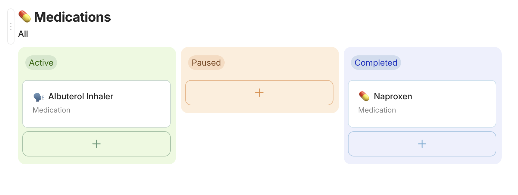
Kanban view: Modified to be closer to Notion, with a small scale effect on hover for the cards. Tags and property fields are now all pill shaped with a solid background for better readbility.
-
Tasks: Now the checkbox is round, with a subtle animation when checked.
-
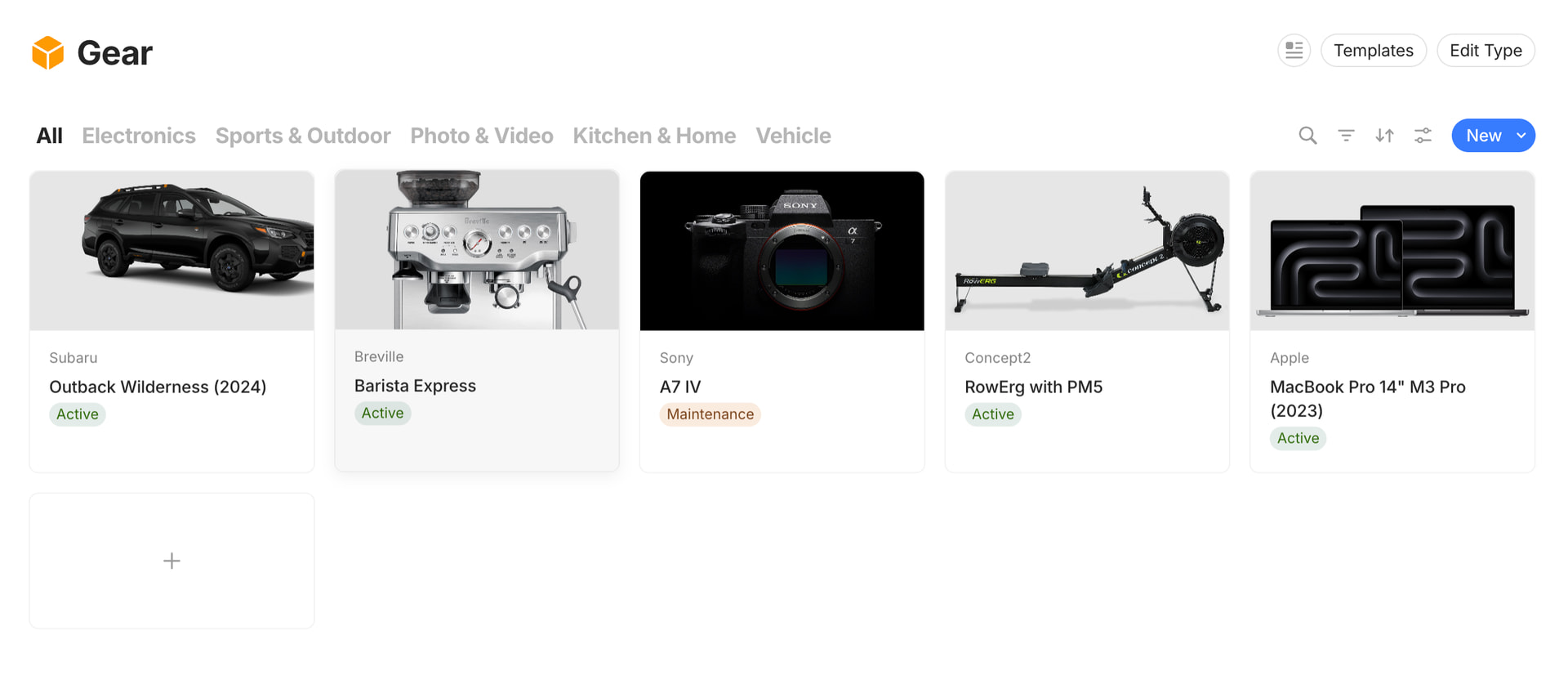
Gallery View: Cards have no shadow, on hover the card scales up a little bit with a cast shadow.
-
Links to object: The background grey is lighter, and are now pilled shape with the same hover effect as cards in gallery view.
-
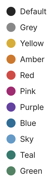
Text colors: Have been slightly tweaked. Mostly Yellow and Green as the previous version was a little sad. However not super happy with the green yet.


 . Hats of to you!
 , self-learning is so satisfying!